MagicKitchen.com
Facebook · Instagram · Audience Network · Image
The ad
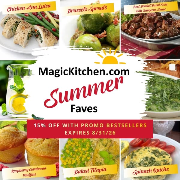
Try our customer-favorite meals for 15% off! Bestselling comfort food delivered right to your door.
15% Off With BESTSELLERS
Shop nowThe funnel behind it

Offer: Our a la carte menu items are sold in pairs. All products are hand prepared, flash frozen, and then shipped to our distribution center for order fulfillment to our customers.
Funnel score
8-point CRO breakdown
How well the landing page behind the ad is built to convert, scored across 8 factors: offer, copy, speed, trust, mobile, message-match, CTA, and social proof.
This page does well at showcasing product variety with high-quality food photography, clear "Best Seller" badges, and multiple trust signals (testimonials, app downloads, social proof badges). However, it critically fails to surface the advertised 15% discount offer anywhere on the page—the primary CTA is a filter button rather than a purchase action, and the headline doesn't mention any discount. The offer clarity is severely compromised because visitors see no discount code, expiration date, or clear redemption path. Mobile experience appears functional but the page lacks urgency messaging. The disconnect between the ad promise (15% off bestsellers) and page content (no visible discount) is the core conversion killer.
What this funnel does right. Steal these.
- Social proof8/10
- Trust signals7/10
- Mobile experience7/10
Where it's weak
- Message match2/10
- Offer clarity2/10
- Call to action3/10
Full breakdown
Call to action
3/10Primary CTA is 'HIDE OUT OF STOCK ITEMS' (a filter button), not a purchase or checkout action; no visible 'Shop Now' or 'Add to Cart' button in the above-fold area.
- Orange button is visually prominent and contrasts well
- Primary CTA is a filter toggle, not a purchase action
- No 'Shop Now' or 'Add to Cart' button visible above the fold
- No secondary CTA directing users to claim the discount
Page speed
6/10PageSpeed score of 61 converts to approximately 6/10; page loads but has room for optimization.
- PageSpeed score of 61 indicates moderate performance issues
- Multiple high-resolution product images may slow initial load
Trust signals
7/10Page displays multiple trust indicators: hand-prepared/flash-frozen product claims, testimonials link, app availability, social media presence, and extensive footer with policies.
- Checkmarks stating 'hand prepared, flash frozen' and fulfillment details
- Testimonials link and 'Our Customers' section in footer
- Privacy Policy, Terms of Use, and other legal links visible
- No visible customer review ratings or star counts on products
- No security badges or certifications displayed above the fold
Mobile experience
7/10Layout appears responsive with stacked product grid, readable text, and accessible navigation; menu and cart icons visible at top.
- Responsive two-column product grid that adapts to screen width
- Hamburger menu and cart icon clearly visible in header
- Product images and text remain readable at mobile size
- Filter button placement may require scrolling on small screens
Headline
6/10Headline clearly identifies the page as 'Best Sellers - Our Customers' Favorites' but doesn't reinforce the advertised 15% discount.
- Clear, descriptive headline that matches page content
- Positions products as customer-validated favorites
- Doesn't mention the 15% discount promised in the ad
- Misses opportunity to create urgency or highlight the offer
Social proof
8/10Multiple trust signals present: 'Best Seller' badges throughout product grid, testimonials link in footer, app store badges, and social media links.
- 'Best Seller' purple badges on 20+ products throughout the grid
- App download buttons (Google Play and App Store) in footer
- Testimonials link and 'Our Customers' in navigation footer
Message match
2/10Ad promises '15% off bestsellers' but page shows no discount, no promo code, and no redemption mechanism; only product listings.
- Ad headline '15% Off With BESTSELLERS' has no corresponding discount display on page
- Ad primary text mentions '15% off' but page contains zero discount messaging
- Page shows bestseller products but no offer to purchase them at discount
Offer clarity
2/10The advertised 15% discount is completely absent from the page; only generic product descriptions and bundle pricing are shown.
- No discount code or percentage visible anywhere on the page
- No expiration date or urgency messaging for the offer
- Offer text only mentions 'a la carte menu items sold in pairs' with no mention of discount
Your own page
You just read somebody else's funnel. What does yours score?
The score above came from the real landing page behind this ad, graded on 8 CRO factors. Run your own page through the same rubric, free, and see what each factor found and where you give up the most ground.
Free, no signup, no card. The same 8 factor score every page here was graded on.
Keep exploring
Data from the public Meta Ad Library. Funnelens is not affiliated with or endorsed by Meta. See data sources.