Factor_
Facebook · Instagram · Messenger · Video
The ad
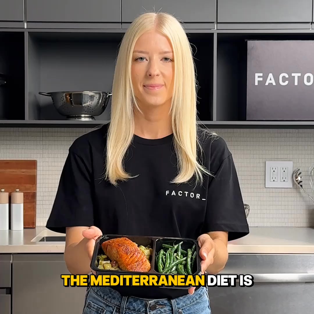
Craving something delicious? Pick from 100+ weekly options with Factor: Mediterranean, Thai, and classic comfort flavors.
50% Off Your First Box
Get offerThe funnel behind it
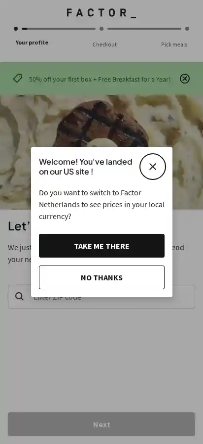
Offer: 50% off your first box + Free Breakfast for a Year!
Funnel score
8-point CRO breakdown
How well the landing page behind the ad is built to convert, scored across 8 factors: offer, copy, speed, trust, mobile, message-match, CTA, and social proof.
This page does well by prominently displaying the strong offer (50% off + free breakfast) in a green banner and matching the ad's core promise. The modal dialog is intrusive and blocks the main content, creating friction. The headline "Let's get you started" is generic and doesn't reinforce the offer or meal variety mentioned in the ad. Mobile layout appears functional but the modal overlay dominates the viewport. Trust signals are minimal—no reviews, testimonials, or brand credibility markers visible. The page successfully captures the discount offer but fails to build confidence or excitement about the 100+ meal options promised in the ad.
What this funnel does right. Steal these.
- Offer clarity8/10
- Mobile experience7/10
Where it's weak
- Social proof0/10
- Page speed1/10
- Trust signals2/10
- Headline3/10
Full breakdown
Call to action
6/10The primary CTA button 'Next' is visible and functional but lacks urgency or clarity about what happens next.
- Button is clearly visible and positioned at the bottom of the modal
- High contrast (dark button) makes it stand out
- Generic 'Next' label doesn't communicate the action (e.g., 'Claim 50% Off' would be stronger)
- No sense of urgency or scarcity messaging on the button
- Modal also offers 'NO THANKS' option which provides an easy exit path
Page speed
1/10PAGESPEED_SCORE of 13 converts to approximately 1 on a 0-10 scale, indicating severe performance issues.
- Extremely low PageSpeed score (13/100) suggests major performance problems
- Page likely loads very slowly, causing user frustration and abandonment
- Poor speed will negatively impact conversion rates and user experience
Trust signals
2/10Trust is undermined by the intrusive modal, lack of social proof, and minimal brand credibility signals.
- Factor branding is visible at the top of the page
- No customer reviews, ratings, or testimonials visible
- Intrusive modal dialog feels like a dark pattern, reducing trust
- No security badges, guarantees, or company credibility information shown
Mobile experience
7/10The page appears mobile-responsive with a full-screen modal dialog, but the modal takes up the entire viewport and blocks navigation.
- Modal dialog is sized appropriately for mobile screens
- Text is readable and buttons are touch-friendly in size
- Navigation breadcrumbs at top are visible
- Modal completely blocks access to the main page content on mobile
- No way to dismiss or minimize the modal without making a choice
- Viewport is dominated by the modal, limiting ability to explore the offer
Headline
3/10The headline 'Let's get you started' is generic and fails to communicate the value proposition or meal variety promised in the ad.
- Generic phrase 'Let's get you started' doesn't mention meals, variety, or the discount
- No connection to the ad's promise of '100+ weekly options' or specific cuisines
- Doesn't differentiate Factor or create excitement about the product
Social proof
0/10No customer reviews, ratings, testimonials, or trust badges are visible on the page.
- No star ratings or review counts visible
- No customer testimonials or success stories shown
- No trust badges, certifications, or media mentions displayed
Message match
6/10The page captures the discount offer from the ad but largely ignores the '100+ weekly options' and cuisine variety (Mediterranean, Thai, comfort) mentioned in the ad copy.
- Discount offer '50% off your first box' directly matches the ad headline
- Free breakfast bonus aligns with ad's promise of value
- No mention of '100+ weekly options' visible on the page
- Specific cuisines (Mediterranean, Thai, comfort) from ad are not referenced
- Page focuses on account setup rather than meal selection or variety
Offer clarity
8/10The offer is clearly stated in the green banner: '50% off your first box + Free Breakfast for a Year!' but the modal dialog partially obscures the page content.
- Green banner at top clearly displays '50% off your first box + Free Breakfast for a Year!'
- Offer is repeated and reinforced visually with contrasting color
- Modal dialog blocks view of the main page content and offer details
- No breakdown of what 'Free Breakfast for a Year' means or how it applies
More ads from Factor_
View all →
Your own page
You just read somebody else's funnel. What does yours score?
The score above came from the real landing page behind this ad, graded on 8 CRO factors. Run your own page through the same rubric, free, and see what each factor found and where you give up the most ground.
Free, no signup, no card. The same 8 factor score every page here was graded on.
Keep exploring
Data from the public Meta Ad Library. Funnelens is not affiliated with or endorsed by Meta. See data sources.