Mack Weldon
Facebook · Instagram · Audience Network · Video
The ad
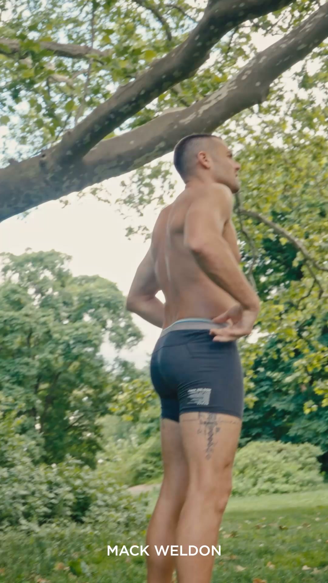
Introducing AIRKNITx Cotton, engineered with breathable micro mesh for maximum breathability and comfort.
Humidity’s Worst Nightmare
Shop nowThe funnel behind it

Offer: Available in boxer briefs (with or without a fly) and a v-neck undershirt. Pick your color below.
Funnel score
8-point CRO breakdown
How well the landing page behind the ad is built to convert, scored across 8 factors: offer, copy, speed, trust, mobile, message-match, CTA, and social proof.
This page effectively showcases the AIRKNITx Cotton product with strong visual storytelling and clear product benefits ("Light as Air," "Feels like wearing nothing"), but suffers from critical performance issues and weak conversion mechanics. The headline is generic and doesn't match the ad's compelling "Humidity's Worst Nightmare" angle. While the page builds trust through brand presence and lifestyle imagery, the CTA is buried deep in the page, the offer clarity is muddled across multiple sections, and the extremely slow page speed (35/100) will severely impact user experience and conversions. The product grid with Quick Add buttons shows good intent but lacks urgency or clear primary conversion path.
What this funnel does right. Steal these.
- Mobile experience7/10
Where it's weak
- Social proof2/10
- Message match3/10
- Page speed4/10
- Headline4/10
- Call to action5/10
Full breakdown
Call to action
5/10Multiple CTAs exist but lack clarity and prominence: Quick Add buttons are scattered throughout the product grid, and the main CTA 'EXPLORE THE FULL AIRKNIT X COLLECTION' is buried in a lifestyle image near the bottom of the page.
- Quick Add buttons are action-oriented and visible on each product
- Secondary CTA button has clear white text on dark background for contrast
- Multiple conversion opportunities throughout the page
- Primary CTA is buried in a lifestyle image halfway down the page, not at top of fold
- No prominent 'Shop Now' or 'Buy Now' button matching the ad's CTA
- Quick Add buttons are secondary and scattered, creating unclear conversion hierarchy
Page speed
4/10PAGESPEED_SCORE of 35 converts to approximately 3.5/10, indicating severe performance issues that will significantly harm user experience and conversion rates.
- Extremely slow page speed (35/100) will cause high bounce rates
- Multiple high-resolution images likely contributing to load time issues
- Poor performance will disproportionately impact mobile users
Trust signals
6/10The page establishes baseline trust through Mack Weldon branding, professional design, and lifestyle imagery, but lacks third-party validation like reviews, certifications, or guarantees.
- Established brand presence (Mack Weldon logo and navigation)
- Professional product photography and lifestyle imagery
- Clear company information and links in footer (About Us, Store Locator, etc.)
- No customer reviews or ratings visible anywhere on page
- No trust badges, certifications, or guarantees mentioned
- No return policy, warranty, or satisfaction guarantee visible in the screenshot
Mobile experience
7/10The layout appears responsive with stacked product cards and readable text, though the page structure suggests mobile optimization exists, but the slow speed will impact mobile experience significantly.
- Product grid appears to stack vertically for mobile viewing
- Text is readable and not cramped
- Navigation menu is present and accessible
- Slow page speed (35/100) will severely impact mobile user experience
- Multiple CTAs may be confusing on smaller screens
- Hero image may not scale optimally on mobile devices
Headline
4/10The page headline 'AIRKNIT COTTON' is a generic product name that fails to communicate the key benefit or match the ad's compelling 'Humidity's Worst Nightmare' positioning.
- Clear and readable typography
- Positioned prominently in the hero section
- Doesn't convey the breathability/comfort benefit that the ad emphasizes
- Misses the emotional hook from the ad ('Humidity's Worst Nightmare')
- Generic product name rather than benefit-driven messaging
Social proof
2/10The page contains virtually no social proof elements—no customer reviews, ratings, testimonials, or user-generated content visible across all three sections.
- No star ratings or review counts visible anywhere on the page
- No customer testimonials or quotes
- No user-generated content or social media integration shown
Message match
3/10Poor alignment between ad and page: ad emphasizes 'breathable micro mesh' and 'Humidity's Worst Nightmare' but page leads with generic 'AIRKNIT COTTON' headline and focuses on product selection rather than the breathability benefit.
- Product imagery shows the underwear being worn, supporting the comfort angle
- The 'Light as Air' subheading partially echoes the breathability message
- Ad's 'Humidity's Worst Nightmare' angle is completely absent from page messaging
- Ad's emphasis on 'breathable micro mesh' engineering is not mentioned on page
- Page focuses on product selection and colors rather than the key benefit from the ad
Offer clarity
6/10The offer is split across multiple sections with unclear hierarchy: 'Back to Basics' section describes boxer briefs and v-neck undershirts with color selection, but the main hero doesn't clearly state what's being sold or the core value proposition.
- Product images clearly show the underwear and undershirt options
- Pricing is visible ($34 for most items) with Quick Add buttons
- Color options are displayed with product names (Phantom, Steel, Bright White, etc.)
- No clear statement of what AIRKNITx Cotton IS in the main offer section
- Multiple CTAs (Quick Add buttons, 'Explore the Full Collection') create confusion about primary conversion goal
- The 'Back to Basics' headline doesn't explain the offer or differentiation
More ads from Mack Weldon
View all →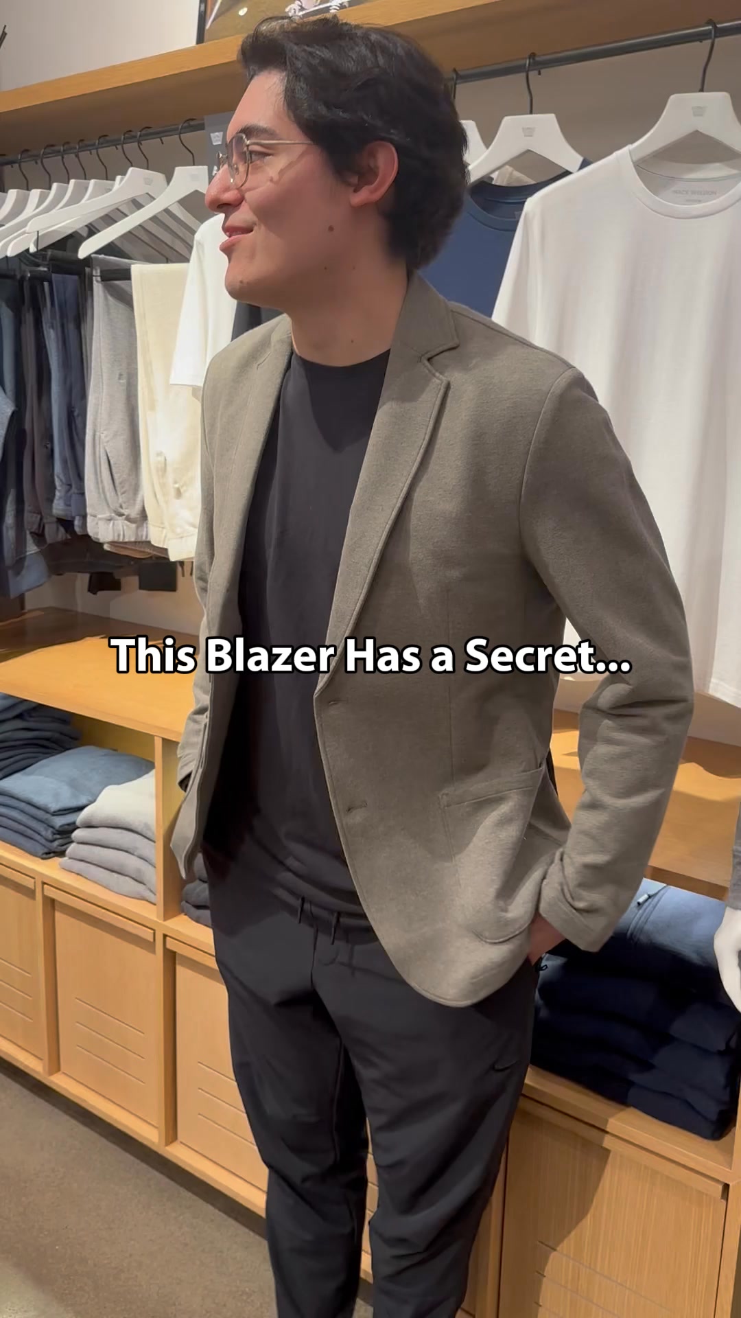
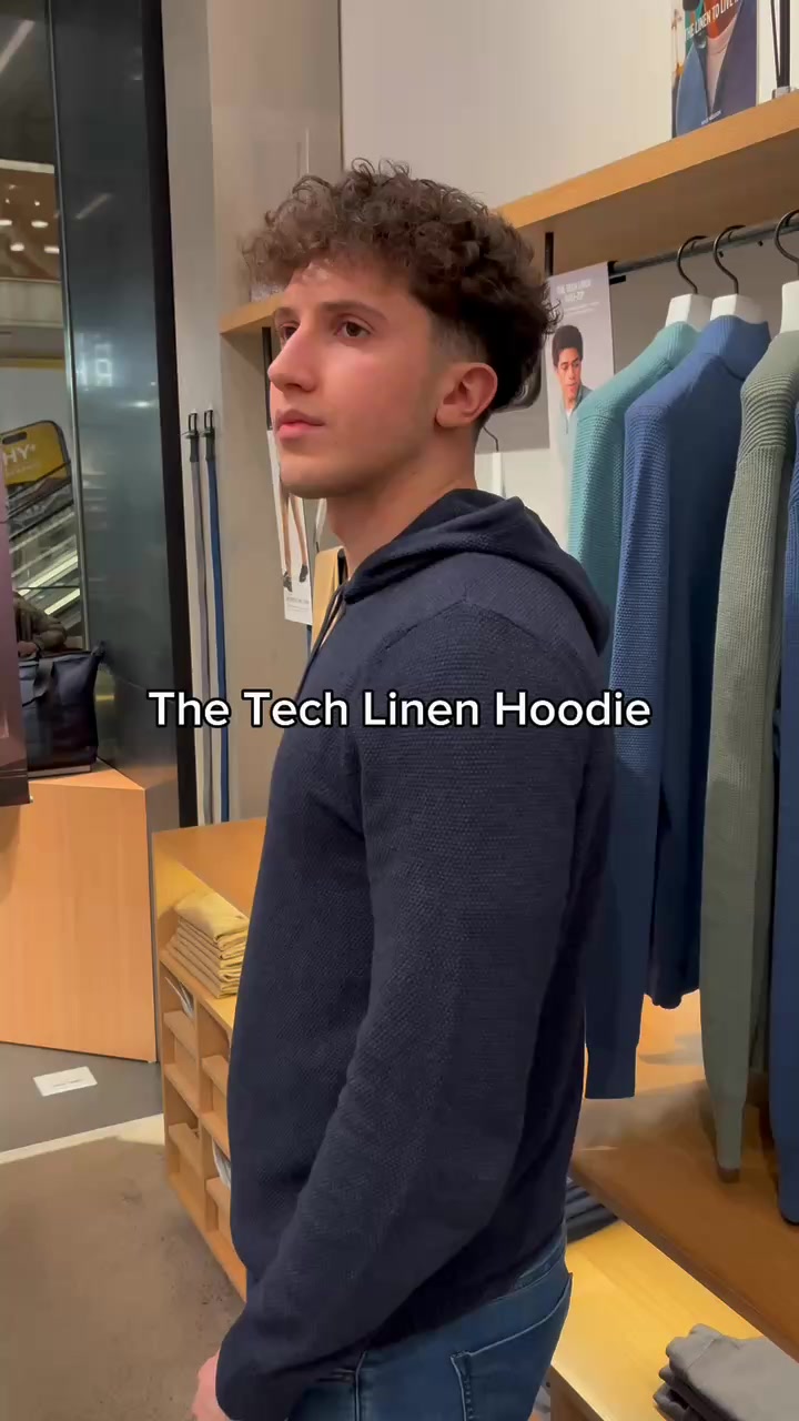

Your own page
You just read somebody else's funnel. What does yours score?
The score above came from the real landing page behind this ad, graded on 8 CRO factors. Run your own page through the same rubric, free, and see what each factor found and where you give up the most ground.
Free, no signup, no card. The same 8 factor score every page here was graded on.
Keep exploring
Data from the public Meta Ad Library. Funnelens is not affiliated with or endorsed by Meta. See data sources.