Owlet
Facebook · Instagram · Audience Network · Video
The ad
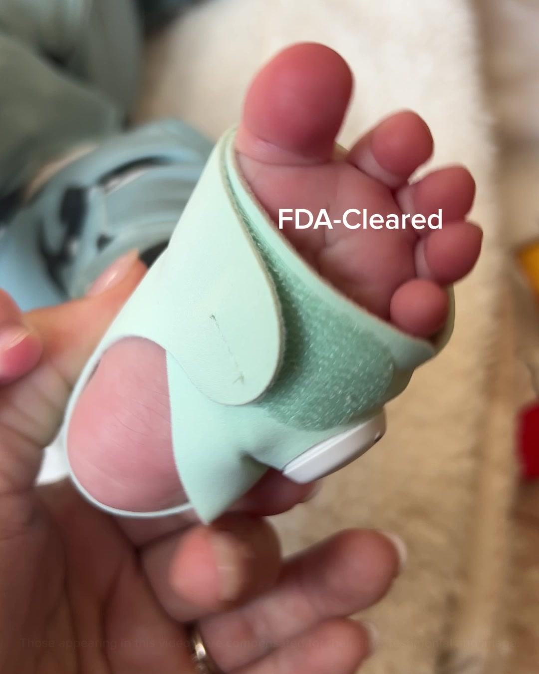
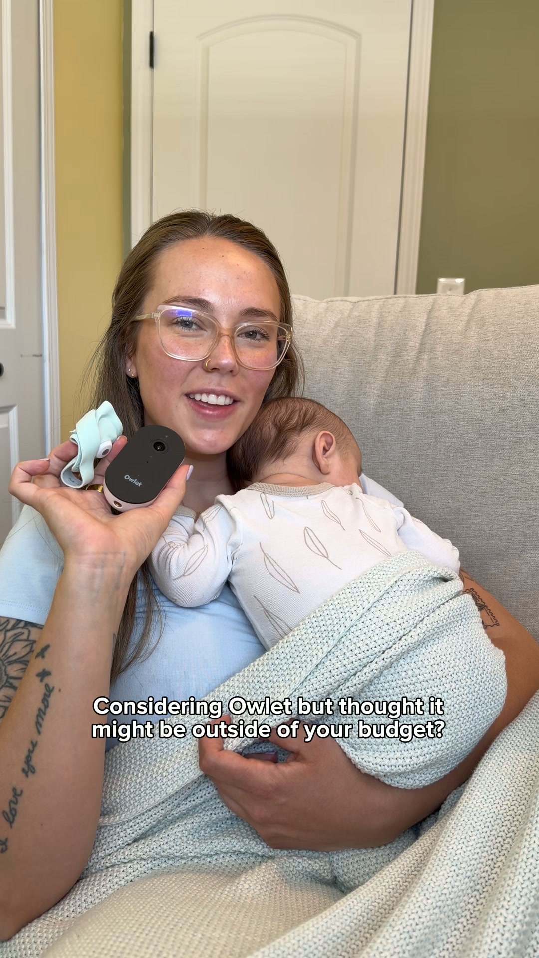
RSV season is stressful, but getting BabySat isn't. Secure a quick prescription online and keep a close eye on your baby's health.
FDA-Cleared BabySat Monitoring System
Learn moreThe funnel behind it

Offer: Introducing the BabySat® monitoring system, a prescription and is intended for babies aged 1-18 months and between 6-30 lbs who could benefit from additional monitoring at home, under the supervision of a physician on ongoing medical needs.
Funnel score
8-point CRO breakdown
How well the landing page behind the ad is built to convert, scored across 8 factors: offer, copy, speed, trust, mobile, message-match, CTA, and social proof.
This page does well establishing medical credibility through FDA-clearance messaging, detailed product features (medical-grade accuracy, live vital signs tracking), and multiple CTAs targeting healthcare providers. However, it suffers from poor page speed (38/100), weak social proof (no reviews, testimonials, or usage statistics visible), and messaging misalignment with the ad's consumer-focused "quick prescription online" angle—the page is clearly designed for medical professionals, not parents seeking quick access. The primary CTA "RX Order Form" is clinical and uninviting for consumers, and the offer clarity is muddled by regulatory language that obscures the actual value proposition.
What this funnel does right. Steal these.
- Headline7/10
Where it's weak
- Social proof1/10
- Message match3/10
- Call to action4/10
- Page speed4/10
- Offer clarity5/10
Full breakdown
Call to action
4/10Primary CTA 'RX Order Form' is clinical and passive; secondary CTAs ('Learn More', 'Download here', 'Contact Us') are scattered and lack urgency.
- Primary CTA button is visually prominent (dark teal, full-width above fold)
- Multiple CTAs throughout page offer different entry points
- Clear visual hierarchy with button styling
- 'RX Order Form' is clinical jargon that alienates consumers; doesn't match ad's 'quick prescription online' promise
- No urgency language (e.g., 'Get Started', 'Secure Your Prescription', 'Order Now')
- Secondary CTAs like 'Learn More' and 'Download here' are weak and don't drive conversion
Page speed
4/10PAGESPEED_SCORE of 38 converts to approximately 3.8/10; this is critically slow and will cause abandonment, especially on mobile.
- Page speed score of 38/100 is in the poor range
- Multiple high-resolution images (product mockup, lifestyle photo, clinical documents) likely unoptimized
- Likely JavaScript-heavy expandable sections and form interactions
Trust signals
6/10FDA-clearance and clinical language build some trust, but lack of customer proof, privacy details, and company transparency limit credibility.
- FDA-Cleared status prominently displayed and repeated throughout
- Clinical study PDFs available for download (whitepapers section)
- Specific medical indications listed (cardiac/respiratory conditions)
- No customer reviews or testimonials to validate claims
- No company background, team credentials, or 'About Us' visible
- Privacy policy link present but buried at bottom; no trust badges or certifications visible
Mobile experience
6/10Layout is responsive and readable on mobile, but long scrolling and stacked sections create friction; form fields visible at bottom are small.
- Text is readable and properly sized for mobile
- Buttons are large enough to tap (primary CTA is full-width)
- Images scale appropriately and don't overflow
- Excessive vertical scrolling required to reach CTAs (multiple 'Learn More' sections before conversion)
- Expandable FAQ sections require tapping to reveal content, adding friction
- Email and date input fields at bottom are small and cramped
Headline
7/10Headline is clear and credible but generic; it names the product and FDA status but doesn't communicate the emotional benefit or urgency.
- FDA-Cleared status builds trust immediately
- Product name is specific (BabySat®)
- Monitoring System clearly indicates function
- No emotional hook or benefit statement (e.g., 'peace of mind', 'early detection')
- Doesn't address the ad's angle about RSV season stress or quick access
- Generic product-name format lacks differentiation
Social proof
1/10No customer reviews, testimonials, usage statistics, clinical trial data, or endorsements visible anywhere on the page.
- Zero customer testimonials or reviews despite multiple page sections
- No usage statistics (e.g., 'trusted by X hospitals' or 'X babies monitored')
- Clinical studies mentioned as downloadable PDFs but no summary stats or quotes on page
Message match
3/10Ad promises 'quick prescription online' and targets stressed parents during RSV season; page is designed for medical professionals and emphasizes clinical features, not consumer convenience.
- Both ad and page mention FDA-cleared status
- Both reference prescription requirement
- Product name (BabySat) matches between ad and page
- Ad targets parents ('RSV season is stressful'); page targets providers ('I am a medical provider, how can my practice get started')
- Ad emphasizes speed ('quick prescription'); page emphasizes clinical workflow and integration
- Ad's consumer angle (health monitoring) vs. page's provider angle (EMR integration, clinician workflows)
Offer clarity
5/10The offer is buried in regulatory language and unclear whether this is for consumers or providers; the actual value (monitoring system for at-risk infants) is stated but the process and pricing are absent.
- FDA-cleared status prominently displayed in headline
- Target age range (1-18 months, 6-30 lbs) clearly specified
- Key features listed (medical-grade accuracy, live vital signs, customizable alarms)
- Prescription requirement mentioned but process unclear—does consumer order directly or request from doctor?
- No pricing, shipping time, or what's included in the system
- Regulatory language ('intended for babies...under supervision of a physician') obscures consumer benefit
More ads from Owlet
View all →
Your own page
You just read somebody else's funnel. What does yours score?
The score above came from the real landing page behind this ad, graded on 8 CRO factors. Run your own page through the same rubric, free, and see what each factor found and where you give up the most ground.
Free, no signup, no card. The same 8 factor score every page here was graded on.
Keep exploring
Data from the public Meta Ad Library. Funnelens is not affiliated with or endorsed by Meta. See data sources.