Two Blind Brothers
Facebook · Instagram · Audience Network · Video
The ad
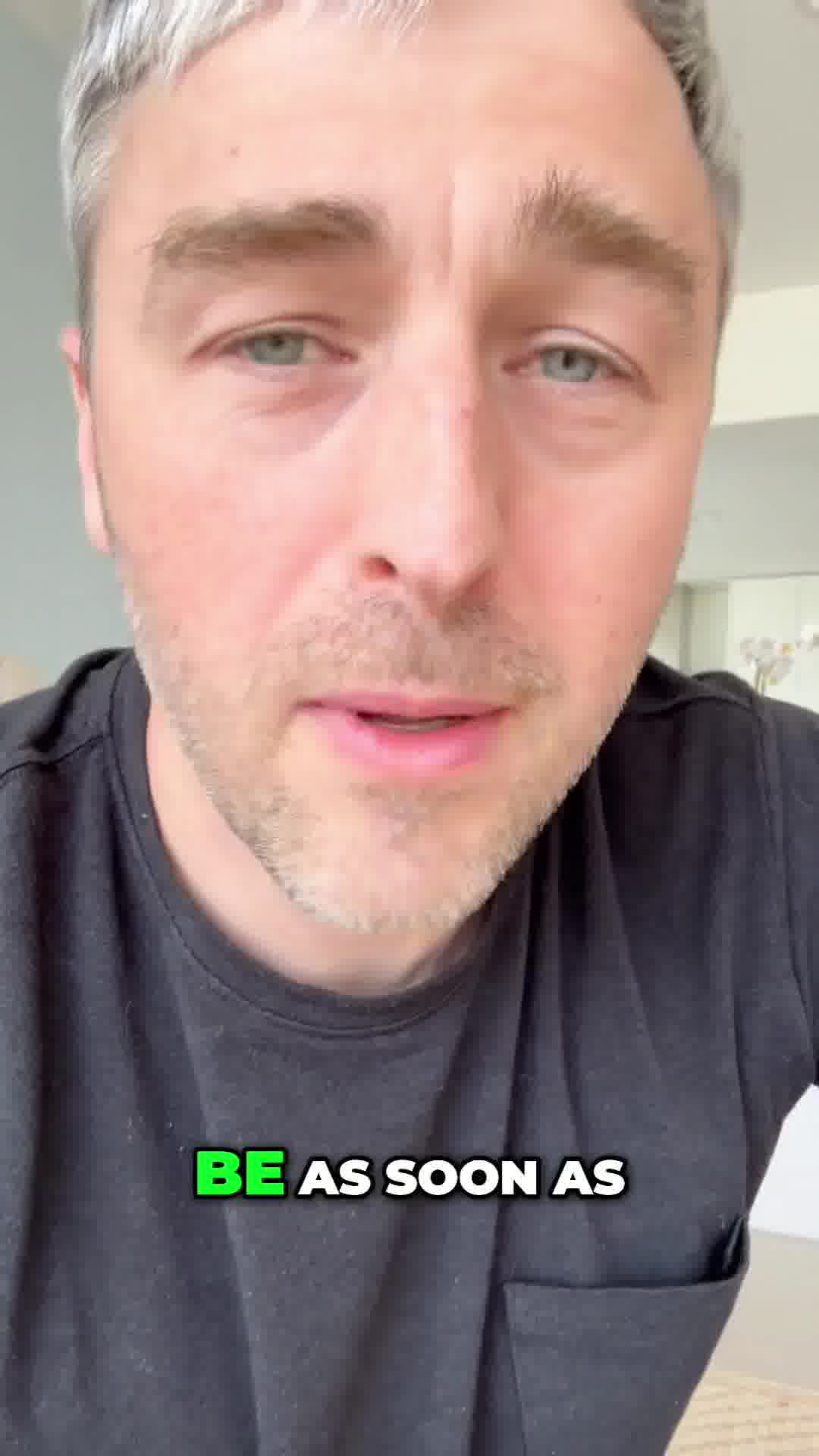
Big News! We wanted to share something really special with you today. As many of you know, this whole brand started because two brothers—Brad and Bryan—were diagnosed with a rare eye disease as kids. And instead of letting that define their future, they made a promise to build something that could push research forward and support the community walking the same road they were. Fast forward to today, and because of supporters like you, we just hit a milestone we could only dream about years ago: six new clinical trials have officially launched. Six new chances to move closer to treatments and cures. Six new reasons to keep fighting. So to celebrate this moment—and to thank the people who helped make it possible—we’re doing something we almost never do: we’re unlocking The Reserve for 48 hours. If you’re new to the name, The Reserve is the collection we created for our supporters. Not for mass production. Not for trends. These are the pieces we make with the softest fabrics we can find, the fits we spend months refining, and the braille details that remind us why this mission exists. It’s the collection we designed for the people who took a chance on Shop Blind, who shared our story, who believed in us long before millions of others did. The Reserve was always meant to be a thank-you—a way to give our community something special, something intentional, something quietly meaningful. And unlocking it right now feels like the perfect way to honor the progress you helped create. For the next 48 hours, you’ll have access to the pieces we normally keep exclusive: the small-batch cuts, the elevated fabrics, the subtle details you don’t notice until you’re up close. They’re built to last, built to feel incredible, and built with purpose in every stitch. This moment… this progress… these six new trials… They happened because of you. Thank you for being part of this mission, for believing in what we do, and for helping us move one step closer to a world where no one loses their vision to these diseases. The Reserve is unlocked—just for you, and only for a little while.
48HRS Only!
Shop nowThe funnel behind it

Offer: The Reserve collection unlocked for 48 hours—exclusive pieces with elevated fabrics, small-batch cuts, and braille details, normally kept exclusive for supporters.
Funnel score
8-point CRO breakdown
How well the landing page behind the ad is built to convert, scored across 8 factors: offer, copy, speed, trust, mobile, message-match, CTA, and social proof.
This page does well at building emotional trust through the founders' story and mission impact (six new clinical trials launched), and it clearly communicates the exclusivity and limited-time nature of The Reserve collection. However, it suffers from poor mobile optimization with cramped text and layout issues, very slow page speed (38/100), and a weak primary CTA that doesn't stand out visually or convey urgency despite the 48-hour window. The headline "Feel the Difference" doesn't match the ad's "48HRS Only!" urgency angle, creating message misalignment. Social proof exists but is limited to a single customer review, and the offer clarity is somewhat buried in lengthy storytelling rather than front-and-center.
What this funnel does right. Steal these.
- Trust signals7/10
Where it's weak
- Call to action3/10
- Message match3/10
- Page speed4/10
- Mobile experience4/10
- Headline4/10
- Social proof5/10
Full breakdown
Call to action
3/10Primary CTA 'Shop now' appears multiple times but lacks visual prominence, urgency signaling, or clear differentiation from other buttons on the page.
- CTA text is clear and action-oriented ('Shop now')
- Appears in multiple locations (hero section, product cards)
- Black button with minimal contrast against dark background—hard to spot
- No urgency language like 'Shop The Reserve Now' or '48 Hours Only'
- Competes with other buttons ('Shop Mens,' 'Shop Womens,' 'Read More') without clear hierarchy
Page speed
4/10Page speed score of 38/100 is very poor, indicating significant performance issues that will hurt conversion and user experience.
- PAGESPEED_SCORE of 38 indicates slow load times and performance bottlenecks
- Multiple high-resolution images and video content likely unoptimized
- Slow speed will increase bounce rate and reduce mobile conversions
Trust signals
7/10Strong trust-building through founders' personal story, mission impact ($2.7M+ contributed), and customer review, but undermined by poor page performance and lack of security/guarantee signals.
- Authentic founders' story: two brothers with rare eye disease who built the brand
- Concrete mission impact: 'six new clinical trials have officially launched'
- Specific financial commitment: 'over $2,700,000 to help fund vital blindness research'
- No visible trust badges, security seals, or SSL indicators
- No money-back guarantee, return policy, or satisfaction promise visible
- No third-party certifications or awards mentioned
Mobile experience
4/10Mobile layout is cramped with small text, poor spacing, and difficult-to-tap buttons; images and content stack awkwardly.
- Navigation menu is accessible via hamburger icon
- Images scale to screen width
- Text is readable (not microscopic)
- Paragraph text is dense with minimal line spacing, hard to scan on small screens
- CTA buttons are narrow and difficult to tap accurately
- Product cards and pricing information are cramped together
Headline
4/10The page headline 'Feel the Difference' is generic and doesn't match the ad's urgency angle of '48HRS Only!' or communicate the exclusive/limited-time nature of the offer.
- Clean, simple typography that's easy to read
- Positioned prominently at top of page
- Completely misaligned with ad headline '48HRS Only!'—no urgency or exclusivity signaled
- Generic benefit statement that could apply to any apparel brand
- Doesn't mention The Reserve, the 48-hour window, or the mission milestone
Social proof
5/10Page includes one 5-star customer review and mission impact statement (over $2.7M contributed to blindness research), but limited in quantity and variety.
- 5-star review from named customer (Vicki) with specific product praise and photo
- Mission impact statement: 'contributed over $2,700,000 to help fund vital blindness research'
- Founders' personal story and mission credibility throughout
- Only one customer review visible on entire page
- No review count, aggregate rating, or testimonial volume displayed
- No mention of how many supporters/customers have purchased or taken the Shop Blind Challenge
Message match
3/10Significant disconnect between ad messaging (48-hour limited-time unlock, celebration of six new trials) and page headline/positioning (generic 'Feel the Difference' about everyday leggings).
- Page does deliver The Reserve collection as promised in ad
- Mission story and founders' narrative present on page
- Product quality messaging aligns with ad's 'elevated fabrics' description
- Ad emphasizes '48HRS Only!' urgency; page headline ignores this entirely
- Ad focuses on mission milestone (six new trials); page buries this in body text
- Ad positions this as exclusive thank-you to supporters; page treats it as regular product launch
Offer clarity
6/10The offer is explained through narrative storytelling rather than clear, scannable benefit statements, requiring readers to extract the core offer from multiple paragraphs.
- Explicitly states 'The Reserve is unlocked—just for you, and only for a little while' near the end
- Describes specific product qualities: 'softest fabrics,' 'elevated fabrics,' 'small-batch cuts'
- Clarifies what The Reserve is: 'the collection we created for our supporters'
- Core offer buried in lengthy narrative paragraphs rather than highlighted upfront
- No clear pricing, discount percentage, or specific product list visible in hero section
- 48-hour deadline mentioned in ad but not prominently displayed on page itself
Your own page
You just read somebody else's funnel. What does yours score?
The score above came from the real landing page behind this ad, graded on 8 CRO factors. Run your own page through the same rubric, free, and see what each factor found and where you give up the most ground.
Free, no signup, no card. The same 8 factor score every page here was graded on.
Keep exploring
Data from the public Meta Ad Library. Funnelens is not affiliated with or endorsed by Meta. See data sources.