Cushion Lab
Facebook · Instagram · Audience Network · Video
The ad
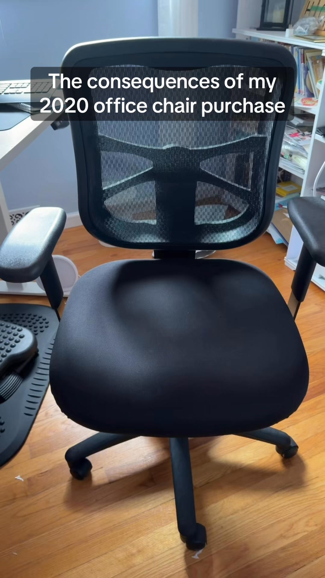
Transform ANY chair into a Comfort Throne in 10 seconds🤩 https://thecushionlab.shop/Sale
Best Gift I've Ever Received ☁️
Shop nowThe funnel behind it
Funnel score
8-point CRO breakdown
How well the landing page behind the ad is built to convert, scored across 8 factors: offer, copy, speed, trust, mobile, message-match, CTA, and social proof.
What this funnel does right. Steal these.
- Offer clarity8/10
- Mobile experience7/10
- Headline7/10
Where it's weak
- Social proof3/10
- Message match4/10
Full breakdown
Call to action
6/10A 'Shop' button appears in the top banner, but the primary product pages lack prominent individual product CTAs; users must click product cards to add to cart.
- Green 'Shop' button in top banner is visible and contrasts well
- Product cards are clickable and lead to product pages
- No 'Add to Cart' buttons visible on product grid—requires clicking product name first
- CTA button text 'Shop' is generic and not action-specific
- No urgency language in CTA (e.g., 'Shop Now', 'Claim Offer')
Page speed
6/10PAGESPEED_SCORE of 58 converts to approximately 5.8 on 0-10 scale, indicating below-average performance.
- PageSpeed score of 58/100 indicates slow loading performance
- Large product images and multiple product cards likely contribute to load time
Trust signals
6/10Footer includes shipping, customer service claims, and payment badges, but lacks security certifications, return policy visibility, or customer testimonials.
- Multiple recognized payment methods displayed (Visa, Mastercard, PayPal, Apple Pay, Google Pay, Shop Pay)
- 'Excellent Customer Service' claim in footer
- 'Free 3-5 Business Day Shipping' and 'Ship from USA' messaging
- No SSL/security badge visible above the fold
- No customer reviews or ratings to build credibility
- Return policy not prominently displayed on sale page
Mobile experience
7/10Layout appears responsive with single-column product grid suitable for mobile, though some spacing could be optimized.
- Single-column product layout is mobile-friendly
- Touch-friendly spacing between product cards
- Navigation menu appears accessible via hamburger icon
- Large whitespace gaps between products may require excessive scrolling
- Product images appear small relative to screen width on mobile
Headline
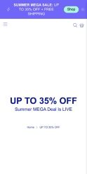
7/10Main headline 'UP TO 35% OFF' is clear and benefit-driven, though somewhat generic for a summer sale.
- 'UP TO 35% OFF' is prominent and immediately visible
- Subheading 'Summer MEGA Deal Is LIVE' adds urgency
- Large navy text contrasts well against white background
- Headline doesn't differentiate from typical e-commerce sales
- No emotional benefit or unique value proposition in headline
- Ad promised 'Best Gift I've Ever Received' but page headline is purely discount-focused
Social proof
3/10Footer shows trust badges and payment methods, but no customer reviews, ratings, testimonials, or user-generated content visible anywhere on the page.
- Multiple payment method logos at bottom (American Express, Apple Pay, Google Pay, Mastercard, PayPal, Shop Pay, Visa)
- Trust indicators like 'Free 3-5 Business Day Shipping' and 'Excellent Customer Service' in footer
- No customer reviews or star ratings visible on any products
- No testimonials or user quotes about product quality
- No social media proof, user-generated content, or customer count indicators
Message match
4/10Ad emphasizes 'Best Gift I've Ever Received' and comfort transformation, but landing page is a generic sale collection with no gift-specific messaging or comfort-focused narrative.
- Products shown are comfort-related (pillows, cushions, seat cushions)
- Sale discount aligns with ad's promotional intent
- Ad headline 'Best Gift I've Ever Received' has no corresponding messaging on page
- Ad's '10 seconds' transformation claim not reflected in page copy
- Page shows generic product grid rather than gift-curated selection or comfort benefits
Offer clarity
8/10The offer is clearly stated: 'UP TO 35% OFF' with 'Summer MEGA Deal Is LIVE' and free shipping mentioned in the banner.
- Bold 'UP TO 35% OFF' headline in large navy text
- Free shipping explicitly mentioned in purple banner at top
- Product prices show both sale and original prices with strikethrough
- No clear expiration date visible for the sale
- Discount percentage varies by product but max is not emphasized
More ads from Cushion Lab
View all →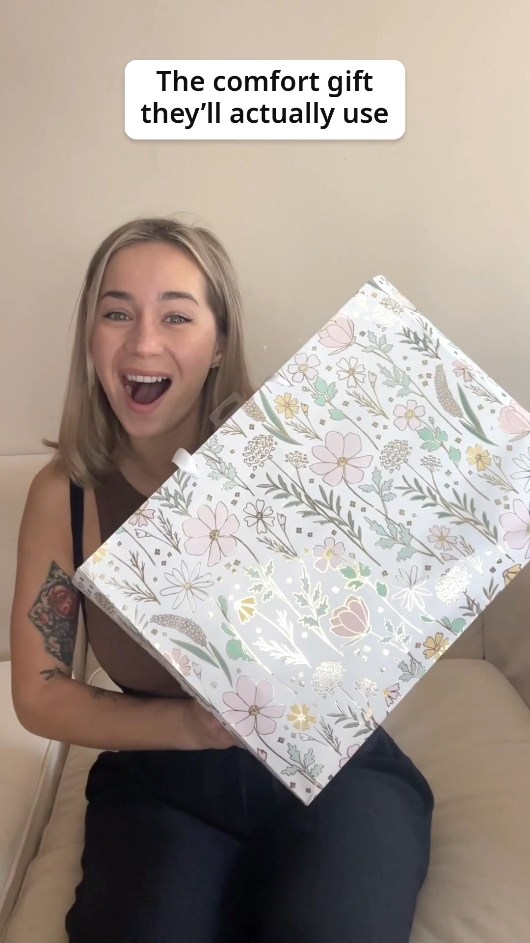 31dVIDEO
Used Every Single Day ☁️🤩
 31dVIDEO
All-Day Comfort, All-New Standard ☁️🤩
 22dVIDEO
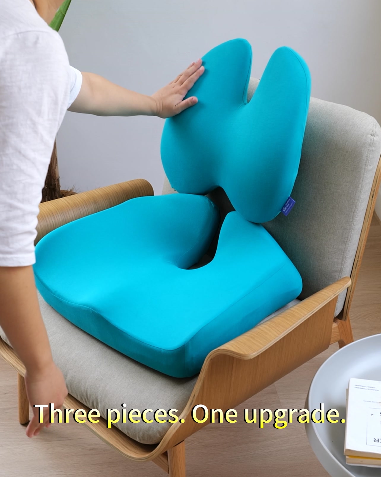
Let Cloud-Like Comfort Lift You Up☁️😍
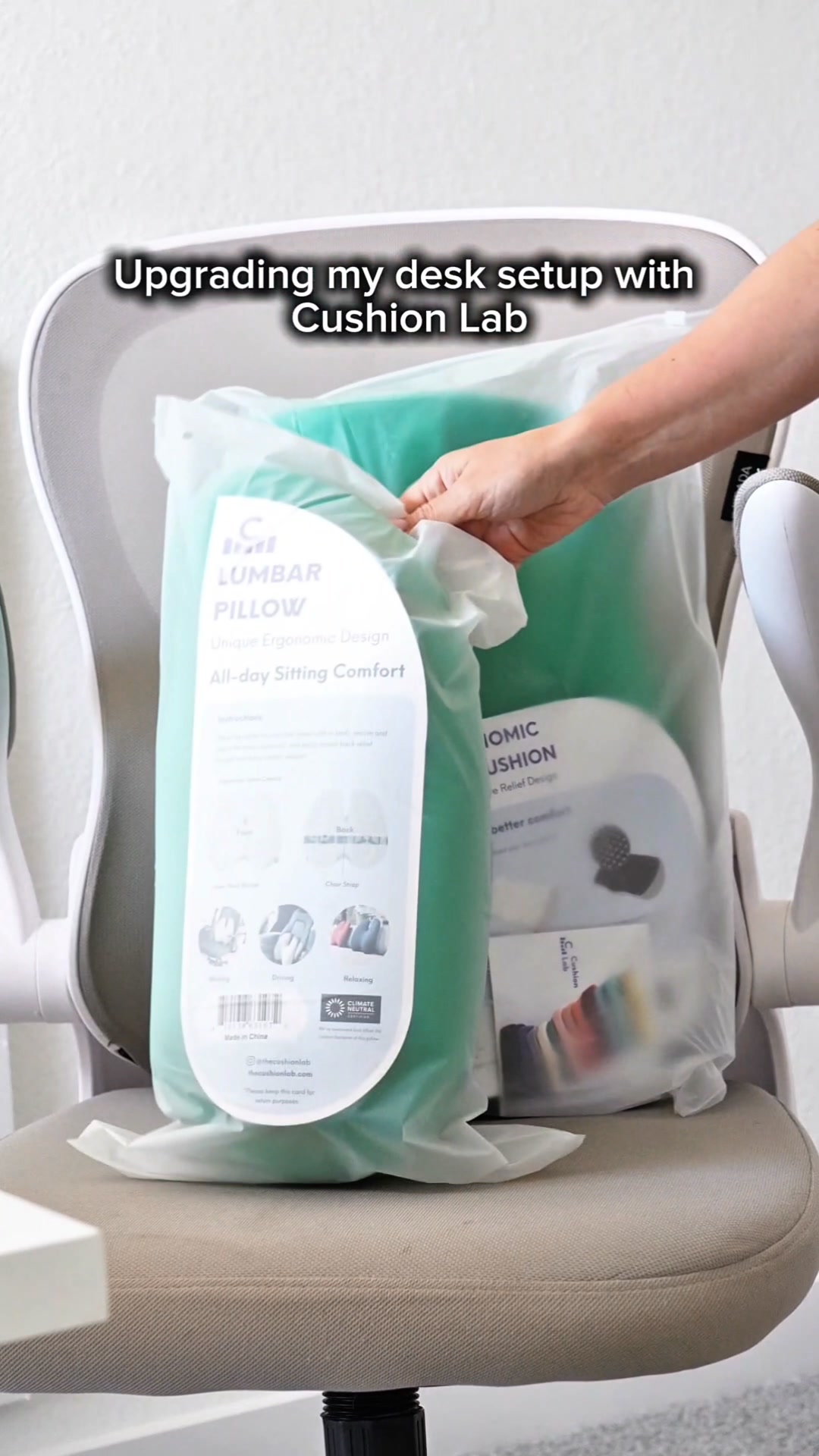 15dVIDEO
Let Cloud-Like Comfort Lift You Up☁️😍
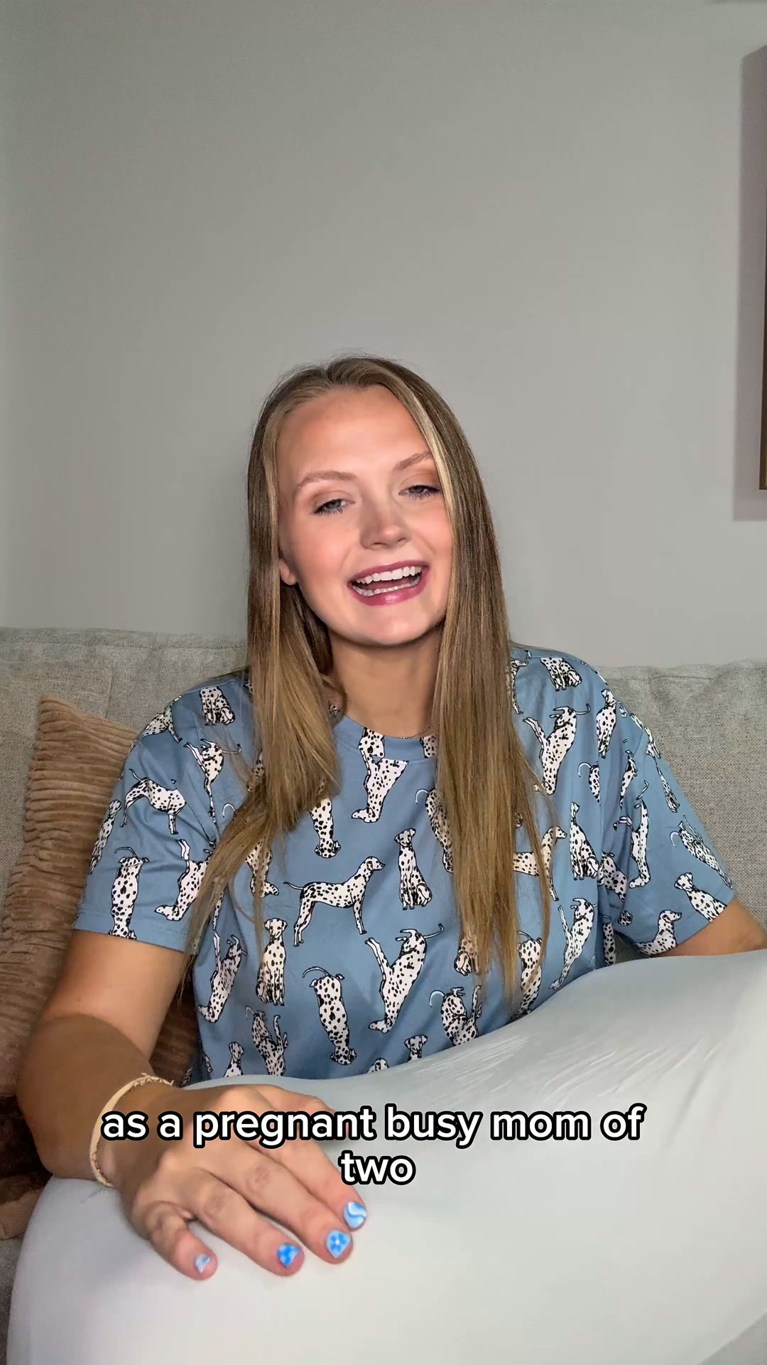 12dVIDEO
Start Sleeping Deeply Tonight 😍
 12dVIDEO
Get Amazing Sleep Tonight! 😍
Your own page
You just read somebody else's funnel. What does yours score?
The score above came from the real landing page behind this ad, graded on 8 CRO factors. Run your own page through the same rubric, free, and see what each factor found and where you give up the most ground.
Free, no signup, no card. The same 8 factor score every page here was graded on.
Keep exploring
Data from the public Meta Ad Library. Funnelens is not affiliated with or endorsed by Meta. See data sources.