HexClad
Facebook · Instagram · Messenger · Video
The ad
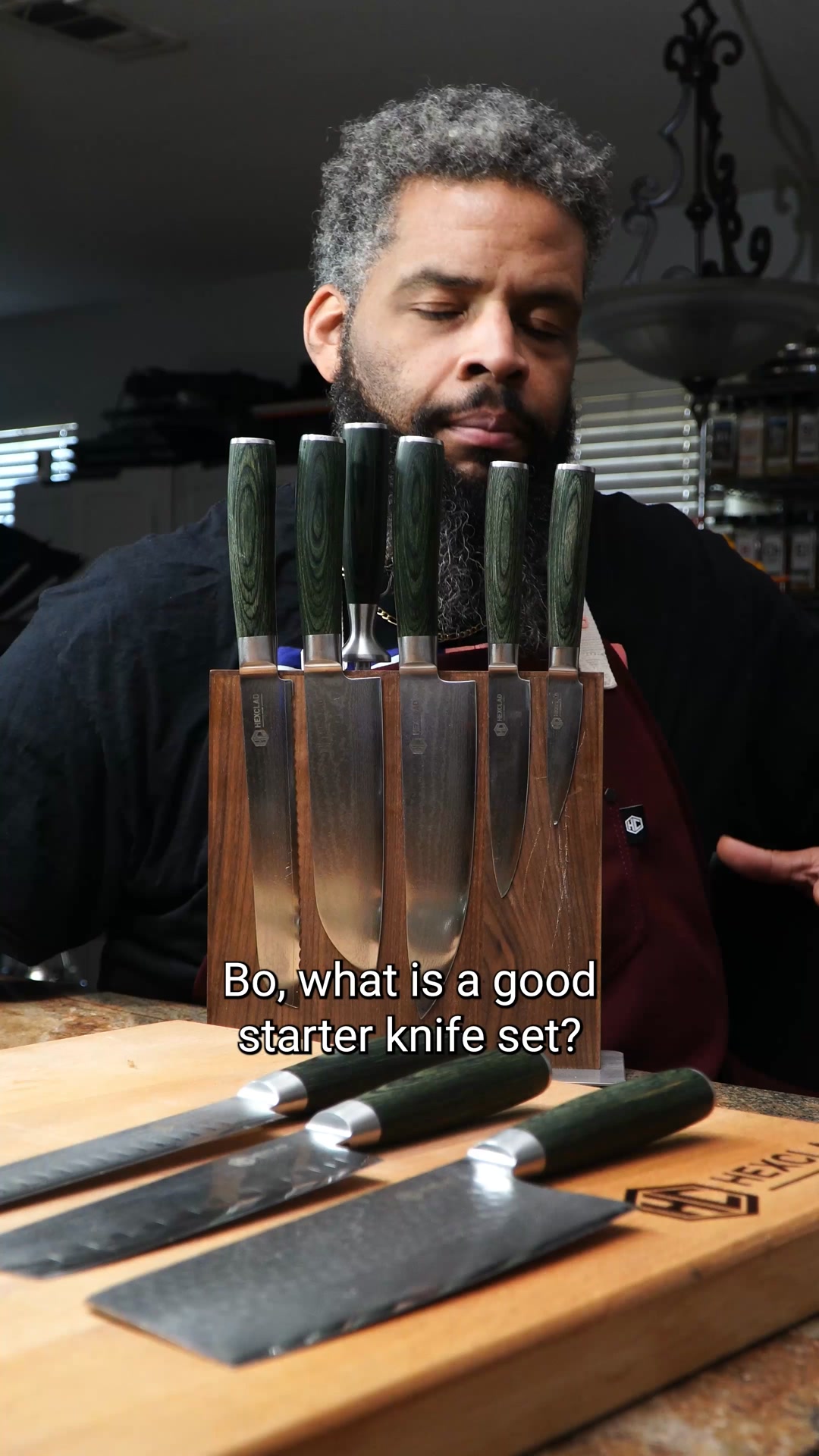
Chefs everywhere are switching to Gordon Ramsay's favorite knives. Because when every cut matters, your knives should work as hard as you do. HexClad knives are engineered for precision, balance, and durability, so prep feels effortless and performance stays razor-sharp meal after meal. 🔪 Forged from 67 layers of the finest Japanese Damascus steel for a harder blade and sharper edge 🔪 Erognomic handle for amazing comfort and grip 🔪 Hybrid full tang construction and full steel bolster for increased durability and balance 🔪 Advanced heat treatment to enhance the steel hardness for a longer-lasting edge 🔪 Deep espresso or forest green pakkawood handles that look as refined as they perform. The result? Cleaner slices. Faster prep. Less fatigue. With knives this thoughtfully crafted, you'll wonder how you ever cooked without them.
The Last Knives You'll Ever Buy
Shop nowThe funnel behind it

Offer: WANT TO SHOP UP TO 52% OFF?
Funnel score
8-point CRO breakdown
How well the landing page behind the ad is built to convert, scored across 8 factors: offer, copy, speed, trust, mobile, message-match, CTA, and social proof.
This landing page is optimized for email capture rather than direct product sales, using a seasonal urgency hook ("End of Summer Sale") and a compelling discount offer (up to 52% off) to drive email signups. The page excels at mobile design with clean typography, a prominent email input field, and a gradient CTA button that stands out. However, it severely underperforms on page speed (27/100), lacks any social proof or trust signals, provides minimal product information, and creates a disconnect between the ad's knife-focused messaging and the page's generic email-capture approach. The offer clarity is moderate—the discount is stated but conditions are vague—and the page fails to establish credibility for a premium product category.
What this funnel does right. Steal these.
- Mobile experience8/10
- Call to action7/10
Where it's weak
- Social proof1/10
- Trust signals2/10
- Message match2/10
- Page speed3/10
- Offer clarity5/10
Full breakdown
Call to action
7/10The 'Unlock Access' button is visually prominent with a gradient (blue-to-gold) that contrasts well against the dark background, though the copy is generic.
- High-contrast gradient button (blue-to-gold) stands out clearly
- Large, tappable button size appropriate for mobile
- Positioned directly below the email input field for logical flow
- Generic 'Unlock Access' copy doesn't reinforce the offer or product
- No sense of urgency in the button text
- Doesn't match the ad's 'Shop now' CTA language
Page speed
3/10Page speed score of 27/100 is critically poor, indicating severe performance issues that will cause abandonment and poor user experience.
- PAGESPEED_SCORE of 27 indicates extremely slow loading
- Large background images (soccer ball/hexagon pattern) likely unoptimized
- Likely JavaScript or asset bloat causing performance degradation
Trust signals
2/10The page provides almost no trust signals—no brand information, no company details, no security badges, no customer testimonials, and no context for why users should trust this offer.
- Professional visual design with clean layout suggests some legitimacy
- No company name, logo, or brand identity visible on main page
- No customer reviews, ratings, or testimonials
- No security badges or trust certifications
Mobile experience
8/10The page is clearly mobile-optimized with full-width layout, large touch targets, readable typography, and appropriate spacing for a vertical scrolling experience.
- Full-width email input field with clear placeholder text
- Large, easily tappable button (Unlock Access) with ample padding
- Generous vertical spacing between elements prevents accidental taps
- Cookie consent banner at bottom is small text and could be hard to read on some devices
Headline
6/10The headline 'THE END OF SUMMER SALE' is clear and seasonal but generic, lacking product specificity or the premium positioning promised in the ad.
- All-caps treatment creates visual impact
- Seasonal timing creates natural urgency
- Simple, scannable language
- No mention of knives or HexClad brand
- Generic sale language doesn't differentiate from competitors
- Doesn't reinforce the 'last knives you'll ever buy' positioning from the ad
Social proof
1/10The entire page lacks any social proof elements—no reviews, ratings, testimonials, customer counts, or trust badges visible across all four image sections.
- No customer reviews or star ratings anywhere on page
- No testimonials or user quotes
- No trust badges, certifications, or social proof indicators
Message match
2/10Severe disconnect: the ad emphasizes premium Japanese Damascus steel knives and Gordon Ramsay endorsement, but the landing page is a generic email-capture form with no product information, imagery, or brand messaging.
- Both ad and page use dark, premium aesthetic
- Ad focuses on knife features; page shows no knives or product details
- Ad mentions Gordon Ramsay and Japanese steel; page has no brand or product context
- Ad CTA is 'Shop now'; page CTA is 'Unlock Access' (email capture, not shopping)
Offer clarity
5/10The discount range (up to 52% off) is stated but lacks specificity about what products qualify or any terms and conditions.
- Clear percentage discount displayed prominently in gold text
- Direct question format ('Want to shop up to 52% off?') creates engagement
- No explanation of what the discount applies to
- No mention of expiration date or urgency deadline
- Vague 'up to' language without clarity on base offer
More ads from HexClad
View all →
Your own page
You just read somebody else's funnel. What does yours score?
The score above came from the real landing page behind this ad, graded on 8 CRO factors. Run your own page through the same rubric, free, and see what each factor found and where you give up the most ground.
Free, no signup, no card. The same 8 factor score every page here was graded on.
Keep exploring
Data from the public Meta Ad Library. Funnelens is not affiliated with or endorsed by Meta. See data sources.