Stanley 1913
Facebook · Instagram · Threads · Video
The ad
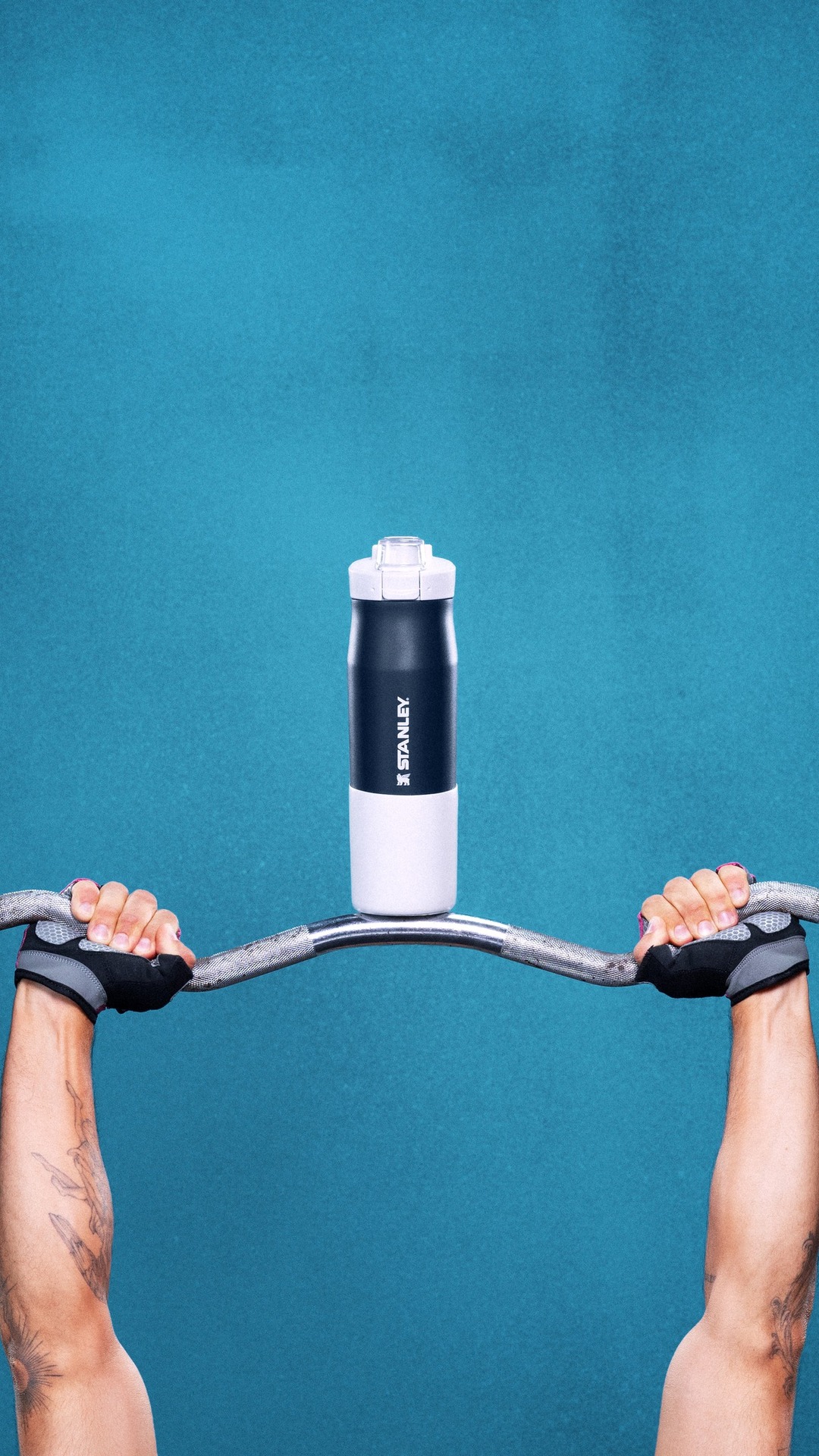
A completely normal amount of obsession went into creating the Vitalize Tempo Bottle
Shop nowThe funnel behind it

Funnel score
8-point CRO breakdown
How well the landing page behind the ad is built to convert, scored across 8 factors: offer, copy, speed, trust, mobile, message-match, CTA, and social proof.
What this funnel does right. Steal these.
- Call to action8/10
- Trust signals7/10
- Mobile experience7/10
- Offer clarity7/10
Where it's weak
- Page speed3/10
- Social proof5/10
Full breakdown
Call to action
8/10Primary CTA 'Add to Cart' is large, prominent, and clearly visible in a contrasting gray button with quantity selector, making it easy to complete the purchase action.
- Large, high-contrast 'Add to Cart' button in gray
- Quantity selector (+/-) integrated directly above CTA
- Button positioned prominently in the purchase flow
- Button color (gray) is less attention-grabbing than typical high-contrast CTAs
- No urgency messaging (e.g., 'Limited Stock' or 'New Arrival' badge is present but not tied to CTA)
Page speed
3/10PAGESPEED_SCORE of 32 converts to approximately 3.2 on the 0-10 scale, indicating very poor page performance that will significantly impact user experience and conversion rates.
- PAGESPEED_SCORE of 32 is critically low
- Slow load times will increase bounce rate
- Poor performance on mobile devices likely
Trust signals
7/10Page displays Stanley branding, product details, multiple color options, and customer reviews, but lacks security badges, guarantees, or detailed company information in the main view.
- Established Stanley brand logo prominently displayed
- Customer reviews with star rating visible
- Detailed product specifications and color options
- No visible security badges or SSL indicators
- No money-back guarantee or warranty information on main view
- Limited company/brand story on product page
Mobile experience
7/10Layout appears responsive with stacked elements, readable text, and touch-friendly buttons, though the modal popup may create friction on mobile.
- Vertical stacking of product images and details
- Large, tappable 'Add to Cart' button
- Color swatches are appropriately sized for touch
- Modal popup (20% off email signup) covers content and requires dismissal
- Quantity selector may be small for precise mobile interaction
- Navigation menu requires hamburger icon, reducing discoverability
Headline
6/10The headline 'The Vitalize™ Tempo Bottle | 24 OZ' is descriptive but generic and doesn't communicate the product's unique value or appeal.
- Clear product name and size specification
- Trademark properly noted
- No compelling benefit or emotional hook
- Doesn't match the ad's tone about 'obsession' and craftsmanship
- Purely functional naming without differentiation
Social proof
5/10Page shows 3.9 stars from 13 reviews on the product carousel at bottom, but this is minimal social proof for a $40 product and not prominently featured on the main product view.
- Star rating (3.9 stars) visible in product carousel section
- Review count (13) provided with rating
- Social proof buried in carousel, not visible on main product section
- Only 13 reviews is a small sample size
- No customer testimonials or user-generated content visible
Message match
6/10Ad emphasizes 'obsession' and craftsmanship, but the landing page focuses on product specs and features rather than the design philosophy or passion behind the product.
- 'New Arrival' badge aligns with product being featured
- Product image quality suggests premium craftsmanship
- Ad's 'obsession' narrative not reflected in page copy
- No storytelling about design or engineering philosophy
- Page leads with specs rather than the emotional/brand story from the ad
Offer clarity
7/10Price ($40.00) and key features (12 Hr / 30 Hr insulation) are clearly displayed, but the unique value proposition of the Tempo Bottle versus other Stanley bottles is not explicitly stated.
- Price prominently shown at $40.00
- Insulation duration clearly marked (12 Hrs / 30 Hrs)
- Multiple color options visible with selection interface
- No clear explanation of what makes this bottle different from other Stanley products
- Product benefits not articulated in the main copy
- Details section requires expansion to understand core features
Your own page
You just read somebody else's funnel. What does yours score?
The score above came from the real landing page behind this ad, graded on 8 CRO factors. Run your own page through the same rubric, free, and see what each factor found and where you give up the most ground.
Free, no signup, no card. The same 8 factor score every page here was graded on.
Keep exploring
Data from the public Meta Ad Library. Funnelens is not affiliated with or endorsed by Meta. See data sources.