American Spoon landing page teardown
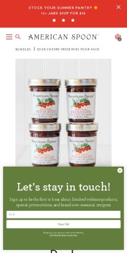
The page at spoon.com has been the destination of a American Spoon Facebook ad for 476 days. We captured it and scored it 76/100 on the 8-point CRO checklist below.
Offer on the page: 4 (9.5 oz / 269g) jars of Sour Cherry Preserves for $55.00
?What is a CRO score?
CRO stands for Conversion Rate Optimization: turning more of the visitors you already have into customers. This score (0 to 100) rates how well a landing page is built to convert, across 8 factors like offer, headline, speed, trust, and mobile. Read the full explainer →
Funnel score
8-point CRO breakdown
How well the landing page behind the ad is built to convert, scored across 8 factors: offer, copy, speed, trust, mobile, message-match, CTA, and social proof.
This product page excels at social proof with 42 five-star reviews prominently displayed and multiple verified customer testimonials praising the product. The headline is clear and descriptive, and trust is reinforced through detailed product information, ingredient transparency, and authentic customer reviews. However, the page suffers from poor mobile optimization (layout issues visible in the screenshot) and slow page speed (42/100), which significantly hurt conversion potential. The CTA button is prominent and clear, but the offer clarity could be stronger—the bundle value proposition isn't explicitly highlighted compared to individual jar pricing. Message match is good, with the ad's emphasis on "one jar is never enough" aligning well with the four-pack bundle positioning.
What this page does right. Steal these.
- Trust signals9/10
- Social proof9/10
- Call to action8/10
- Headline8/10
- Message match8/10
- Offer clarity7/10
Where it leaks conversions
- Page speed4/10
- Mobile experience5/10
Full breakdown
Call to action
8/10The 'Add To Cart' button is prominent, red, and clearly visible in the product section, with quantity selector adjacent to it.
- Bright red 'Add To Cart' button stands out against white background
- Positioned directly below price and quantity selector for easy conversion
- Clear, action-oriented text
- No secondary CTA or urgency messaging (e.g., 'Limited stock' or 'Add to cart before they're gone')
- Button could be larger for better mobile visibility
Page speed
4/10Page speed score of 42/100 converts to approximately 4/10, indicating significant performance issues that will hurt mobile conversion rates.
- PAGESPEED_SCORE of 42 indicates slow loading times
- High likelihood of image optimization issues (multiple product images and carousel)
- Slow speed will negatively impact mobile user experience and bounce rates
Trust signals
9/10Strong trust signals throughout: 42 five-star reviews, verified buyer badges, detailed product information, transparent ingredients, local sourcing details, and clear company information in footer.
- 42 verified customer reviews with 5/5 star rating and verified buyer badges
- Detailed product description with specific sourcing ('Michigan-grown Montmorency cherries', 'Petoskey, Michigan kitchen')
- Transparent ingredients list and product specifications (9.5 oz / 269g each)
Mobile experience
5/10Mobile optimization appears problematic with layout issues visible, text sizing inconsistencies, and navigation elements that may not be fully responsive.
- Product image carousel is visible and appears functional
- Quantity selector and CTA button are present on mobile view
- Navigation menu appears cramped and difficult to access on mobile
- Text content in description section may have readability issues on smaller screens
- Overall layout appears not fully optimized for mobile viewport
Headline
8/10The headline 'Sour Cherry Preserves Four-Pack' is descriptive and product-focused, clearly communicating what the page offers.
- Specific product name and format clearly stated
- Matches the product category (BUNDLES > SOUR CHERRY PRESERVES FOUR-PACK)
- Straightforward and scannable
- Lacks emotional appeal or benefit-driven language
- Doesn't reinforce the 'one jar is never enough' positioning from the ad
Social proof
9/10Exceptional social proof with 42 verified five-star reviews, 100% 5-star rating, and multiple detailed customer testimonials visible throughout the page.
- 5/5 stars with 42 reviews prominently displayed in customer reviews section
- 100% of reviews are 5-star ratings (shown in review breakdown)
- Multiple verified buyer testimonials with names and dates (Daniel M., Katherine, Marlene M., Alice D., Janice P.)
Message match
8/10Strong alignment between ad messaging ('one jar is never enough', four-pack bundle, tart-sweet flavor) and the product page content.
- Ad's 'one jar is never enough' concept directly supported by four-pack bundle offering
- Product description emphasizes flavor profile matching ad's 'tart-sweet magic' language
- Four-pack positioning aligns with ad's 'stock up' messaging
- Page headline doesn't echo the ad's compelling 'One Jar Will NOT Be Enough' positioning
- Emotional/sensory language from ad ('transported', 'warm summer days') not reflected in product headline
Offer clarity
7/10The four-pack bundle and $55 price are clearly stated, but no explicit value comparison or savings messaging versus individual jars is shown.
- Price clearly displayed ($55.00)
- Bundle quantity explicitly stated (4 jars, 9.5 oz each)
- Includes: section lists exactly what's in the pack
- No 'save X%' or value comparison messaging
- Individual jar price not shown for comparison
- No urgency messaging around bundle pricing
Your own page
That is one page's teardown. Now get your own.
Same 8-factor rubric, same evidence-backed notes, on your landing page instead of theirs. Free, no signup, about 30 seconds.
Free, no signup, no card. The same 8 factor score every page here was graded on.
Keep exploring
Captured from the public page at spoon.com; ad data from the public Meta Ad Library. Funnelens is not affiliated with American Spoon or Meta. See data sources.