ILIA Beauty landing page teardown
The page at shop.iliabeauty.com has been the destination of a ILIA Beauty Facebook ad for 3 days. We captured it and scored it 69/100 on the 8-point CRO checklist below.
?What is a CRO score?
CRO stands for Conversion Rate Optimization: turning more of the visitors you already have into customers. This score (0 to 100) rates how well a landing page is built to convert, across 8 factors like offer, headline, speed, trust, and mobile. Read the full explainer →
Funnel score
8-point CRO breakdown
How well the landing page behind the ad is built to convert, scored across 8 factors: offer, copy, speed, trust, mobile, message-match, CTA, and social proof.
What this page does right. Steal these.
- Social proof9/10
- Trust signals8/10
- Headline8/10
- Call to action7/10
Where it leaks conversions
- Page speed4/10
- Message match5/10
Full breakdown
Call to action
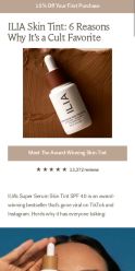
7/10Primary CTA 'Meet The Award-Winning Skin Tint' is visible and action-oriented, though the actual 'Shop now' button from the ad is not clearly visible in this screenshot.
- Clear button text 'Meet The Award-Winning Skin Tint' is prominent and descriptive
- Button has contrasting color (tan/beige) against page background
- No visible 'Shop now' button in the visible portion of the page
- CTA text is descriptive but not as direct as 'Shop now' or 'Buy now'
Page speed
4/10PageSpeed score of 40 converts to approximately 4/10, indicating significant performance issues that will hurt mobile user experience and conversions.
- PageSpeed score of 40 is well below acceptable thresholds
- Slow load time will increase bounce rate, especially on mobile
- Performance issues likely caused by unoptimized images or code
Trust signals
8/10Multiple trust signals present including award-winning status, 13,372 reviews with 5-star rating, and mentions of viral success on major social platforms.
- 13,372 customer reviews with 5-star rating
- Explicitly labeled as 'award-winning bestseller'
- Social proof mentioning TikTok and Instagram viral success
- No visible security badges, SSL indicators, or return policy information
- No brand credentials or founder information visible
Mobile experience
6/10Page appears to have mobile-responsive design but the layout shows some potential spacing issues and the product image takes up significant vertical space.
- Text is readable and not cramped
- Product image is centered and visible
- Star rating and review count are clearly displayed
- Large product image may require excessive scrolling on mobile
- Button placement not clearly visible in screenshot, may be below fold on mobile
- Top banner offer may be cut off or hard to see on small screens
Headline
8/10Headline 'ILIA Skin Tint: 6 Reasons Why It's a Cult Favorite' is compelling and benefit-driven, clearly communicating the product and its appeal.
- Specific number (6 reasons) creates curiosity and structure
- Uses social proof language ('Cult Favorite')
- Clear product identification (ILIA Skin Tint)
- Doesn't directly mention the summer angle from the ad primary text
Social proof
9/10Strong social proof with 5-star rating and 13,372 reviews prominently displayed under the product section.
- 13,372 reviews shown with 5-star rating display
- Descriptive text mentions 'award-winning bestseller' and viral success on TikTok and Instagram
- Star rating visually prominent and easy to spot
Message match
5/10Ad emphasizes 'best for summer' but the landing page focuses on 'cult favorite' and award-winning status without highlighting summer-specific benefits.
- Product shown is the correct ILIA Skin Tint product from the ad
- Ad's summer angle (@iliabeauty summer messaging) not reflected in page headline or copy
- Ad mentions Sephora partnership but page doesn't emphasize this
- Disconnect between ad's casual tone and page's more formal 'cult favorite' positioning
Offer clarity
6/10The offer is visible at the top ('15% Off Your First Purchase') but is buried above the fold and not prominently featured in the main content area.
- Clear discount percentage stated at top banner
- Specific offer amount (15% off) is quantified
- Offer relegated to small banner at very top, easy to miss
- No urgency language or expiration date visible
- Offer not reinforced in main CTA or product section
Your own page
That is one page's teardown. Now get your own.
Same 8-factor rubric, same evidence-backed notes, on your landing page instead of theirs. Free, no signup, about 30 seconds.
Free, no signup, no card. The same 8 factor score every page here was graded on.
Keep exploring
Captured from the public page at shop.iliabeauty.com; ad data from the public Meta Ad Library. Funnelens is not affiliated with ILIA Beauty or Meta. See data sources.