OllieSmile landing page teardown
The page at olliesmile.com has been the destination of a OllieSmile Facebook ad for 304 days. We captured it and scored it 78/100 on the 8-point CRO checklist below.
?What is a CRO score?
CRO stands for Conversion Rate Optimization: turning more of the visitors you already have into customers. This score (0 to 100) rates how well a landing page is built to convert, across 8 factors like offer, headline, speed, trust, and mobile. Read the full explainer →
Funnel score
8-point CRO breakdown
How well the landing page behind the ad is built to convert, scored across 8 factors: offer, copy, speed, trust, mobile, message-match, CTA, and social proof.
What this page does right. Steal these.
- Social proof9/10
- Call to action8/10
- Trust signals8/10
- Message match8/10
- Offer clarity8/10
- Mobile experience7/10
- Headline7/10
Full breakdown
Call to action
8/10Multiple 'Shop Now' CTAs in teal/turquoise color are visible throughout the page, creating multiple conversion opportunities.
- Prominent teal 'Shop Now' button appears at least 3 times in the visible sections
- High-contrast color (teal) stands out against gray background
- Clear, action-oriented text 'Shop Now' is direct and unambiguous
- CTA text is generic ('Shop Now') rather than benefit-driven (e.g., 'Get 10% Off' or 'Repair My Smile')
- Multiple CTAs may dilute focus rather than guide users to a single primary conversion point
Page speed
6/10PageSpeed score of 57 converts to approximately 5.7 on the 0-10 scale, indicating below-average performance with room for optimization.
- Page loads and displays content (images, text, reviews visible)
- Hero section with product image renders quickly
- PageSpeed score of 57/100 indicates slow performance relative to industry standards
- Multiple high-resolution product images and customer photos likely contribute to load time
- Modal popup and review carousel may add rendering overhead
Trust signals
8/10Multiple trust signals present: verified buyer reviews with photos, 5-star rating, 50,000+ Happy Smiles, dentist approval, and detailed product science explanations.
- Verified buyer badges on all visible reviews (Christine B., Nikki Y., Sandra Z., Julie V., marcy d.)
- Detailed scientific explanations: 'Clinically Proven Science', 'Hydroxyapatite has been used for over 40 years in Japan'
- Transparency about ingredients: 'Only 11 ingredients—no artificial dyes, no SLS, no gimmicks'
- No visible security badges, SSL certificate, or payment security indicators in screenshots
- No visible return policy, money-back guarantee, or satisfaction guarantee mentioned in captured sections
Mobile experience
7/10Page appears mobile-responsive with stacked layout, readable text, and accessible buttons, though some sections show text wrapping issues.
- Vertical stacking of content is appropriate for mobile viewing
- Large, tappable 'Shop Now' buttons with adequate spacing
- Product image and key benefits visible above the fold on mobile
- Some text appears cramped or small in places (e.g., review text, feature descriptions)
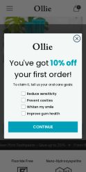
- Modal popup ('You've got 10% off your first order!') takes up significant screen real estate on mobile
- Horizontal scrolling may be required for some elements (e.g., customer photo carousel)
Headline
7/10The main headline 'The Toothpaste That Repairs Your Smile—Naturally' is benefit-focused but somewhat generic; the ad headline 'Fluoride Free Cavity Protection' is more specific.
- Benefit-driven language: 'Repairs Your Smile—Naturally' speaks to the core desire
- Clear positioning: emphasizes natural alternative to fluoride
- Supported by 5-star rating (5.0 with 312 reviews) immediately below headline
- Headline doesn't lead with the unique ingredient (hydroxyapatite) that differentiates the product
- Generic phrasing 'Repairs Your Smile' could apply to many toothpastes
- Ad headline 'Fluoride Free Cavity Protection' is more compelling than the page headline
Social proof
9/10Extensive social proof throughout: 5.0 stars from 312 reviews, 50,000+ Happy Smiles badge, multiple verified buyer reviews with photos, and 90% would recommend statistic.
- 5-star rating with 312 reviews and '50,000+ Happy Smiles' badge prominently displayed near headline
- Multiple verified buyer reviews with photos and detailed testimonials (Christine B., Nikki Y., Sandra Z., Julie V., marcy d.)
- 90% recommendation rate visible in lower section with customer photos
- One negative review visible (Nikki Y. - 4 stars, 'Disappointed') not addressed until company response further down
- Review photos are small and not always clearly visible
Message match
8/10Strong alignment between ad messaging and page content: both emphasize hydroxyapatite as fluoride-free alternative, natural ingredients, and cavity protection.
- Ad's 'Fluoride Free Cavity Protection' matches page's prominent 'Fluoride-Free Protection' messaging
- Ad's emphasis on hydroxyapatite benefits directly reflected in page sections: 'Clinically Proven Science', 'Clean, Simple Formula'
- Ad's 'Dentist-Approved' claim supported by page's 'Kid-Safe & Dentist Approved' section
- Ad mentions '10% Hydroxyapatite formula' but page doesn't prominently display this percentage in the hero section
- Ad's NASA/Japanese heritage story is mentioned on page but not in the primary hero area where ad viewers land
Offer clarity
8/10The offer is clearly stated: a fluoride-free toothpaste with 10% nano-hydroxyapatite formula, though the specific discount or pricing is not visible in the screenshots.
- Product benefits explicitly listed: 'Fluoride-Free Protection', 'Nano-Hydroxyapatite', 'Advanced Sensitivity Relief'
- Key differentiator prominently displayed: '10% nano-hydroxyapatite (10%)' vs fluoride alternative
- Multiple 'Shop Now' CTAs visible throughout the page with consistent messaging
- No visible pricing or discount amount shown in the captured screenshots
- The specific offer details (e.g., 'Save up to 25%') appear cut off or partially visible at page edges
Your own page
That is one page's teardown. Now get your own.
Same 8-factor rubric, same evidence-backed notes, on your landing page instead of theirs. Free, no signup, about 30 seconds.
Free, no signup, no card. The same 8 factor score every page here was graded on.
Keep exploring
Captured from the public page at olliesmile.com; ad data from the public Meta Ad Library. Funnelens is not affiliated with OllieSmile or Meta. See data sources.