Ka'Chava
Facebook · Instagram · Messenger · Video
The ad
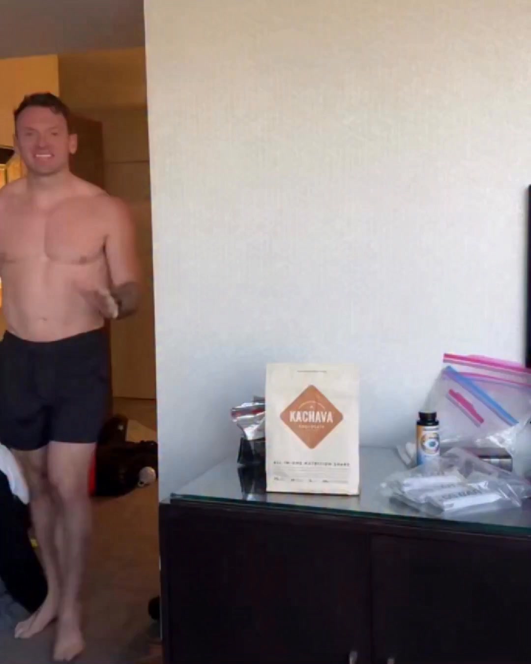
I’ve had @kachava for 874 days straight. Not sure if that’s impressive or a problem… Not joking — @sterlinglock has been drinking Kachava since November of 2023. Shakes are my favorite and I toss two scoops into my morning shake every day. It’s one of the few things I started taking and actually felt a difference. My energy levels are steadier. My body feels more primed. As someone who mainly eats for utility (like meat and rice all the time), it’s easy to skimp on micronutrients, adaptogens, etc. I like knowing that @kachava is filled with all the good stuff. Bonus points that it doesn’t upset my stomach when 92% of everything else does. This isn’t an ad. I just don’t go a day without it. Thanks for a great product @kachava!
We Make Nutrition Easy
Shop nowThe funnel behind it

Offer: Subscribe & Save 15% OFF - Choose servings. Easily change your quantities. Cancel any time. Pre-shipment reminders (no surprise charges). Or One-time purchase - Choose servings.
Funnel score
8-point CRO breakdown
How well the landing page behind the ad is built to convert, scored across 8 factors: offer, copy, speed, trust, mobile, message-match, CTA, and social proof.
This page excels at social proof with 67k+ five-star reviews prominently displayed and extensive user video testimonials throughout. The subscription offer is clearly presented with tangible benefits (15% off, easy changes, cancel anytime). However, the page suffers from severe performance issues (PageSpeed 26/100), which will hurt conversion significantly. The headline "Superblend Shake" is generic and doesn't match the ad's "We Make Nutrition Easy" positioning. The CTA button is present but not particularly prominent, and the page lacks urgency or scarcity messaging beyond a limited-time free sample offer buried mid-page. Trust signals are strong (Love-it Guarantee, secure checkout, fast shipping), but the slow load time undermines all other strengths.
What this funnel does right. Steal these.
- Social proof9/10
- Trust signals8/10
- Offer clarity8/10
- Mobile experience7/10
Where it's weak
- Page speed3/10
- Headline3/10
- Message match4/10
Full breakdown
Call to action
6/10Primary CTA 'Add to Cart' button is present and visible but uses muted gray color that doesn't stand out strongly against the page background.
- Clear 'Add to Cart' button positioned after pricing options
- Secondary CTA 'TRY KA'CHAVA' in orange at bottom of page provides alternative entry point
- Primary button uses gray color that lacks visual prominence
- Button text is generic 'Add to Cart' rather than benefit-driven
- No urgency language or scarcity messaging on the main CTA
Page speed
3/10PageSpeed score of 26/100 is critically poor, indicating severe performance issues that will cause abandonment.
- PageSpeed score 26/100 indicates very slow load time
- Large hero image and multiple video thumbnails likely causing performance drag
- Slow speed will significantly impact mobile conversion rates
Trust signals
8/10Multiple trust signals present: Love-it Guarantee, Secure Checkout badge, Fast Shipping, HSA/FSA eligibility, 1% donation to nonprofits, and extensive user testimonials.
- Love-it Guarantee with 30-day trial explicitly stated
- Security badge and Fast Shipping icons visible in checkout section
- HSA/FSA eligible badge with 'Save an average of 30%' claim
- Trust badges are somewhat small and scattered rather than consolidated
Mobile experience
7/10Layout appears responsive with stacked flavor options and readable text, though some elements may be cramped on very small screens.
- Flavor selection options stack vertically for mobile viewing
- Text is readable and not overly small
- Buttons appear appropriately sized for touch interaction
- Large product image may slow mobile load times further
- Dropdown menus for quantity selection may be fiddly on mobile
Headline
3/10Page headline 'Superblend Shake' is generic product name with no value proposition, mismatched to ad headline 'We Make Nutrition Easy'.
- Headline is large and visible at top of product section
- Generic product name only, no benefit or differentiation
- Doesn't match advertiser's 'We Make Nutrition Easy' positioning
- Doesn't address the ad's core message about ease and consistency
Social proof
9/10Extensive social proof throughout: 67k+ five-star reviews, 92k+ reviews with 4.5 stars, and 18+ user video testimonials visible on page.
- 67k+ five-star reviews displayed prominently under headline
- 4.5-star rating with 92k+ reviews shown in lower section
- Grid of 18+ authentic user video testimonials with play buttons visible
Message match
4/10Ad emphasizes personal testimony, consistency (874 days), and feeling a real difference; page focuses on product specs and reviews rather than the transformation story.
- Page does show '67k+ five-star reviews' which validates the 'great product' claim from ad
- Subscription option supports the 'consistency' angle from the ad's 874-day story
- Ad's personal narrative about energy and body feeling 'more primed' not reflected in headline or copy
- Page leads with flavor selection rather than the benefit story
- Ad's emphasis on 'easy' (doesn't upset stomach, fills micronutrient gaps) not highlighted in page messaging
Offer clarity
8/10Subscription and one-time purchase options are clearly labeled with specific benefits listed (15% off, easy changes, cancel anytime).
- Subscribe & Save option explicitly states '15% OFF' with three key benefits listed below
- One-time purchase option clearly separated as alternative
- Pricing section visible with dropdown options for each flavor
- Actual price not visible in this screenshot section
- Limited-time free sample offer is buried and uses small text
More ads from Ka'Chava
View all →

Your own page
You just read somebody else's funnel. What does yours score?
The score above came from the real landing page behind this ad, graded on 8 CRO factors. Run your own page through the same rubric, free, and see what each factor found and where you give up the most ground.
Free, no signup, no card. The same 8 factor score every page here was graded on.
Keep exploring
Data from the public Meta Ad Library. Funnelens is not affiliated with or endorsed by Meta. See data sources.