Ka'Chava
Facebook · Instagram · Messenger · Image
The ad
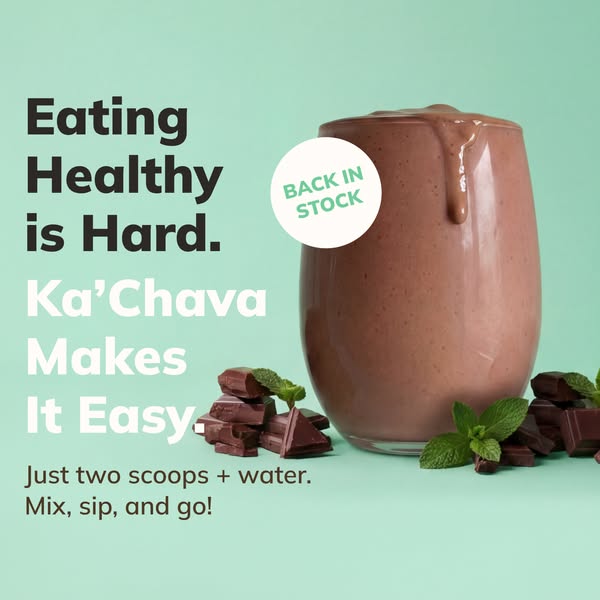
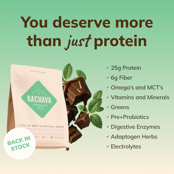
You deserve more than protein. Ka'Chava is packed with protein + fiber + omegas + vitamins + minerals + so much more for complete nutrition 💪 Just 2 scoops + water. Mix, sip & go! Designed to help support: ✔️Your brain ✔️Your muscles ✔️Your heart ✔️Your gut ✔️Your skin ✔️Your hair ✔️Your whole health
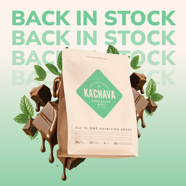
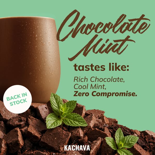
NEW Chocolate Mint is Back!
Shop nowThe funnel behind it
Offer: Total: $69.95 $59.95/bag (Subscribe & Save 15% off)
Funnel score
8-point CRO breakdown
How well the landing page behind the ad is built to convert, scored across 8 factors: offer, copy, speed, trust, mobile, message-match, CTA, and social proof.
Ka'Chava's landing page excels at building trust through abundant social proof (67k+ reviews, expert endorsements, video testimonials) and comprehensive benefit messaging that matches the ad's "whole-body nutrition" positioning. The page clearly articulates the offer with subscription savings and a strong value proposition. However, the page suffers from severe performance issues (PageSpeed 31/100), which will hurt conversion rates and user experience. The CTA button placement is somewhat buried below the fold on mobile, and the initial hero section could more directly emphasize the "NEW Chocolate Mint" angle from the ad. The product imagery and ingredient transparency are strong, but slow load times undermine the otherwise solid conversion fundamentals.
What this funnel does right. Steal these.
- Trust signals9/10
- Social proof9/10
- Message match8/10
- Offer clarity8/10
- Call to action7/10
- Headline7/10
Where it's weak
- Page speed3/10
Full breakdown
Call to action
7/10Primary CTA 'Try Ka'Chava' is clear and action-oriented, but appears below substantial content and secondary CTAs ('Add to Cart') are less prominent. Multiple CTAs could dilute focus.
- Primary CTA 'Try Ka'Chava' uses action verb and is visually distinct (dark button)
- CTA appears in sticky pricing section that's easy to locate
- Secondary 'Add to Cart' button provides clear conversion path
- Primary CTA is positioned below extensive content, requiring scroll to reach
- Multiple CTAs ('Try Ka'Chava', 'Add to Cart', 'See more benefits') may split attention
- CTA button color (dark brown) doesn't contrast strongly against page background
Page speed
3/10PageSpeed score of 31/100 indicates severe performance issues that will significantly impact user experience and conversion rates. This is a critical problem.
- PageSpeed score of 31/100 indicates critical performance issues
- Slow load times will increase bounce rate and reduce conversions
- Large hero images and multiple product carousels likely contribute to poor performance
Trust signals
9/10Exceptional trust signals: 67k+ verified reviews, named expert endorsement with credentials, multiple trust badges (Love-it Guarantee, Secure Checkout, Fast Shipping), HSA/FSA eligibility, 1% donation to nonprofits, and comprehensive FAQ section.
- 67k+ five-star reviews with visible star ratings throughout page
- Named expert endorsement: Jess Sims (Viral Peloton Instructor, ESPN Reporter) with photo and quote
- Trust badges: Love-it Guarantee, Secure Checkout, Fast Shipping, HSA/FSA eligible, 1% donation program
Mobile experience
6/10Mobile layout is functional with stacked elements and readable text, but the page is quite long and requires extensive scrolling to reach CTAs. Flavor selection and pricing sections are accessible but not optimized for thumb navigation.
- Text is readable and properly sized for mobile screens
- Flavor selection dropdown is mobile-friendly with clear options
- Pricing section is sticky and remains accessible while scrolling
- Page requires extensive scrolling to reach primary CTA (below fold)
- Multiple expandable sections (FAQs, benefits) add to scroll burden
- Hero image and product showcase take up significant vertical space on small screens
Headline
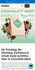
7/10The headline 'No Tracking, No Stacking. Ka'Chava is whole-body nutrition. Now in Chocolate Mint!' is benefit-focused and mentions the new flavor, but doesn't lead with the product name or create urgency.
- Mentions 'Now in Chocolate Mint' to match the ad's NEW angle
- Emphasizes 'whole-body nutrition' which aligns with ad messaging
- Distinctive positioning with 'No Tracking, No Stacking' differentiator
- Doesn't lead with 'NEW' or create urgency around the flavor launch
- Long and complex structure may not grab attention immediately
- Doesn't emphasize the complete nutrition angle as strongly as ad copy
Social proof
9/10Exceptional social proof throughout: 67k+ five-star reviews displayed prominently, expert testimonial from Jess Sims (Viral Peloton Instructor and ESPN Reporter) with photo and quote, video testimonials section, and multiple review badges.
- 67k+ five-star reviews prominently displayed with star rating near headline
- Named expert endorsement: Jess Sims with photo, credentials, and direct quote about product benefits
- Video testimonials section ('Videos' button) and written reviews option for additional proof
Message match
8/10Strong alignment between ad and page: both emphasize complete nutrition (protein + fiber + omegas + vitamins + minerals), the NEW Chocolate Mint flavor is featured, and the 'whole-body health' positioning matches the ad's benefit list.
- Ad's 'NEW Chocolate Mint' is prominently featured in hero and flavor selection
- Page emphasizes 'whole-body nutrition' matching ad's multi-benefit positioning
- Ingredient list and benefits (brain, muscles, heart, gut, skin, hair) align with ad claims
- Ad's emphasis on 'just 2 scoops + water' simplicity isn't highlighted on page
- Page focuses more on subscription model than the quick/easy preparation angle
Offer clarity
8/10Pricing is clearly displayed with subscription savings ($59.95/bag with 15% off) and benefits are explicitly listed, though the comparison price ($69.95) could be more prominent.
- Clear pricing: $59.95/bag with Subscribe & Save 15% off label
- Explicit benefits listed: Only $3.99/serving, easily change quantities, cancel anytime
- Multiple flavor options with stock status clearly marked
- Original price ($69.95) is smaller and less prominent than sale price
- Subscription vs. one-time purchase options require scrolling to compare
More ads from Ka'Chava
View all →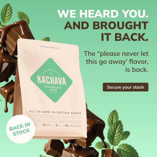

Your own page
You just read somebody else's funnel. What does yours score?
The score above came from the real landing page behind this ad, graded on 8 CRO factors. Run your own page through the same rubric, free, and see what each factor found and where you give up the most ground.
Free, no signup, no card. The same 8 factor score every page here was graded on.
Keep exploring
Data from the public Meta Ad Library. Funnelens is not affiliated with or endorsed by Meta. See data sources.