TRX Training
Facebook · Instagram · Audience Network · Image
The ad
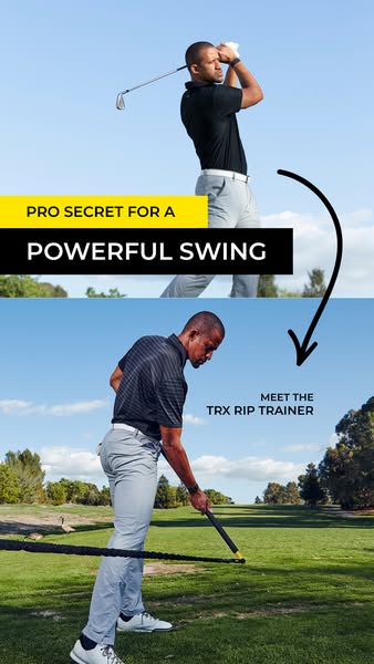
Here's an absolute game-changer for athletes and fitness fanatics that are looking to build core strength! 💪🏼 The TRX Rip Trainer is an innovative resistance system that unlocks next level rotational strength. With 360 degrees of motion, the Rip Trainer challenges your abs, obliques, back, and hips in ways traditional equipment cannot. Increase power, control, and core stability for baseball, golf, lacrosse, and any racquet sport. 🏌️🎾 Grab a TRX Rip Trainer and level up your game today! 😎
Level Up Your Training 🏌
Shop nowThe funnel behind it

Offer: 20% OFF + FREE SHIPPING - LIMITED TIME OFFER
Funnel score
8-point CRO breakdown
How well the landing page behind the ad is built to convert, scored across 8 factors: offer, copy, speed, trust, mobile, message-match, CTA, and social proof.
This page excels at problem-solution storytelling with strong visual hierarchy, clear benefit messaging, and multiple trust signals (PGA coaches, 5-star reviews, guarantees). The headline and hero section immediately establish credibility and relevance to golfers. However, the page suffers from severe performance issues (PageSpeed 30/100), weak mobile optimization with cramped layouts, and a somewhat buried primary CTA that doesn't stand out enough against the yellow background. The offer clarity is good but could be more prominent above the fold. Social proof is strong with named coaches and customer reviews, but trust signals like guarantees appear lower on the page.
What this funnel does right. Steal these.
- Trust signals8/10
- Headline8/10
- Social proof8/10
- Message match7/10
- Offer clarity7/10
Where it's weak
- Page speed3/10
- Mobile experience4/10
Full breakdown
Call to action
6/10Multiple yellow SHOP NOW and ADD TO CART buttons exist, but primary CTA lacks sufficient visual distinction and urgency.
- Bright yellow ADD TO CART buttons create good contrast against white product cards
- Multiple CTAs throughout page reduce friction for conversion
- SHOP NOW button appears early in hero section
- Primary SHOP NOW button in hero blends into yellow promotional banner above it
- No urgency language on CTA (e.g., 'Buy Now', 'Claim Offer', 'Get 20% Off')
- CTA buttons could be larger and more prominent, especially on mobile
Page speed
3/10PageSpeed score of 30/100 indicates severe performance issues that will significantly impact user experience and conversion rates.
- PageSpeed score of 30/100 is critically slow
- Multiple high-resolution images throughout page likely not optimized
- Slow load time will cause abandonment before users see key messaging
Trust signals
8/10Strong trust signals including PGA coach endorsements, 5-star reviews, money-back guarantee, free shipping, and 2-year warranty build credibility.
- 30 DAY MONEY BACK GUARANTEE and 2 YEAR WARRANTY badges in yellow section
- FREE SHIPPING and HASSLE FREE RETURNS clearly stated
- Named PGA coaches and LPGA pro provide professional credibility
- Trust badges appear mid-page rather than immediately visible
- No security badges, SSL indicators, or payment method logos visible
- No company background or 'About Us' information visible in these sections
Mobile experience
4/10Mobile experience is cramped with poor spacing, small text, and navigation elements that likely interfere with content on smaller screens.
- Yellow promotional banner and hero image are visible on mobile
- Product cards stack vertically, which is appropriate for mobile layout
- Navigation menu and search icon take up significant space at top
- Text appears small and cramped in product description sections
- Yellow CTA buttons may be difficult to tap accurately on mobile
Headline
8/10THE PRO'S SECRET TO A MORE POWERFUL SWING is benefit-driven and speaks directly to the target audience's desire.
- Headline immediately establishes credibility by referencing pros
- Focuses on the primary benefit (powerful swing) not just the product
- Positioned above compelling hero image showing the product in use
- Headline is somewhat generic and could be more specific to the TRX Rip Trainer
- Doesn't differentiate from other golf training products
- Could emphasize the unique rotational/core aspect more directly
Social proof
8/10Multiple credible endorsements from PGA coaches, LPGA pro, and 5-star customer reviews with specific testimonials throughout the page.
- Named PGA coaches (Trevor Anderson, Tyler Simper) and LPGA pro (Jodi Ewart) with titles visible
- Three detailed 5-star customer reviews with names and specific benefits mentioned
- Reviews section titled 'Real People. Real Reviews.' with yellow background for emphasis
- Coach endorsements appear mid-page, not immediately visible
- Only 3 customer reviews shown; no aggregate rating or review count displayed
- No visible testimonial video or more dynamic social proof formats
Message match
7/10Page aligns well with ad's focus on core strength and rotational power for golf, though ad emphasizes multi-sport use while page is golf-specific.
- Page headline and hero section match ad's core message about powerful swing
- Product benefits (rotational strength, core stability) directly align with ad copy
- Golf-specific positioning matches the ad's primary sport focus
- Ad mentions baseball, lacrosse, and racquet sports; page is almost entirely golf-focused
- Ad emphasizes '360 degrees of motion' but page doesn't highlight this feature prominently
- Ad's multi-sport angle is abandoned on landing page, creating slight message drift
Offer clarity
7/10The 20% OFF + FREE SHIPPING offer is clearly displayed but appears mid-page rather than prominently above the fold.
- 20% OFF + FREE SHIPPING banner is bright yellow and hard to miss
- LIMITED TIME OFFER creates urgency
- Specific discount percentage and free shipping are both stated
- Offer appears after substantial scrolling, not immediately visible
- No countdown timer or expiration date shown to reinforce urgency
- Bundle pricing ($292 vs $365) requires reading product details to understand value
More ads from TRX Training
View all →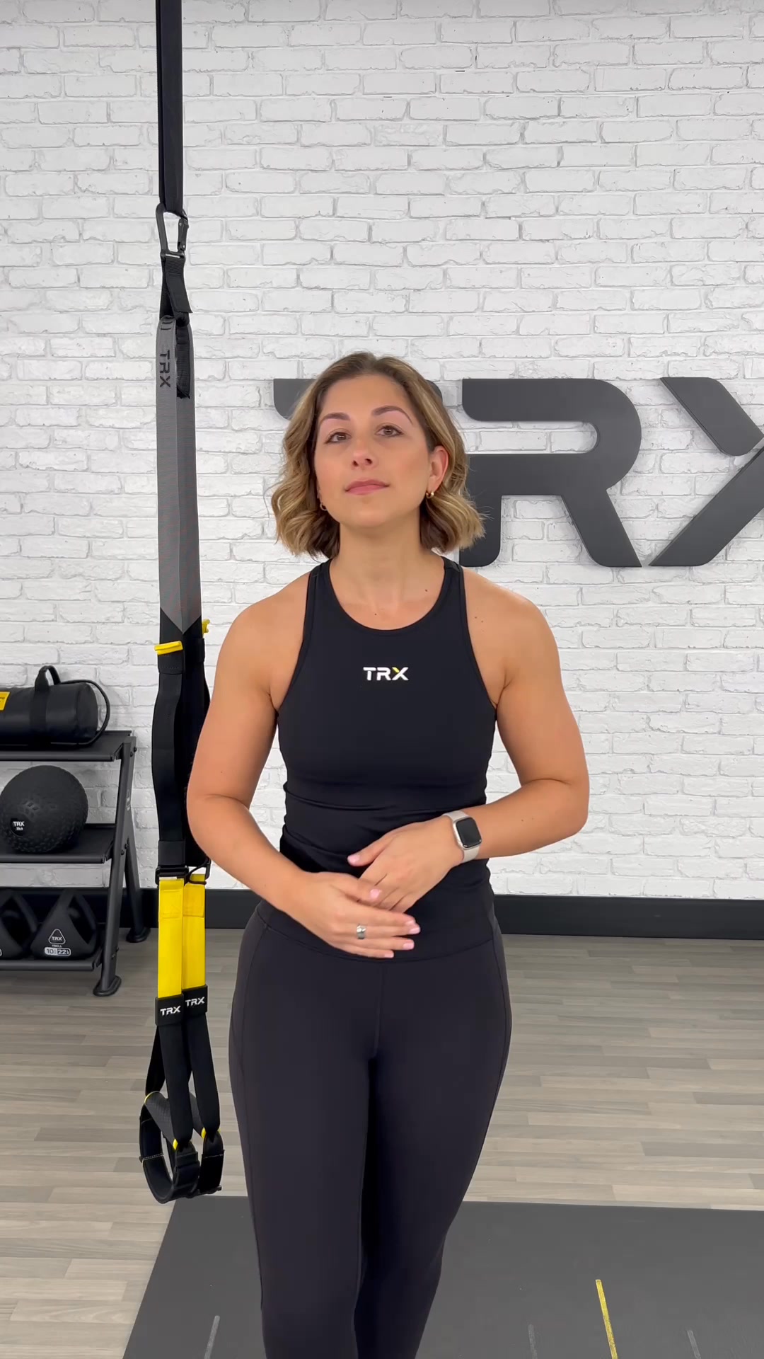 159dVIDEO
6-Week Bodyweight Plan That Works
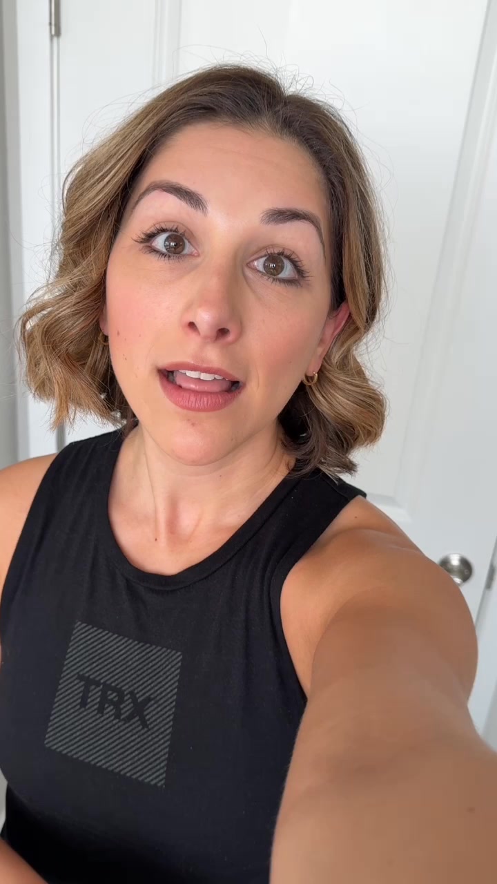 159dVIDEO
6-Week Bodyweight Plan That Works
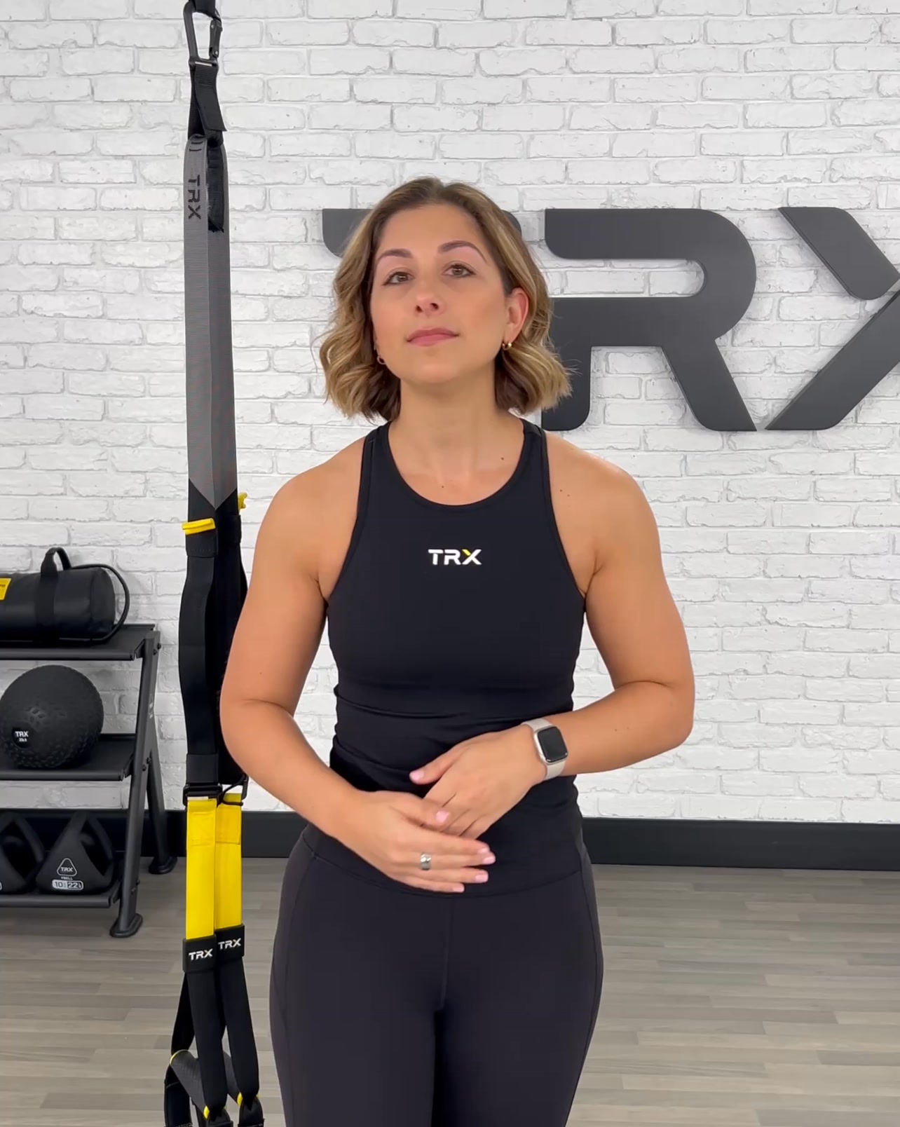 157dVIDEO
6-Week Bodyweight Plan That Works
 156dVIDEO
6-Week Bodyweight Plan That Works
 153dVIDEO
6-Week Bodyweight Plan That Works
 112dVIDEO
Start your free program today.
Your own page
You just read somebody else's funnel. What does yours score?
The score above came from the real landing page behind this ad, graded on 8 CRO factors. Run your own page through the same rubric, free, and see what each factor found and where you give up the most ground.
Free, no signup, no card. The same 8 factor score every page here was graded on.
Keep exploring
Data from the public Meta Ad Library. Funnelens is not affiliated with or endorsed by Meta. See data sources.