Therabody
Facebook · Instagram · Audience Network · Image
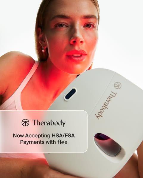
The ad
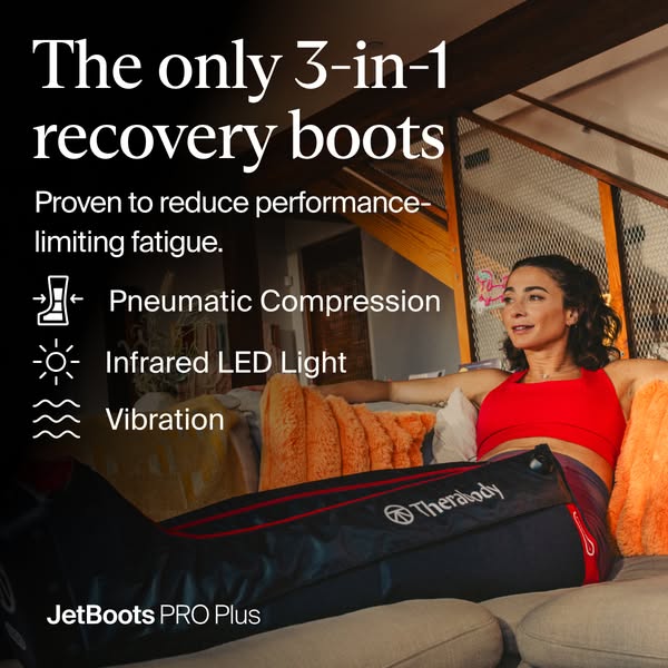
3 therapies help reduce heavy-leg fatigue faster with JetBoots PRO Plus.
Fresh legs for your next run
Shop nowThe funnel behind it

Offer: JetBoots PRO Plus are the first wireless leg compression boots to combine pneumatic compression, vibration and infrared LED light – three scientifically proven therapies working together to target muscle soreness, reduce swelling and fight the fatigue that follows hard training.
Funnel score
8-point CRO breakdown
How well the landing page behind the ad is built to convert, scored across 8 factors: offer, copy, speed, trust, mobile, message-match, CTA, and social proof.
This page excels at building trust through extensive social proof (4.7-star rating from 57 reviews, HSA/FSA/FDA approvals, 1-year warranty, Olympic athlete endorsements), detailed product benefits backed by clinical studies (32% improvement, 36% reduction, 40% increase metrics), and comprehensive feature comparisons. However, it suffers from critical speed issues (PageSpeed 25/100), a generic headline that doesn't match the ad's "Fresh legs for your next run" angle, and a high price point ($1,149.99) presented without urgency or financing emphasis upfront. The mobile experience appears functional but the page is dense with information that may overwhelm on smaller screens. The CTA is clear but buried below extensive content, and the offer clarity could be stronger—the product benefits are explained but the core value proposition isn't immediately punchy.
What this funnel does right. Steal these.
- Social proof9/10
- Trust signals8/10
- Call to action7/10
- Offer clarity7/10
Where it's weak
- Page speed3/10
- Headline5/10
Full breakdown
Call to action
7/10The 'Add to bag' CTA is clear and prominent, but it's positioned after extensive scrolling through product details, and there's no secondary CTA or urgency messaging directly adjacent to it.
- Large, high-contrast 'Add to bag' button in dark color that stands out
- Financing options (Afterpay, Klarna) displayed immediately below the CTA
- CTA is positioned after key product information and trust signals
- CTA is buried below extensive product description and benefits—requires significant scrolling
- No urgency messaging (limited stock, time-limited offer) directly near the CTA
- No secondary CTA or alternative action (e.g., 'Learn more' or 'Compare models')
Page speed
3/10PageSpeed score of 25/100 indicates severe performance issues that will significantly impact user experience and conversion rates.
- PageSpeed score of 25/100 is critically low and will cause slow load times
- Multiple high-resolution product images and videos likely contributing to performance issues
- Extensive content and interactive elements (carousels, tabs) may be slowing page rendering
Trust signals
8/10Strong trust signals throughout: multiple certifications (HSA/FSA, FDA, TSA), 1-year warranty, 4.7-star rating, detailed clinical studies with footnotes, and endorsements from Olympic athletes and practitioners.
- Multiple trust badges prominently displayed: HSA/FSA Accepted, FDA Cleared, TSA Approved, 1-Year Limited Warranty
- 4.7-star rating from 57 verified reviews with detailed breakdown
- Named athlete endorsements from Alexi Pappas (Olympian) with detailed testimonial
- No visible security badges or SSL indicators in the header area shown
- Clinical studies are cited but full study details require clicking 'Learn more' links
Mobile experience
6/10The page appears to have a mobile-responsive layout with stacked elements and touch-friendly buttons, but the dense information architecture and multiple image galleries may create friction on smaller screens.
- Primary CTA button ('Add to bag') appears to be full-width and touch-friendly
- Product images are displayed in a vertical carousel format suitable for mobile
- Navigation and header elements appear responsive
- Extensive product description and benefits create significant scrolling burden on mobile
- Multiple image galleries and comparison tables may be difficult to navigate on small screens
- Price and financing options require scrolling to discover on mobile
Headline
5/10The headline 'JetBoots PRO Plus' is purely descriptive and doesn't match the ad's benefit-driven angle of 'Fresh legs for your next run.'
- Clear product name that's immediately recognizable
- Positioned prominently at the top of the product section
- Generic product name only—no benefit or emotional hook
- Doesn't align with ad messaging about 'fresh legs' or fatigue reduction
- Misses opportunity to lead with the primary use case (runners/athletes)
Social proof
9/10Extensive social proof throughout: 4.7-star rating from 57 reviews, multiple trust badges (HSA/FSA Accepted, FDA Cleared, TSA Approved, 1-Year Limited Warranty), 'Popular - 55 people added to bag in 24 hours,' and detailed testimonials from Olympic athletes and practitioners.
- 4.7-star rating with 57 reviews and detailed review breakdown visible in reviews section
- Multiple trust badges (HSA/FSA, FDA, TSA, 1-Year Warranty) displayed prominently below product description
- Named athlete testimonials from Alexi Pappas (Olympian, Marathon runner) with detailed quote about product benefits
Message match
6/10The ad promises 'Fresh legs for your next run' and '3 therapies help reduce heavy-leg fatigue faster,' but the page headline is generic ('JetBoots PRO Plus') and the primary benefit messaging is buried in the product description rather than leading the page.
- Page does explain the 3 therapies (pneumatic compression, vibration, infrared LED) matching the ad's promise
- Clinical benefits about fatigue reduction (40% increase in relaxation feelings) align with ad messaging
- Product is positioned for athletes and runners, matching the ad's 'next run' angle
- Headline doesn't reflect the ad's benefit-driven messaging ('Fresh legs' vs. 'JetBoots PRO Plus')
- Heavy-leg fatigue isn't mentioned in the initial headline or subheading
- The 3-therapy angle is explained but not prominently featured as the lead benefit
Offer clarity
7/10The offer is clearly explained with specific benefits and clinical data, but the core value proposition isn't immediately punchy and the high price ($1,149.99) lacks context for ROI.
- Specific clinical metrics displayed prominently (32% improvement, 36% reduction, 40% increase)
- Clear product comparison table showing JetBoots PRO Plus vs Prime with feature checkmarks
- Detailed 'What's Included' section showing all components in the package
- Price point ($1,149.99) shown without financing emphasis or payment plan visibility until scrolling
- Core value proposition buried under layers of content rather than leading with the main benefit
- No clear statement of what problem this solves (heavy-leg fatigue) in the initial product description
More ads from Therabody
View all →

Your own page
You just read somebody else's funnel. What does yours score?
The score above came from the real landing page behind this ad, graded on 8 CRO factors. Run your own page through the same rubric, free, and see what each factor found and where you give up the most ground.
Free, no signup, no card. The same 8 factor score every page here was graded on.
Keep exploring
Data from the public Meta Ad Library. Funnelens is not affiliated with or endorsed by Meta. See data sources.