TRX Training
Facebook · Instagram · Audience Network · Image
The ad
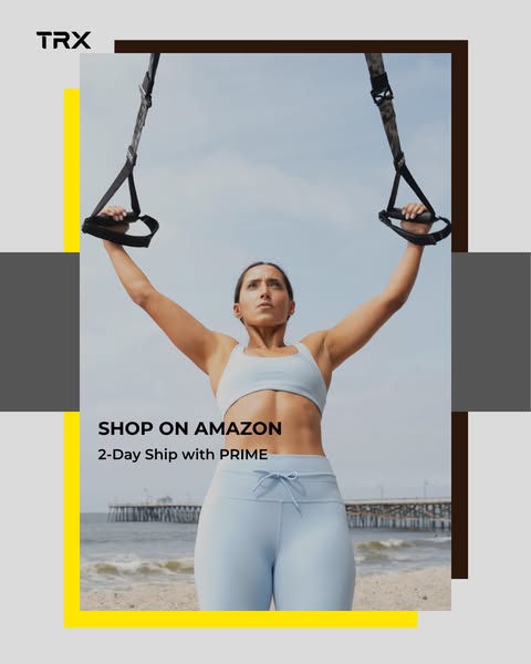
Ditch the gym stress! Build strength on your terms, no mirrors or machines needed. Feel the results for yourself. Shop now and get 2-day shipping with Prime! 🛒📦
Train smarter. Move better. Get stronger.
Shop nowThe funnel behind it

Offer: TRX GO Suspension Trainer, At Home, Portable Gym Workout. For Strength Training, Full Body Exercise Equipment
Funnel score
8-point CRO breakdown
How well the landing page behind the ad is built to convert, scored across 8 factors: offer, copy, speed, trust, mobile, message-match, CTA, and social proof.
This Amazon product page does well on trust (Amazon branding, seller info, 30-day returns, 1K+ bought indicator) and offer clarity (detailed specs, multiple product images, videos, and related products shown). However, it suffers significantly on speed (PAGESPEED_SCORE of 35 is poor), mobile optimization (dense layout with many expandable sections), and message match (the page is a standard product listing that doesn't directly address the ad's "ditch gym stress" positioning or emphasize the 2-day Prime shipping prominently). The headline is functional but generic, and while social proof exists (1K+ bought, reviews structure), it's not prominently displayed above the fold. The CTA buttons are clear and visible but compete with multiple secondary actions.
What this funnel does right. Steal these.
- Call to action8/10
- Trust signals8/10
- Offer clarity8/10
Where it's weak
- Page speed4/10
- Message match4/10
- Mobile experience5/10
- Headline5/10
Full breakdown
Call to action
8/10Two prominent, contrasting CTAs ('Add to cart' in yellow and 'Buy Now' in orange) are clearly visible and easy to tap on mobile.
- Bright yellow 'Add to cart' button is highly visible and contrasts well with page background
- Secondary 'Buy Now' button in orange provides alternative conversion path
- Both buttons are full-width and appropriately sized for mobile interaction
- Multiple CTAs may create decision paralysis rather than clear primary action
- No urgency messaging (like 'Limited stock' or 'Only X left') near the buttons
Page speed
4/10PAGESPEED_SCORE of 35 converts to approximately 3.5 on a 0-10 scale, indicating poor page performance that will hurt conversion rates.
- PAGESPEED_SCORE of 35 is significantly below acceptable thresholds (should be 50+)
- Multiple product images and videos likely contributing to slow load times
- Poor speed will increase bounce rate and reduce mobile conversions
Trust signals
8/10Strong trust signals from Amazon branding, seller information (TRX Training), return policy, and purchase volume indicator.
- Amazon branding and logo at top of page provides strong trust signal
- Seller information clearly shown ('Sold by TRX Training') with link to store
- FREE 30-day refund/replacement policy prominently displayed
- No customer review rating visible in the main product section above fold
- No security badges or certifications visible in the screenshots
Mobile experience
5/10Page is mobile-responsive but has dense, collapsed sections and requires significant scrolling through expandable content, creating friction on small screens.
- Product images are responsive and display well on mobile
- CTA buttons are full-width and appropriately sized for touch
- Navigation and search bar are accessible at top
- Many expandable sections ('Product details', 'Top highlights', 'Product specifications', etc.) require tapping to reveal content, creating friction
- Long vertical scroll required to see all product information
- Dense layout with multiple collapsed sections makes it hard to quickly understand the offer on mobile
Headline
5/10The page headline is a long, feature-focused product title that doesn't match the ad's benefit-driven messaging about ditching gym stress.
- Headline clearly identifies the product and its primary use (suspension trainer for home workouts)
- Headline is generic product description, not benefit-driven like the ad ('Train smarter. Move better. Get stronger')
- No emotional connection to 'ditch gym stress' positioning from the ad
- Long and cluttered with multiple features rather than a single compelling promise
Social proof
6/10Page shows '1K+ bought in past month' indicator and references to TRX Training Club membership, but customer reviews and ratings are not prominently displayed above the fold.
- '1K+ bought in past month' social proof indicator visible early in the product section
- TRX Training Club membership offer with description of world-class trainers
- Multiple related products and 'Customers who bought this item also bought' section showing ecosystem
- No star rating or review count visible in the main product section above fold
- Customer testimonials or detailed reviews not shown in the visible portions
- Social proof is weak compared to typical high-converting product pages
Message match
4/10The ad emphasizes 'ditch gym stress' and 'no mirrors or machines' with 2-day Prime shipping, but the page is a standard product listing with no messaging alignment to these benefits.
- Product itself matches the ad's offering (suspension trainer for home workouts)
- Page does mention 'portable' and 'at home' in the headline, aligning with ad's gym-free positioning
- No messaging about 'ditching gym stress' or emotional benefits on the page
- 2-day Prime shipping mentioned in ad is not prominently featured or highlighted on page
- Page focuses on technical specs and features rather than the lifestyle/stress-relief angle of the ad
Offer clarity
8/10Product specs, materials, weight capacity, and included items are clearly detailed in expandable sections with multiple product images and videos.
- Detailed product specifications (weight, material, max weight capacity) visible in 'Top highlights' section
- Multiple product images showing all components and use cases
- Videos and 'What's in the box' section showing exactly what customer receives
- Key offer details (like 2-day Prime shipping mentioned in ad) not prominently featured above fold
- Product description video failed to load ('media could not be loaded' message visible)
More ads from TRX Training
View all → 159dVIDEO
6-Week Bodyweight Plan That Works
 159dVIDEO
6-Week Bodyweight Plan That Works
 157dVIDEO
6-Week Bodyweight Plan That Works
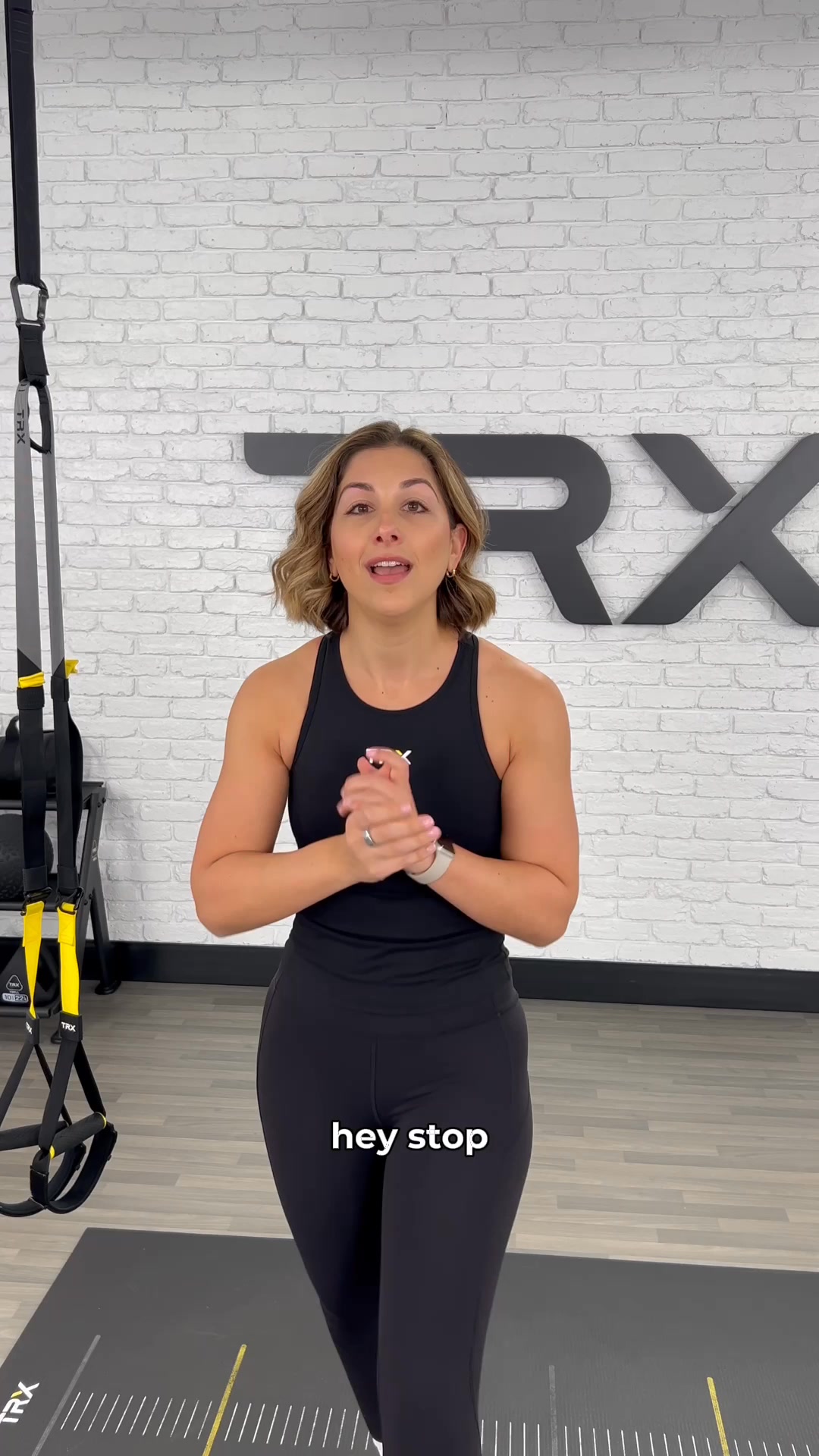 156dVIDEO
6-Week Bodyweight Plan That Works
 153dVIDEO
6-Week Bodyweight Plan That Works
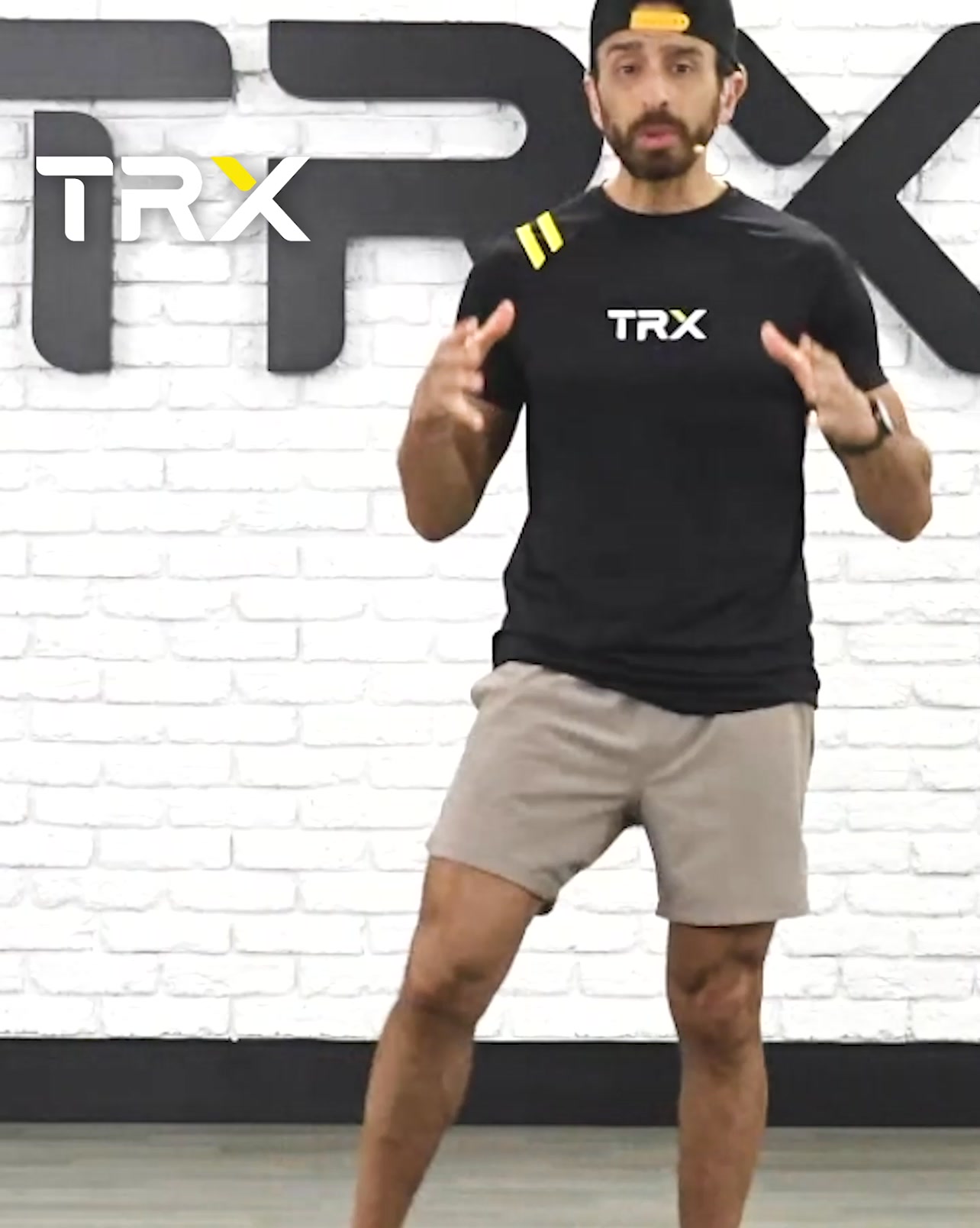 112dVIDEO
Start your free program today.
Your own page
You just read somebody else's funnel. What does yours score?
The score above came from the real landing page behind this ad, graded on 8 CRO factors. Run your own page through the same rubric, free, and see what each factor found and where you give up the most ground.
Free, no signup, no card. The same 8 factor score every page here was graded on.
Keep exploring
Data from the public Meta Ad Library. Funnelens is not affiliated with or endorsed by Meta. See data sources.