HexClad
Facebook · Instagram · Messenger · Image
The ad
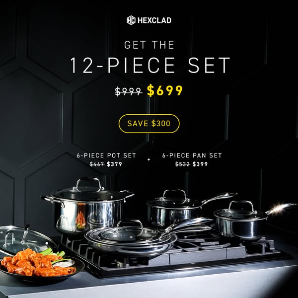
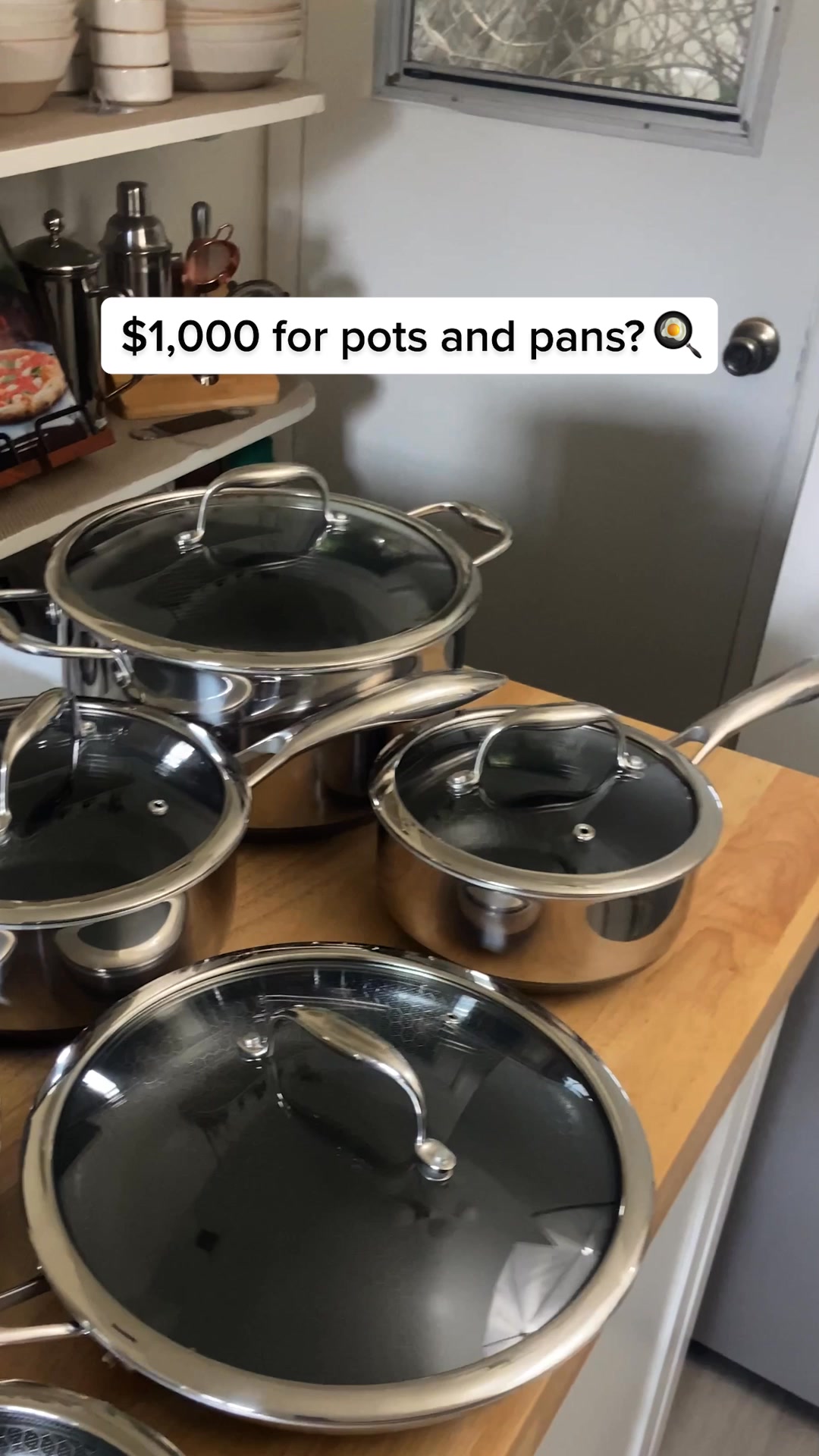
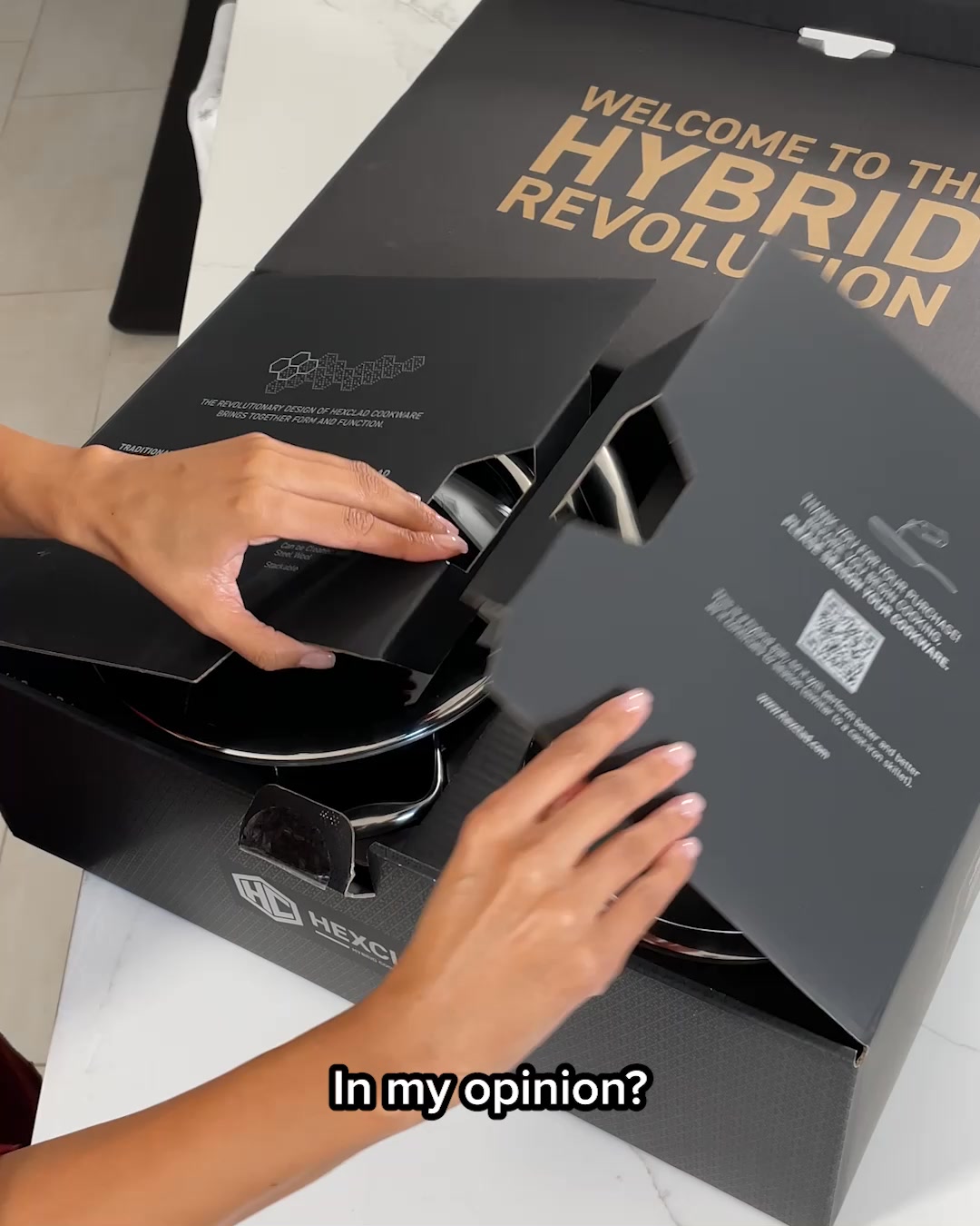
Invest in HexClad's hybrid pots and pans and you'll never have to shop for cookware again. Trusted by Michelin Star chefs like Gordon Ramsay, HexClad's cookware combines the best parts of stainless steel, cast iron, and nonstick into one genius pan. ✔️ Nonstick for Easy Cleaning ✔️ Free from Forever Chemicals ✔️ Even Heat Distribution ✔️ Sears to Perfection ✔️ Dishwasher-Safe ✔️ Oven-Safe up to 900°F Plus it comes with a Lifetime Warranty, FREE shipping & 30-day returns! Upgrade today to see why 1,000,000+ home cooks around the world swear by Gordon Ramsay’s favorite cookware.
50k+ ⭐⭐⭐⭐⭐ reviews
Shop nowThe funnel behind it

Offer: WANT TO SHOP UP TO 52% OFF?
Funnel score
8-point CRO breakdown
How well the landing page behind the ad is built to convert, scored across 8 factors: offer, copy, speed, trust, mobile, message-match, CTA, and social proof.
This landing page captures attention with a strong visual hero (product imagery) and clear seasonal urgency ("End of Summer Sale"), but it severely underperforms on core conversion elements. The page is essentially a lead-gen gate that asks for an email before revealing the actual offer or product details—a friction point that contradicts the ad's promise of direct product shopping. The headline and offer are generic and don't reinforce the ad's key differentiators (HexClad's hybrid technology, chef endorsement, or specific product benefits). Mobile optimization appears adequate, but the page speed is critically poor (28/100), which will tank conversion rates. Social proof is minimal—no visible reviews, testimonials, or the "50k+ 5-star reviews" mentioned in the ad. Trust signals are weak, with no visible security badges, guarantees, or brand credentials on the visible sections. The CTA is vague ("Unlock Access") rather than action-oriented, and there's a complete disconnect between the ad's detailed product messaging and this page's minimal, email-capture approach.
What this funnel does right. Steal these.
- Mobile experience7/10
Where it's weak
- Social proof1/10
- Message match1/10
- Trust signals2/10
- Headline2/10
- Page speed3/10
- Offer clarity3/10
- Call to action4/10
Full breakdown
Call to action
4/10The CTA 'Unlock Access' is vague and doesn't clearly communicate what happens next or what value the user will receive.
- Button is visually prominent with gradient color (blue-to-gold)
- Positioned clearly below the email input field
- Large, tappable size suitable for mobile
- 'Unlock Access' is generic and doesn't say 'Shop Now' or 'Get Discount'
- Doesn't clarify whether clicking leads to product page, discount code, or email confirmation
- Creates friction by requiring email before showing products
Page speed
3/10Page speed score of 28/100 is critically poor and will severely impact conversion rates and user experience.
- PAGESPEED_SCORE of 28 indicates very slow load times
- Likely causes high bounce rates before users see the offer
- Mobile performance is probably severely degraded
Trust signals
2/10Minimal trust signals visible—no security badges, guarantees, brand credentials, or the lifetime warranty and 30-day returns mentioned in the ad.
- HexClad logo is visible at top, providing brand recognition
- No visible security badges (SSL, payment security, etc.)
- No mention of lifetime warranty, free shipping, or 30-day returns from the ad
- No customer reviews or testimonials to build credibility
Mobile experience
7/10Mobile layout is clean and functional with stacked elements, readable text, and appropriately sized touch targets.
- Email input field is full-width and easy to tap
- Button is large and clearly tappable
- Text hierarchy is clear with large headline and subheading
- Excessive whitespace above the fold may require scrolling to see the offer on smaller screens
- No visible mobile-specific optimizations like countdown timers or urgency indicators
Headline
2/10The headline 'THE END OF SUMMER SALE' is generic seasonal messaging with no product or brand differentiation.
- Clear, large typography makes it readable
- Creates urgency with 'end of' framing
- No mention of HexClad, cookware, or hybrid technology
- Doesn't reinforce the ad's key claim about Gordon Ramsay or chef endorsement
- Completely generic—could apply to any summer sale
Social proof
1/10No visible social proof on the page—no reviews, testimonials, star ratings, or the '50k+ 5-star reviews' promised in the ad.
- Ad mentions '50k+ ⭐⭐⭐⭐⭐ reviews' but none are visible on page
- No customer testimonials or case studies
- No mention of '1,000,000+ home cooks' or Gordon Ramsay endorsement visible
Message match
1/10Severe disconnect: the ad promises direct product shopping with detailed cookware benefits, but the page is an email-capture gate with no product information.
- Ad says 'Shop now' but page requires email before shopping
- Ad highlights hybrid technology, nonstick, heat distribution, and oven-safe features—none visible on page
- Ad mentions Gordon Ramsay and Michelin Star chefs—no endorsement visible
Offer clarity
3/10The offer is vague—'up to 52% off' is shown, but no specific products, bundles, or terms are visible before the email gate.
- Percentage discount (52% off) is clearly stated in gold text
- No product details visible—cookware sets, specific items, or bundle information are hidden behind email gate
- No clarity on what 'up to' means or which products qualify
- No mention of free shipping, 30-day returns, or lifetime warranty from the ad
More ads from HexClad
View all →

Your own page
You just read somebody else's funnel. What does yours score?
The score above came from the real landing page behind this ad, graded on 8 CRO factors. Run your own page through the same rubric, free, and see what each factor found and where you give up the most ground.
Free, no signup, no card. The same 8 factor score every page here was graded on.
Keep exploring
Data from the public Meta Ad Library. Funnelens is not affiliated with or endorsed by Meta. See data sources.