Aviron
Facebook · Instagram · Messenger · Image
The ad
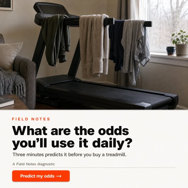
Before buying a treadmill, find out the real odds it becomes a daily habit rather than a dusty corner. Most people overestimate daily use, because the excitement of a new machine hides how repetitive it gets. Once that fades, the habit usually fades with it. It's a predictable pattern, not a personal failing. A free 3-minute test reads your schedule and tolerance for repetition, then scores your honest odds of daily use. Better to know now than after the machine arrives.
Will the treadmill get daily use?
Learn moreThe funnel behind it

Offer: A 3-minute test that looks at your habits, your space, and your goals, and tells you what it'll actually take for the routine to hold.
Funnel score
8-point CRO breakdown
How well the landing page behind the ad is built to convert, scored across 8 factors: offer, copy, speed, trust, mobile, message-match, CTA, and social proof.
This page excels at building credibility through detailed, research-backed content that diagnoses why fitness equipment fails (content fatigue, dopamine void, engineering blindspots, etc.). The writing is engaging and the problem framing is compelling. However, the page struggles with offer clarity—the actual test/quiz is buried mid-page and its mechanics aren't clearly explained upfront. The CTA buttons are visually prominent but generic ("GET MY SCORE"), and there's minimal social proof (only one user quote from Jason). The page is long-form editorial content that takes significant scrolling to reach conversion points, which may hurt mobile experience and completion rates. Message match is moderate: the ad promises a "free 3-minute test" about daily use odds, and the page does deliver this, but it's positioned as a secondary offer after extensive educational content rather than the primary value prop.
What this funnel does right. Steal these.
- Headline8/10
- Call to action7/10
- Page speed7/10
- Trust signals7/10
Where it's weak
- Social proof3/10
- Offer clarity5/10
Full breakdown
Call to action
7/10Two prominent, high-contrast orange CTAs with clear labels, but generic copy and no urgency or benefit statement.
- Bright orange buttons stand out against white background
- Clear, scannable labels: 'GET MY SCORE' and 'GET MY READINESS SCORE'
- Positioned at natural reading breaks (after diagnosis section, after main content)
- Generic CTA copy ('GET MY SCORE') doesn't communicate value or outcome
- No urgency, scarcity, or benefit-driven language (e.g., 'Find Out Your Odds' or 'See If It'll Stick')
- No micro-copy explaining what happens next (e.g., 'Takes 3 minutes, no email required')
Page speed
7/10PageSpeed score of 65 converts to approximately 6.5/10, rounded to 7; page loads but has room for optimization.
- Page renders and is readable; no obvious broken images or missing elements in screenshots
- PageSpeed score of 65 indicates moderate performance issues (target is 90+)
- Long-form page with multiple images may slow load on mobile networks
Trust signals
7/10Strong trust-building through detailed, research-backed content and expert framing, but limited third-party validation.
- Byline with author name (Jordan Hayes, Senior Editor) and publication date (July 2026)
- Extensive citations of behavioral science (BJ Fogg, James Clear, Anna Lembke, Mihaly Csikszentmihalyi)
- Specific data points (44M Wii Fit units, 15M Ring Fit units, 1M+ Zwift subs) ground claims
- No security badges, privacy certifications, or data-protection statements visible
- Limited third-party validation (TechCrunch mention is brief and buried)
- No company credentials, team bios, or 'About Us' link visible on page
Mobile experience
6/10Long-form content with readable text and stacked layout, but extensive scrolling required to reach conversion points.
- Text is readable and well-spaced; no tiny fonts or cramped layouts visible
- Images scale and stack vertically for mobile viewing
- CTA buttons are full-width and easy to tap
- Massive amount of scrolling required (6+ screens) to reach first CTA
- Long paragraphs and dense body text may discourage mobile reading
- No sticky header or floating CTA to reduce friction on mobile
Headline
8/10Strong, specific headline that directly addresses the pain point (expensive machines becoming coat racks) with a numbered-list promise.
- Specific and curiosity-driven: '10 REASONS WHY' creates list-reading expectation
- Directly names the problem: 'EXPENSIVE FITNESS MACHINES BECOME COAT RACKS'
- Subheadline reinforces credibility: '50,000+ buyers discovered' and '92% of members still working out a year later'
- Headline is about the problem, not the solution (the test itself)
- Long and complex; could be more punchy for mobile scanning
Social proof
3/10Minimal social proof: only one named user quote (Jason from Virginia) and vague references to 'researchers' and 'Trade My Spin' data.
- One direct user quote from Jason (Peloton owner) admitting the machine became a laundry rack
- Reference to '2,000+ post-purchase interviews' with former owners
- Mention of 'Trade My Spin' business model (1 in 4 of 4.5M Pelotons unused)
- Only one named, attributed user testimonial on entire page
- No star ratings, review counts, or aggregated user feedback visible
- No logos of publications, brands, or third-party validators (TechCrunch mention is buried in body text)
Message match
6/10Ad promises a 'free 3-minute test' about daily use odds; page delivers this, but buries it under extensive educational content rather than leading with it.
- Page does offer the free 3-minute test promised in ad
- Test is positioned as addressing the core question: 'Will your next machine become a daily habit or a coat rack?'
- Ad's framing (predictable pattern, not personal failing) matches page's diagnostic tone
- Ad leads with the test as primary offer; page leads with 10-reason article as primary content
- Ad emphasizes 'odds of daily use'; page emphasizes 'why machines fail' (different angle)
- Test is secondary CTA, not the hero of the page—editorial content dominates
Offer clarity
5/10The core offer (a 3-minute test) exists but is buried and its exact mechanics/output are vague.
- Two CTA boxes clearly label the test as '3 MIN · FREE · NO CREDIT CARD' and '3 MIN · FREE · 10 QUESTIONS'
- Descriptive text explains the test 'looks at your habits, your space, and your goals'
- Free and time commitment are explicitly stated
- Test is positioned as a secondary offer after 2,000+ words of content, not the primary value
- Unclear what the output/score actually tells you beyond 'odds of daily use'
- No preview of what happens after you take the test or how results are delivered
More ads from Aviron
View all →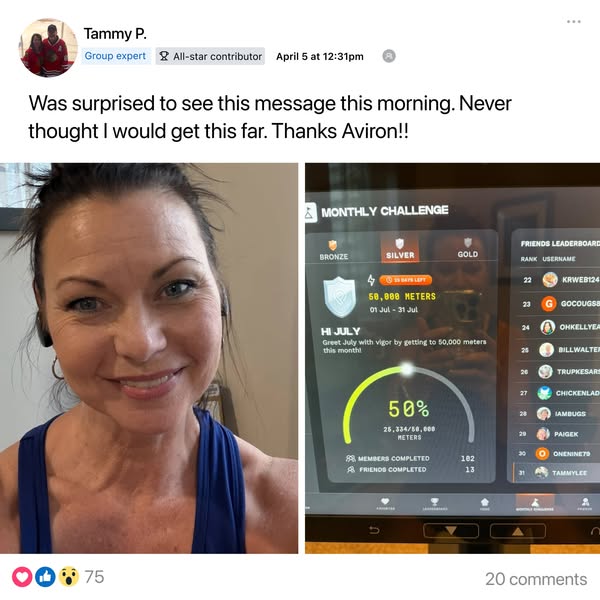
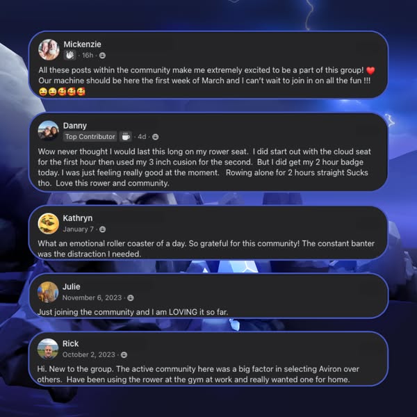
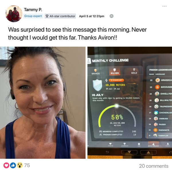
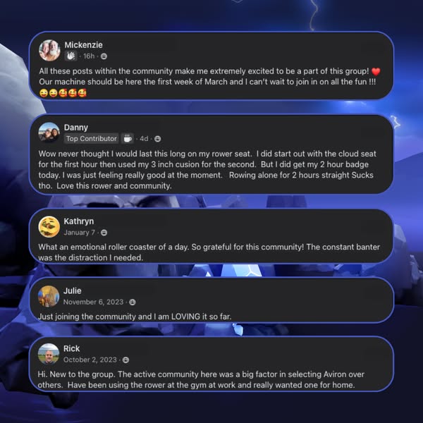
Your own page
You just read somebody else's funnel. What does yours score?
The score above came from the real landing page behind this ad, graded on 8 CRO factors. Run your own page through the same rubric, free, and see what each factor found and where you give up the most ground.
Free, no signup, no card. The same 8 factor score every page here was graded on.
Keep exploring
Data from the public Meta Ad Library. Funnelens is not affiliated with or endorsed by Meta. See data sources.