Nomatic
Facebook · Instagram · Audience Network · Video
The ad
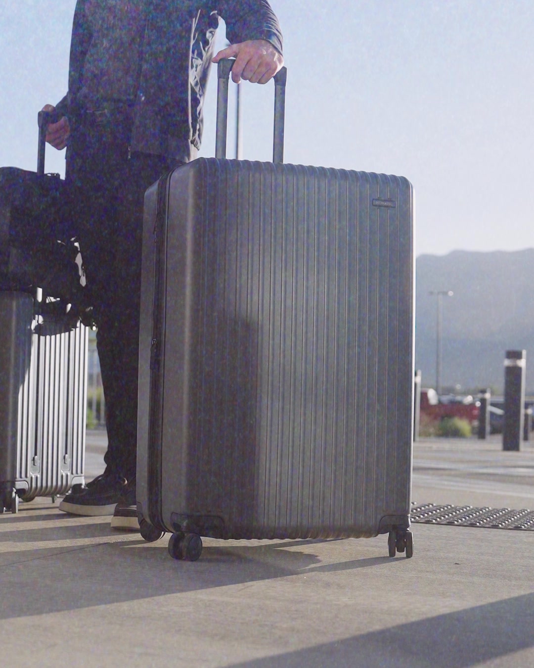
Start lighter, pack heavier. The Method Check-In weighs 15% less than the competition — so more of the airline’s weight limit belongs to you. Up to 20% more space, same exterior size. Shop the Method Check-In.
15% Lighter Check-In Bag
Shop nowThe funnel behind it

Offer: <UNKNOWN>
Funnel score
8-point CRO breakdown
How well the landing page behind the ad is built to convert, scored across 8 factors: offer, copy, speed, trust, mobile, message-match, CTA, and social proof.
This page is severely compromised by extremely poor mobile rendering and load performance. The screenshots show a mostly blank page with only the NOMATIC logo visible at the top and fragmented product imagery at the bottom—critical content like headline, offer details, CTA button, and product information are either missing from the capture or failed to render. The page speed score of 29 is critically poor, indicating severe performance issues that would frustrate users. While the brand identity (NOMATIC) is present, the page fails to communicate the advertised value proposition (15% lighter, 20% more space) or provide a clear path to purchase. Without visible offer clarity, functional CTAs, or trust signals, this page cannot effectively convert traffic from the ad.
Where it's weak
- Social proof0/10
- Call to action1/10
- Trust signals1/10
- Mobile experience1/10
- Message match1/10
- Offer clarity1/10
- Headline2/10
- Page speed3/10
Full breakdown
Call to action
1/10No call-to-action button is visible in any of the four screenshots provided.
- Primary CTA button is not visible in the captured page sections
- No 'Shop now' button or equivalent purchase trigger is shown
- No secondary CTAs or navigation options visible to guide users
Page speed
3/10PageSpeed score of 29 converts to approximately 3/10, indicating critically poor performance.
- PageSpeed score of 29 is critically poor (bottom 10% of web performance)
- Visible rendering failures suggest slow/incomplete page load
- Blank sections and missing content indicate performance-related load issues
Trust signals
1/10No trust indicators, company information, guarantees, or credibility signals are visible.
- NOMATIC brand logo is present at top
- No company information, about section, or credentials visible
- No money-back guarantee, warranty, or return policy shown
- No contact information, customer service details, or support options visible
Mobile experience
1/10The page appears to be a mobile screenshot with severe rendering failures—mostly blank space with only logo and fragmented images visible.
- Massive blank/white space indicates failed mobile layout rendering
- Content is not properly stacked or optimized for mobile viewport
- Images are cut off and fragmented, suggesting responsive design failure
Headline
2/10Only the NOMATIC logo is visible at the top; the actual page headline is not shown in these screenshots.
- Logo-only header provides no value proposition or product information
- No headline text visible to communicate the 15% lighter benefit from the ad
- Page appears to have failed to render critical above-the-fold content
Social proof
0/10No reviews, ratings, testimonials, trust badges, or social proof elements are visible anywhere on the page.
- No star ratings or review counts visible
- No customer testimonials or quotes shown
- No trust badges, certifications, or social proof indicators present
Message match
1/10The ad promises '15% lighter' and '20% more space' but these benefits are not visible on the page.
- Ad headline '15% Lighter Check-In Bag' not visible on page
- Ad's weight and space benefits not communicated in visible content
- Product positioning from ad (lighter, more space) not reinforced on page
Offer clarity
1/10No offer details, pricing, specifications, or product benefits are visible in the captured screenshots.
- No product specifications visible (weight savings, space increase not shown)
- No pricing information displayed
- Product images are fragmented and unclear, failing to showcase the check-in bag
More ads from Nomatic
View all →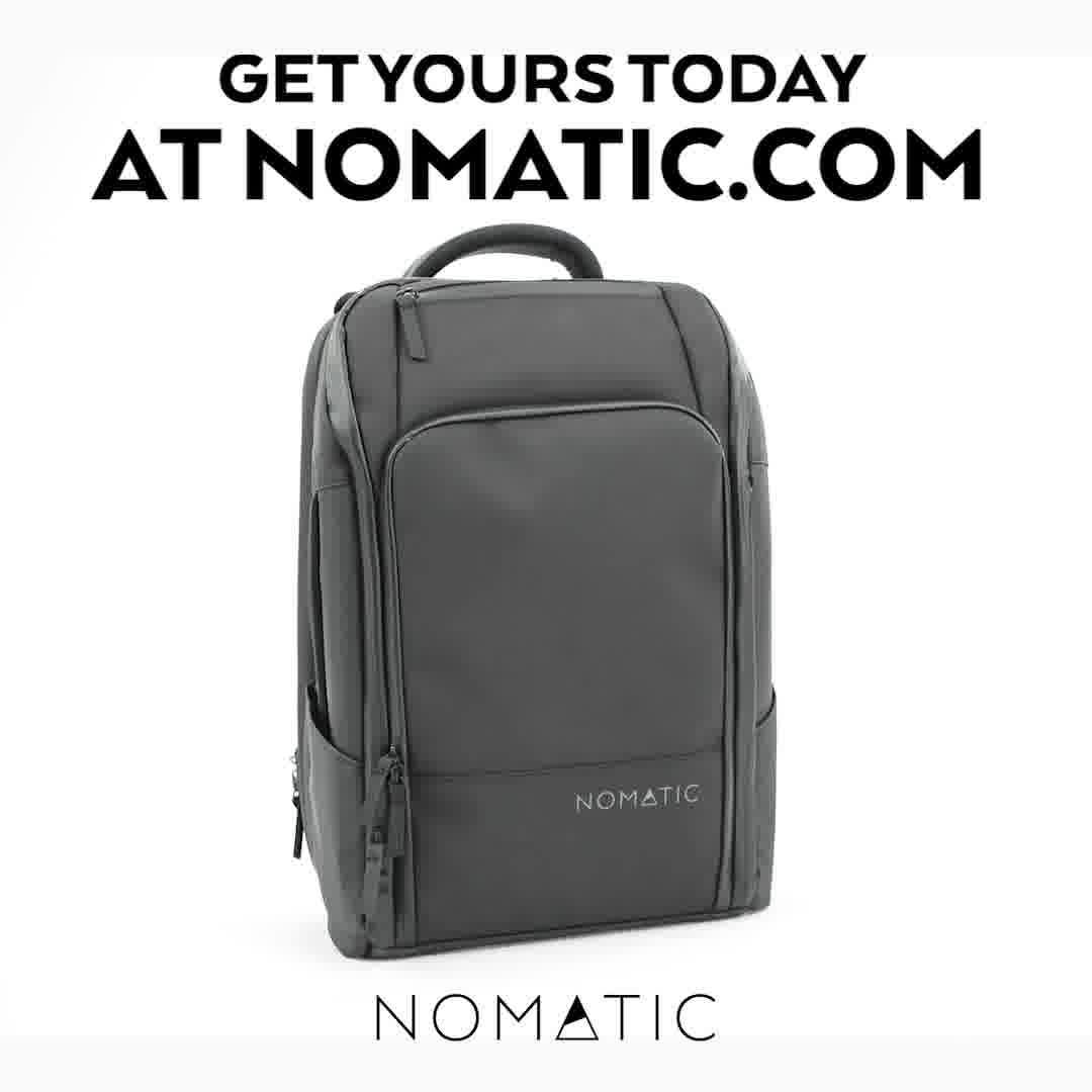 428dVIDEO
The Most Functional Travel Pack Ever
 428dVIDEO
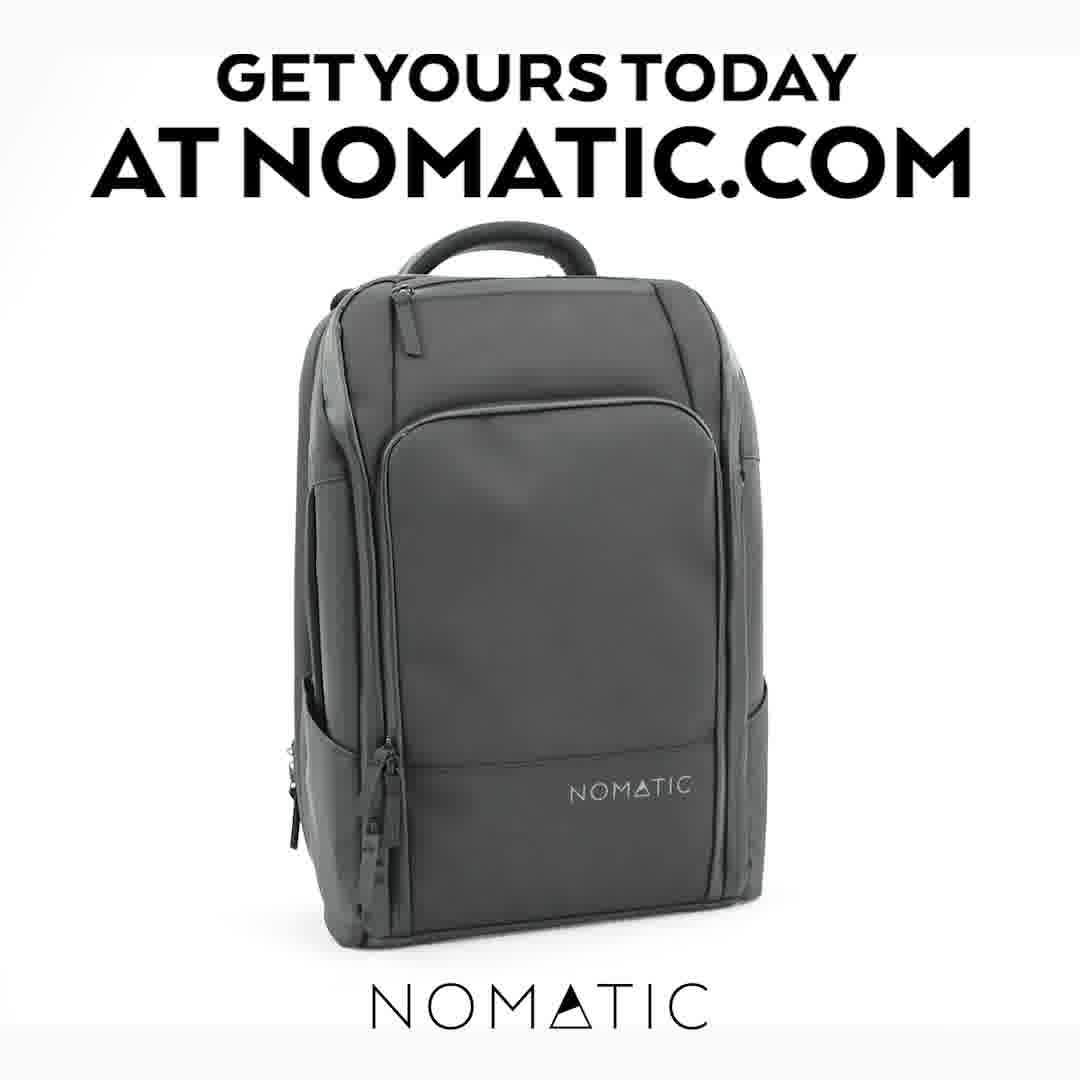
The Most Functional Travel Pack Ever
 428dVIDEO
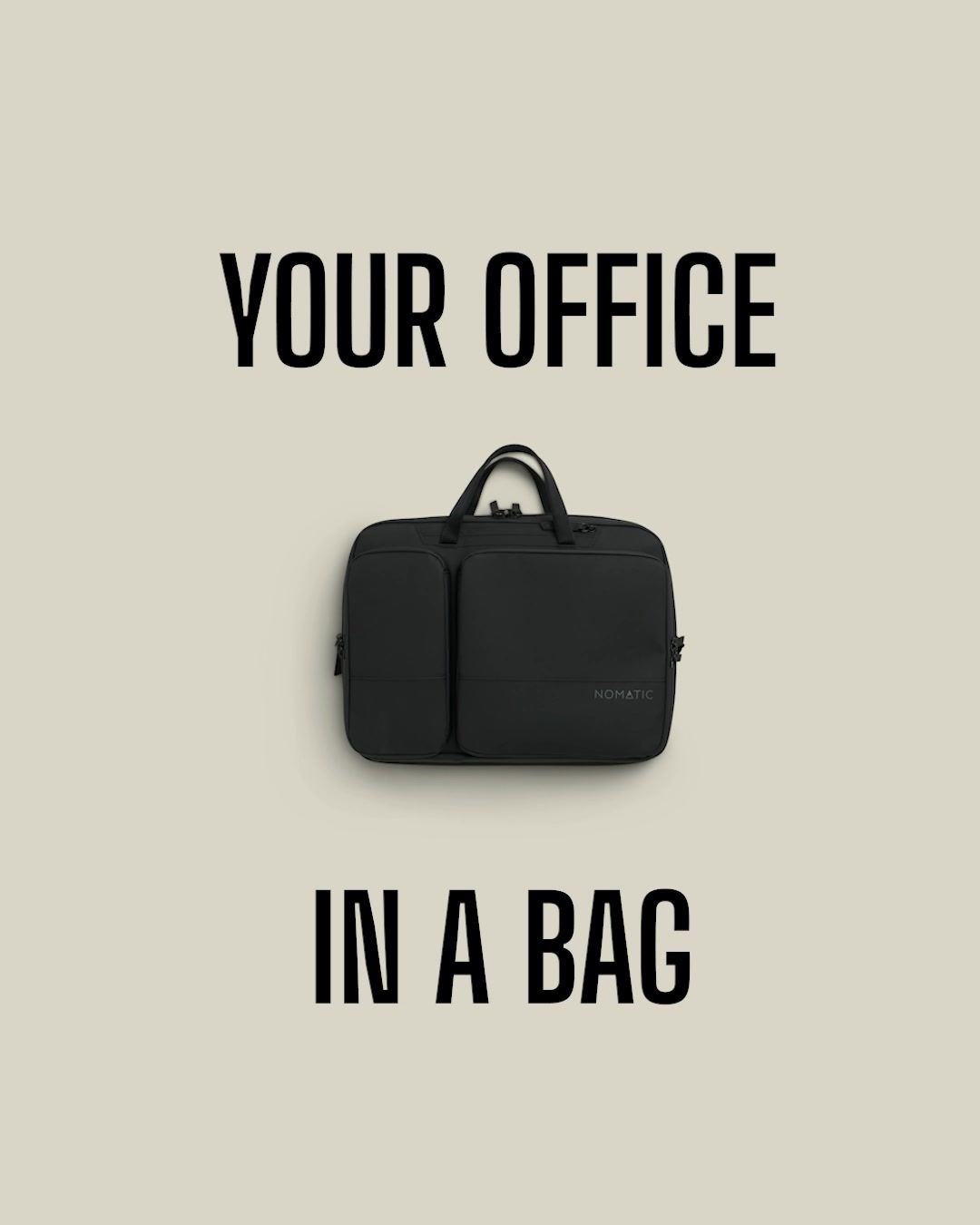
All-New: Your Office in a Bag
 428dVIDEO
Nomatic Travel Pack = Zombie-Proof ✅
 167dVIDEO
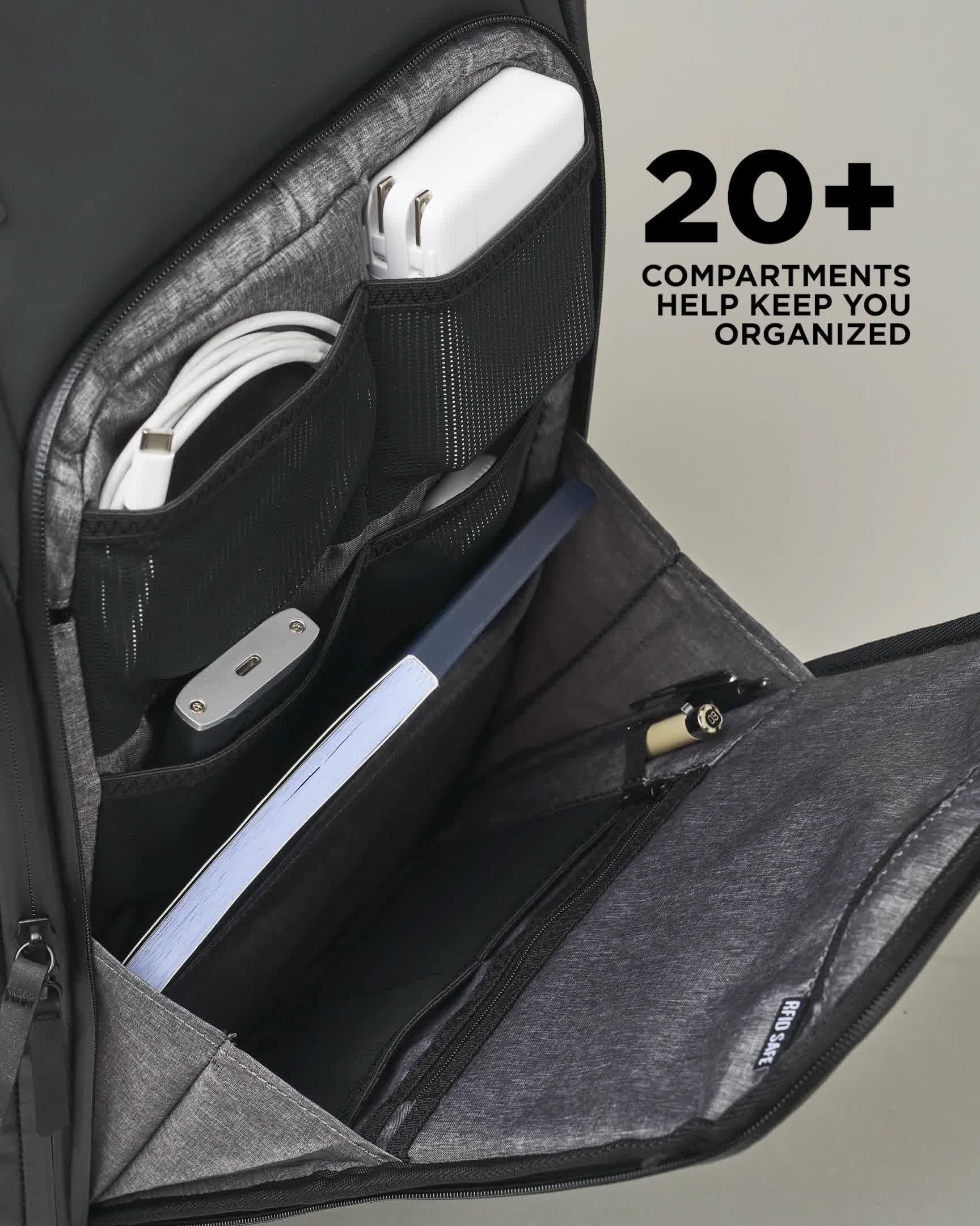
The Most Functional Travel Pack Ever
 118dVIDEO
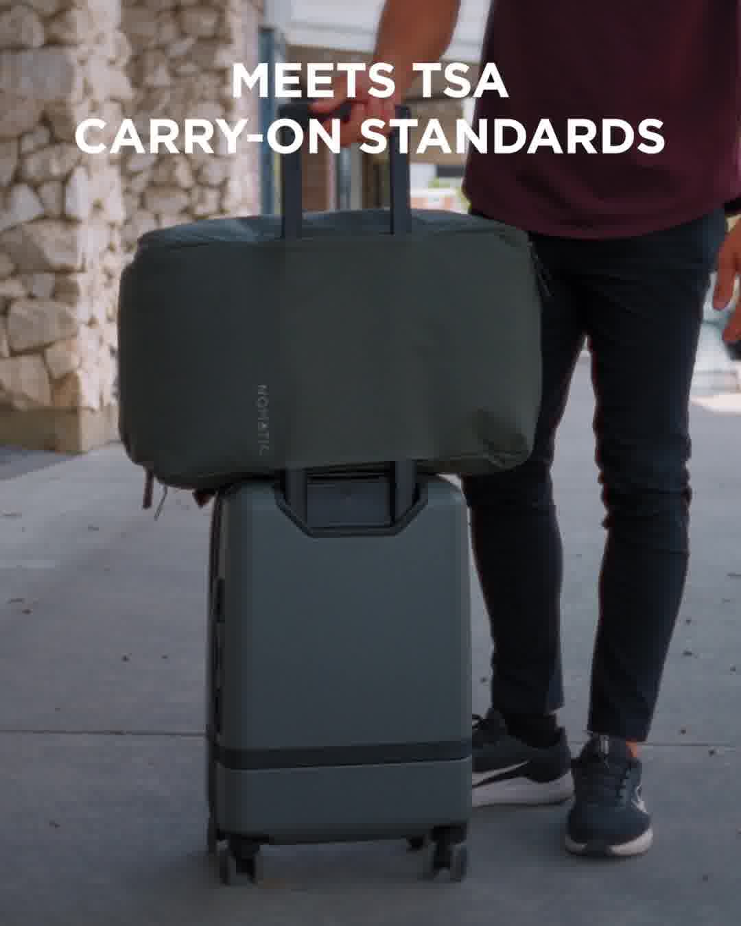
Travel Bag 40L – Now in Olive & Navy
Your own page
You just read somebody else's funnel. What does yours score?
The score above came from the real landing page behind this ad, graded on 8 CRO factors. Run your own page through the same rubric, free, and see what each factor found and where you give up the most ground.
Free, no signup, no card. The same 8 factor score every page here was graded on.
Keep exploring
Data from the public Meta Ad Library. Funnelens is not affiliated with or endorsed by Meta. See data sources.