Aviron
Facebook · Instagram · Messenger · Image
The ad
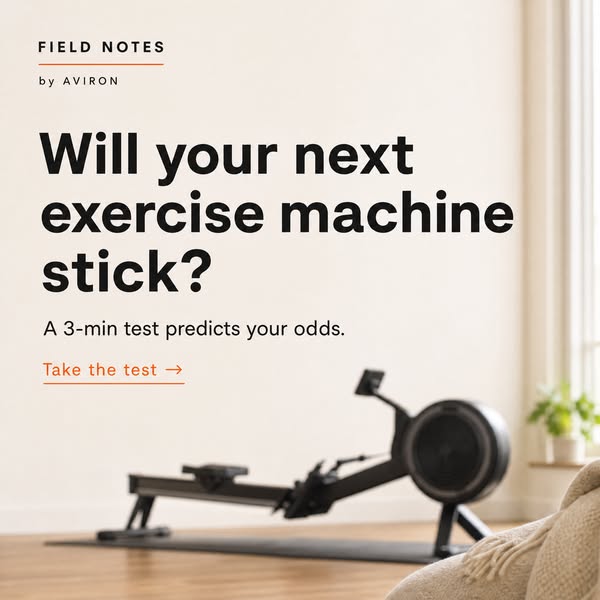
Some machines get used for years. Others become laundry racks by spring. A short quiz can tell you which way yours is likely to go — and what tips the odds.
Find Out Before You Buy
Learn moreThe funnel behind it

Offer: A 3-minute test that looks at your habits, your space, and your goals, and tells you what it'll actually take for the routine to hold.
Funnel score
8-point CRO breakdown
How well the landing page behind the ad is built to convert, scored across 8 factors: offer, copy, speed, trust, mobile, message-match, CTA, and social proof.
This page excels at building trust through detailed, research-backed content that diagnoses why fitness machines fail (content fatigue, dopamine void, engineering blindspots, etc.). The Aviron Strong Series Rower is positioned as the solution built on game psychology principles, with strong social proof (92% retention rate, 50,000+ buyers). However, the page buries its primary CTA deep within the content (appearing twice in callout boxes), making it less prominent than the editorial narrative. The headline is compelling but lengthy, and the mobile experience likely suffers from the dense, long-form article structure. The offer clarity is strong—the quiz is clearly explained—but the page prioritizes education over conversion urgency.
What this funnel does right. Steal these.
- Page speed10/10
- Trust signals9/10
- Social proof9/10
- Message match8/10
- Offer clarity8/10
- Headline7/10
Where it's weak
- Mobile experience5/10
Full breakdown
Call to action
6/10Two CTAs present ('GET MY SCORE' buttons) but they are buried within the article content rather than prominently positioned, and the primary CTA text is generic.
- Bright orange button color stands out against white background
- CTA appears twice, increasing visibility across the long-form content
- Clear, action-oriented text ('GET MY SCORE')
- CTAs are embedded within callout boxes mid-article rather than sticky or above-the-fold
- Generic CTA text ('GET MY SCORE') doesn't reinforce the benefit or urgency
- No sense of scarcity, urgency, or incentive to act now
Page speed
10/10PAGESPEED_SCORE of 100 indicates excellent performance across all speed metrics.
- Perfect PageSpeed score (100) indicates optimal Core Web Vitals
- Fast load times support conversion and user experience
Trust signals
9/10High trust established through detailed research-backed content, specific statistics, real user testimonials, founder story, and credible sources cited (TechCrunch, behavioral science references).
- Detailed founder story (Andy, product designer with ADHD) humanizes the brand
- Specific, verifiable statistics (92% retention, 50,000+ buyers, 1 in 4 Pelotons unused)
- Real user testimonial from Jason with specific details ($2,000 Peloton, laundry rack use)
Mobile experience
5/10The page is likely mobile-unfriendly due to its long-form article structure with dense text blocks, multiple images, and deep CTA placement.
- Navigation menu appears clean and minimal at top
- Large, bold headlines should be readable on mobile
- Extremely long-form content (6+ image sections) will require excessive scrolling on mobile
- Dense text blocks without clear visual breaks between sections
- CTAs buried deep in the content, requiring significant scrolling to reach on mobile
Headline
7/10The headline is attention-grabbing and specific, but it's lengthy and focuses on the problem rather than the solution.
- Highly specific and curiosity-driven ('10 REASONS WHY')
- Directly addresses the reader's pain point (expensive machines becoming coat racks)
- Uses bold, large typography that commands attention
- Very long (16 words), which may not scan well on mobile
- Focuses on the problem rather than the benefit or solution
- Doesn't mention Aviron or the product until much deeper in the page
Social proof
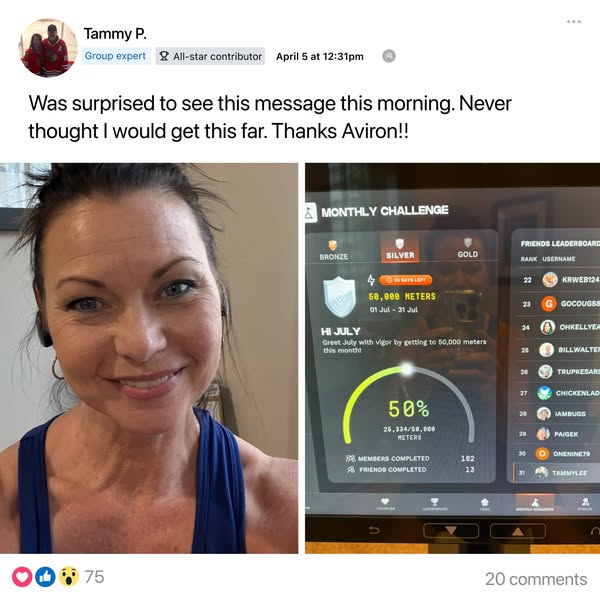
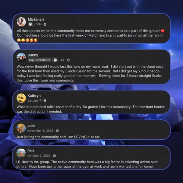
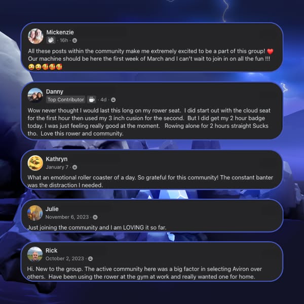
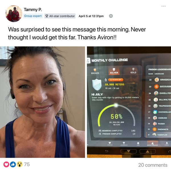
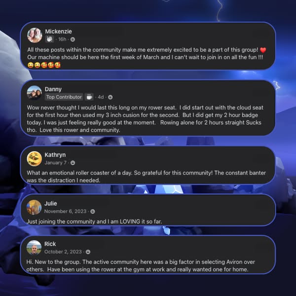
9/10Strong social proof throughout: 92% retention rate for Aviron, 50,000+ buyers discovered the product, 1 in 4 Pelotons unused, 44M Wii Fit units sold, and detailed user testimonials.
- 92% of Aviron owners still actively using after a year (specific, credible metric)
- 50,000+ buyers discovered the product (demonstrates scale and trust)
- Comparative data showing 1 in 4 Pelotons sit unused (validates the problem)
Message match
8/10Strong alignment between ad and page: ad promises a quiz to predict machine usage, page delivers exactly that with detailed reasoning for why machines fail.
- Ad headline 'Find Out Before You Buy' matches page's core offer (the quiz)
- Ad primary text about machines becoming laundry racks directly mirrors page's main topic
- Page content explains the 'why' behind the ad's premise, building credibility
- Ad CTA is 'Learn more' but page CTA is 'GET MY SCORE'—slight disconnect in call-to-action language
Offer clarity
8/10The offer is clearly stated as a 3-minute quiz that predicts machine usage and provides a readiness score, with explicit benefits listed.
- Quiz duration and format clearly stated ('3 min · Free · No credit card')
- Benefit explicitly named: tells you 'what it'll actually take for the routine to hold'
- Offer appears in two prominent callout boxes with consistent messaging
- The quiz is positioned as secondary to the 10-reasons article rather than as the primary value prop
- No mention of what happens after taking the quiz or how results are delivered
More ads from Aviron
View all →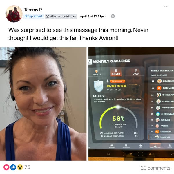
Your own page
You just read somebody else's funnel. What does yours score?
The score above came from the real landing page behind this ad, graded on 8 CRO factors. Run your own page through the same rubric, free, and see what each factor found and where you give up the most ground.
Free, no signup, no card. The same 8 factor score every page here was graded on.
Keep exploring
Data from the public Meta Ad Library. Funnelens is not affiliated with or endorsed by Meta. See data sources.