BarkBox landing page teardown
The page at bark.co has been the destination of a BarkBox Facebook ad for 55 days. We captured it and scored it 59/100 on the 8-point CRO checklist below.
Offer on the page: Extra toys FREE for a full year
?What is a CRO score?
CRO stands for Conversion Rate Optimization: turning more of the visitors you already have into customers. This score (0 to 100) rates how well a landing page is built to convert, across 8 factors like offer, headline, speed, trust, and mobile. Read the full explainer →
Funnel score
8-point CRO breakdown
How well the landing page behind the ad is built to convert, scored across 8 factors: offer, copy, speed, trust, mobile, message-match, CTA, and social proof.
What this page does right. Steal these.
- Call to action8/10
- Mobile experience8/10
- Offer clarity8/10
- Headline7/10
Where it leaks conversions
- Social proof2/10
- Page speed3/10
- Message match4/10
Full breakdown
Call to action
8/10The CONTINUE button is large, prominent, and uses high-contrast dark blue with white text, making it highly visible and clickable.
- Large button spanning full width at bottom of page
- High-contrast dark blue background with white text
- Clear, action-oriented label 'CONTINUE'
- Button text doesn't reinforce the offer (e.g., 'Get Free Toys' would be stronger)
Page speed
3/10PageSpeed score of 26 is very poor, indicating significant performance issues that will hurt user experience and conversion.
- PageSpeed score of 26/100 indicates severe performance problems
- Slow load times will increase bounce rate and reduce conversions
- Mobile performance is likely particularly poor at this speed
Trust signals
6/10The page shows the BarkBox brand logo and professional design, but lacks trust signals like security badges, guarantees, or customer testimonials.
- BARK: logo at top establishes brand identity
- Clean, professional design with organized layout
- Clear product categorization suggests legitimate business
- No security badges, SSL indicators, or trust seals visible
- No money-back guarantee or satisfaction guarantee mentioned
- No customer reviews or testimonials to build credibility
Mobile experience
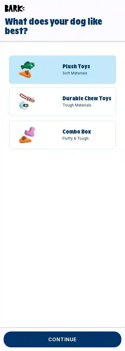
8/10The layout appears mobile-optimized with stacked cards, large touch targets, and full-width button, though the screenshot shows a mobile view.
- Full-width button with adequate padding for touch interaction
- Vertically stacked card layout is mobile-friendly
- Large product images and text are readable on small screens
- Significant whitespace below the third option suggests potential scrolling fatigue
Headline
7/10The headline 'What does your dog like best?' is engaging and personalized but doesn't reinforce the promotional offer from the ad.
- Question format creates engagement and invites user participation
- Personalized language ('your dog') creates relevance
- Large, bold text in dark blue is highly visible
- Doesn't mention the free toy offer or promotion
- Generic question doesn't differentiate from typical product selection flows
Social proof
2/10No social proof elements are visible on this page—no reviews, ratings, testimonials, or user counts.
- No customer reviews or ratings displayed
- No testimonials or user testimonials visible
- No trust badges, certifications, or social indicators
Message match
4/10The ad promises 'free toys for a year' but this page is a product preference selector with no mention of the promotional offer, creating a disconnect.
- Page is part of the BarkBox funnel as indicated by the URL
- Product selection aligns with the dog toy category mentioned in the ad
- Ad headline 'A FREE toy every month. For a year.' is completely absent from the page
- Ad primary text about 'extra toys FREE' is not reinforced here
- Page appears to be a generic product preference flow, not a promotion-specific landing page
Offer clarity
8/10The offer is clear: three product options (Plush Toys, Durable Chew Toys, Combo Box) with descriptive subtitles, though the 'free toys for a year' benefit isn't explicitly stated on this page itself.
- Three distinct product options with clear names and material descriptions
- Visual product images help users understand what they're choosing
- Subtitles ('Soft Materials', 'Tough Materials', 'Fluffy & Tough') clarify the difference between options
- The free toy offer from the ad is not mentioned on this page
- No pricing or subscription details visible to clarify the full offer
Your own page
That is one page's teardown. Now get your own.
Same 8-factor rubric, same evidence-backed notes, on your landing page instead of theirs. Free, no signup, about 30 seconds.
Free, no signup, no card. The same 8 factor score every page here was graded on.
Keep exploring
Captured from the public page at bark.co; ad data from the public Meta Ad Library. Funnelens is not affiliated with BarkBox or Meta. See data sources.