NOBULL landing page teardown
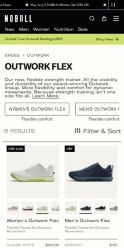
The page at nobullproject.com has been the destination of a NOBULL Facebook ad for 32 days. We captured it and scored it 48/100 on the 8-point CRO checklist below.
Offer on the page: Flexible Trainer for Dynamic Movements - $150
?What is a CRO score?
CRO stands for Conversion Rate Optimization: turning more of the visitors you already have into customers. This score (0 to 100) rates how well a landing page is built to convert, across 8 factors like offer, headline, speed, trust, and mobile. Read the full explainer →
Funnel score
8-point CRO breakdown
How well the landing page behind the ad is built to convert, scored across 8 factors: offer, copy, speed, trust, mobile, message-match, CTA, and social proof.
This page effectively showcases the Outwork Flex product line with clear product imagery, consistent $150 pricing, and strong visual organization. However, it suffers from critical weaknesses: the page speed is severely compromised (23/100), the primary CTA is buried in a modal popup rather than prominently displayed on the main page, and there's minimal social proof visible (only star ratings without review counts). The headline "Outwork Flex" is generic and doesn't communicate the key benefit of flexibility and stability mentioned in the ad. The modal CTA "Of Course. Lock it in." is clever but obscures the standard "Shop now" call-to-action, creating friction in the conversion path.
What this page does right. Steal these.
- Offer clarity8/10
- Mobile experience7/10
Where it leaks conversions
- Page speed2/10
- Call to action3/10
- Social proof3/10
- Headline4/10
- Trust signals5/10
- Message match5/10
Full breakdown
Call to action
3/10The primary CTA 'Of Course. Lock it in.' is hidden inside a modal popup at the bottom of the page, not prominently displayed on the main product listing page.
- CTA button is high-contrast black with white text
- Clever copy 'Lock it in' ties to product benefit messaging
- CTA is buried in a modal popup, not visible on main page
- No prominent 'Shop now' or 'Add to cart' button on product cards themselves
- Users must scroll to bottom and interact with modal to see primary CTA
Page speed
2/10PageSpeed score of 23/100 is critically poor, indicating severe performance issues that will harm user experience and conversions.
- PageSpeed score of 23/100 is in the critical range
- Page likely has slow image loading, unoptimized assets, or render-blocking resources
- Users will experience significant delays before page becomes interactive
Trust signals
5/10The page shows a recognizable brand (NOBULL) and product imagery, but lacks trust signals like customer reviews, security badges, return policies, or company information.
- NOBULL brand logo visible at top
- Professional product photography on all items
- Star ratings visible on products
- No customer review text or testimonials visible
- No security badges or trust seals shown
- No visible return policy, warranty, or guarantee information
Mobile experience
7/10The layout appears responsive with a 2-column grid that would stack on mobile, and navigation is accessible via hamburger menu.
- Hamburger menu visible for mobile navigation
- Product grid appears to be responsive
- Touch-friendly spacing between product cards
- Modal popup may be difficult to interact with on small screens
- Color swatches on products may be too small to tap accurately on mobile
Headline
4/10The headline 'Outwork Flex' is a simple product name that fails to communicate the key benefits mentioned in the ad (flexibility, durability, stability).
- Clear and easy to read in large text
- Generic product name without benefit statement
- Doesn't convey 'flexible, durable, locked-in, stable' messaging from the ad
- No emotional hook or value proposition
Social proof
3/10Star ratings (4.8-5.0) appear on product cards but no review counts, testimonials, or other social proof elements are visible anywhere on the page.
- Star ratings displayed on most product cards
- No review counts shown (e.g., '5.0 from 2,100 reviews')
- No customer testimonials or quotes visible
- No trust badges, certifications, or brand endorsements shown
Message match
5/10The page shows the product and price but doesn't emphasize the ad's key claims about flexibility, durability, being locked-in, and stability for lifts.
- Product name 'Outwork Flex' matches ad headline
- Descriptor 'Flexible Trainer for Dynamic Movements' aligns with ad messaging about dynamic moves
- No mention of 'durable' or 'locked-in' stability benefits from the ad
- Ad emphasizes 'stable for lifts' but page doesn't highlight this feature
- No copy explaining why this shoe is different or better than alternatives
Offer clarity
8/10Product name, price ($150), and descriptor (Flexible Trainer for Dynamic Movements) are clearly visible on every product card throughout the page.
- Consistent $150 price displayed on all product cards
- Descriptor 'Flexible Trainer for Dynamic Movements' appears on every product
- Product name 'Outwork Flex' clearly labeled
- No information about what makes this shoe different from competitors
- No sizing or fit guidance visible
Your own page
That is one page's teardown. Now get your own.
Same 8-factor rubric, same evidence-backed notes, on your landing page instead of theirs. Free, no signup, about 30 seconds.
Free, no signup, no card. The same 8 factor score every page here was graded on.
Keep exploring
Captured from the public page at nobullproject.com; ad data from the public Meta Ad Library. Funnelens is not affiliated with NOBULL or Meta. See data sources.