NOBULL landing page teardown
The page at nobullproject.com has been the destination of a NOBULL Facebook ad for 6 days. We captured it and scored it 54/100 on the 8-point CRO checklist below.
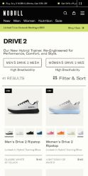
Offer on the page: Our New Hybrid Trainer. Re-Engineered for Performance, Comfort, and Style.
?What is a CRO score?
CRO stands for Conversion Rate Optimization: turning more of the visitors you already have into customers. This score (0 to 100) rates how well a landing page is built to convert, across 8 factors like offer, headline, speed, trust, and mobile. Read the full explainer →
Funnel score
8-point CRO breakdown
How well the landing page behind the ad is built to convert, scored across 8 factors: offer, copy, speed, trust, mobile, message-match, CTA, and social proof.
This collection page does well with clear product differentiation (Ripstop vs. standard Drive 2), abundant social proof (4.8-5.0 star ratings on nearly every product), and strong visual presentation of 41 shoe variants. However, it suffers from critical speed issues (PageSpeed 26/100), weak headline-to-ad alignment (generic "Drive 2" vs. specific ad messaging about Ripstop/breathability), and a buried CTA that requires scrolling past a full product grid. The email signup offer at the bottom (25% off) is compelling but comes too late in the funnel, and the modal CTA options ("Of Course. Lock it in" vs. "Pass, I'll Pay Full Price") are confusing rather than clear.
What this page does right. Steal these.
- Social proof9/10
- Offer clarity7/10
Where it leaks conversions
- Call to action3/10
- Page speed3/10
- Message match3/10
- Headline4/10
Full breakdown
Call to action
3/10Primary CTA 'Shop now' is buried in the ad copy and not prominently featured on the page; the main interaction is clicking individual products, with a confusing modal CTA at the very bottom.
- Individual product cards are clickable and lead to product pages
- Modal at bottom offers two clear options: 'Of Course. Lock it in' and 'Pass, I'll Pay Full Price'
- 'Shop now' CTA from ad is not visible as a prominent button on the collection page
- No above-the-fold CTA button to drive immediate action
- Modal CTA language is confusing and doesn't clearly communicate the offer ('Lock it in' is vague)
Page speed
3/10PageSpeed score of 26/100 converts to approximately 2.6/10, indicating severe performance issues that will harm user experience and conversions.
- PageSpeed score of 26/100 is critically low
- Large product grid with many high-resolution shoe images likely causing slow load times
- No visible lazy-loading or image optimization strategies
Trust signals
6/10Brand name (NOBULL) is visible, star ratings provide some credibility, but no security badges, guarantees, or customer testimonials are shown.
- NOBULL brand logo visible in header
- Star ratings (4.8-5.0) on products build credibility
- Professional product photography and clean layout suggest legitimacy
- No security badges, SSL indicators, or trust seals visible
- No money-back guarantee, return policy, or warranty information visible above the fold
- No customer testimonials, case studies, or brand authority signals
Mobile experience
6/10Layout appears responsive with stacked product grid, but the page speed issue (26/100) likely causes poor mobile experience and slow load times.
- Product grid appears to stack vertically for mobile viewing
- Touch-friendly product cards with color swatches
- Filter & Sort button is accessible for mobile users
- Extremely slow page speed (26/100) will cause poor mobile experience and high bounce rates
- No visible mobile-specific optimizations or fast-loading image strategies
- Modal CTA at bottom may be difficult to interact with on small screens
Headline
4/10The headline 'Drive 2' is generic and doesn't match the ad's specific messaging about Ripstop or breathability distinctions.
- Subheading 'Our New Hybrid Trainer. Re-Engineered for Performance, Comfort, and Style' adds context
- Clear product category identification
- Headline 'Drive 2' is vague and doesn't differentiate Ripstop from standard variant
- Doesn't echo ad primary text about 'locked-in for dynamic training' or 'breathable for fast-paced training'
- No value proposition or benefit-driven language in main headline
Social proof
9/10Nearly every product displays 4.8-5.0 star ratings, with 'NEW COLOR' and 'NEW' badges adding freshness signals throughout the grid.
- Star ratings (4.8-5.0) visible on almost every product tile in the grid
- Multiple 'NEW COLOR' and 'NEW' badges signal recent additions and active product development
- Color variant options with visual swatches show product popularity and customization
- No review count displayed (e.g., '4.9 stars from 2,100 reviews') to quantify social proof
- No customer testimonials or quotes visible on the page
- No trust badges, certifications, or brand authority signals
Message match
3/10Ad emphasizes specific product variants (Ripstop vs. breathable) and their use cases, but the page headline and layout don't reinforce these distinctions clearly.
- Product tabs at top do distinguish between variants with 'High Breathability' labels
- Product descriptions mention 'Locked-In' and 'Lightweight' variants matching ad messaging
- Headline 'Drive 2' doesn't mention Ripstop or breathability from the ad
- Ad's specific messaging about 'dynamic training' vs. 'fast-paced training' is not reflected in page copy
- No clear visual hierarchy guiding users to the specific variant mentioned in the ad
Offer clarity
7/10The page clearly distinguishes Drive 2 Ripstop (locked-in) from Drive 2 (breathable), but the primary offer is product selection, not a specific deal or discount until the footer.
- Two clear product tabs at top: 'MEN'S DRIVE 2 MESH' and 'WOMEN'S DRIVE 2 MESH' with 'High Breathability' labels
- Product descriptions explicitly state 'Locked-In Hybrid Training Shoe' vs. 'Lightweight Hybrid Training Shoe'
- Consistent $150 pricing across all variants shown
- No prominent discount or special offer visible above the fold
- 25% off first order is buried in footer email signup, not featured on collection page
- Unclear which Drive 2 variant matches the ad's messaging about 'Ripstop' vs. 'breathable'
Your own page
That is one page's teardown. Now get your own.
Same 8-factor rubric, same evidence-backed notes, on your landing page instead of theirs. Free, no signup, about 30 seconds.
Free, no signup, no card. The same 8 factor score every page here was graded on.
Keep exploring
Captured from the public page at nobullproject.com; ad data from the public Meta Ad Library. Funnelens is not affiliated with NOBULL or Meta. See data sources.