Olipop landing page teardown
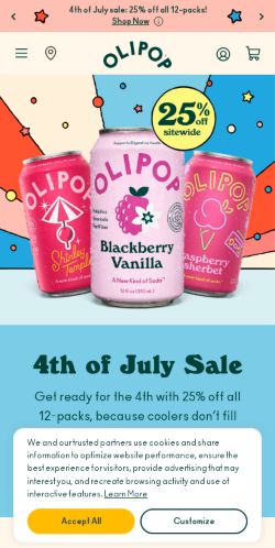
The page at drinkolipop.com has been the destination of a Olipop Facebook ad for 73 days. We captured it and scored it 56/100 on the 8-point CRO checklist below.
Offer on the page: Real ingredients. Real refreshment. Real digestive health support.
?What is a CRO score?
CRO stands for Conversion Rate Optimization: turning more of the visitors you already have into customers. This score (0 to 100) rates how well a landing page is built to convert, across 8 factors like offer, headline, speed, trust, and mobile. Read the full explainer →
Funnel score
8-point CRO breakdown
How well the landing page behind the ad is built to convert, scored across 8 factors: offer, copy, speed, trust, mobile, message-match, CTA, and social proof.
OLIPOP's landing page excels at brand storytelling with vibrant visuals, clear product differentiation (9g vs 6g fiber lines), and strong social proof from major publications (Bloomberg, Forbes, BuzzFeed). However, it suffers from poor mobile performance (PageSpeed 40/100), a generic headline that doesn't match the ad's picnic/summer positioning, and CTAs scattered throughout rather than optimized for conversion. The page builds trust through retail partnerships and ingredient transparency but fails to capitalize on the seasonal, social angle the ad promises.
What this page does right. Steal these.
- Social proof8/10
- Offer clarity8/10
- Trust signals7/10
Where it leaks conversions
- Mobile experience3/10
- Message match3/10
- Page speed4/10
- Headline4/10
- Call to action5/10
Full breakdown
Call to action
5/10Multiple CTAs exist but lack hierarchy; primary 'Shop Now' button is prominent above-the-fold but secondary CTAs dilute focus.
- Primary 'Shop Now' button is large, yellow, and high-contrast above the fold
- Secondary CTAs ('Shop 9g Fiber', 'Shop 6g Fiber') are action-oriented and specific
- Final 'Find In Store' CTA provides alternative conversion path
- At least 6 different CTAs scattered throughout page create decision paralysis
- No urgency messaging (limited time, stock, etc.) on any CTA
- CTAs don't match ad CTA language ('Shop now' vs 'Shop Now')
Page speed
4/10PageSpeed score of 40/100 converts to approximately 4/10, indicating poor performance.
- PageSpeed 40/100 is well below acceptable thresholds
- Multiple high-resolution product images and hero sections will load slowly
- Likely causes high bounce rates on mobile devices
Trust signals
7/10Multiple trust signals present: retail partnerships, media mentions, ingredient transparency, and certifications.
- Retail availability shown with major partners (Walmart, Instacart, Whole Foods, Target)
- Media mentions from established publications (Bloomberg, Forbes, BuzzFeed)
- Ingredient transparency section with proprietary OLISMART blend explanation
- No visible customer review count or ratings
- No money-back guarantee or satisfaction guarantee visible above fold
- Limited transparency on pricing or shipping costs (only '$3.99 flat rate' mentioned in header)
Mobile experience
3/10Page layout appears responsive but PageSpeed score of 40 indicates severe mobile performance issues.
- Navigation menu appears accessible on mobile (hamburger icon visible)
- Product images scale appropriately in visible sections
- PageSpeed 40/100 indicates slow load times, poor Core Web Vitals
- Multiple large image sections will cause slow rendering on mobile
- Email signup form and footer links may be difficult to interact with on small screens
Headline
4/10The headline 'The feel good soda' is generic and doesn't match the ad's picnic/summer social positioning.
- Emotionally resonant language ('feel good') aligns with wellness positioning
- Doesn't reference the seasonal/picnic context promised in the ad
- Vague and could apply to any wellness beverage
- Misses the social/gathering angle ('call your friends') from the ad
Social proof
8/10Strong media mentions and user-generated content visible throughout the page.
- Major publication logos (Bloomberg, Forbes, BuzzFeed, Bustle) displayed prominently mid-page
- User testimonial quote: 'It's gently sweet and creamy, and almost drinks like a dessert' with attributed media sources
- User-generated content section showing real person drinking OLIPOP with colorful design overlay
- No star ratings or numerical review counts visible
- No customer testimonials with names or specific use cases
Message match
3/10Ad emphasizes summer picnics and social gatherings; page focuses on product specs and health benefits with no seasonal or social context.
- Product imagery shows drinks in appealing contexts
- Colorful, vibrant design matches ad aesthetic
- Ad's picnic/summer theme completely absent from page copy
- Ad's social gathering angle ('call your friends') not reflected anywhere
- Page leads with health/fiber benefits; ad leads with lifestyle/fun
Offer clarity
8/10The product's core benefit is clearly stated: real ingredients, real refreshment, and digestive health support via fiber.
- Fiber content prominently labeled on product cards (9g, 6g options)
- Clear product differentiation by fiber line with dedicated sections
- Ingredient transparency emphasized in 'Made with real ingredients' section
- Multiple CTAs ('Shop Now', 'Add 12 Pack', 'Shop 9g Fiber', 'Shop 6g Fiber') create unclear primary conversion path
- Offer details (pricing, bundle options) not visible in above-the-fold area
Your own page
That is one page's teardown. Now get your own.
Same 8-factor rubric, same evidence-backed notes, on your landing page instead of theirs. Free, no signup, about 30 seconds.
Free, no signup, no card. The same 8 factor score every page here was graded on.
Keep exploring
Captured from the public page at drinkolipop.com; ad data from the public Meta Ad Library. Funnelens is not affiliated with Olipop or Meta. See data sources.