TEMPTU landing page teardown
The page at temptu.com has been the destination of a TEMPTU Facebook ad for 93 days. We captured it and scored it 46/100 on the 8-point CRO checklist below.
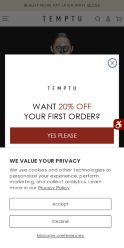
Offer on the page: 20% OFF YOUR FIRST ORDER
?What is a CRO score?
CRO stands for Conversion Rate Optimization: turning more of the visitors you already have into customers. This score (0 to 100) rates how well a landing page is built to convert, across 8 factors like offer, headline, speed, trust, and mobile. Read the full explainer →
Funnel score
8-point CRO breakdown
How well the landing page behind the ad is built to convert, scored across 8 factors: offer, copy, speed, trust, mobile, message-match, CTA, and social proof.
This landing page shows a popup modal offering 20% off the first order, which is a strong conversion incentive. However, the page suffers from critical issues: the main headline visible is buried inside a discount popup rather than being the primary page headline, making it impossible to assess the actual page headline or offer clarity. The page appears to be mostly blank white space in the above-the-fold area, suggesting either a loading issue or poor initial content hierarchy. While the CTA buttons are clear and the mobile layout appears functional, the lack of visible product information, social proof, or trust signals in the main page content significantly undermines conversion potential. The popup itself is well-designed with clear options, but it's obscuring what should be the core value proposition.
What this page does right. Steal these.
- Call to action8/10
- Page speed7/10
- Mobile experience7/10
Where it leaks conversions
- Social proof1/10
- Trust signals2/10
- Message match3/10
Full breakdown
Call to action
8/10The primary CTA 'YES PLEASE' is prominently displayed in a dark red button with high contrast, making it highly visible and clickable.
- Primary CTA 'YES PLEASE' uses high-contrast dark red button
- CTA is large and easy to tap on mobile
- Secondary 'NO THANKS' option provides clear alternative path
- CTA is inside a popup modal rather than on the main page
- No visible primary CTA on the main landing page itself
Page speed
7/10PageSpeed score of 67 converts to approximately 7/10, indicating acceptable but not excellent performance.
- Score of 67 is in the acceptable range for mobile performance
- Not in the 'good' range (90+) that would indicate fast loading
- Room for optimization to improve user experience
Trust signals
2/10The page lacks essential trust signals: no customer reviews, testimonials, security badges, company information, or credibility markers are visible.
- TEMPTU branding is present
- Privacy policy link is visible at the bottom
- No customer reviews or ratings visible
- No security badges or trust certifications shown
- No company information, credentials, or social proof
Mobile experience
7/10The page appears to be mobile-optimized with a responsive layout, clear button sizing, and readable text, though the large blank space suggests potential layout issues.
- Buttons are large and easily tappable on mobile
- Text is readable and properly sized
- Popup modal is full-width and mobile-friendly
- Excessive white space may indicate poor mobile layout or loading issues
- No visible navigation or menu structure in the screenshots
Headline
not assessedThe main page headline is not visible in any of the screenshots; only a popup headline 'WANT 20% OFF YOUR FIRST ORDER?' is shown, which is not the page's primary headline.
- No main page headline visible in above-the-fold area
- Only popup headline visible, which is not the page's primary headline
- Large blank white space where headline should be
Social proof
1/10No customer reviews, testimonials, ratings, user-generated content, or any social proof elements are visible anywhere on the page.
- No star ratings or review counts visible
- No customer testimonials or quotes
- No user-generated content, brand logos, or trust badges visible
Message match
3/10The ad emphasizes 'Bridal Glow, Powered by TEMPTU' and professional bridal makeup, but the landing page only shows a generic 20% off popup with no bridal-specific messaging or imagery.
- TEMPTU branding is visible in the popup
- No bridal-specific messaging visible on the page
- No imagery of bridal makeup or the professional use case mentioned in the ad
- Generic discount offer doesn't match the premium bridal positioning in the ad
Offer clarity
6/10The popup clearly states '20% OFF YOUR FIRST ORDER' but the main page offer is completely obscured by the modal, making it impossible to assess the primary offer.
- Popup clearly displays '20% OFF' in large text
- Discount percentage is prominent and easy to understand
- Two distinct CTA options (YES PLEASE / NO THANKS) make the choice clear
- Main page offer is completely hidden behind the popup modal
- No visible product information or pricing on the main page
- Unclear what the actual landing page offer is beyond the discount popup
Your own page
That is one page's teardown. Now get your own.
Same 8-factor rubric, same evidence-backed notes, on your landing page instead of theirs. Free, no signup, about 30 seconds.
Free, no signup, no card. The same 8 factor score every page here was graded on.
Keep exploring
Captured from the public page at temptu.com; ad data from the public Meta Ad Library. Funnelens is not affiliated with TEMPTU or Meta. See data sources.