Bowflex
Facebook · Instagram · Audience Network · Image
The ad
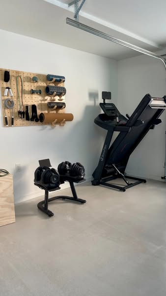
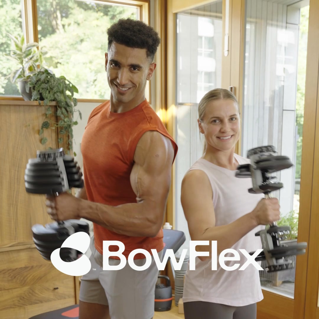
If you’ve been thinking about building a home gym, this is it. Score up to $500 off, plus free shipping on select products. 🤩
Build Your Dream Gym For Less 😍
Shop nowThe funnel behind it

Offer: Score up to $500 off, plus free shipping on select products
Funnel score
8-point CRO breakdown
How well the landing page behind the ad is built to convert, scored across 8 factors: offer, copy, speed, trust, mobile, message-match, CTA, and social proof.
BowFlex's landing page excels at emotional branding with vibrant visuals, a clear product category structure, and strong message alignment with the "movement" theme. However, it significantly underperforms on conversion mechanics: the primary CTA is vague ("Learn More" instead of "Shop Now"), the discount offer is buried and not prominently displayed above the fold, and there's no urgency or scarcity messaging. The page also suffers from slow load times (58/100 PageSpeed) and lacks visible social proof like reviews or testimonials. While the design is modern and mobile-responsive, the lack of a clear, prominent discount announcement at the top and weak CTAs create friction for deal-seeking visitors from the ad.
What this funnel does right. Steal these.
- Mobile experience7/10
- Headline7/10
Where it's weak
- Social proof2/10
- Call to action3/10
- Message match3/10
- Trust signals4/10
- Offer clarity4/10
Full breakdown
Call to action
3/10Primary CTAs are vague 'Learn More' buttons that don't match the ad's 'Shop Now' call-to-action or create purchase intent.
- CTAs are visually distinct with black buttons and white text
- Multiple CTAs present throughout the page for different products
- Primary CTA says 'Learn More' instead of 'Shop Now' or 'Buy Now'
- No urgency language like 'Limited Time' or 'Shop Sale'
- CTA doesn't match the ad's 'Shop now' messaging, creating disconnect
Page speed
6/10PageSpeed score of 58/100 converts to approximately 5.8, indicating below-average performance with room for improvement.
- Page structure appears relatively clean without excessive bloat
- PageSpeed score of 58 indicates slow load times
- Multiple high-resolution images may contribute to slow performance
- Likely impacts mobile user experience and conversion rates
Trust signals
4/10The page lacks customer reviews, security badges, guarantees, or other trust signals; only brand logos (Schwinn, JRNY) are visible.
- Schwinn and JRNY brand logos shown, indicating parent company backing
- Professional design and high-quality product photography
- No customer reviews or ratings visible
- No money-back guarantee or return policy mentioned
- No security badges or SSL indicators visible
Mobile experience
7/10The page appears responsive with stacked layouts, readable text, and touch-friendly buttons suitable for mobile viewing.
- Single-column layout optimized for mobile screens
- Large, tappable buttons and category cards
- Text is readable without horizontal scrolling
- Navigation menu is collapsed but accessible
- Some product images may load slowly on mobile due to page speed issues
Headline
7/10The headline 'Fuel a love of movement' is emotionally resonant and brand-aligned, though it doesn't mention the sale or discount.
- Emotionally compelling and action-oriented language
- Aligns with brand philosophy ('Fitness should feel good')
- Large, readable typography with strong visual hierarchy
- Doesn't mention the sale, discount, or promotional offer
- Doesn't create urgency or scarcity
- Generic enough that it could apply to any fitness brand
Social proof
2/10The page contains no visible customer reviews, ratings, testimonials, or trust badges throughout all four sections.
- No star ratings or review counts visible anywhere on the page
- No customer testimonials or success stories
- No trust badges, certifications, or third-party validation shown
Message match
3/10The ad promises '$500 off + free shipping' and 'Build Your Dream Gym For Less,' but the landing page doesn't prominently feature these offers or sale messaging.
- Page features home gym products that align with 'Build Your Dream Gym' concept
- Product categories match the types of equipment mentioned in ad context
- No '$500 off' or discount messaging visible on the page
- No 'free shipping' callout anywhere
- Hero headline 'Fuel a love of movement' doesn't match ad's 'Build Your Dream Gym For Less' messaging
Offer clarity
4/10The $500 discount offer is not visible in the hero section or above the fold; it only appears in the ad text, not on the page itself.
- Product categories are clearly labeled with icons (Bikes, Max Trainers, Home Gyms, etc.)
- Featured products have descriptive text explaining benefits
- No discount amount or 'up to $500 off' messaging visible in hero or top section
- No free shipping callout on the page
- Offer details are completely absent from above-the-fold content
More ads from Bowflex
View all →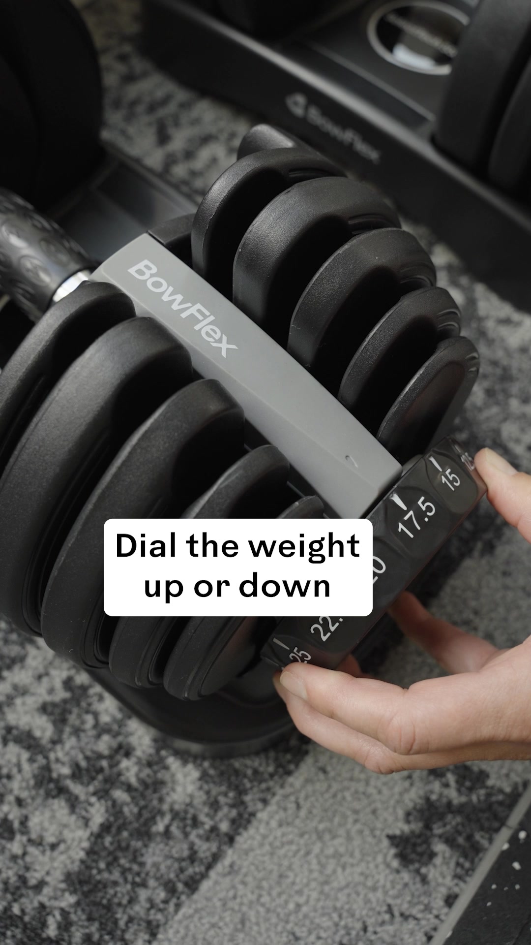

Your own page
You just read somebody else's funnel. What does yours score?
The score above came from the real landing page behind this ad, graded on 8 CRO factors. Run your own page through the same rubric, free, and see what each factor found and where you give up the most ground.
Free, no signup, no card. The same 8 factor score every page here was graded on.
Keep exploring
Data from the public Meta Ad Library. Funnelens is not affiliated with or endorsed by Meta. See data sources.