Bowflex
Facebook · Instagram · Audience Network · Video
The ad
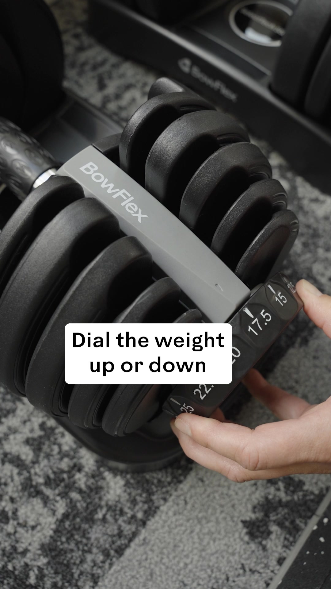
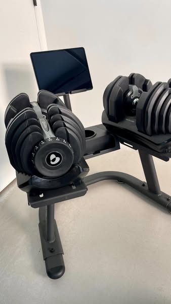
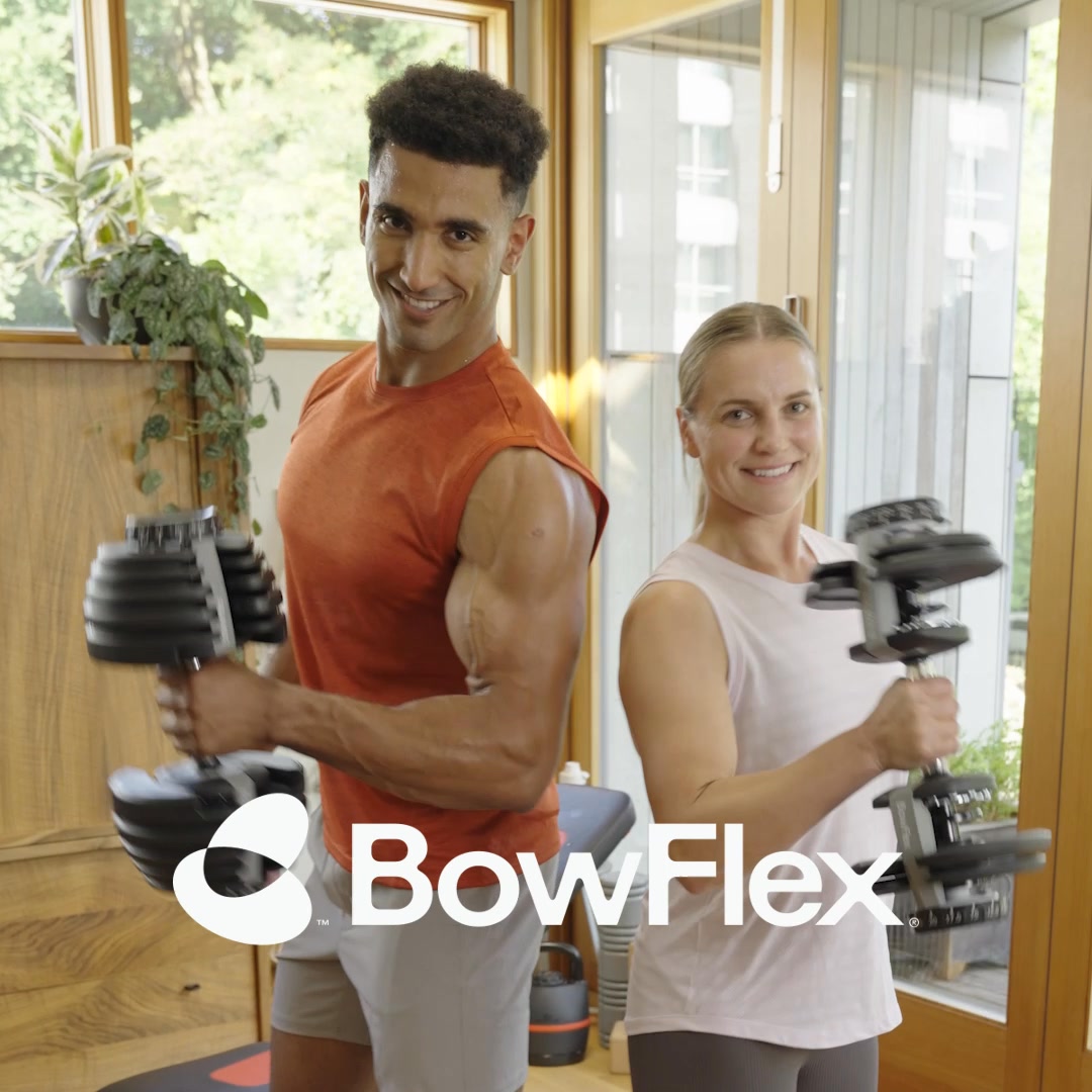
Discover innovative equipment that adapts to you, making every workout and home gym space personal and intuitive to use.
Big on strength. Small on space.
Shop nowThe funnel behind it

Offer: Discover your strength with weights that dial up to 24 kg per dumbbell.
Funnel score
8-point CRO breakdown
How well the landing page behind the ad is built to convert, scored across 8 factors: offer, copy, speed, trust, mobile, message-match, CTA, and social proof.
BowFlex's landing page excels at emotional branding with vibrant visuals, a clear product focus on adjustable weights, and strong category navigation. However, it suffers from poor message-to-ad alignment—the ad promises "small on space" and "adapts to you," but the page emphasizes "love of movement" and fitness feeling good, with limited emphasis on space-saving or adaptability. The page lacks specific social proof (no reviews, testimonials, or user counts visible), and the primary CTA is a generic "Learn More" rather than a direct purchase call. Mobile optimization appears solid, but the page speed is poor (51/100), which will hurt conversion rates. The offer clarity is moderate—while the 552i Dumbbells are featured with a specific spec (24 kg), the broader product range and value proposition could be clearer upfront.
What this funnel does right. Steal these.
- Mobile experience7/10
Where it's weak
- Social proof1/10
- Message match3/10
- Call to action4/10
- Page speed5/10
- Trust signals5/10
- Headline5/10
Full breakdown
Call to action
4/10The primary CTA 'Learn More' is generic and non-committal, appearing twice on the page with no sense of urgency or clear next step.
- CTAs are visually distinct with black background and white text
- Positioned after product descriptions where interest is highest
- Appears multiple times (at least twice visible) to increase conversion opportunities
- 'Learn More' is vague and doesn't create urgency or clarity about what happens next
- No primary 'Shop Now' or 'Buy Now' CTA visible despite the ad saying 'Shop now'
- No sense of scarcity, limited-time offer, or incentive to act immediately
Page speed
5/10PageSpeed score of 51/100 converts to approximately 5/10, indicating slow load times that will negatively impact user experience and conversion rates.
- PageSpeed score of 51 indicates significant performance issues
- Multiple high-resolution images throughout the page likely contribute to slow loading
- Slow page speed will increase bounce rate and reduce conversion likelihood
Trust signals
5/10The page shows brand identity (BowFlex/Schwinn/JRNY) and professional design, but lacks trust signals like reviews, security badges, guarantees, or company information.
- Professional design with high-quality product photography
- Established brand names visible (BowFlex, Schwinn, JRNY) at top and bottom
- Footer includes Privacy Policy and Terms of Use links
- No customer reviews, ratings, or testimonials visible
- No money-back guarantee, warranty information, or risk-reversal statement
- No security badges, trust seals, or third-party certifications visible
Mobile experience
7/10The page appears well-optimized for mobile with stacked layouts, readable text, and touch-friendly category cards, though some elements could be tighter.
- Category cards (Bikes, Max Trainers, etc.) are stacked vertically and appropriately sized for mobile
- Large, readable headline and subheading text with good contrast
- Product images scale responsively and maintain visual impact
- Navigation menu appears compact but could be clearer on mobile
- Some whitespace could be reduced to improve mobile scrolling efficiency
- CTA buttons could be larger for easier mobile tapping
Headline
5/10The headline 'Fuel a love of movement' is emotionally resonant but generic and doesn't differentiate the product or communicate the core value proposition.
- Emotionally engaging language that appeals to fitness motivation
- Large, bold typography makes it prominent above the fold
- Supported by subheading 'Fitness should feel good' that reinforces the emotional angle
- Doesn't mention the product category (weights, dumbbells, adjustable equipment)
- Doesn't communicate space-saving or adaptability despite the ad's focus on 'small on space'
- Generic enough to apply to any fitness brand, lacks differentiation
Social proof
1/10The page contains no visible customer reviews, testimonials, ratings, user counts, or any form of social proof across all four sections.
- No star ratings or review counts visible anywhere on the page
- No customer testimonials or quotes featured
- No mention of user base size, awards, or third-party validation
Message match
3/10Poor alignment between ad messaging and page content: ad emphasizes 'small on space' and 'adapts to you,' but page focuses on 'love of movement' and emotional fitness benefits.
- Both ad and page feature BowFlex/adjustable weight products
- Page shows product categories that align with 'innovative equipment' claim
- JRNY Digital Fitness section mentions 'adaptive' which loosely connects to 'adapts to you'
- Ad headline 'Big on strength. Small on space' is not reflected in page messaging
- Page emphasizes emotional/lifestyle benefits while ad emphasizes product features (space, adaptability)
- No mention of space-saving benefits or compact design on the visible page sections
Offer clarity
6/10The 552i Dumbbells feature a specific weight spec (24 kg), but the broader offer and value proposition lack clarity for visitors unfamiliar with the product line.
- Specific product spec visible: 'weights that dial up to 24 kg per dumbbell'
- Clear product categories shown (Bikes, Max Trainers, Home Gyms, Treadmills, Weights, JRNY Digital Fitness)
- Featured products section highlights two key items with descriptions
- No pricing information visible on the page
- Vague tagline 'Fuel a love of movement' doesn't explain what makes this product special
- No clear explanation of the 'adjustable' feature that the URL emphasizes
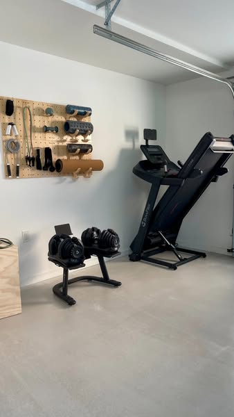
More ads from Bowflex
View all →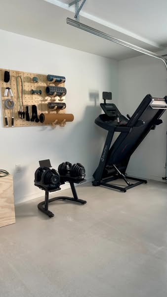

Your own page
You just read somebody else's funnel. What does yours score?
The score above came from the real landing page behind this ad, graded on 8 CRO factors. Run your own page through the same rubric, free, and see what each factor found and where you give up the most ground.
Free, no signup, no card. The same 8 factor score every page here was graded on.
Keep exploring
Data from the public Meta Ad Library. Funnelens is not affiliated with or endorsed by Meta. See data sources.