Echelon
Facebook · Instagram · Audience Network · Video
The ad

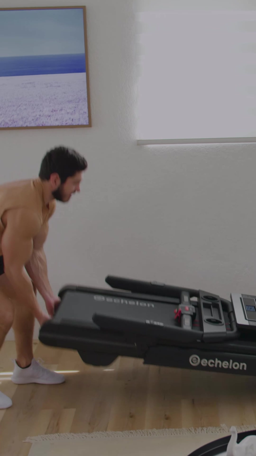
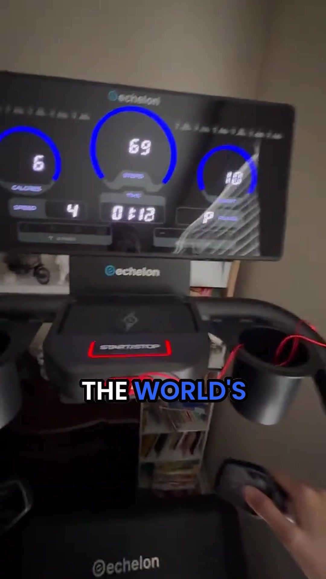
There is one machine at every serious gym with a queue behind it. The stairmill. Nothing delivers the same combination of glute activation, calorie burn, and low-impact intensity per session. And until now, it has never existed for the home. Commercial stairmills fail the residential test on three counts. Too tall for standard ceilings. Too loud for a household. Safety systems designed for supervised gyms, not families. Echelon spent years solving all three. The Summit Stairmill Home S-22 fits under a 9-foot ceiling. Its near-silent drive system handles early-morning sessions without disturbing anyone. A safety system built specifically to residential standards: emergency stop magnetic clip, motion sensor auto-stop under the bottom step, weight activation sensor, and lower handrail stop button. Performance is not a compromise. A 30-degree incline. 14 to 140 steps per minute. Full rotating stairs that engage glutes, hamstrings, quads, and core on every rep. 350-pound user weight. The 22-inch HD touchscreen puts the Echelon Fit app directly in your session: live and on-demand climb classes, Echelon AI training plans, scenic routes, FitOS streaming, and Echelon Worlds. MagSafe wireless charging and LED side lighting included. Get the Echelon Summit Stairmill Home S-22. The machine you have been commuting to is now at home.
Summit Stairmill Home S-22 🔥
Shop nowThe funnel behind it

Funnel score
8-point CRO breakdown
How well the landing page behind the ad is built to convert, scored across 8 factors: offer, copy, speed, trust, mobile, message-match, CTA, and social proof.
What this funnel does right. Steal these.
- Call to action9/10
- Social proof9/10
- Offer clarity9/10
- Trust signals8/10
- Message match8/10
- Mobile experience7/10
- Headline7/10
Full breakdown
Call to action
9/10Primary CTA 'CLAIM $400 OFF!' is large, blue, high-contrast, and positioned prominently with urgency signals (low stock, countdown timer) directly above it.
- Large blue button with white text 'CLAIM $400 OFF!' is highly visible and action-oriented
- Low Stock warning and countdown timer (08:15:34) create immediate urgency
- Secondary CTAs visible throughout (navigation buttons at bottom for carousel testimonials)
Page speed
6/10PageSpeed score of 56 converts to approximately 5.6 on 0-10 scale, indicating slow load times that could hurt conversion.
- PageSpeed score of 56 is below acceptable threshold (should be 70+)
- Multiple high-resolution product images may be slowing page load
- Heavy interactive elements (carousel, countdown timer) may impact performance
Trust signals
8/10Strong trust signals: 69k+ verified reviews, Trustpilot 'Excellent' rating, verified buyer testimonials, media mentions (Men's Health, LiveScience), 'Designed & Made in USA' badge, and specific safety certifications mentioned.
- Trustpilot 'Excellent' badge with 2,075 reviews and green stars
- Verified buyer badges on testimonials (Rachel M., Bianca S.)
- 'Designed & Made in USA' badge visible at bottom with American flag
- Media logos (Men's Health, LiveScience) are shown but without context or links to articles
- No visible security badges (SSL, payment security) in the screenshot
Mobile experience
7/10Page appears mobile-responsive with stacked layout, but bottom navigation bar suggests mobile optimization; however, some elements like the countdown timer and feature list may be cramped on small screens.
- Bottom navigation bar (Home, Equipment, Membership, Cart, Search) is mobile-friendly
- Images are responsive and scale appropriately
- Text is readable with good contrast
- Countdown timer display (07 HRS, 15 MINS, 22 SECS) may be hard to read on mobile
- Feature list with checkmarks could be cramped on small screens
Headline
7/10The main headline 'Burn More Calories in Less Time' is benefit-driven but generic; the page's top headline 'Feel Good Spring: Refresh Your Gear, Ignite Your Workout!' is seasonal but doesn't differentiate the product.
- Subheading '5 No-BS Reasons Anyone Who Wants to Get Fitter, Faster Needs This Stairmill at Home' is specific and benefit-focused
- Clear product positioning as '#1 Best-Selling Stairclimber in the USA' establishes authority
- Top banner headline is generic seasonal messaging, not product-specific
- Main body headline 'Burn More Calories in Less Time' lacks differentiation from competitors
Social proof
9/10Multiple strong social proof elements: 4.9/5.0 from 69k+ customers (shown twice), Trustpilot 'Excellent' rating with 2,075 reviews, verified buyer testimonials with photos, and '12k+ bought in past month' scarcity indicator.
- 4.9/5.0 stars from 69k+ customers displayed prominently near top and bottom
- Trustpilot 'Excellent' badge with 2,075 reviews and green star rating visible
- Verified buyer testimonials with photos (Rachel M., Bianca S.) showing real usage and results
- Testimonials are partially cut off in the screenshot, limiting full impact
Message match
8/10Strong alignment between ad copy and landing page: ad emphasizes residential-specific solutions (fits under 9-foot ceiling, quiet, safe), and page delivers exactly this with 5 reasons and detailed feature list.
- Ad's three main pain points (height, noise, safety) are addressed in Reasons #1-3 on page
- Ad's performance specs (30-degree incline, 14-140 steps/min, 350-lb capacity) match feature list
- Ad's screen/app features (22-inch HD touchscreen, Echelon Fit app, scenic routes) are highlighted in Reason #4
- Ad emphasizes 'commercial stairmills fail' but page doesn't explicitly contrast vs. competitors
Offer clarity
9/10The offer is crystal clear: a home stairmill with specific features (fits under 8-foot ceilings, quiet, safe, 22-inch screen) and a concrete discount ($400 off) with urgency (limited time, low stock).
- CLAIM $400 OFF button prominently displayed with blue CTA
- Low Stock warning with countdown timer (08:15:34) creates urgency
- Specific product name and model (Summit Stairmill Home S-22) repeated throughout
More ads from Echelon
View all →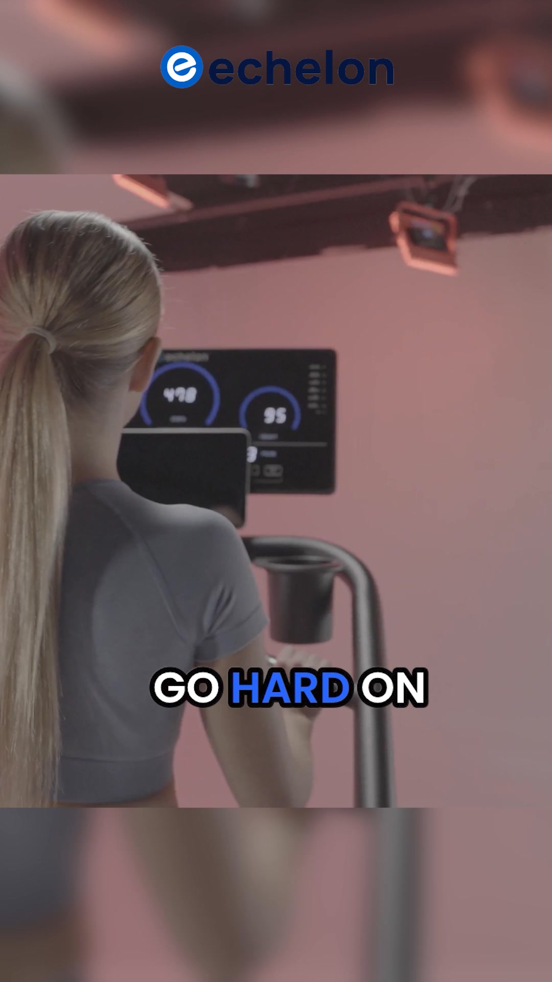
Your own page
You just read somebody else's funnel. What does yours score?
The score above came from the real landing page behind this ad, graded on 8 CRO factors. Run your own page through the same rubric, free, and see what each factor found and where you give up the most ground.
Free, no signup, no card. The same 8 factor score every page here was graded on.
Keep exploring
Data from the public Meta Ad Library. Funnelens is not affiliated with or endorsed by Meta. See data sources.