Echelon
Facebook · Instagram · Audience Network · Video
The ad
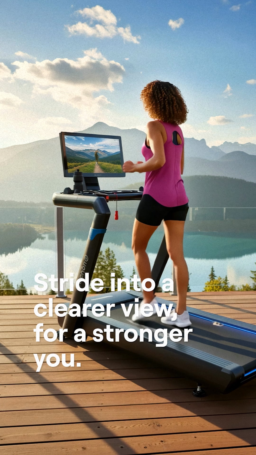
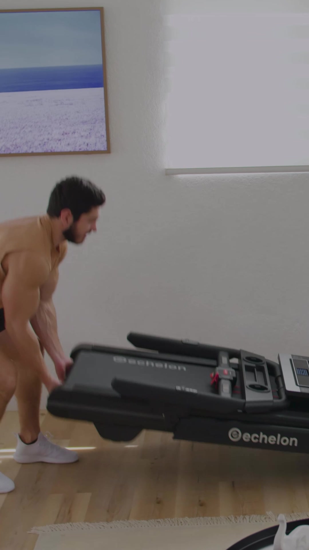
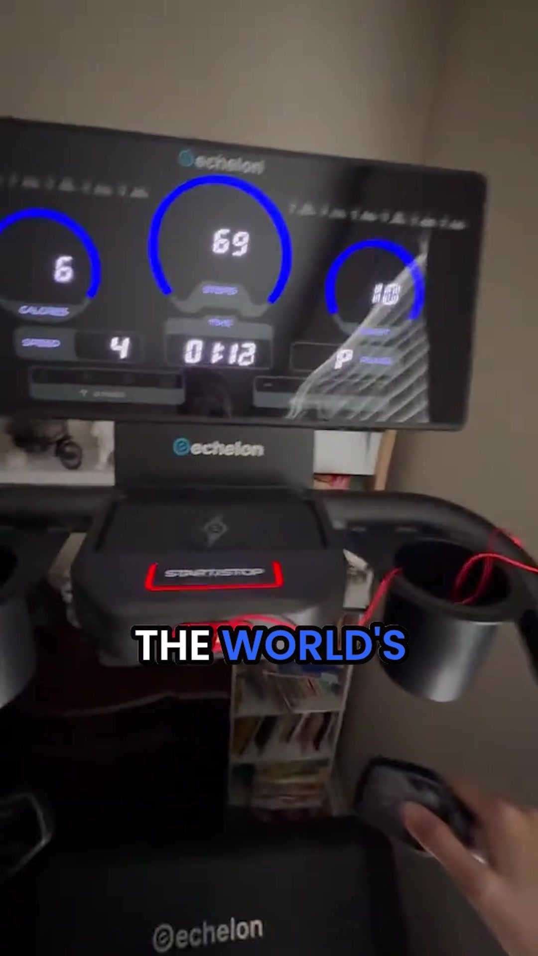
STOP Overpaying for Bulky Treadmills 🚨 I wanted a real treadmill. A long deck, enough speed to actually run, and a motor that would not struggle. I also needed it to fit in an apartment, stay quiet enough for 6am, and store somewhere other than blocking the bedroom door. Every treadmill I looked at solved one of those problems. Most solved none of them together. The Echelon Stride-6s-10 solves all of them. A 20.5 by 60-inch running surface wider and longer than most competitors. A 3.0 HP whisper-quiet brushless motor that reaches 12.5 MPH without disturbing anyone. A waterfall open-front deck that gives your stride room to move. 12 incline levels. The 10-inch HD touchscreen puts the Echelon Fit app directly in every session: live and on-demand classes, Echelon AI training that adapts as you improve, FitOS streaming, and gamified Echelon Worlds runs. Shared with up to five family members. One button folds it flat to 10 inches. Transport wheels move it without lifting. Runner's World Editor's Top Pick. Get the Echelon Stride-6s. A full-performance treadmill with nowhere to hide.
Echelon Stride 6 - Studio Workouts, Half Price 🔥
Shop nowThe funnel behind it

Offer: GET 17% OFF STRIDE-6, DON'T MISS OUT! (with countdown timer showing 07 days, 15 hours, 22 seconds)
Funnel score
8-point CRO breakdown
How well the landing page behind the ad is built to convert, scored across 8 factors: offer, copy, speed, trust, mobile, message-match, CTA, and social proof.
This page excels at social proof (69k+ verified customers, 4.9/5 stars, Forbes/Livestrong mentions, multiple verified buyer testimonials) and trust signals (Trustpilot reviews, "Designed & Engineered in the USA" badge, low-stock urgency). The headline is compelling and benefit-driven, and the offer is crystal clear with a countdown timer creating urgency. However, the page suffers from weak message-match with the ad (ad emphasizes quiet motor and apartment-friendly design; page leads with "5 reasons" listicle format that doesn't directly mirror ad copy). Mobile optimization appears solid but the page speed is sluggish (61/100 = 6/10). The CTA is prominent and repeated, though the primary button could be more action-oriented. The offer clarity is strong with explicit discount amount and scarcity messaging.
What this funnel does right. Steal these.
- Trust signals9/10
- Social proof9/10
- Offer clarity9/10
- Call to action8/10
- Headline8/10
- Mobile experience7/10
Where it's weak
- Message match5/10
Full breakdown
Call to action
8/10Primary CTA 'CLAIM $300 CAD OFF!' is large, blue, and prominently placed; repeated throughout page with consistent messaging.
- Large blue button with high contrast makes CTA stand out
- Action verb 'CLAIM' creates sense of urgency and ownership
- CTA repeated multiple times down the page maintains visibility
- Button text could be more direct (e.g., 'Get $300 Off Now' vs 'Claim')
Page speed
6/10PageSpeed score of 61/100 converts to approximately 6/10, indicating room for improvement in load time and performance.
- PageSpeed score of 61 is below optimal (target 80+)
- Multiple high-resolution images throughout page may slow load
- Countdown timer and dynamic elements may impact performance
Trust signals
9/10Strong trust signals throughout: verified customer reviews, major media mentions (Forbes, Livestrong), Trustpilot certification, 'Designed & Engineered in the USA' badge, verified buyer badges, and specific customer testimonials with photos.
- Forbes and Livestrong logos establish media credibility
- 'Designed & Engineered in the USA' badge with flag graphic
- Trustpilot 4.9/5 rating with 2,075 reviews and verified buyer badges on testimonials
Mobile experience
7/10Page appears mobile-responsive with stacked layout, readable text, and touch-friendly buttons, though some elements could be optimized for smaller screens.
- Countdown timer is clearly visible and readable on mobile
- CTA buttons appear large and tappable
- Images are responsive and scale appropriately
- Text-heavy sections (reasons 1-5) may require excessive scrolling on mobile
- Some testimonial cards appear cramped on smaller screens
Headline
8/10Main headline is benefit-driven and specific, highlighting the core value proposition (replacing expensive treadmills).
- Specific comparison to $3,000 CAD treadmills creates clear value anchor
- Listicle format (5 reasons) signals structured, scannable content
- Mentions geographic specificity (Across Canada) adds relevance
- Doesn't directly address the ad's key selling points (quiet motor, apartment-friendly, folds flat)
Social proof
9/10Multiple layers of social proof: 69k+ verified customers, 4.9/5 stars, Forbes/Livestrong logos, verified buyer testimonials with photos, Trustpilot 4.9/5 with 2,075 reviews, and '12k+ bought in past month' metric.
- 4.9/5 from 69k+ Customers displayed prominently under headline
- Forbes and Livestrong logos with 'LIVESTRONG' badge visible
- Multiple verified buyer testimonials with photos and names (Lauren P., Jasmine W., Marcus J.)
Message match
5/10Page leads with listicle format highlighting 5 reasons, but ad emphasizes specific product features (quiet motor, apartment-friendly, folds flat, 60-inch deck, 12.5 MPH speed).
- Both page and ad emphasize value proposition vs. expensive competitors
- Page mentions foldability (Reason #4) which matches ad copy
- Page shows product images and real-world usage scenarios
- Ad's emphasis on quiet motor and 6am workouts not prominently featured in headline or early reasons
- Ad's specific technical specs (20.5x60 deck, 3.0 HP, 12.5 MPH, 12 incline levels) not visible in top sections
- Page structure (5 reasons listicle) doesn't mirror ad's narrative flow about solving multiple problems
Offer clarity
9/10Discount amount ($300 CAD off), percentage (17%), and urgency (countdown timer, low stock warning) are all explicitly stated.
- Countdown timer showing 07:15:22 creates time pressure
- $300 CAD OFF in large blue button at mid-page
- Low Stock warning with order deadline (09:15:34) near CTA
More ads from Echelon
View all →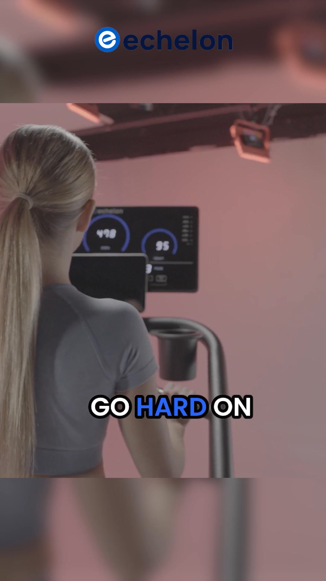

Your own page
You just read somebody else's funnel. What does yours score?
The score above came from the real landing page behind this ad, graded on 8 CRO factors. Run your own page through the same rubric, free, and see what each factor found and where you give up the most ground.
Free, no signup, no card. The same 8 factor score every page here was graded on.
Keep exploring
Data from the public Meta Ad Library. Funnelens is not affiliated with or endorsed by Meta. See data sources.