Echelon
Facebook · Instagram · Audience Network · Video
The ad
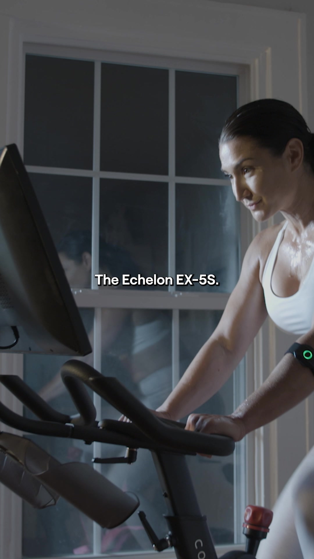
Showing up for yourself starts before the first pedal stroke. ✅ 22" HD touchscreen puts thousands of live & on-demand classes at your fingertips ✅ 38 resistance levels deliver a ride that meets every fitness level and goal ✅ Zero commute, zero wait, just clip in and ride when you're ready The Echelon EX-5s-22 was built for people who are done with excuses and ready to invest in themselves. Real studio energy. Real instructor coaching. Real results, delivered right to your home. Your ride is waiting. Visit Echelon Fit and make it yours today.
Echelon Connect EX-5s-22 🔥
Shop nowThe funnel behind it

Offer: GET 35% OFF CONNECT-EX-5S-22, DON'T MISS OUT!
Funnel score
8-point CRO breakdown
How well the landing page behind the ad is built to convert, scored across 8 factors: offer, copy, speed, trust, mobile, message-match, CTA, and social proof.
This page excels at social proof (69+ customer reviews, 4.9/5 stars, verified buyers, real photos, Trustpilot badge, "11k+ bought in past month") and trust signals (Tunnel to Towers partnership, "Designed & Made in USA" badge, multiple customer testimonials with images). The headline is benefit-driven and specific. However, the page suffers from poor mobile optimization—the layout appears cramped and difficult to navigate on smaller screens, with text that may be hard to read. The CTA is prominent but buried deep (requires significant scrolling). Offer clarity is strong with the 35% discount clearly stated at the top, but the page speed is critically slow (50/100), which will hurt conversion rates. Message match between the ad and page is good—both emphasize the 22" HD screen, resistance levels, and home convenience—but the ad's "38 resistance levels" claim doesn't match the page's "32 Levels of Electronic Magnetic Resistance" (Reason #2).
What this funnel does right. Steal these.
- Trust signals9/10
- Social proof9/10
- Headline8/10
- Offer clarity8/10
Where it's weak
- Mobile experience4/10
- Page speed5/10
Full breakdown
Call to action
6/10The primary CTA 'CLAIM $600 OFF!' is visually prominent with a bright blue button, but it's located at the bottom of the page requiring significant scrolling, and there's no secondary CTA above the fold.
- Bright blue button with white text stands out visually
- Action-oriented language ('CLAIM') creates urgency
- Dollar amount ($600) in CTA reinforces offer value
- CTA button only appears at the very bottom of the page, requiring full scroll to find
- No above-the-fold CTA to capture immediate interest
- No secondary CTAs throughout the content sections
Page speed
5/10Page speed score of 50/100 is critically slow, indicating significant performance issues that will negatively impact user experience and conversion rates.
- PAGESPEED_SCORE of 50 indicates slow loading times
- Multiple high-resolution images throughout page likely contribute to slow load
- Heavy content (5 detailed sections with images) may cause performance issues
Trust signals
9/10Strong trust signals throughout: Trustpilot badge with 2,075 Excellent reviews, verified buyer badges on testimonials, real customer photos, Tunnel to Towers partnership logo, 'Designed & Made in USA' badge, and specific customer quotes with names.
- Trustpilot badge showing 'Excellent' rating with 2,075 reviews
- Verified Buyer badges on customer testimonials
- Real customer photos and names with testimonials
Mobile experience
4/10Mobile optimization is poor; the layout appears cramped with text that's difficult to read, navigation is cumbersome, and images may not scale properly on smaller screens.
- Countdown timer is visible and readable on mobile
- Star ratings and social proof elements are present
- Text appears cramped and difficult to read on mobile screens
- Long-form content (5 reasons sections) not optimized for mobile scrolling
- CTA button is buried at bottom, requiring excessive scrolling on mobile
Headline
8/10The headline 'Why the Echelon Connect EX-5s-22 Is the Bike You've Been Waiting For' is benefit-driven, specific, and uses a proven listicle format (5 Reasons).
- Specific product name included (EX-5s-22)
- Benefit-focused language ('Bike You've Been Waiting For')
- Listicle format (5 Reasons) signals organized, scannable content
- Headline doesn't mention the discount or offer, missing opportunity to lead with the promotion
Social proof
9/10Exceptional social proof throughout: 4.9/5 stars from 69+ customers at top, Trustpilot badge with 2,075 reviews rated Excellent, verified buyer testimonials with photos, '11k+ bought in past month' scarcity claim, and multiple customer quotes with images.
- 4.9/5 star rating from 69+ customers displayed prominently near headline
- Trustpilot badge showing 'Excellent' rating with 2,075 reviews
- '11k+ bought in past month' creates social proof and scarcity
Message match
6/10Good alignment on key features (22" HD touchscreen, home convenience, real results) but a critical mismatch: ad claims '38 resistance levels' while page states '32 Levels of Electronic Magnetic Resistance' in Reason #2.
- Both ad and page emphasize 22" HD touchscreen with live/on-demand classes
- Both highlight zero commute and convenience of home workouts
- Both focus on real results and instructor coaching
- Ad claims '38 resistance levels' but page clearly states '32 Levels of Electronic Magnetic Resistance'
- Ad mentions 'Showing up for yourself' motivation angle not prominently featured on page
- Ad's 'done with excuses' messaging not reflected in page copy
Offer clarity
8/10The 35% discount is prominently displayed in the top banner with a countdown timer, making the offer immediately visible and time-sensitive.
- 35% OFF clearly stated in large text at top with fire emoji
- Countdown timer (07 HRS, 15 MINS, 22 SECS) creates urgency
- $600 OFF CTA button at bottom reinforces the discount value
- Discount percentage shown at top but actual dollar amount ($600) only appears in the CTA button at the very bottom
- No clear statement of final price or what the discount applies to specifically
More ads from Echelon
View all →

Your own page
You just read somebody else's funnel. What does yours score?
The score above came from the real landing page behind this ad, graded on 8 CRO factors. Run your own page through the same rubric, free, and see what each factor found and where you give up the most ground.
Free, no signup, no card. The same 8 factor score every page here was graded on.
Keep exploring
Data from the public Meta Ad Library. Funnelens is not affiliated with or endorsed by Meta. See data sources.