Hyperice
Facebook · Instagram · Messenger · Carousel
The ad
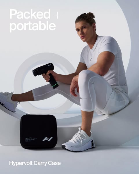
Consider this your sign to take recovery on the road. 🧳 Every Hypervolt 3 comes with a carry case included, not an add-on. Packed, portable, and ready. ⚡
Hyperice
Shop nowThe funnel behind it

Offer: Introductie van de Hypervolt 3. Krachtige percussiemassage, verfijnde ergonomie en doordacht ontworpen opzetstukkken komen samen in drie massage guns die met je meebewegen.
Funnel score
8-point CRO breakdown
How well the landing page behind the ad is built to convert, scored across 8 factors: offer, copy, speed, trust, mobile, message-match, CTA, and social proof.
This landing page showcases the Hypervolt 3 massage gun with strong visual hierarchy and product-focused content, but suffers from critical performance issues and weak social proof. The page excels at presenting multiple product lines (Hypervolt, Normatec, Venom, Hyperice Contrast 2, Vyper, Hypersphere) with clear CTAs and professional imagery, creating good message match with the ad's emphasis on portability and the included carry case. However, the extremely slow page speed (33/100) is a major liability, and there's minimal social proof—no customer reviews, testimonials, or trust signals visible across the entire page. The headline is clear but generic, and while the offer is well-explained through product descriptions, the page relies heavily on product education rather than conversion psychology.
What this funnel does right. Steal these.
- Offer clarity8/10
- Call to action7/10
- Mobile experience7/10
- Message match7/10
Where it's weak
- Social proof2/10
- Page speed3/10
- Trust signals4/10
Full breakdown
Call to action
7/10Multiple clear CTAs are present throughout the page ('Shop Hypervolt 3', 'Shop Hypervolt', 'Shop Normatec', 'Shop Venom', 'Shop Hyperice Contrast 2', 'Shop Vyper', 'Shop Hypersphere'), all in high-contrast black buttons.
- High-contrast black buttons with white text stand out clearly
- Multiple CTAs positioned after each product section
- Clear action-oriented language ('Shop', 'Shop now')
- Primary CTA 'Shop Hypervolt 3' appears relatively far down the page after introductory text
- No urgency language in CTAs (no 'Limited time', 'Exclusive', etc.)
Page speed
3/10PageSpeed score of 33/100 is critically slow, indicating severe performance issues that will negatively impact user experience and conversion rates.
- PageSpeed score of 33/100 indicates very poor performance
- Likely slow image loading and rendering
- High bounce risk due to slow load times
Trust signals
4/10Trust is undermined by the complete absence of social proof, customer reviews, or third-party validation, though the professional design and brand presence (Hyperice logo) provide some baseline credibility.
- Professional brand logo and design aesthetic
- Clear product photography and specifications
- Established brand name (Hyperice) visible throughout
- No customer reviews, ratings, or testimonials anywhere on page
- No trust badges, security seals, or certifications visible
- No user-generated content or social proof elements
Mobile experience
7/10The page appears to be mobile-responsive with stacked layout, readable text, and touch-friendly button sizes visible in the screenshots.
- Vertical stacking of content appropriate for mobile viewing
- Large, easily tappable CTA buttons
- Images scale appropriately for mobile screens
- Navigation menu appears to be hamburger-style but functionality unclear from screenshots
- Multiple product sections may create excessive scrolling on mobile
Headline
6/10The headline 'Een nieuw tijdperk van massagepistolen' (A new era of massage guns) is clear but generic and doesn't differentiate or highlight the portability/carry case benefit emphasized in the ad.
- Clear and readable in large font at top of page
- Directly describes the product category
- Generic phrasing that doesn't emphasize portability or the included carry case
- Doesn't create urgency or compelling reason to act now
- Doesn't match the ad's focus on 'recovery on the road' and portability
Social proof
2/10The page contains virtually no social proof elements—no customer reviews, ratings, testimonials, user-generated content, or trust badges visible across all six image sections.
- No customer reviews or star ratings anywhere on the page
- No testimonials or user testimonials visible
- No trust badges, certifications, or third-party validation shown
Message match
7/10The page content aligns well with the ad's message about portability and recovery on the road—the carry case is mentioned in the intro text, and the product is positioned as mobile/portable through the hero image of a runner.
- Hero image shows athlete in motion, supporting 'recovery on the road' message
- Introductory text mentions the carry case and portability concept
- Product positioning emphasizes mobility and on-the-go use
- Carry case benefit is buried in descriptive text rather than highlighted as a key selling point
- Ad emphasizes 'included, not an add-on' but page doesn't make this distinction clear
Offer clarity
8/10The Hypervolt 3 offer is clearly explained with specific benefits (powerful percussion massage, refined ergonomics, thoughtful design) and the carry case inclusion is mentioned in the introductory text.
- Detailed product description under the hero image explaining key features
- Multiple product sections with clear benefit statements for each variant
- Price clearly displayed (€149 for Hypervolt Go 3)
- Carry case benefit mentioned in intro text but not prominently highlighted as a key differentiator
- No clear comparison of what's included vs. what competitors offer
More ads from Hyperice
View all →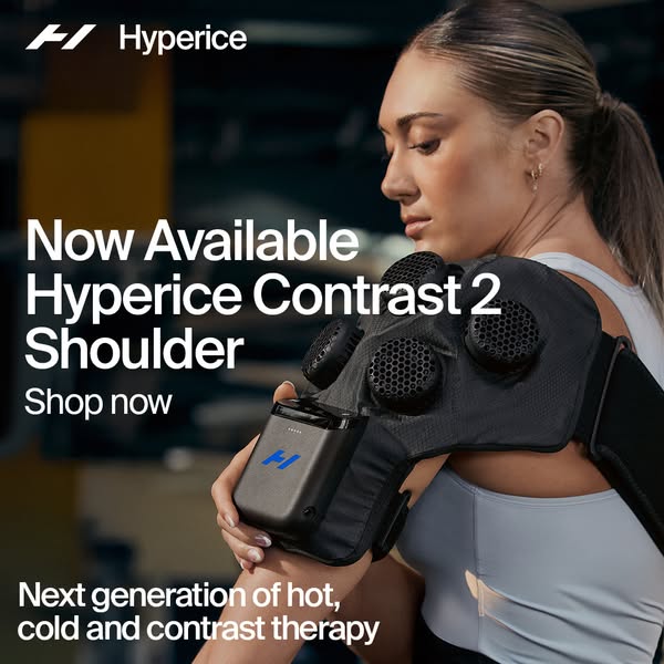 124dIMAGE
Ease shoulder pain fast
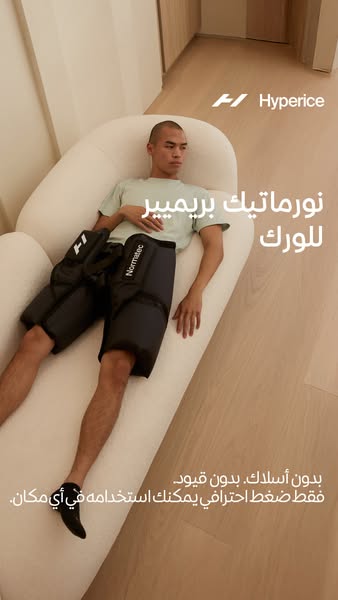 123dIMAGE
امنح وركيك تعافياً بمستوى النخبة
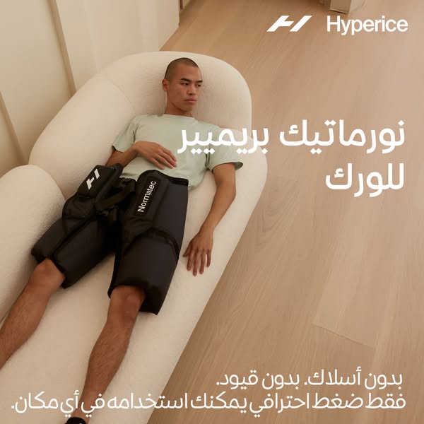 115dIMAGE
امنح وركيك تعافياً بمستوى النخبة
 110dVIDEO
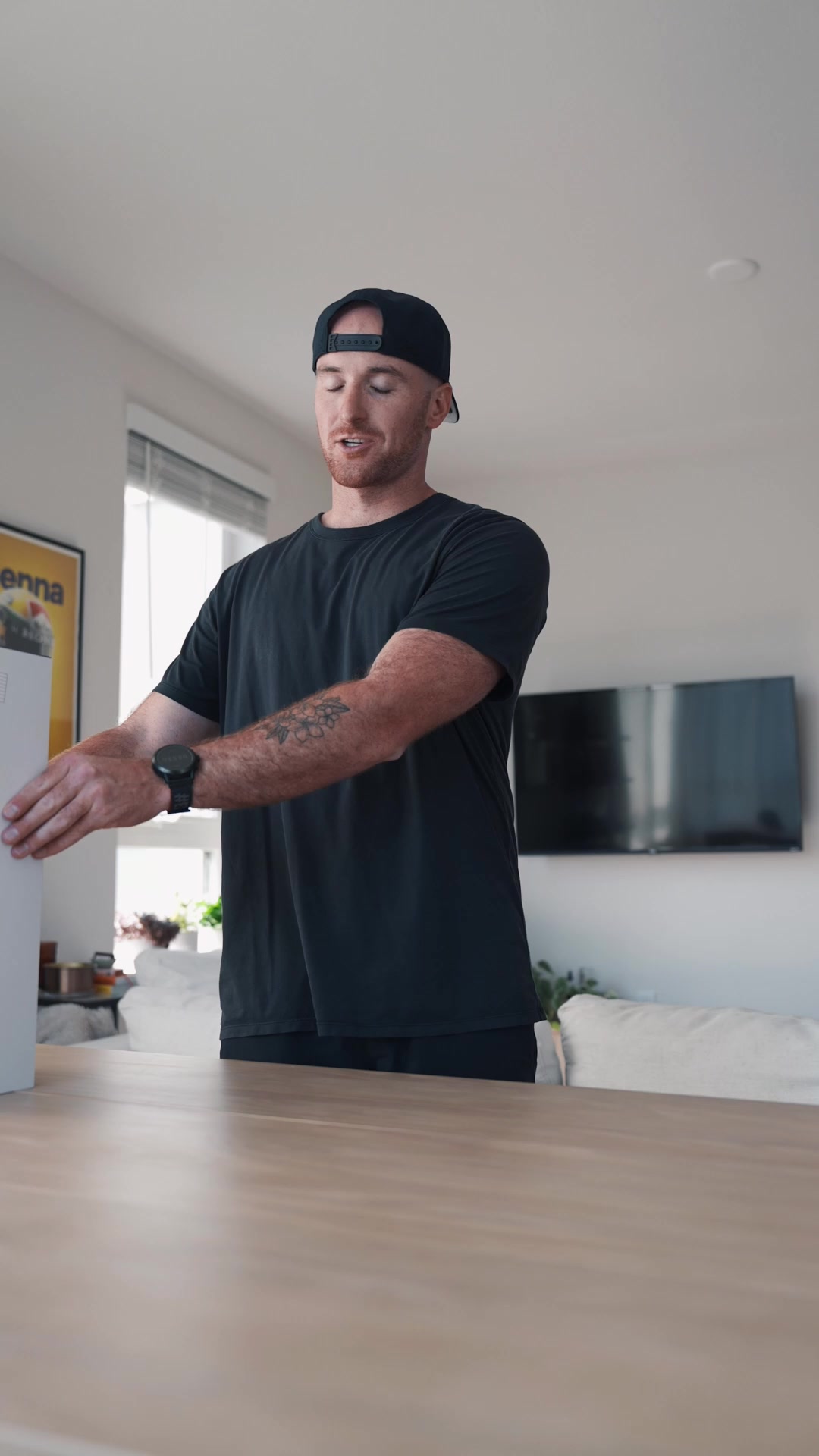
Get science-backed recovery.
 110dVIDEO
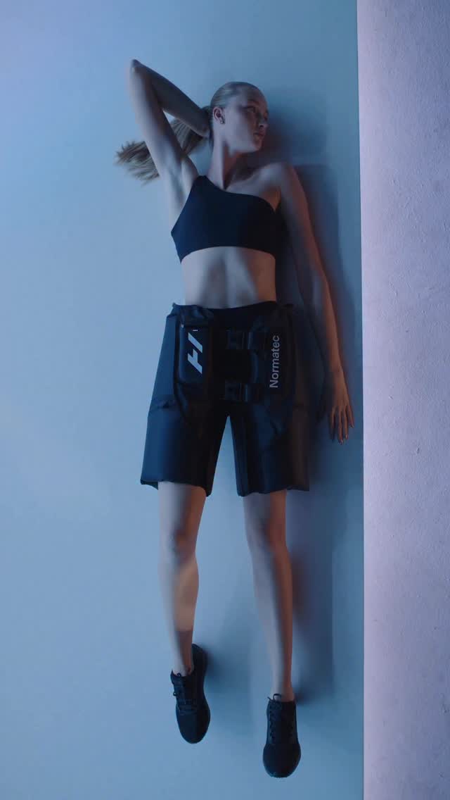
Introducing Normatec Elite Hips. 🔄 Fully integrated device with no external control units or hoses 💨7 levels of dynamic air compression massage 🔋4+ hours of battery life 🩳 New buckle and added velcro around the legs for a custom fit 💪 Perfect for hips, IT band and lower back recovery No cords. No restrictions. Just pro-level compression you can take anywhere. Now available at our link in bio or at hyperice.com.
 100dIMAGE
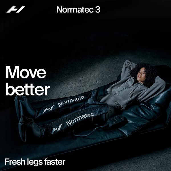
Recharge with Normatec 3
Your own page
You just read somebody else's funnel. What does yours score?
The score above came from the real landing page behind this ad, graded on 8 CRO factors. Run your own page through the same rubric, free, and see what each factor found and where you give up the most ground.
Free, no signup, no card. The same 8 factor score every page here was graded on.
Keep exploring
Data from the public Meta Ad Library. Funnelens is not affiliated with or endorsed by Meta. See data sources.