Boll & Branch
Facebook · Instagram · Audience Network · Image
The ad
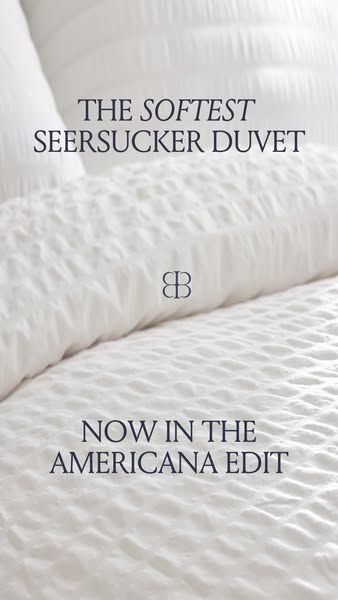
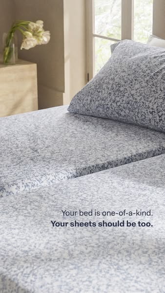
(Re)introducing Seersucker, an iconic summer texture made softer than ever with our buttery Signature fabric. Airy by design with a laid-back look, for the ultimate summer ease in three classic shades.
Shop The Americana Edit
Shop nowThe funnel behind it

Offer: Share what brings you here & we'll unlock your offer
Funnel score
8-point CRO breakdown
How well the landing page behind the ad is built to convert, scored across 8 factors: offer, copy, speed, trust, mobile, message-match, CTA, and social proof.
This landing page has significant issues that undermine conversion potential. While the page does feature a clear discount offer (15% off) and uses a visually appealing textile background that aligns with the bedding category, it suffers from critical problems: the headline "Enjoy 15% Off" is generic and doesn't match the ad's "Shop The Americana Edit" messaging, creating confusion about the actual campaign. The primary CTA options are confusing and don't clearly direct users to shop the seersucker collection mentioned in the ad. The page lacks visible social proof, trust signals, or product-specific information that would validate the premium positioning. Mobile optimization appears poor with low contrast text and unclear navigation. Most critically, the PageSpeed score of 30 is severely problematic, indicating the page loads very slowly, which will cause significant bounce rates. The message match between ad and landing page is weak—the ad emphasizes seersucker's summer appeal and fabric quality, but the page focuses on a generic discount unlock mechanism rather than showcasing the product.
Where it's weak
- Page speed1/10
PageSpeed score of 30 indicates severe performance issues that will cause high bounce rates and poor user experience.
- Social proof2/10
No visible customer reviews, testimonials, ratings, or trust badges appear anywhere on the page.
- Call to action3/10
Multiple button options ('Replace Worn Bedding,' 'Sheets for Hot Sleepers,' etc.) create confusion rather than a clear primary action to shop the collection.
- Trust signals3/10
No visible company credentials, certifications, guarantees, or social proof elements to build confidence in the brand or offer.
- Message match3/10
Ad emphasizes seersucker's summer texture and fabric quality, but landing page focuses on a generic discount unlock with no product-specific messaging.
- Mobile experience4/10
Text contrast is poor on the dark textile background, buttons are stacked vertically but lack clear hierarchy, and the overall layout feels cramped.
- Headline4/10
Generic 'Enjoy 15% Off' headline doesn't match the ad's 'Shop The Americana Edit' messaging or highlight the seersucker product.
Full breakdown
Multiple button options ('Replace Worn Bedding,' 'Sheets for Hot Sleepers,' etc.) create confusion rather than a clear primary action to shop the collection.
PageSpeed score of 30 indicates severe performance issues that will cause high bounce rates and poor user experience.
No visible company credentials, certifications, guarantees, or social proof elements to build confidence in the brand or offer.
Text contrast is poor on the dark textile background, buttons are stacked vertically but lack clear hierarchy, and the overall layout feels cramped.
Generic 'Enjoy 15% Off' headline doesn't match the ad's 'Shop The Americana Edit' messaging or highlight the seersucker product.
No visible customer reviews, testimonials, ratings, or trust badges appear anywhere on the page.
Ad emphasizes seersucker's summer texture and fabric quality, but landing page focuses on a generic discount unlock with no product-specific messaging.
The 15% discount is clearly stated, but the mechanism to unlock it (sharing what brings you here) is vague and creates friction.
More ads from Boll & Branch
View all →

Your own page
You just read somebody else's funnel. What does yours score?
The score above came from the real landing page behind this ad, graded on 8 CRO factors. Run your own page through the same rubric, free, and see what each factor found and where you give up the most ground.
Free, no signup, no card. The same 8 factor score every page here was graded on.
Keep exploring
Data from the public Meta Ad Library. Funnelens is not affiliated with or endorsed by Meta. See data sources.