Hyperice
Facebook · Instagram · Messenger · Image
The ad
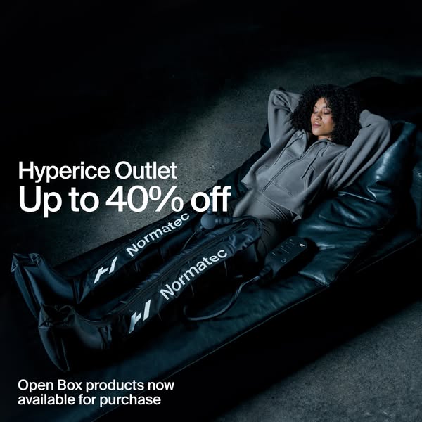
Save up to 40% off Open Box units of our top product lines while supplies last.
Hyperice Outlet, Now Open.
Shop nowThe funnel behind it

Offer: Save up to 40% off Open Box units of our top product lines while supplies last.
Funnel score
8-point CRO breakdown
How well the landing page behind the ad is built to convert, scored across 8 factors: offer, copy, speed, trust, mobile, message-match, CTA, and social proof.
This page fails to deliver on the ad promise of an "Outlet" with "up to 40% off Open Box units." Instead, it's a general product showcase landing page featuring multiple product lines (Hypervolt, Normatec, Hyperboot, Venom, Hyperice Contrast 2, Vyper, Hypersphere) with full retail pricing (€149, €1,099, €749.99, €269, €449, etc.) and no visible discount messaging or outlet positioning. The headline "Een nieuw tijdperk van massagepistolen" (A new era of massage guns) is generic and doesn't match the outlet/discount narrative. While the page has strong visual design, product imagery, and clear CTAs, it completely misses the core value proposition advertised—creating a significant disconnect between ad and landing experience. The page loads slowly (PageSpeed 44/100) and lacks any social proof elements like reviews or testimonials.
What this funnel does right. Steal these.
- Mobile experience7/10
Where it's weak
- Social proof0/10
- Message match1/10
- Offer clarity2/10
- Headline3/10
- Page speed4/10
- Trust signals4/10
Full breakdown
Call to action
6/10Multiple clear, high-contrast black CTAs are present throughout ('Shop Hypervolt 3', 'Shop Hyperboot', 'Shop Venom', etc.), but they don't reinforce the outlet/discount offer.
- High-contrast black buttons with white text, easy to spot
- Multiple CTAs positioned after each product section
- Clear action-oriented copy ('Shop', 'Shop now')
- CTAs don't mention discount, outlet, or limited-time nature of the offer
- No primary CTA that specifically directs to outlet/discounted items
- Button copy is generic product-focused rather than offer-focused
Page speed
4/10PageSpeed score of 44/100 converts to approximately 4.4/10, indicating slow page load performance.
- PageSpeed score of 44/100 is well below acceptable thresholds
- Likely heavy image assets without optimization
- Slow load time will increase bounce rate and reduce conversions
Trust signals
4/10Page has professional design and recognizable brand, but lacks trust signals like reviews, security badges, or company information.
- Professional product photography and design aesthetic
- Hyperice brand logo and consistent branding throughout
- Clear product names and descriptions
- No customer reviews, ratings, or testimonials visible
- No trust badges, security seals, or certifications shown
- No company information, guarantees, or return policy visible in screenshots
Mobile experience
7/10Page appears responsive with stacked layout, readable text, and touch-friendly button sizing visible in the mobile-optimized screenshots.
- Vertical stacking of content appropriate for mobile viewport
- Large, tappable buttons with adequate spacing
- Images scale appropriately to mobile width
- Navigation menu appears collapsed but functionality unclear from screenshots
- Product grid layout could be optimized further for mobile browsing
Headline
3/10The headline 'Een nieuw tijdperk van massagepistolen' is generic product positioning that doesn't align with the outlet/discount ad promise.
- Clear, readable typography in Dutch matching the audience
- Positioned prominently at the top of the page
- Doesn't mention outlet, discount, or 'Open Box' positioning
- Generic 'new era' messaging doesn't create urgency or match ad narrative
- Fails to communicate the value proposition advertised (40% off)
Social proof
0/10No customer reviews, ratings, testimonials, trust badges, or social proof elements are visible anywhere on the page.
- No star ratings or review counts visible on any products
- No customer testimonials or case studies shown
- No trust badges, certifications, or social proof indicators present
Message match
1/10Severe disconnect: ad promises 'Hyperice Outlet, Now Open' with '40% off Open Box units', but page shows full-price product showcase with no outlet or discount positioning.
- Ad headline 'Hyperice Outlet, Now Open' has no corresponding outlet section on page
- Ad primary text '40% off Open Box units' offer is completely missing from page
- Page shows regular product catalog with full retail pricing, not an outlet experience
Offer clarity
2/10The advertised 'up to 40% off Open Box units' offer is completely absent from the page; only full retail prices are shown.
- No discount messaging or 'Open Box' language visible anywhere on the page
- Full retail prices displayed (€149, €1,099, €749.99, €269, €449) with no strikethrough or discount indicators
- No outlet section, clearance area, or limited-time offer messaging
More ads from Hyperice
View all →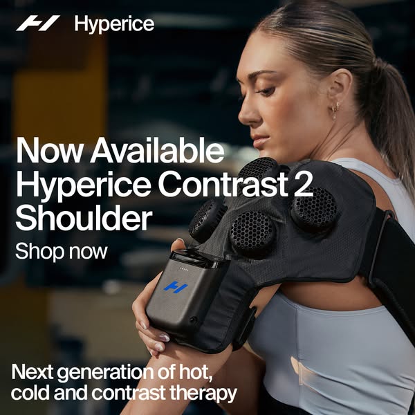 124dIMAGE
Ease shoulder pain fast
 123dIMAGE
امنح وركيك تعافياً بمستوى النخبة
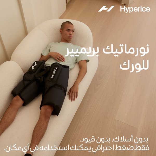 115dIMAGE
امنح وركيك تعافياً بمستوى النخبة
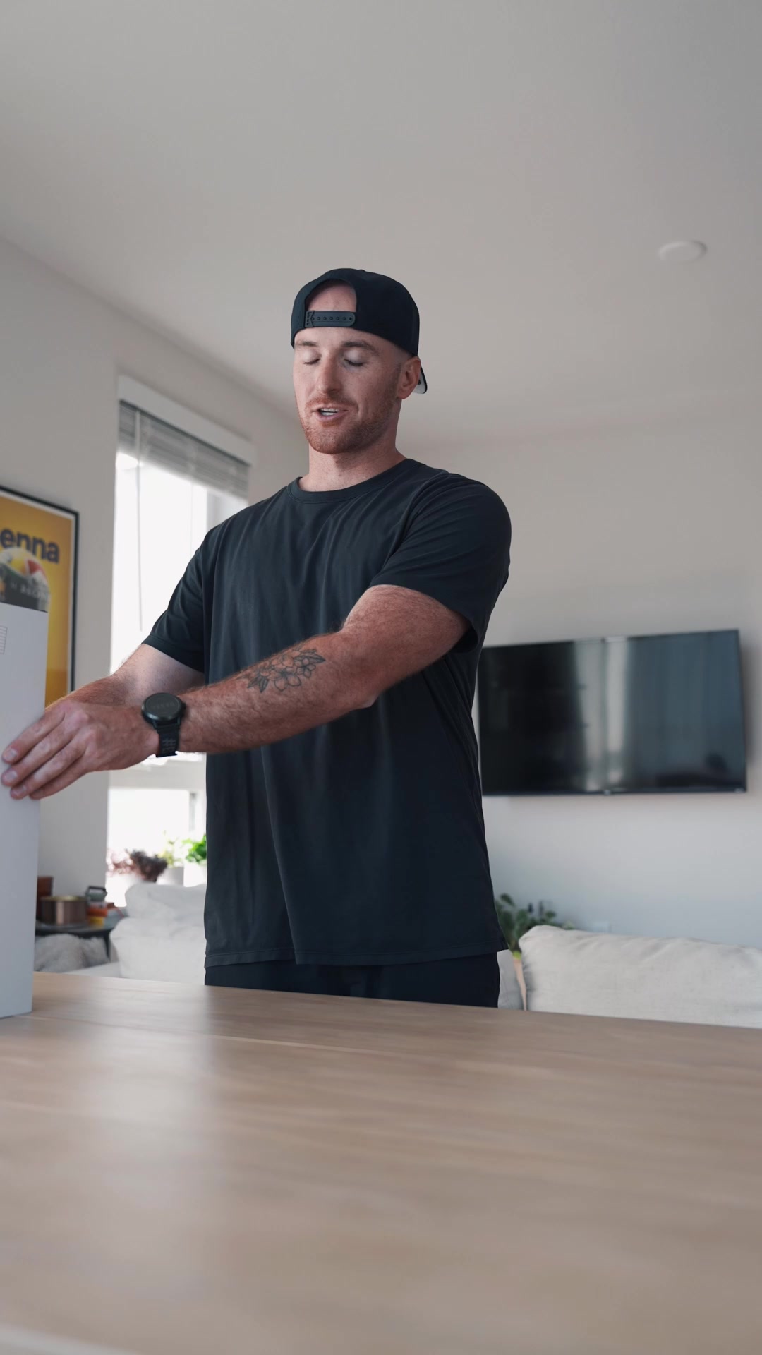 110dVIDEO
Get science-backed recovery.
 110dVIDEO
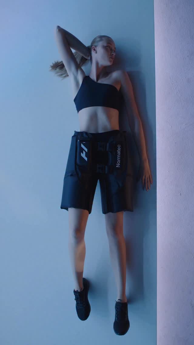
Introducing Normatec Elite Hips. 🔄 Fully integrated device with no external control units or hoses 💨7 levels of dynamic air compression massage 🔋4+ hours of battery life 🩳 New buckle and added velcro around the legs for a custom fit 💪 Perfect for hips, IT band and lower back recovery No cords. No restrictions. Just pro-level compression you can take anywhere. Now available at our link in bio or at hyperice.com.
 100dIMAGE
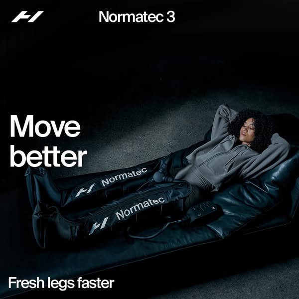
Recharge with Normatec 3
Your own page
You just read somebody else's funnel. What does yours score?
The score above came from the real landing page behind this ad, graded on 8 CRO factors. Run your own page through the same rubric, free, and see what each factor found and where you give up the most ground.
Free, no signup, no card. The same 8 factor score every page here was graded on.
Keep exploring
Data from the public Meta Ad Library. Funnelens is not affiliated with or endorsed by Meta. See data sources.