Kosas
Facebook · Instagram · Messenger · Video
The ad
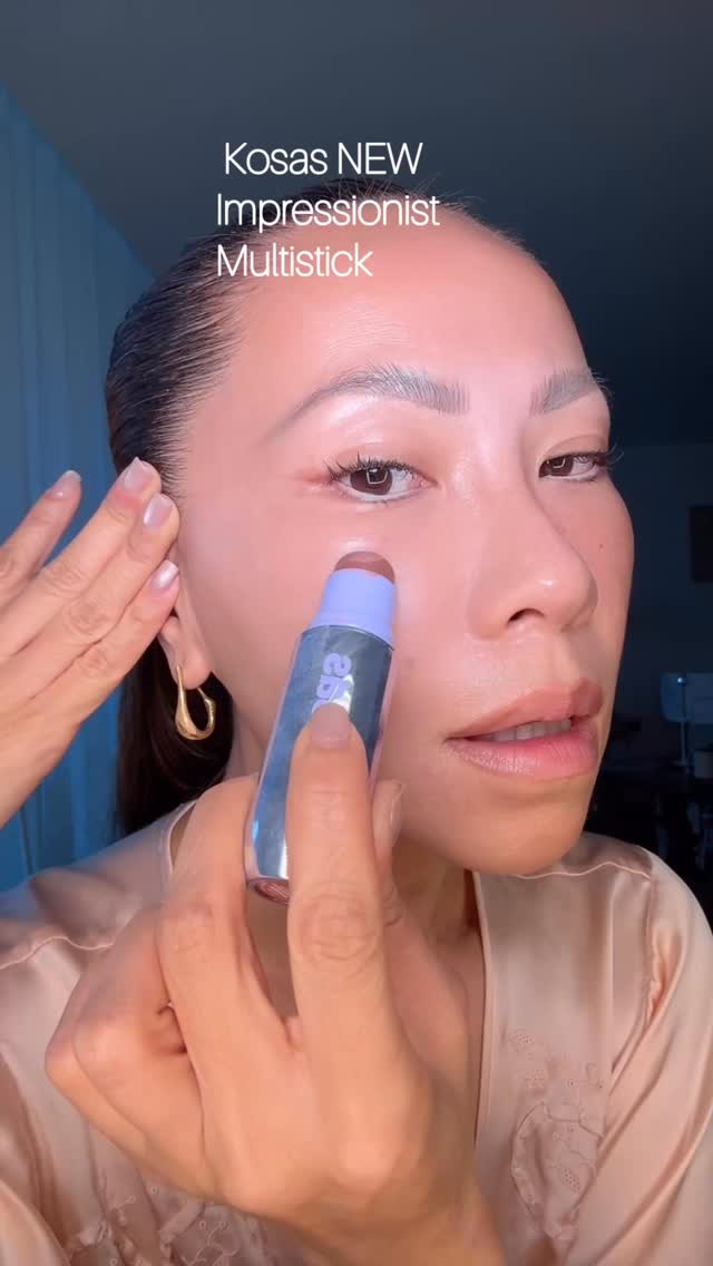
The most beautiful Multi DEW-mensional blush 🥟 @kosas #namvoglow #dewydumplings #creamblush #kosaspartner #skin
Shop nowThe funnel behind it
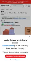
Offer: Sign in or create an account to enjoy FREE standard shipping on all orders.
Funnel score
8-point CRO breakdown
How well the landing page behind the ad is built to convert, scored across 8 factors: offer, copy, speed, trust, mobile, message-match, CTA, and social proof.
This is a sign-in/account creation page, not a product page. The page shows a login form with email and password fields, a "Keep me signed in" checkbox, and two CTAs: a primary "Sign In" button and a secondary "Create Account" button. The offer (free standard shipping) is clearly stated in the headline. However, this page is a poor match for the ad about a Kosas blush product—users clicking "Shop now" on a beauty product ad land on a login wall rather than the product itself. The page is mobile-optimized with clean typography and proper spacing, but the fundamental issue is that it's intercepting the user's journey to the product with a login requirement, which creates friction and message mismatch.
What this funnel does right. Steal these.
- Mobile experience8/10
- Offer clarity8/10
- Call to action7/10
- Trust signals7/10
Where it's weak
- Social proof0/10
- Message match2/10
Full breakdown
Call to action
7/10Two CTAs are present: a primary 'Sign In' button and secondary 'Create Account' button, both clearly visible and actionable.
- Primary CTA 'Sign In' is large, black, and high-contrast against white background
- Secondary CTA 'Create Account' provides alternative path for new users
- Both buttons are appropriately sized for mobile interaction
- No CTA directly related to viewing the product the user clicked on
Page speed
6/10PageSpeed score of 58 converts to approximately 5.8 on the 0-10 scale, indicating below-average performance.
- PageSpeed score of 58 indicates slow loading performance
- May cause user abandonment before form is even visible
Trust signals
7/10Page includes trust signals like legal links and Sephora branding, but lacks product-specific credibility.
- Links to 'TERMS OF USE' and 'Privacy Policy' are visible
- Sephora is an established, recognizable brand
- Checkbox for 'Keep me signed in' shows standard security practice
- No security badges or SSL indicators visible
- No customer reviews or ratings to build confidence
Mobile experience
8/10Page is well-optimized for mobile with proper spacing, readable text, and appropriately sized touch targets.
- Input fields are large and easy to tap
- Buttons are full-width and appropriately sized for mobile
- Text is readable without zooming
Headline
6/10The headline 'Sign In' is clear but generic and doesn't connect to the product or offer value beyond the subheading.
- Subheading clearly states the benefit: 'FREE standard shipping on all orders'
- Direct and unambiguous about the page's purpose
- No mention of the product or category the user was trying to access
- Doesn't create urgency or excitement about the blush product from the ad
Social proof
0/10No social proof elements are visible on this sign-in page.
- No customer reviews or ratings shown
- No user testimonials or trust badges
- No indication of how many customers use Sephora
Message match
2/10Severe mismatch: ad promotes a Kosas blush product, but landing page is a generic login form with no product context.
- Sephora branding is consistent with the retailer in the ad
- User clicked 'Shop now' for a specific blush product but lands on login page instead
- No mention of Kosas, blush, or any product category
- Ad promises product shopping experience; page delivers account management friction
Offer clarity
8/10The free standard shipping offer is explicitly stated in the subheading with clear conditions.
- 'FREE standard shipping on all orders' is prominently displayed
- Condition is clear: applies to 'all orders'
- Positioned immediately under the main headline for visibility
More ads from Kosas
View all →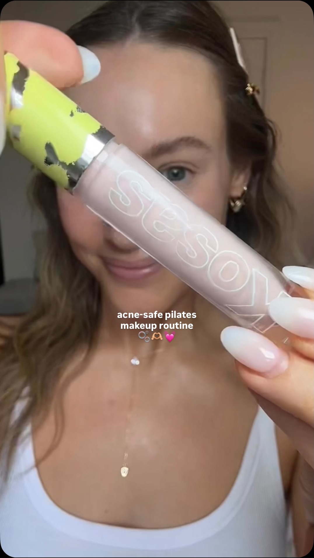 63dVIDEO
I always get so many questions about my favorite acne-safe makeup for teaching and taking Pilates… and it’s by far @kosas 💕 #kosaspartner The Revealer Concealer + Revealer Extra Bright duo gives me the perfect awake & glowy look without the pore clogging ingredients ✨ Linked in my ShopMy if you want to give it a try! #grwm #naturalmakeup #skin #skincare
 63dVIDEO
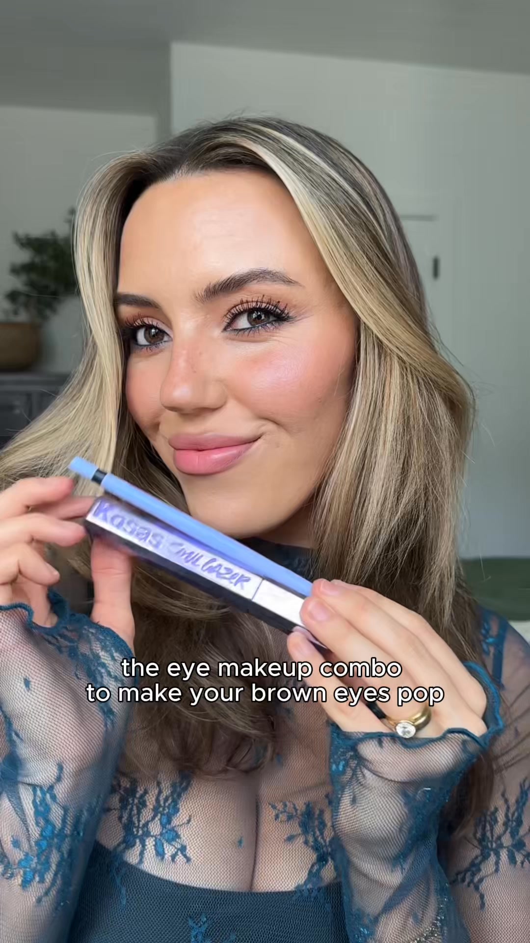
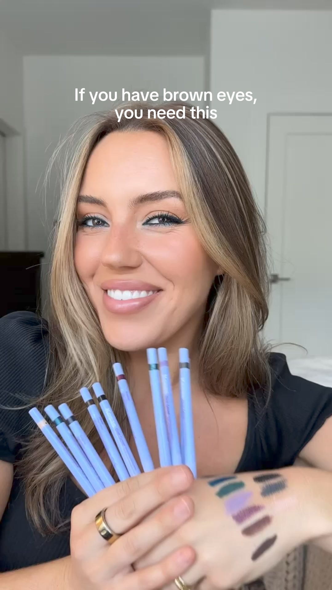
NEW! Soulgazer Set!
 63dVIDEO
NEW! Soulgazer Intensifying Gel Eyeliner
 63dVIDEO
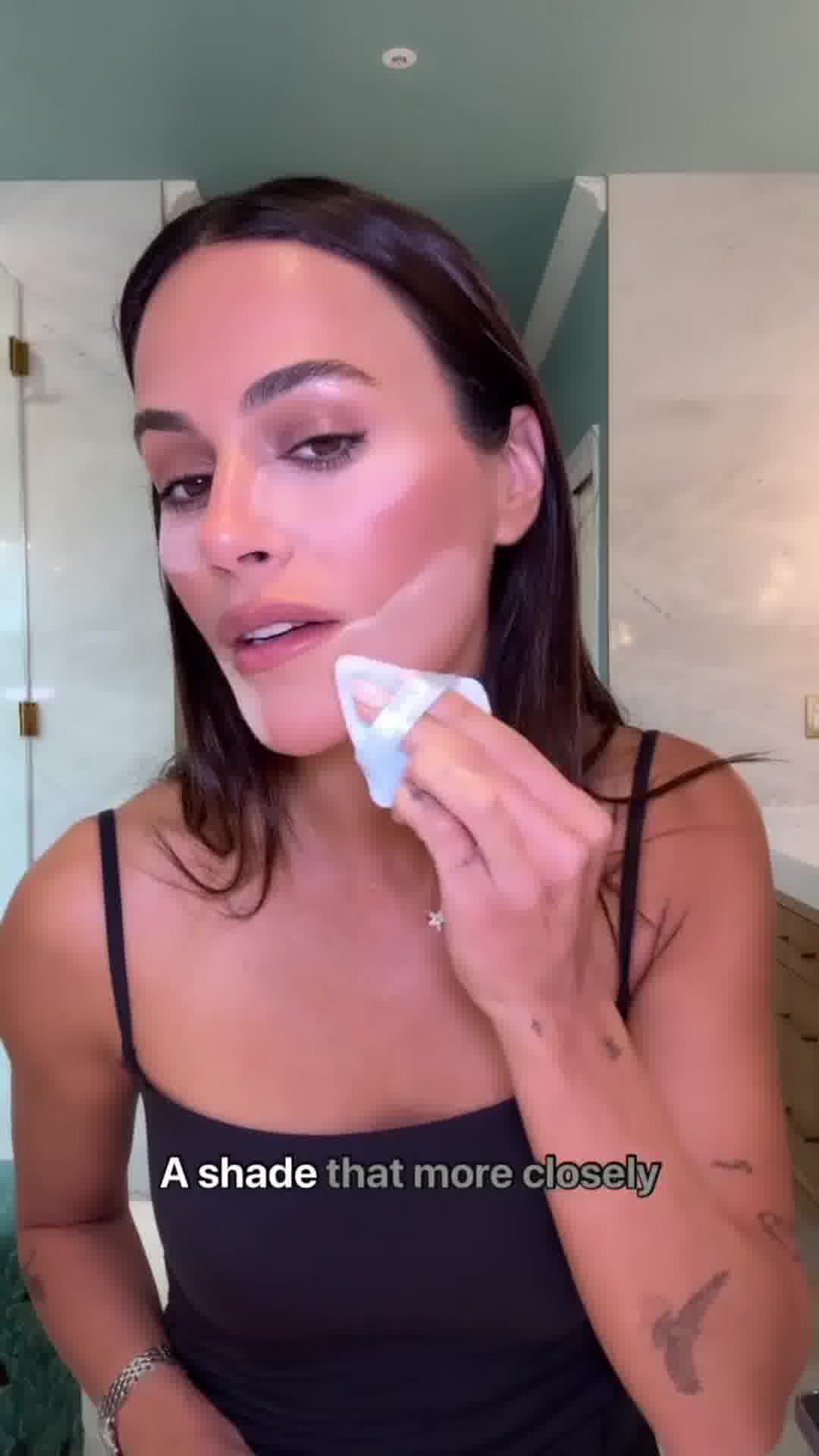
weird things that were going on in my life when I created several different @kosas products… part 1💞
 63dVIDEO
NEW! Cloud Set Mist
 53dVIDEO
NEW Lip Pulse
Your own page
You just read somebody else's funnel. What does yours score?
The score above came from the real landing page behind this ad, graded on 8 CRO factors. Run your own page through the same rubric, free, and see what each factor found and where you give up the most ground.
Free, no signup, no card. The same 8 factor score every page here was graded on.
Keep exploring
Data from the public Meta Ad Library. Funnelens is not affiliated with or endorsed by Meta. See data sources.