Graza
Facebook · Instagram · Audience Network · Video
The ad
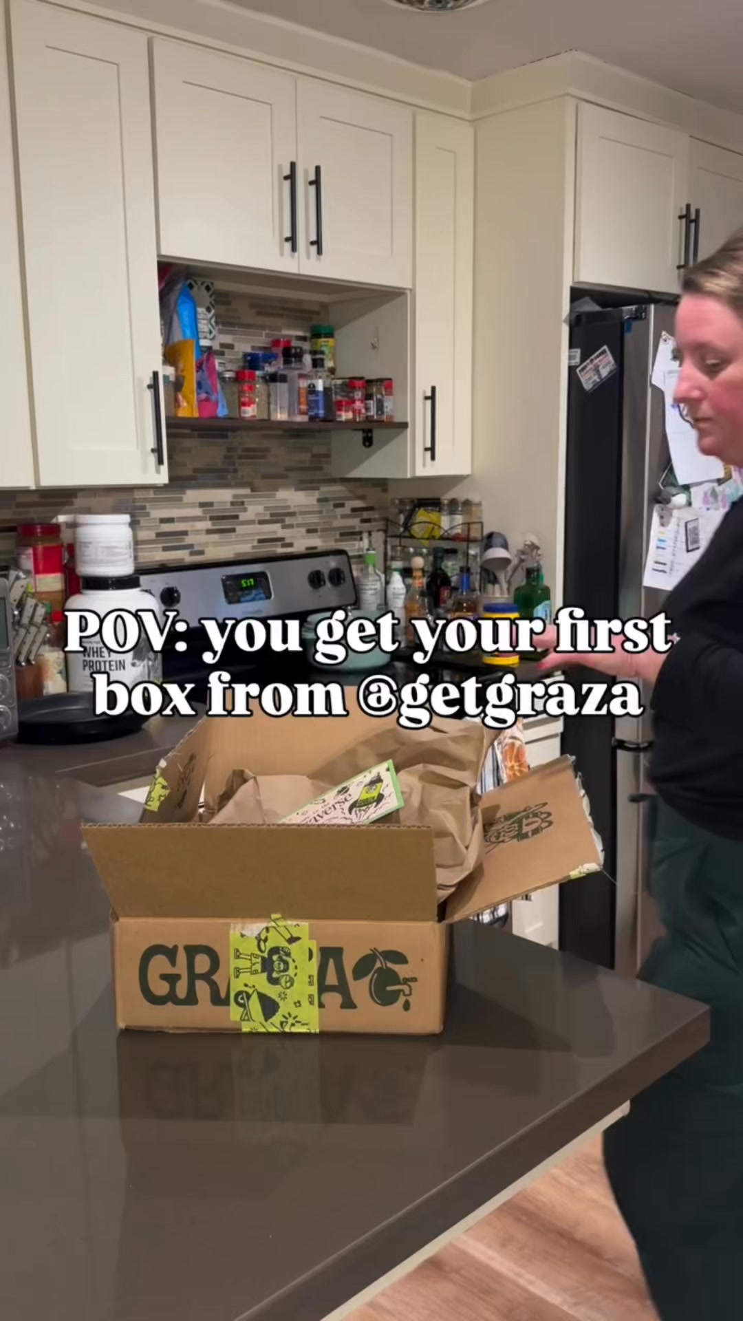
Tastes like: your new go-to olive oil set for cooking, dressing, and frying.
Do not use sparingly.
Shop nowThe funnel behind it

Offer: What do you use olive oil for??
Funnel score
8-point CRO breakdown
How well the landing page behind the ad is built to convert, scored across 8 factors: offer, copy, speed, trust, mobile, message-match, CTA, and social proof.
This landing page does several things well: it has a clear brand identity (GRAZA), uses an engaging interactive element (segmented buttons for olive oil uses), and maintains a clean mobile-optimized layout with good visual hierarchy. However, it suffers from critical weaknesses. The page speed score of 36 is severely problematic and will cause significant bounce rates. The headline "You've got a special discount!" doesn't match the ad's "Do not use sparingly" messaging, creating confusion about the value proposition. The primary CTA buttons are segmented questions rather than a clear conversion action, and there's no visible "Shop now" button above the fold. The offer clarity is muddled—it's unclear what discount is being offered or what the actual product is until scrolling. Social proof elements (reviews, testimonials, trust badges) are absent from the visible sections. The page appears to be a quiz/selector rather than a direct product landing page, which may work for engagement but doesn't align with the ad's direct sales intent.
What this funnel does right. Steal these.
- Mobile experience: The layout is responsive and appears well-formatted for mobile with stacked buttons and readable text, though the overall UX flow is confusing.
Where it's weak
- Page speed2/10
PageSpeed score of 36 is critically slow and will cause high bounce rates and poor user experience.
- Social proof2/10
No visible customer reviews, testimonials, ratings, or trust badges appear anywhere on the page sections shown.
- Message match3/10
The ad emphasizes 'Do not use sparingly' and a product set for multiple uses, but the page leads with a discount offer and quiz format that doesn't reinforce the ad's messaging.
- Trust signals4/10
The brand name GRAZA is visible but there are no security badges, guarantees, return policies, or social proof elements to build trust.
- Headline4/10
The headline 'You've got a special discount!' is generic and doesn't match the ad's 'Do not use sparingly' messaging or communicate the product value.
- Call to action5/10
The primary interactive elements are segmented question buttons rather than a clear 'Shop now' conversion CTA, making the path to purchase unclear.
- Offer clarity5/10
The offer mentions 'special discount' but no specific discount percentage or terms are visible, and the actual product offer is buried behind interactive buttons.
Full breakdown
The primary interactive elements are segmented question buttons rather than a clear 'Shop now' conversion CTA, making the path to purchase unclear.
PageSpeed score of 36 is critically slow and will cause high bounce rates and poor user experience.
The brand name GRAZA is visible but there are no security badges, guarantees, return policies, or social proof elements to build trust.
The layout is responsive and appears well-formatted for mobile with stacked buttons and readable text, though the overall UX flow is confusing.
The headline 'You've got a special discount!' is generic and doesn't match the ad's 'Do not use sparingly' messaging or communicate the product value.
No visible customer reviews, testimonials, ratings, or trust badges appear anywhere on the page sections shown.
The ad emphasizes 'Do not use sparingly' and a product set for multiple uses, but the page leads with a discount offer and quiz format that doesn't reinforce the ad's messaging.
The offer mentions 'special discount' but no specific discount percentage or terms are visible, and the actual product offer is buried behind interactive buttons.
More ads from Graza
View all →
Your own page
You just read somebody else's funnel. What does yours score?
The score above came from the real landing page behind this ad, graded on 8 CRO factors. Run your own page through the same rubric, free, and see what each factor found and where you give up the most ground.
Free, no signup, no card. The same 8 factor score every page here was graded on.
Keep exploring
Data from the public Meta Ad Library. Funnelens is not affiliated with or endorsed by Meta. See data sources.