Hydrow
Facebook · Instagram · Audience Network · Image
The ad
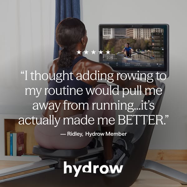
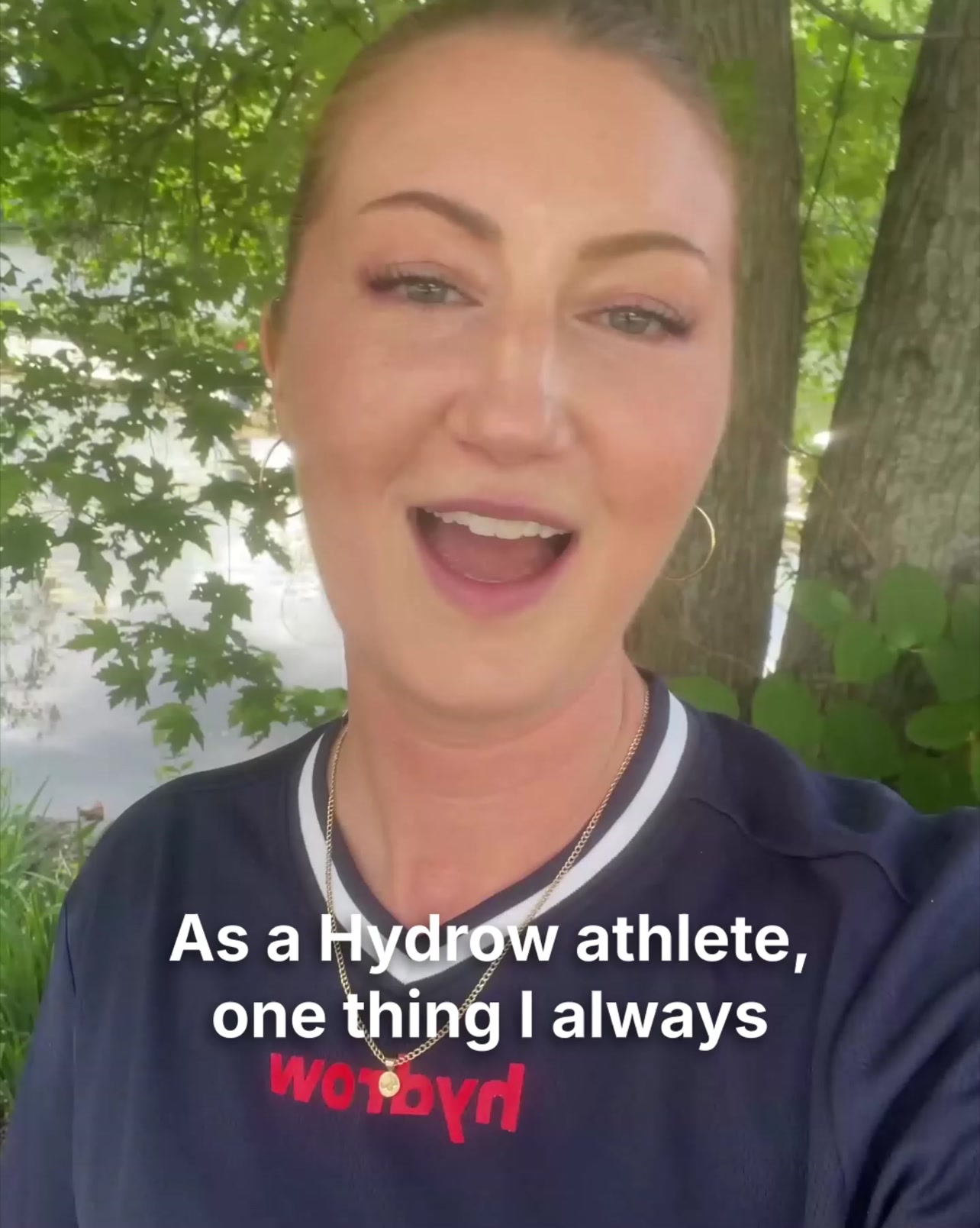
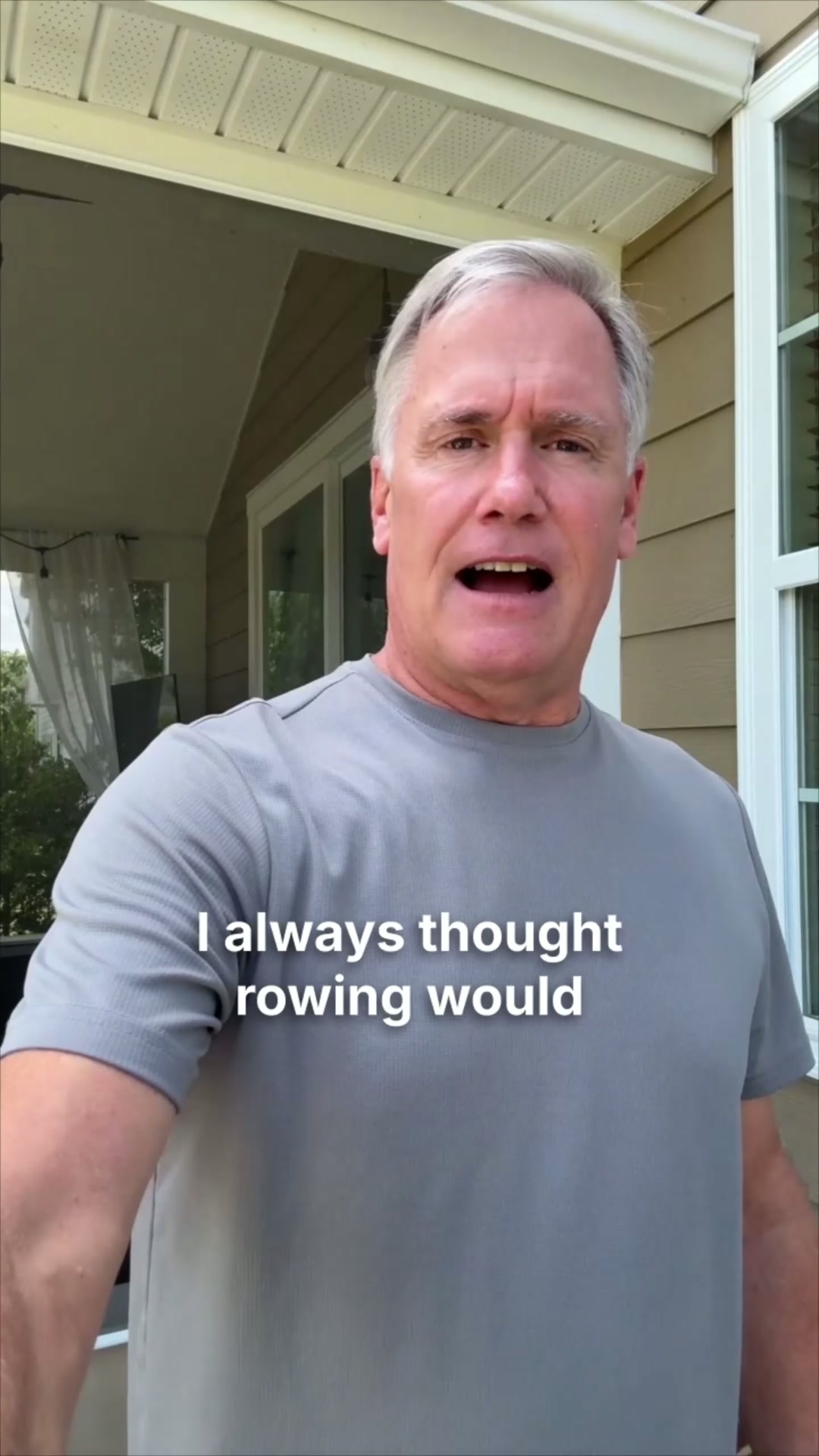
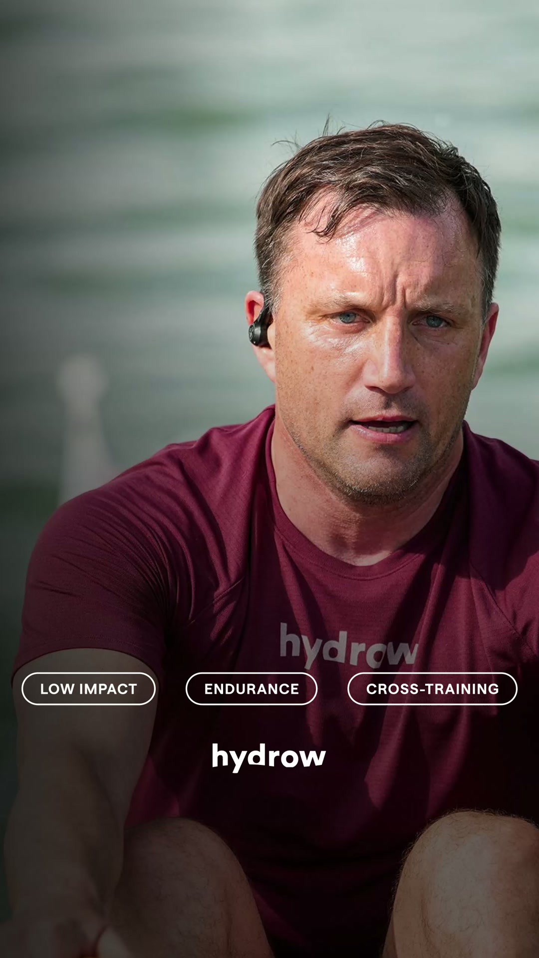
Your body's not the same as it used to be — but the fire's still there
Keep pushing with Hydrow.
Learn moreThe funnel behind it

Offer: Discover stunning waterways, elite coaching, and a thrilling, total-body burn with Hydrow
Funnel score
8-point CRO breakdown
How well the landing page behind the ad is built to convert, scored across 8 factors: offer, copy, speed, trust, mobile, message-match, CTA, and social proof.
Hydrow's landing page effectively communicates the emotional and physical benefits of their rowing machine with strong brand messaging and impressive social proof metrics. The page successfully matches the ad's tone about maintaining fitness motivation. However, it suffers from two critical weaknesses: (1) a generic 'Learn more' CTA that fails to drive conversion urgency, and (2) a PageSpeed score of 52 that will significantly hamper mobile conversion rates. The page prioritizes brand storytelling and lifestyle positioning over conversion optimization. Adding a stronger primary CTA ('Start Your Free Trial' or 'Get Started'), improving page speed, and including user testimonials would substantially improve performance.
What this funnel does right. Steal these.
- Mobile experience: Page appears well-optimized for mobile with readable typography, proper spacing, and vertical layout. Text hierarchy is clear. Images scale appropriately. No obvious mobile usability issues in captured sections.
- Headline: Primary headline 'ROW ANYWHERE. FEEL IT EVERYWHERE.' is compelling and memorable. Matches ad messaging about the product's capability. Secondary headline 'DON'T JUST ROW. ROW WITH US.' reinforces community aspect.
- Social proof: Strong social proof elements: Men's Health award ('Best Connected Rower'), 550,000+ members, 6,000+ workouts, 100+ destinations. Community validation is prominent and credible. Missing individual testimonials or user reviews.
- Message match: Strong alignment between ad and page. Ad emphasizes 'fire's still there' (motivation/capability) and page delivers on full-body engagement, immersive experience, and community. Messaging is cohesive and on-brand.
- Trust signals: Trust signals present: Men's Health credibility, large member base (550K+), professional design, clear brand identity. Missing: customer testimonials, pricing transparency, money-back guarantee, security badges, or detailed company information in visible sections.
- Offer clarity: Core offer is clear (rowing machine with coaching/destinations), but pricing and specific product details are not visible in the captured sections. Value proposition is communicated through benefits rather than explicit offer terms.
Where it's weak
- Page speed5/10
PageSpeed score of 52 indicates poor performance. This is below acceptable standards (target 75+) and will negatively impact conversion rates, especially on mobile. Likely issues with image optimization, JavaScript, or server response time.
Full breakdown
Primary CTA 'Learn more' is generic and weak for a product landing page. No urgency or clear next action. Secondary CTA 'LET'S GET OUT THERE' is more compelling but appears lower on page. Missing conversion-focused CTAs like 'Start Free Trial' or 'Shop Now'.
PageSpeed score of 52 indicates poor performance. This is below acceptable standards (target 75+) and will negatively impact conversion rates, especially on mobile. Likely issues with image optimization, JavaScript, or server response time.
Trust signals present: Men's Health credibility, large member base (550K+), professional design, clear brand identity. Missing: customer testimonials, pricing transparency, money-back guarantee, security badges, or detailed company information in visible sections.
Page appears well-optimized for mobile with readable typography, proper spacing, and vertical layout. Text hierarchy is clear. Images scale appropriately. No obvious mobile usability issues in captured sections.
Primary headline 'ROW ANYWHERE. FEEL IT EVERYWHERE.' is compelling and memorable. Matches ad messaging about the product's capability. Secondary headline 'DON'T JUST ROW. ROW WITH US.' reinforces community aspect.
Strong social proof elements: Men's Health award ('Best Connected Rower'), 550,000+ members, 6,000+ workouts, 100+ destinations. Community validation is prominent and credible. Missing individual testimonials or user reviews.
Strong alignment between ad and page. Ad emphasizes 'fire's still there' (motivation/capability) and page delivers on full-body engagement, immersive experience, and community. Messaging is cohesive and on-brand.
Core offer is clear (rowing machine with coaching/destinations), but pricing and specific product details are not visible in the captured sections. Value proposition is communicated through benefits rather than explicit offer terms.
More ads from Hydrow
View all →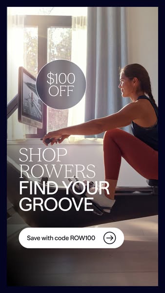
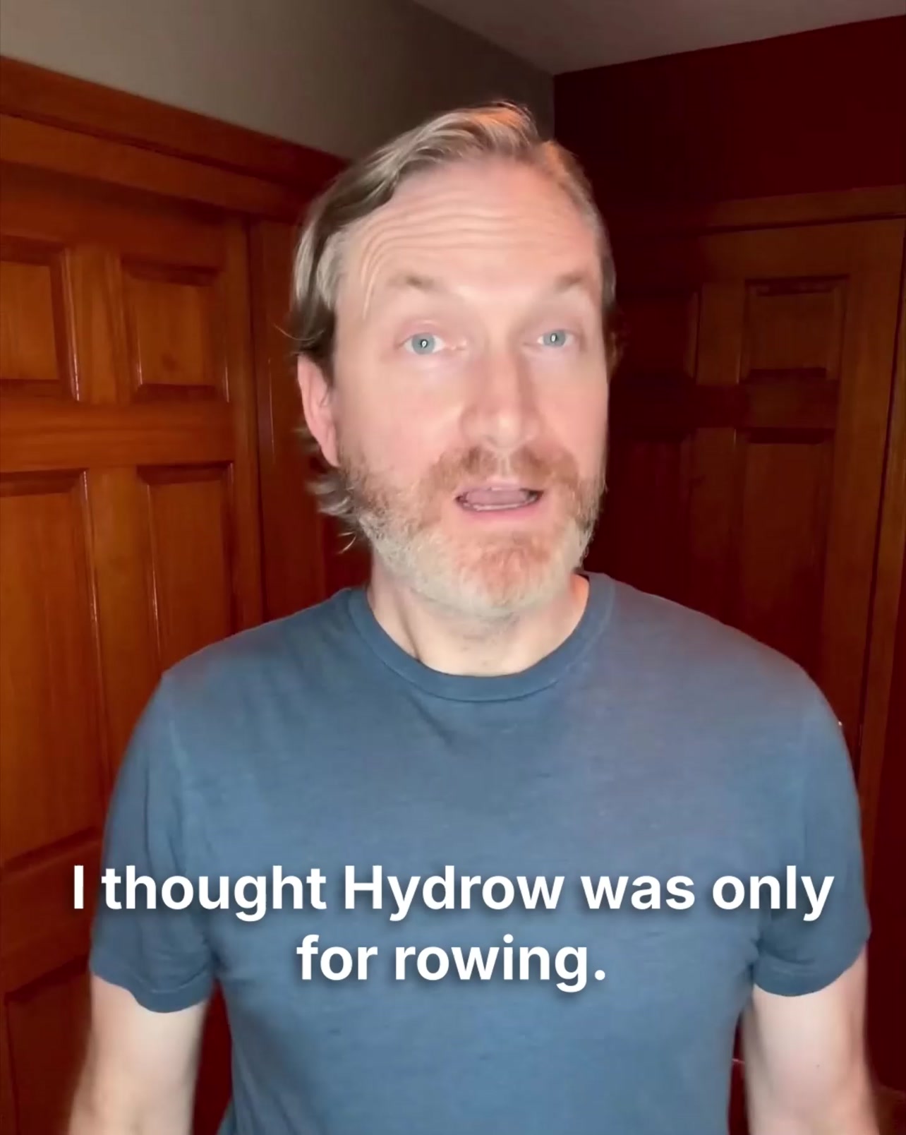
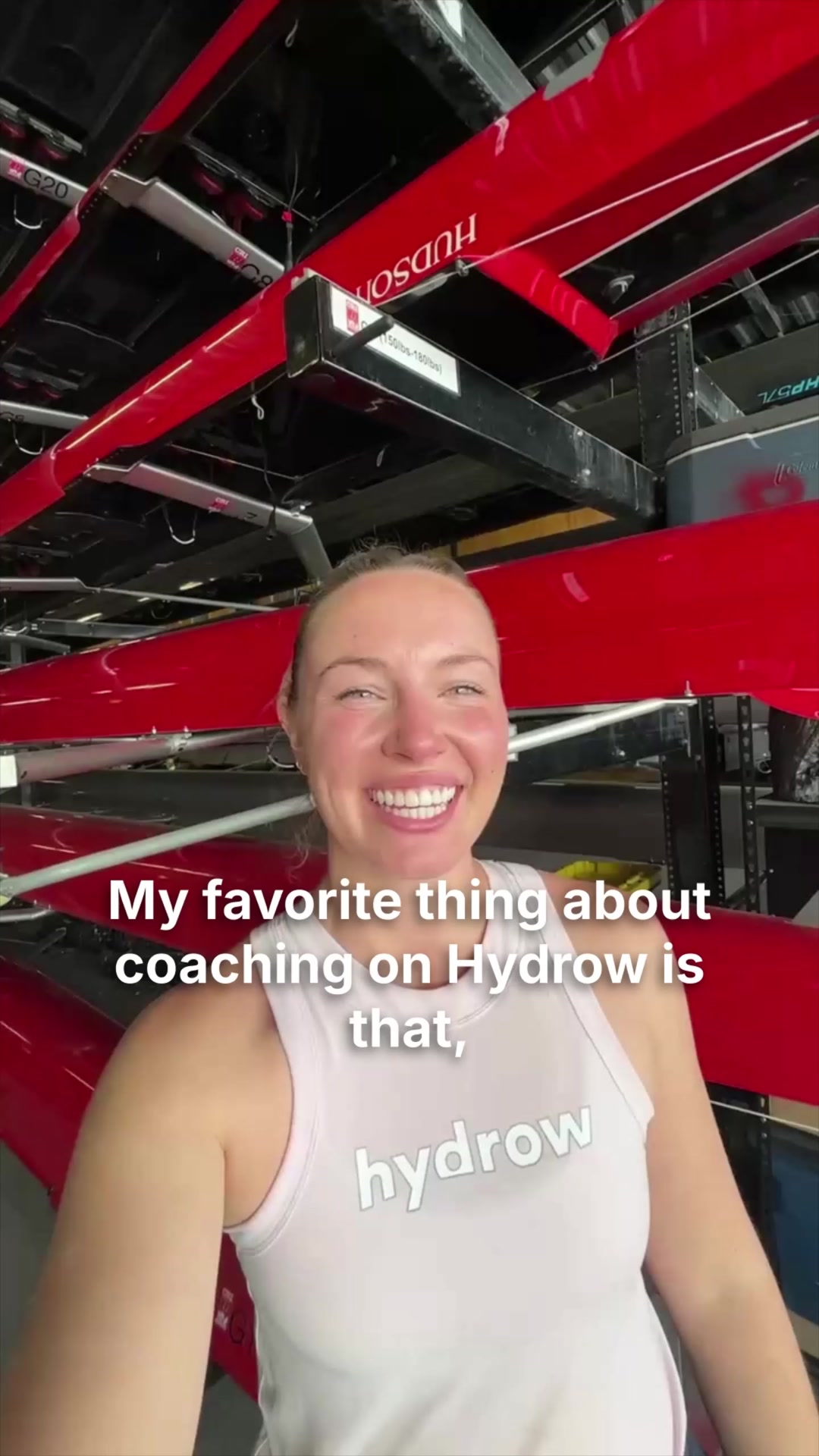
Your own page
You just read somebody else's funnel. What does yours score?
The score above came from the real landing page behind this ad, graded on 8 CRO factors. Run your own page through the same rubric, free, and see what each factor found and where you give up the most ground.
Free, no signup, no card. The same 8 factor score every page here was graded on.
Keep exploring
Data from the public Meta Ad Library. Funnelens is not affiliated with or endorsed by Meta. See data sources.