Tatcha
Facebook · Instagram · Audience Network · Video
The ad
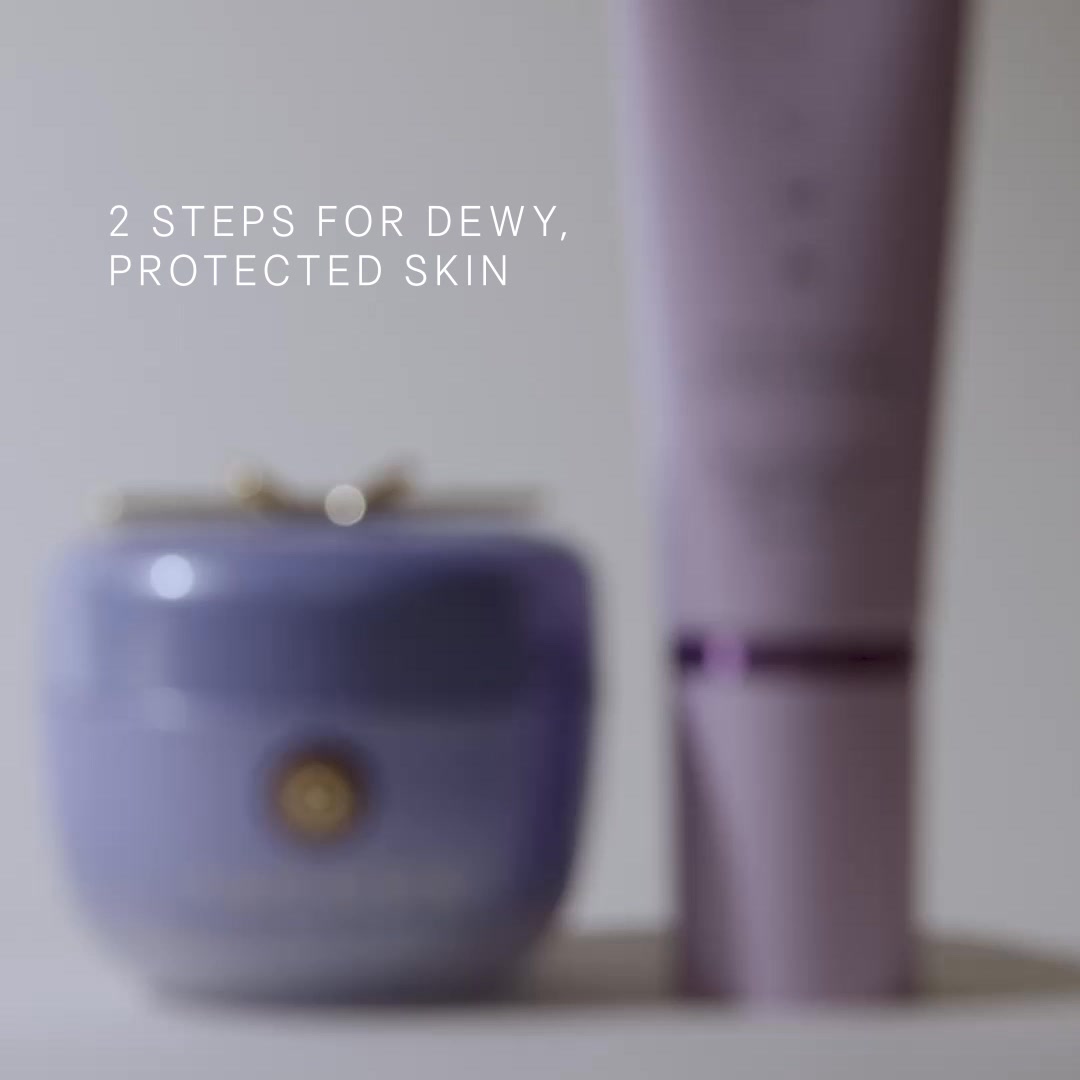
Enjoy milky-light protection and rich hydration with our bestselling moisturizer and new daily sunscreen that target 3 key signs of visible sun damage.
Milky-Light Skincare
Shop nowThe funnel behind it

Offer: Choose a mini Rice Polish with $75+ orders of a full size with $150+ orders* | Code: RICE26
Funnel score
8-point CRO breakdown
How well the landing page behind the ad is built to convert, scored across 8 factors: offer, copy, speed, trust, mobile, message-match, CTA, and social proof.
This page does well with strong visual presentation, premium brand trust, and clear product organization across 46 items. However, it suffers from significant CRO weaknesses: the headline "Curate your own set" is generic and doesn't match the ad's focus on "milky-light skincare" or sun protection; the offer is buried in a small banner and lacks clarity on the actual discount value; the primary CTA is vague ("Add 3 items") rather than action-oriented; mobile experience appears cramped with small product cards; and the 35 PageSpeed score indicates severe performance issues that will hurt conversions. The page also lacks prominent social proof elements like reviews or testimonials, and the message match between the ad (sun damage protection) and landing page (generic product curation) is weak.
Where it's weak
- Page speed2/10
PageSpeed score of 35 indicates severe performance issues that will cause high bounce rates and poor user experience on mobile devices.
- Social proof3/10
No visible customer reviews, ratings, testimonials, or trust badges are displayed on the page to build credibility.
- Message match3/10
The ad emphasizes 'milky-light protection' and 'sun damage' but the landing page is a generic product curation tool with no prominent messaging about these specific benefits.
- Call to action4/10
The primary CTA 'Add 3 items' is vague and transactional rather than benefit-driven, lacking urgency or clarity on what happens next.
- Offer clarity4/10
The offer is buried in a small top banner with confusing tiered pricing ($75+ for mini, $150+ for full size) and a code requirement, making it unclear what discount customers actually receive.
- Mobile experience5/10
Product grid appears functional but cards are small and cramped on mobile, with limited whitespace and potentially difficult navigation through 46 products.
- Headline5/10
The headline 'Curate your own set' is generic and doesn't align with the ad's promise of 'milky-light skincare' or sun protection benefits.
Full breakdown
The primary CTA 'Add 3 items' is vague and transactional rather than benefit-driven, lacking urgency or clarity on what happens next.
PageSpeed score of 35 indicates severe performance issues that will cause high bounce rates and poor user experience on mobile devices.
Tatcha is an established premium brand with professional product photography and clear branding, but lacks security badges, guarantees, or customer testimonials to reinforce trust.
Product grid appears functional but cards are small and cramped on mobile, with limited whitespace and potentially difficult navigation through 46 products.
The headline 'Curate your own set' is generic and doesn't align with the ad's promise of 'milky-light skincare' or sun protection benefits.
No visible customer reviews, ratings, testimonials, or trust badges are displayed on the page to build credibility.
The ad emphasizes 'milky-light protection' and 'sun damage' but the landing page is a generic product curation tool with no prominent messaging about these specific benefits.
The offer is buried in a small top banner with confusing tiered pricing ($75+ for mini, $150+ for full size) and a code requirement, making it unclear what discount customers actually receive.
More ads from Tatcha
View all →
Your own page
You just read somebody else's funnel. What does yours score?
The score above came from the real landing page behind this ad, graded on 8 CRO factors. Run your own page through the same rubric, free, and see what each factor found and where you give up the most ground.
Free, no signup, no card. The same 8 factor score every page here was graded on.
Keep exploring
Data from the public Meta Ad Library. Funnelens is not affiliated with or endorsed by Meta. See data sources.