Echelon
Facebook · Instagram · Audience Network · Video
The ad

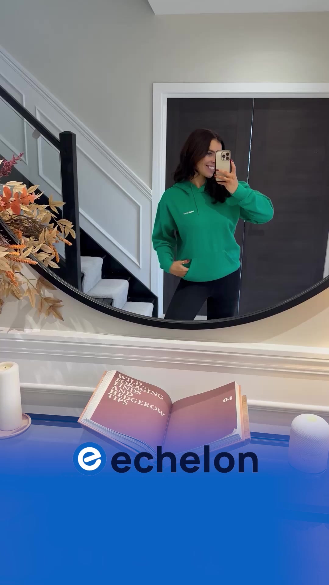
You asked for harder… so we delivered. More intensity. More challenge. No excuses. Welcome to the next level of #Inferno45 — with classes from Michael & Joey 🔥 Catch Michael’s class tomorrow at 12:00 PM ET / 5:00 PM BST. #EchelonFitness #WorkoutWithUs #ChallengeYourself
SubscribeThe funnel behind it

Funnel score
8-point CRO breakdown
How well the landing page behind the ad is built to convert, scored across 8 factors: offer, copy, speed, trust, mobile, message-match, CTA, and social proof.
What this funnel does right. Steal these.
- Call to action8/10
- Mobile experience8/10
- Offer clarity8/10
- Page speed7/10
- Trust signals7/10
- Headline7/10
- Social proof7/10
Where it's weak
- Message match5/10
Full breakdown
Call to action
8/10Multiple 'CHOOSE PLAN' buttons are prominent and action-oriented, with clear visual hierarchy; however, primary CTA text is generic and doesn't match ad's intensity messaging.
- Two prominent 'CHOOSE PLAN' buttons (one per tier) in contrasting blue color
- Clear visual hierarchy with buttons positioned directly under pricing
- 'Cancel Anytime' reassurance text below monthly option reduces friction
- CTA text 'CHOOSE PLAN' is generic and doesn't match ad's 'Subscribe' or intensity theme
- No urgency language (e.g., 'Start Now', 'Join the Challenge')
- Multiple CTAs may dilute focus; unclear which is primary
Page speed
7/10PageSpeed score of 69 converts to approximately 6.9/10; page loads acceptably but has room for optimization, particularly for mobile performance.
- Page appears to load with visible content quickly
- Images are present but not excessively large
- Score of 69 indicates moderate performance issues
- Likely optimization needed for image compression or lazy loading
Trust signals
7/10Professional design, specific pricing, and one customer testimonial build trust; however, limited social proof, no security badges, and no company credentials or guarantees visible.
- Professional branding and clean design throughout
- Specific pricing ($39.99, $11.99) rather than vague 'starting at' language
- Named customer testimonial with 5-star rating
- No security badges, SSL indicators, or privacy policy links visible
- Limited social proof (only one review shown)
- No company credentials, founding date, or user statistics
Mobile experience
8/10Layout appears responsive with stacked elements, readable text, and touch-friendly button sizing; however, some sections may require horizontal scrolling or have cramped spacing on smaller screens.
- Buttons are large and easily tappable (CHOOSE PLAN buttons)
- Text is readable with good contrast throughout
- Stacked layout suggests mobile-first responsive design
- Feature lists with checkmarks may be cramped on very small screens
- Multiple CTAs could create confusion on mobile with limited screen real estate
Headline
7/10Main headline 'JOIN THE ECHELON FITNESS COMMUNITY' is clear and benefit-focused but generic; doesn't differentiate or create urgency.
- Large, bold typography makes it immediately visible
- Community-focused messaging aligns with fitness industry norms
- Positioned prominently above the fold
- Generic language ('join the community') lacks specificity or differentiation
- No mention of the 'harder' intensity or challenge referenced in the ad
- Doesn't communicate the 'next level' positioning from the ad copy
Social proof
7/10One 5-star review quote from 'Amber G.' appears early, but limited social proof overall; no review count, testimonial volume, or user statistics visible.
- 5-star rating display with full stars immediately under headline
- Specific customer quote ('I've completely changed my mental health and physical health') is credible and outcome-focused
- Attributed to named customer (Amber G.) adds authenticity
- Only one testimonial visible on entire page
- No review count or aggregate rating statistics shown
- No user numbers, subscriber counts, or other quantitative social proof
Message match
5/10Ad emphasizes 'harder', 'intensity', 'challenge', and 'next level' with instructor names (Michael & Joey), but landing page focuses on membership features and community without reinforcing the challenge/intensity positioning.
- Page mentions 'COMPLETE EXPERT-LED CHALLENGES' in feature list
- Instructor section ('MEET THE DREAM TEAM') appears lower on page
- Multiple class types (ride, run, row, FitPass) align with ad's fitness focus
- Headline doesn't reference 'challenge', 'intensity', or 'next level' from ad
- No mention of Michael & Joey or #Inferno45 class on visible sections
- Page leads with generic 'community' messaging instead of challenge/intensity positioning
Offer clarity
8/10Two membership tiers are clearly presented with distinct pricing ($39.99/mo Premier, $11.99/mo FitPass) and feature lists, though the value proposition differences could be more explicit.
- Premier membership clearly labeled 'MOST POPULAR' with dark header
- Comprehensive feature lists with checkmarks for each tier
- Annual pricing option shown as savings ($33.33/mo vs $39.99/mo)
- FitPass tier lacks a 'MOST POPULAR' label despite potentially being the entry point
- Feature comparison between tiers requires reading both sections separately
More ads from Echelon
View all →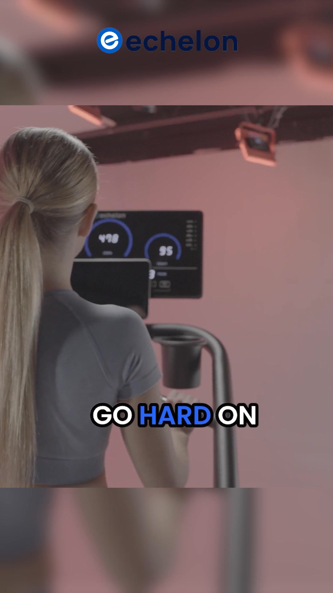

Your own page
You just read somebody else's funnel. What does yours score?
The score above came from the real landing page behind this ad, graded on 8 CRO factors. Run your own page through the same rubric, free, and see what each factor found and where you give up the most ground.
Free, no signup, no card. The same 8 factor score every page here was graded on.
Keep exploring
Data from the public Meta Ad Library. Funnelens is not affiliated with or endorsed by Meta. See data sources.