NOBULL
Instagram · Video
The ad
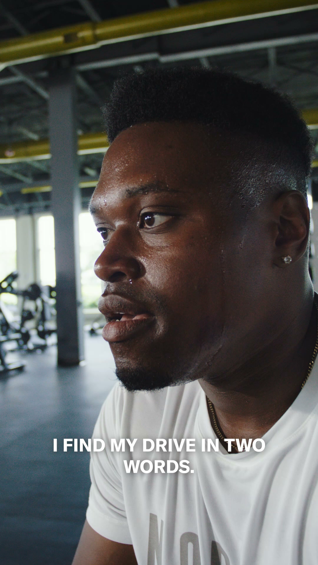
Drive 2 Ripstop: locked-in for dynamic training. Drive 2: breathable for fast-paced training. Find your Drive.
Shop nowThe funnel behind it
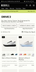
Offer: Get 25% off your first order. Use code WELCOME25
Funnel score
8-point CRO breakdown
How well the landing page behind the ad is built to convert, scored across 8 factors: offer, copy, speed, trust, mobile, message-match, CTA, and social proof.
This product collection page does well with clear product imagery, consistent pricing ($150), and strong social proof through star ratings (4.8-5.0) on nearly every shoe. The headline "Drive 2" is minimal but supported by a clear subheading explaining the product category. However, the page suffers from severe speed issues (PageSpeed 31/100), which is critical for mobile conversion. The primary CTA "Of Course. Lock it in." is buried in a modal popup at the bottom and doesn't clearly connect to the product collection. The offer clarity is strong with the 25% discount prominently displayed, but the message match between the ad's focus on "dynamic training" and "fast-paced training" distinctions isn't clearly reflected in the product filtering or descriptions visible on the page.
What this funnel does right. Steal these.
- Social proof9/10
- Trust signals8/10
- Offer clarity8/10
- Mobile experience7/10
Where it's weak
- Page speed3/10
- Call to action4/10
- Message match5/10
Full breakdown
Call to action
4/10Primary CTA 'Of Course. Lock it in.' appears only in a modal popup at the bottom of the page, not prominently on product cards or above the fold.
- Modal CTA is visually distinct with high contrast (black background, white text)
- CTA is buried in a modal popup at bottom, not on product cards
- No 'Add to Cart' or 'Shop' buttons visible on individual products in the grid
- CTA text 'Of Course. Lock it in.' is cryptic and doesn't clearly indicate purchase action
Page speed
3/10PageSpeed score of 31/100 converts to approximately 3/10, indicating critical performance issues that will severely impact conversion rates.
- PageSpeed score of 31/100 is critically low
- Large product image grid likely causing slow load times
- Multiple high-resolution product photos across 40+ items
Trust signals
8/10Strong trust signals include consistent 4.8-5.0 star ratings across products, NOBULL brand logo, clear company information in footer, and transparent pricing.
- Star ratings (4.8-5.0) on nearly every product build credibility
- Established NOBULL brand logo and navigation structure
- Footer includes company address (Boston, MA) and legal links (Terms, Privacy Policy)
- No customer review counts visible (e.g., '4.9 stars from 2,100 reviews')
- No testimonials or customer quotes on the page
Mobile experience
7/10Layout appears responsive with stacked product grid, readable text, and accessible navigation, though the severe speed issues will impact mobile experience.
- Product grid appears to stack properly for mobile viewing
- Text is readable and navigation menu is accessible
- Color swatches are visible and interactive on mobile
- PageSpeed score of 31 indicates severe mobile performance issues
- Modal popup at bottom may be difficult to interact with on small screens
Headline
6/10Main headline 'Drive 2' is minimal; supported by subheading 'Our New Hybrid Trainer. Re-Engineered for Performance, Comfort, and Style.'
- Subheading clearly explains product category and benefits
- Product name is prominent and memorable
- Single-word headline 'Drive 2' lacks compelling hook or differentiation
- Doesn't emphasize the 'dynamic' vs 'breathable' distinction mentioned in the ad
Social proof
9/10Nearly every product card displays star ratings (4.8-5.0 stars), with multiple color/variant options shown and 'NEW' badges on select items.
- Star ratings visible on 20+ product cards throughout the page
- Ratings consistently high (4.8-5.0 range) building credibility
- NEW COLOR and NEW badges create freshness perception
Message match
5/10Ad emphasizes 'Drive 2 Ripstop: locked-in for dynamic training' vs 'Drive 2: breathable for fast-paced training', but the page doesn't clearly differentiate these two product lines in filtering or messaging.
- Both Drive 2 and Drive 2 Ripstop variants are present on the page
- Product descriptions mention 'Locked-In Hybrid Training Shoe' and 'Lightweight Hybrid Training Shoe'
- No clear visual separation or filtering between Ripstop and standard Drive 2 models
- Ad's emphasis on 'dynamic' vs 'fast-paced' training distinction not reflected in product copy
- Tab navigation shows 'MEN'S DRIVE 2 MESH' and 'WOMEN'S DRIVE 2 MESH' but doesn't highlight Ripstop variant
Offer clarity
8/10The 25% off first order offer is clearly stated at the bottom with email signup, and all products are consistently priced at $150.
- 25% Off First Order headline with clear value proposition
- Consistent $150 pricing visible on all product cards
- Email signup form with clear benefit statement
- Discount code WELCOME25 shown at top is partially cut off
- No urgency messaging (expiration date, limited quantity)
More ads from NOBULL
View all → 32dVIDEO
Outwork Flex: Our newest strength trainer. Flexible. Durable. Locked-In. Stable for lifts. Added comfort for dynamic moves.
 31dCAROUSEL
New Outwork Flex
 20dVIDEO
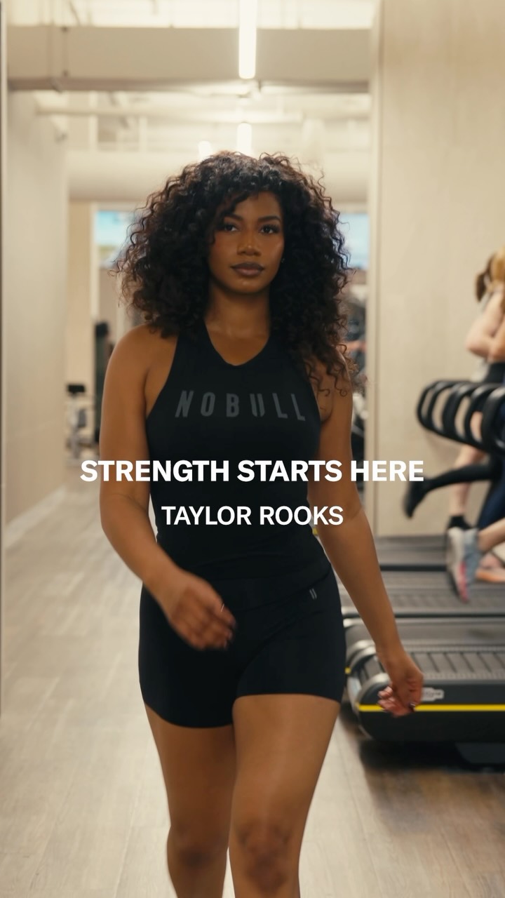
Living up to outside expectations? @taylorrooks knows that real strength starts when you focus on living up to your own. Strength Starts Here.
Outwork Flex: Our newest strength trainer. Flexible. Durable. Locked-In. Stable for lifts. Added comfort for dynamic moves.
 18dVIDEO
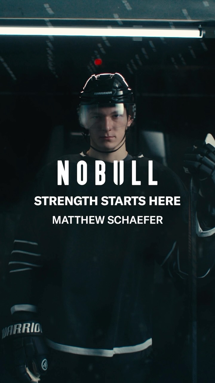
For @matthew.schaefer48, strength starts when you approach the offseason one day at a time, and focus on building the best version of yourself. Strength Starts Here.
 14dVIDEO
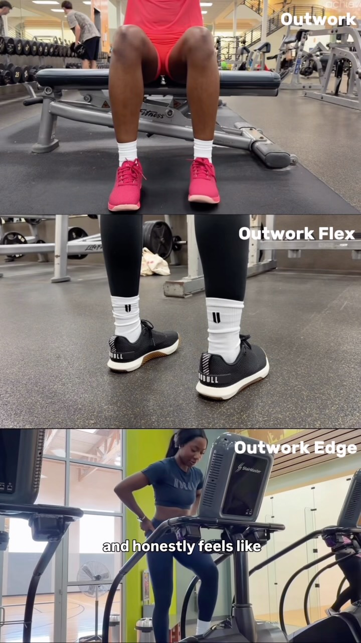
No matter how you start your day, the Outwork lineup has you covered. Three shoes. One NOBULLsh*t approach to training.
Your own page
You just read somebody else's funnel. What does yours score?
The score above came from the real landing page behind this ad, graded on 8 CRO factors. Run your own page through the same rubric, free, and see what each factor found and where you give up the most ground.
Free, no signup, no card. The same 8 factor score every page here was graded on.
Keep exploring
Data from the public Meta Ad Library. Funnelens is not affiliated with or endorsed by Meta. See data sources.