Ollie
Facebook · Instagram · Messenger · Video
The ad
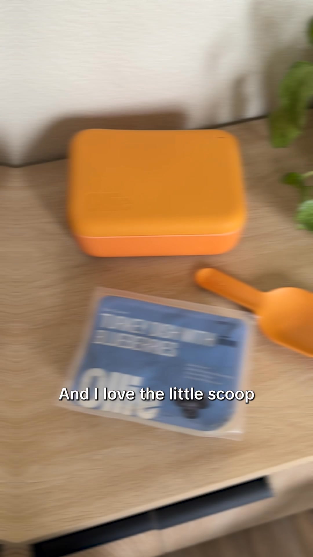
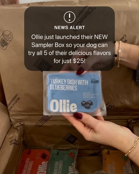
FETCH 50% OFF + FREE WELCOME KIT 🧡 Ollie creates fresh meals with a simple mission: your dog’s wellness. 🐾 Custom meal plans for your pup 🥕 100% fresh, human-grade ingredients 🩺 Formulated with vet nutritionists 🐕 Unlimited routine health screenings ⭐️ Thousands of raving reviews Discover the perfect meal plan for your dog with a quick quiz!
Get 50% OFF Your First Box!
Shop nowThe funnel behind it
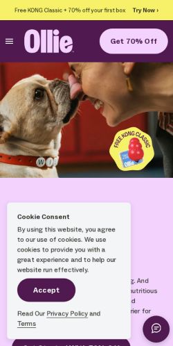
Offer: Get 70% Off
Funnel score
8-point CRO breakdown
How well the landing page behind the ad is built to convert, scored across 8 factors: offer, copy, speed, trust, mobile, message-match, CTA, and social proof.
Ollie's landing page excels at emotional connection and trust-building through authentic dog imagery, extensive social proof (20,000+ 5-star reviews), and a clear value proposition. The page effectively showcases the product offering with detailed "how it works" steps, ingredient transparency, and a comprehensive comparison table. However, the page suffers from significant speed issues (PageSpeed 48/100), inconsistent discount messaging (advertised 50% off vs. page's 70% off), and a somewhat buried primary CTA that requires scrolling. The mobile experience appears functional but could be optimized further. The messaging around fresh, vet-formulated meals aligns well with the ad, but the discount discrepancy creates confusion about the actual offer.
What this funnel does right. Steal these.
- Social proof9/10
- Trust signals8/10
- Offer clarity8/10
- Call to action7/10
- Headline7/10
Where it's weak
- Page speed5/10
- Message match5/10
Full breakdown
Call to action
7/10Multiple CTAs present ('Get 70% Off', 'Get Started With 70% Off', 'Get Ollie Delivered', 'Get Started') with consistent purple branding, but primary CTA requires scrolling and isn't sticky.
- High-contrast purple buttons with clear, action-oriented copy
- Multiple CTA placements throughout page (header, after value prop, after how-it-works, footer)
- Button text is specific and benefit-driven ('Get Started With 70% Off')
- Primary CTA not sticky/fixed to viewport—requires scrolling to find
- Header CTA ('Get 70% Off') is less prominent than it could be
- No clear visual hierarchy between multiple CTAs—could confuse users about which to click
Page speed
5/10PageSpeed score of 48/100 indicates significant performance issues that will hurt conversion rates and user experience.
- Images appear to load and display properly
- Page structure is logical and doesn't require excessive scrolling for key content
- PageSpeed score of 48/100 is well below acceptable threshold (should be 70+)
- Slow load time will increase bounce rate and reduce conversions
- Multiple image-heavy sections likely contributing to performance issues
Trust signals
8/10Strong trust signals throughout: 20,000+ verified reviews, real customer testimonials with photos, detailed ingredient transparency, vet nutritionist formulation, and comprehensive FAQ section.
- 20,000+ 5-star reviews with link to full reviews
- Real customer testimonials with dog photos and specific names
- Detailed 'How it works' section explaining the process transparently
- No visible money-back guarantee or risk-reversal statement in main content
- No trust badges (SSL, BBB, etc.) visible in the screenshots
- No clear company background or 'about us' information visible on page
Mobile experience
6/10Page appears responsive with stacked layouts and touch-friendly buttons, but some elements may be cramped on small screens.
- Buttons are large and easily tappable
- Content stacks vertically for mobile viewing
- Images scale responsively
- Comparison table may be difficult to read on mobile due to small text
- FAQ section with expandable items could be optimized for mobile interaction
- Hero image takes significant vertical space on mobile, pushing content below fold
Headline
7/10The headline 'Only the best for your #1' is emotionally resonant and benefit-focused, though somewhat generic.
- Emotionally compelling language that speaks to pet owner psychology
- Positioned prominently after hero image with strong visual hierarchy
- Reinforces brand positioning around premium, quality-focused offering
- Doesn't mention the core benefit (fresh food, health, nutrition) explicitly
- Generic enough that it could apply to many pet brands
- Doesn't reinforce the discount or urgency that drives conversions
Social proof
9/10Extensive social proof throughout: 20,000+ 5-star reviews prominently displayed, customer testimonials with photos and names, and a detailed comparison table showing product advantages.
- 20,000+ 5-Star Reviews badge with clickable link positioned directly under headline
- Real customer testimonials with dog photos, names, and specific results (e.g., 'Never Misses a Meal')
- Comprehensive feature comparison table showing Ollie's advantages over competitors
- Testimonials carousel only shows one at a time—could display multiple simultaneously
- No visible trust badges (SSL, money-back guarantee, etc.) in the visible sections
- Customer reviews section doesn't show individual star ratings or review text
Message match
5/10Significant mismatch: ad promises 50% off + free welcome kit, but page advertises 70% off; ad emphasizes quiz and custom meal plans, page emphasizes product features and social proof.
- Both ad and page focus on fresh, human-grade ingredients
- Both mention vet nutritionist formulation
- Both reference health benefits and customer satisfaction
- Ad says '50% OFF' but page says '70% OFF'—major discount discrepancy
- Ad emphasizes 'quick quiz' as entry point, but page buries quiz in 'How it works' section
- Ad highlights 'unlimited routine health screenings' prominently, but page mentions this only in comparison table
Offer clarity
8/10The offer is clearly stated as 70% off with a free welcome kit, though it conflicts with the ad's 50% off claim.
- Prominent 'Get 70% Off' button in header
- Clear breakdown of what's included in the starter box (meals, tools, feeding guide)
- Visual product showcase with labeled components (scoop, puptainer)
- Discount mismatch between ad (50% off) and landing page (70% off) creates confusion
- No clear expiration date or urgency deadline visible for the offer
- Pricing details not shown on page—users must complete quiz to see actual cost
More ads from Ollie
View all →



Your own page
You just read somebody else's funnel. What does yours score?
The score above came from the real landing page behind this ad, graded on 8 CRO factors. Run your own page through the same rubric, free, and see what each factor found and where you give up the most ground.
Free, no signup, no card. The same 8 factor score every page here was graded on.
Keep exploring
Data from the public Meta Ad Library. Funnelens is not affiliated with or endorsed by Meta. See data sources.