Botanique Paris
Facebook · Instagram · Audience Network · Image
The ad
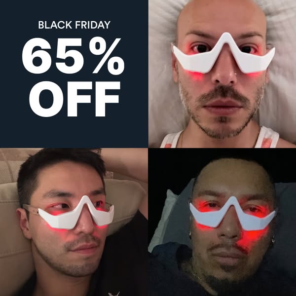
Millions of men worldwide are ditching expensive surgeries and using RevitalEyes to naturally rejuvenate their under eyes You're our next success story 🫵
What are you waiting for 👉
Get offerThe funnel behind it

Offer: $79.95 (Save 50% / $80.04 off original $220.98)
Funnel score
8-point CRO breakdown
How well the landing page behind the ad is built to convert, scored across 8 factors: offer, copy, speed, trust, mobile, message-match, CTA, and social proof.
This page excels at social proof with extensive before/after imagery, clinician endorsements, and specific consumer results (82-91% saw improvements). The offer is clear with prominent pricing and discount display. However, the page suffers from poor mobile optimization—text is cramped, CTAs are small, and the layout doesn't adapt well to smaller screens. Page speed is critically slow (42/100), which will hurt conversion. The headline is functional but generic. Multiple CTAs ("ADD TO CART" appears twice) create some friction. Trust is strong through clinical backing and guarantees, but the slow load time undermines the professional presentation.
What this funnel does right. Steal these.
- Trust signals9/10
- Social proof9/10
- Offer clarity9/10
- Message match8/10
- Call to action7/10
Where it's weak
- Page speed4/10
- Mobile experience4/10
Full breakdown
Call to action
7/10Primary CTA 'ADD TO CART' is clear and action-oriented, but appears multiple times on the page creating some friction, and button sizing could be larger for mobile.
- Clear, action-oriented button text 'ADD TO CART'
- Dark navy button color provides good contrast against light background
- CTA appears in multiple strategic locations (mid-page and lower page)
- Multiple identical CTAs on same page may confuse user priority
- Button appears relatively small on mobile view
- No urgency language in CTA itself (e.g., 'Buy Now', 'Claim Offer')
Page speed
4/10PageSpeed score of 42/100 converts to approximately 4.2/10—critically slow, well below acceptable thresholds.
- PageSpeed score of 42/100 indicates severe performance issues
- Multiple high-resolution images and videos likely causing load delays
- Slow load time will significantly impact conversion rates and user experience
Trust signals
9/10Strong trust signals: Clinicians' Choice badge, 902 clinician endorsements, 4.8-star rating from 11K+ reviews, before/after photos, clinical study link, money-back guarantee, HSA/FSA eligibility, and specific result statistics.
- Clinicians' Choice badge with statement: '902 clinicians, including dermatologists, share this on FrontrowMD without compensation'
- 4.8-star rating from 11,190 reviews with 'Trusted by TM+ customers' label
- Money-back guarantee: '365 DAY GUARANTEE' and 'Less than 0.5% of users claim our money-back guarantee'
Mobile experience
4/10Mobile experience is poor: text is cramped, images don't scale properly, CTAs are small, and navigation is cluttered.
- Product images are visible on mobile
- Price and discount information remains readable
- Text content appears cramped and difficult to read on narrow screens
- CTA buttons appear too small for easy mobile tapping
- Product carousel thumbnails are difficult to interact with on mobile
Headline
6/10The headline is descriptive but lacks emotional appeal or urgency that would differentiate from competitors.
- Clearly identifies the product and its dual function (Red Light Therapy + EMS)
- Specifies target audience (For Men)
- Generic, feature-focused language without benefit-driven hook
- No sense of urgency or transformation promise
- Doesn't address the pain point (eye bags, aging) in the headline itself
Social proof
9/10Extensive social proof throughout: 4.8-star rating from 11,190 reviews, Clinicians' Choice badge, 902 clinicians endorsing, before/after photos, specific result percentages (82-91%), and customer testimonials with photos.
- 4.8 stars from 11,190 reviews displayed prominently under product title
- Clinicians' Choice badge with 902 clinicians endorsement statement
- Multiple before/after transformation photos with customer names and testimonials
Message match
8/10Ad promises 'naturally rejuvenate under eyes' and positions as alternative to 'expensive surgeries'—page delivers on this with clinical technology, before/afters, and affordability messaging.
- Ad's 'naturally rejuvenate' claim matches page's emphasis on non-invasive red light therapy
- Ad's surgery alternative positioning aligns with page's 'No Surgery or Downtime' section
- Ad's success story angle matches extensive before/after results displayed
- Ad targets 'millions of men' but page doesn't emphasize male-specific benefits beyond title
Offer clarity
9/10Price, discount amount, and original price are all clearly displayed with strong visual hierarchy.
- Original price ($220.98) crossed out next to sale price ($79.95)
- Discount amount explicitly stated: 'Save 50% ($80.04)'
- Multiple product bundle options shown with clear pricing
More ads from Botanique Paris
View all →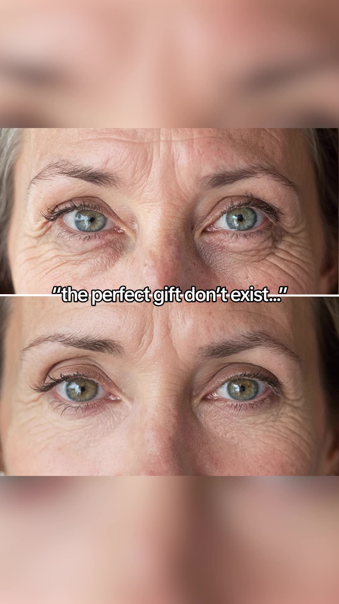
Your own page
You just read somebody else's funnel. What does yours score?
The score above came from the real landing page behind this ad, graded on 8 CRO factors. Run your own page through the same rubric, free, and see what each factor found and where you give up the most ground.
Free, no signup, no card. The same 8 factor score every page here was graded on.
Keep exploring
Data from the public Meta Ad Library. Funnelens is not affiliated with or endorsed by Meta. See data sources.