NOBULL
Instagram · Video
The ad
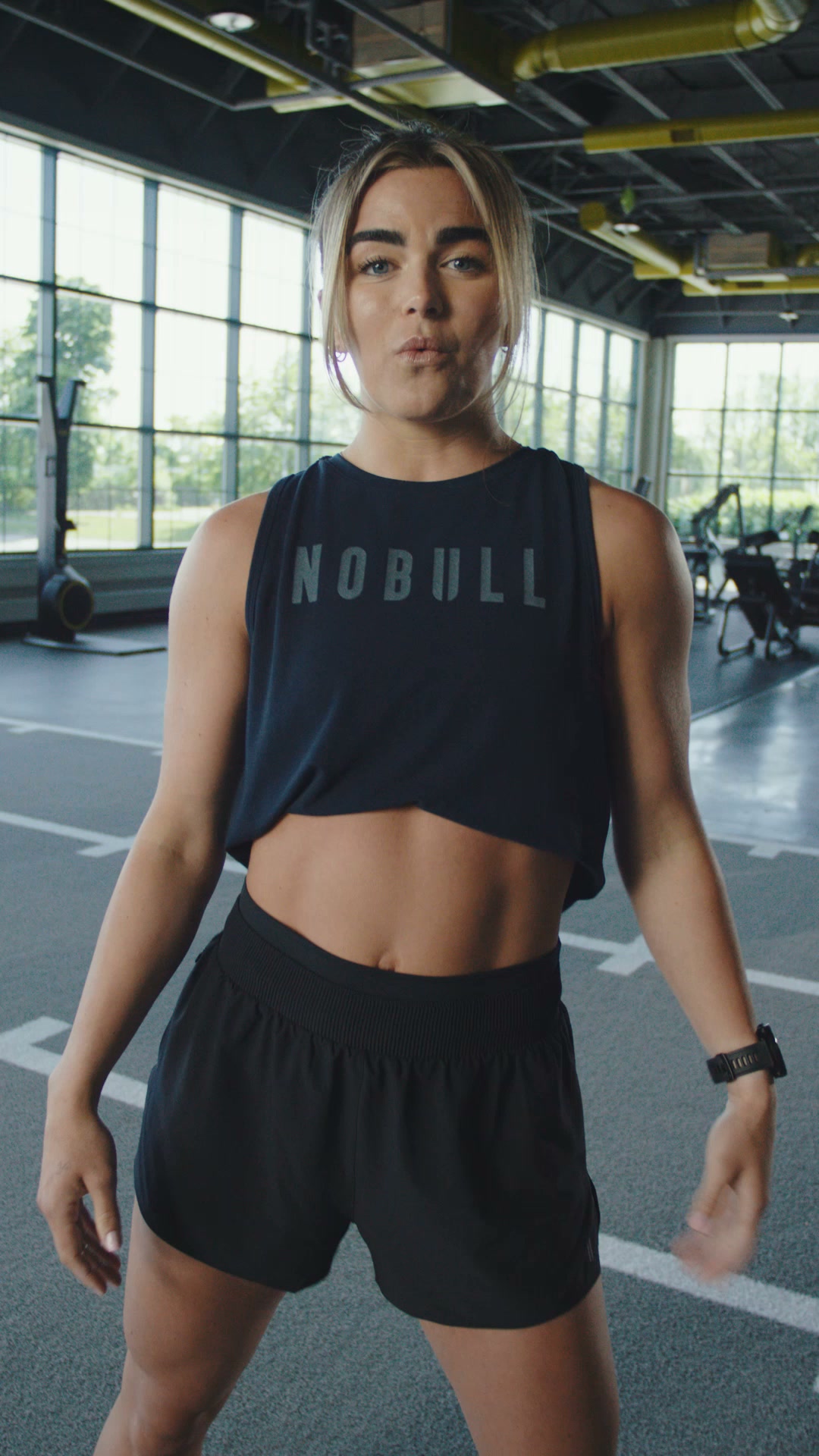
Drive 2 Ripstop: locked-in for dynamic training. Drive 2: breathable for fast-paced training. Find your Drive.
Shop nowThe funnel behind it

Offer: Drive 2 Ripstop: locked-in for dynamic training. Drive 2: breathable for fast-paced training. Find your Drive.
Funnel score
8-point CRO breakdown
How well the landing page behind the ad is built to convert, scored across 8 factors: offer, copy, speed, trust, mobile, message-match, CTA, and social proof.
This landing page effectively showcases the Drive 2 product line with clear segmentation and good message-to-ad alignment. However, it suffers from critical performance issues (39 PageSpeed score) that will significantly harm conversion rates. The page lacks persuasive social proof elements—no reviews, testimonials, or user ratings—which are essential for e-commerce conversion. CTAs are present but lack urgency or compelling language. The design is clean and mobile-responsive, but the slow load speed undermines the user experience. Trust is built primarily on brand recognition rather than explicit trust signals. The product imagery is strong, but the page needs customer validation, performance optimization, and more compelling benefit-driven messaging to maximize conversions.
What this funnel does right. Steal these.
- Mobile experience: Mobile layout appears responsive and functional. Product grid adapts well, navigation is accessible, and CTAs are tap-friendly. Color swatches and product images scale appropriately. No obvious mobile UX friction detected.
- Message match: Strong alignment between ad copy and landing page. Ad mentions 'Drive 2 Ripstop' and 'Drive 2' with training focus; page delivers exactly this with clear product segmentation (Mesh vs Ripstop, Men's vs Women's). Message consistency is excellent.
- Call to action: Multiple CTAs present: 'Shop Here' banner at top, product cards with implicit click-to-purchase, and newsletter signup CTA at bottom. Primary CTAs are clear but not particularly compelling. Missing urgency language (e.g., 'Limited stock', 'Shop now before they're gone').
- Offer clarity: Clear product differentiation between Drive 2 Ripstop and Drive 2 variants. Price point ($150) is visible. However, the value proposition (why choose Drive 2 over competitors) isn't explicitly stated beyond 'hybrid trainer' positioning.
Where it's weak
- Page speed2/10
PageSpeed score of 39 is critically poor. This severely impacts conversion rates, especially on mobile. Slow load times increase bounce rate and reduce trust. Immediate optimization needed for Core Web Vitals.
- Social proof4/10
Minimal social proof present. No customer reviews, ratings, testimonials, or user-generated content visible. No trust badges, certifications, or athlete endorsements shown. Only implicit proof through product imagery and 'NEW' labels, which is insufficient for conversion optimization.
- Trust signals5/10
Moderate trust signals. Brand logo and professional design present. Newsletter signup with privacy policy link shows transparency. However, no customer reviews, return policy visibility, security badges, or company credibility markers (awards, press mentions, customer count) are evident. Trust is built primarily on brand recognition alone.
Full breakdown
Multiple CTAs present: 'Shop Here' banner at top, product cards with implicit click-to-purchase, and newsletter signup CTA at bottom. Primary CTAs are clear but not particularly compelling. Missing urgency language (e.g., 'Limited stock', 'Shop now before they're gone').
PageSpeed score of 39 is critically poor. This severely impacts conversion rates, especially on mobile. Slow load times increase bounce rate and reduce trust. Immediate optimization needed for Core Web Vitals.
Moderate trust signals. Brand logo and professional design present. Newsletter signup with privacy policy link shows transparency. However, no customer reviews, return policy visibility, security badges, or company credibility markers (awards, press mentions, customer count) are evident. Trust is built primarily on brand recognition alone.
Mobile layout appears responsive and functional. Product grid adapts well, navigation is accessible, and CTAs are tap-friendly. Color swatches and product images scale appropriately. No obvious mobile UX friction detected.
Page headline 'DRIVE 2' is minimal and product-focused but lacks emotional hook or benefit statement. Subheading 'Our New Hybrid Trainer. Re-Engineered for Performance, Comfort, and Style' provides context but is generic. No urgency or compelling reason to act now.
Minimal social proof present. No customer reviews, ratings, testimonials, or user-generated content visible. No trust badges, certifications, or athlete endorsements shown. Only implicit proof through product imagery and 'NEW' labels, which is insufficient for conversion optimization.
Strong alignment between ad copy and landing page. Ad mentions 'Drive 2 Ripstop' and 'Drive 2' with training focus; page delivers exactly this with clear product segmentation (Mesh vs Ripstop, Men's vs Women's). Message consistency is excellent.
Clear product differentiation between Drive 2 Ripstop and Drive 2 variants. Price point ($150) is visible. However, the value proposition (why choose Drive 2 over competitors) isn't explicitly stated beyond 'hybrid trainer' positioning.
More ads from NOBULL
View all →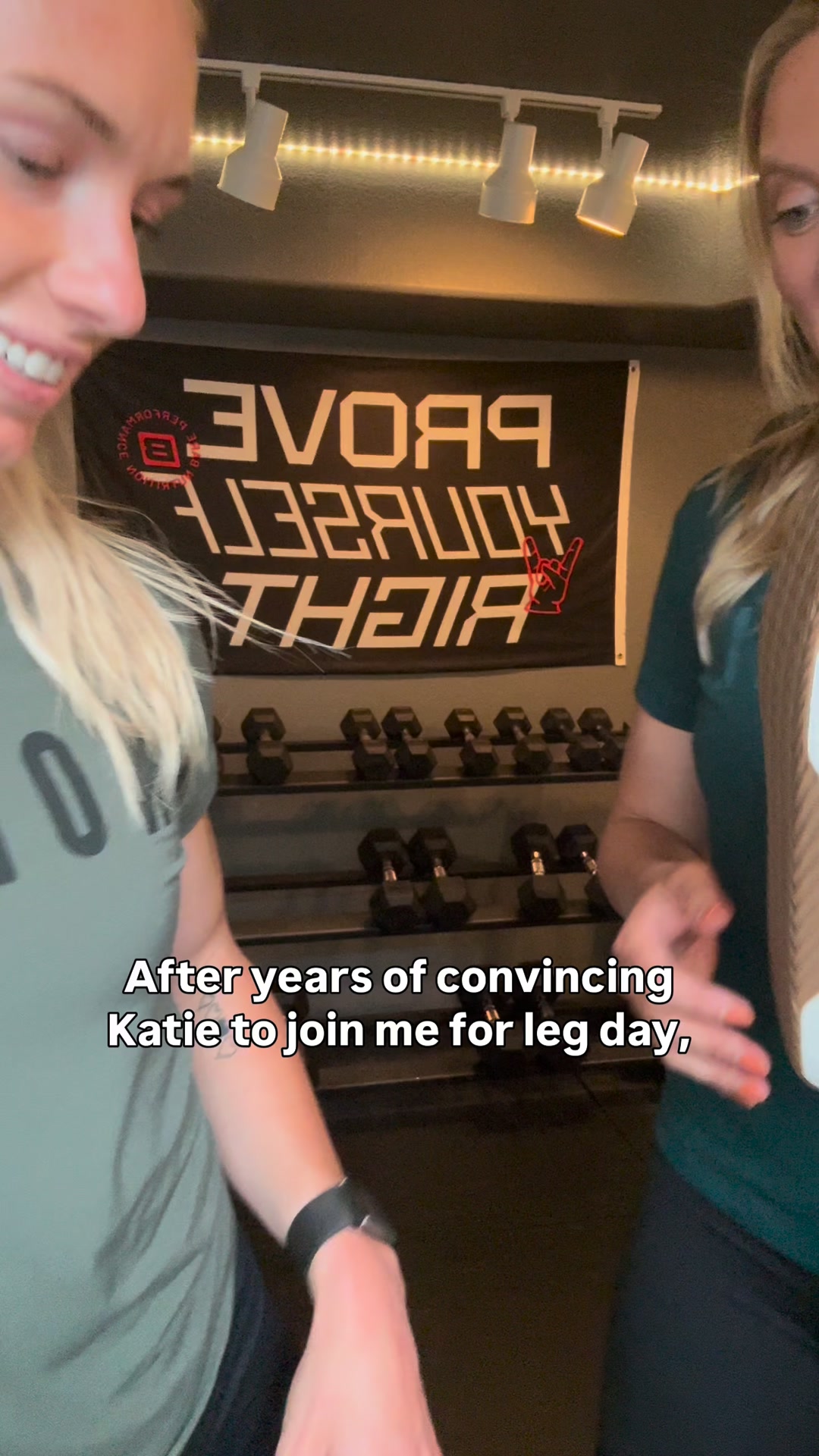 32dVIDEO
Outwork Flex: Our newest strength trainer. Flexible. Durable. Locked-In. Stable for lifts. Added comfort for dynamic moves.
 31dCAROUSEL
New Outwork Flex
 20dVIDEO
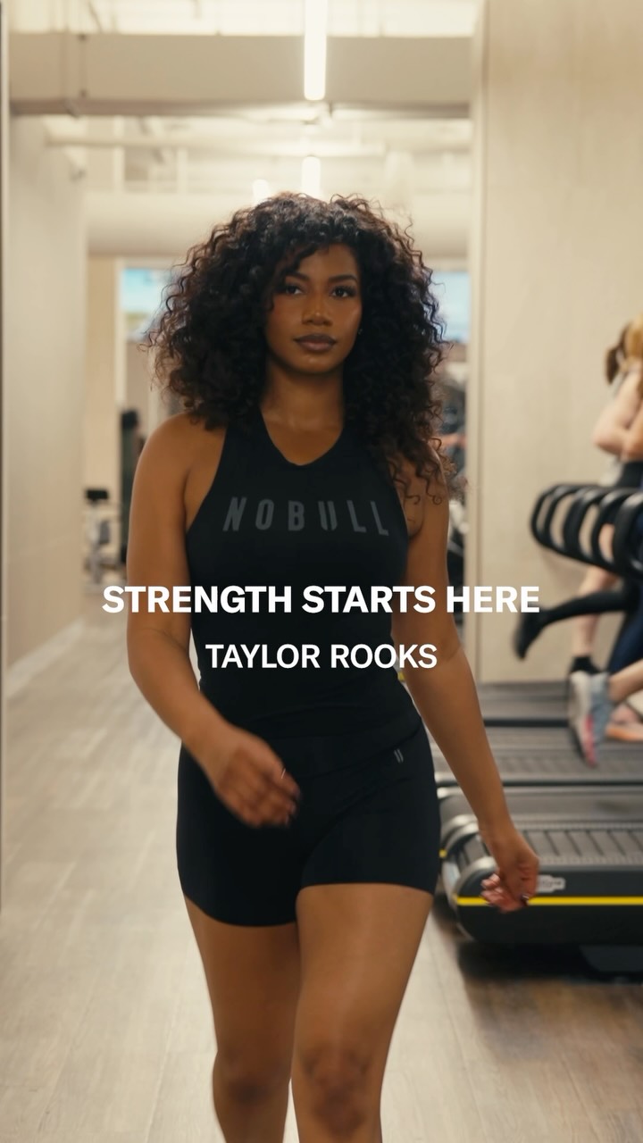
Living up to outside expectations? @taylorrooks knows that real strength starts when you focus on living up to your own. Strength Starts Here.
Outwork Flex: Our newest strength trainer. Flexible. Durable. Locked-In. Stable for lifts. Added comfort for dynamic moves.
 18dVIDEO
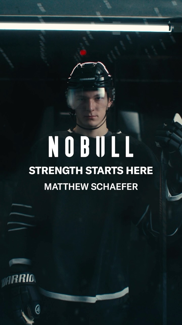
For @matthew.schaefer48, strength starts when you approach the offseason one day at a time, and focus on building the best version of yourself. Strength Starts Here.
 14dVIDEO
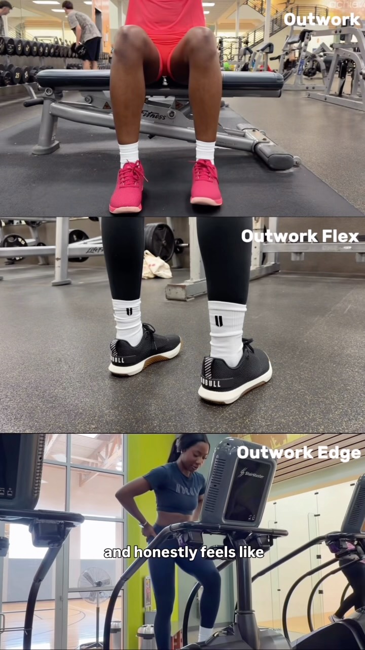
No matter how you start your day, the Outwork lineup has you covered. Three shoes. One NOBULLsh*t approach to training.
Your own page
You just read somebody else's funnel. What does yours score?
The score above came from the real landing page behind this ad, graded on 8 CRO factors. Run your own page through the same rubric, free, and see what each factor found and where you give up the most ground.
Free, no signup, no card. The same 8 factor score every page here was graded on.
Keep exploring
Data from the public Meta Ad Library. Funnelens is not affiliated with or endorsed by Meta. See data sources.