Bowflex
Facebook · Instagram · Audience Network · Video
The ad

Discover innovative equipment that adapts to you, making every workout and home gym space personal and intuitive to use.
A Next Level Workout
Shop nowThe funnel behind it

Offer: Fitness should feel good.
Funnel score
8-point CRO breakdown
How well the landing page behind the ad is built to convert, scored across 8 factors: offer, copy, speed, trust, mobile, message-match, CTA, and social proof.
This landing page excels at emotional branding and visual design, with vibrant imagery and an inspiring message that aligns well with the ad's promise of personalized, intuitive fitness. However, it suffers from weak conversion mechanics: the primary CTA is vague ("Learn More" rather than "Shop Now"), there's no clear pricing or offer details visible, and the page lacks trust signals like reviews or guarantees. Mobile optimization appears solid with readable text and touch-friendly buttons, but the page speed is poor (58/100), which will hurt conversion rates. The featured products section provides some structure, but the overall flow doesn't create urgency or clearly guide visitors toward purchase.
What this funnel does right. Steal these.
- Mobile experience7/10
- Headline7/10
Where it's weak
- Social proof2/10
- Trust signals3/10
- Call to action4/10
- Offer clarity4/10
Full breakdown
Call to action
4/10The page uses 'Learn More' buttons for featured products, which is weak for e-commerce, and 'Explore JRNY' for the membership section, but no primary 'Shop Now' or purchase-oriented CTA is prominent.
- CTAs are visually distinct with black buttons and white text
- Multiple CTAs present throughout the page for different product sections
- Primary CTA is 'Learn More' instead of action-oriented 'Shop Now' or 'Buy'
- No urgency-driven language (limited time, exclusive, etc.)
- CTAs lead to product details rather than direct purchase flow
Page speed
6/10PageSpeed score of 58/100 converts to approximately 5.8 on the 0-10 scale, indicating below-average performance that will negatively impact conversion rates.
- Images appear to load and display properly
- Page structure is relatively clean without excessive clutter
- PageSpeed score of 58 indicates slow loading performance
- Multiple high-resolution images may be contributing to load time
- Slow speed will increase bounce rate and reduce conversions
Trust signals
3/10The page lacks essential trust signals: no customer reviews, no security badges, no guarantees, no company credentials, and no clear return policy or support information visible above the fold.
- Professional brand design and polished visual presentation
- Schwinn and JRNY brand logos suggest established companies
- No customer reviews, ratings, or testimonials visible
- No money-back guarantee, warranty, or risk-reversal statement
- No security badges or trust certifications visible
Mobile experience
7/10The page displays well on mobile with readable text, properly sized buttons, and a logical vertical layout, though some sections could be more touch-optimized.
- Text is large and readable on mobile screens
- Category cards and product sections stack vertically for easy scrolling
- Buttons appear to be appropriately sized for touch interaction
- Navigation menu is collapsed but not clearly visible in the header
- Product images could be larger for mobile viewing
- No obvious mobile-specific optimizations like click-to-call or mobile checkout
Headline
7/10The headline 'Fuel a love of movement' is emotionally resonant and brand-focused, though it doesn't directly communicate the product or value proposition.
- Emotionally compelling and memorable phrasing
- Large, bold typography that's immediately visible
- Aligns with the lifestyle/wellness positioning
- Doesn't mention the product category (fitness equipment, home gym, etc.)
- Doesn't communicate a specific benefit or outcome
- Generic enough that it could apply to any fitness brand
Social proof
2/10The page contains no visible customer reviews, ratings, testimonials, case studies, or trust badges throughout all four sections.
- No customer reviews or star ratings anywhere on the page
- No testimonials or success stories from users
- No trust badges, certifications, or social proof elements visible
Message match
6/10The page's emotional positioning ('Fuel a love of movement,' 'Fitness should feel good') aligns with the ad's promise of personalized, intuitive equipment, but lacks the 'innovative' and 'adaptive' specifics mentioned in the ad.
- Lifestyle imagery and emotional messaging match the ad's wellness focus
- Product categories (Bikes, Max Trainers, Treadmills, etc.) align with 'innovative equipment'
- Emphasis on personal fitness journey matches 'adapts to you' messaging
- Ad emphasizes 'innovative' and 'adaptive' technology, but page doesn't highlight these features
- No mention of personalization or customization capabilities visible
- Ad says 'Shop now' but page primary CTA is 'Learn More'
Offer clarity
4/10The page shows product categories and featured items but provides no pricing, subscription costs, or clear value proposition for what visitors are actually buying.
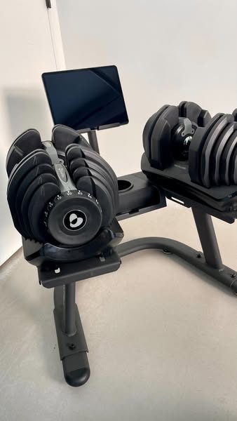
- Featured products section with product names (552i Dumbbells, Max Total 40)
- Product descriptions like 'weights that dial up to 24 kg per dumbbell'
- No pricing information visible anywhere on the page
- No clear offer or promotion (free shipping, discount, trial period, etc.)
- Vague tagline 'Fitness should feel good' doesn't explain what's being sold
More ads from Bowflex
View all →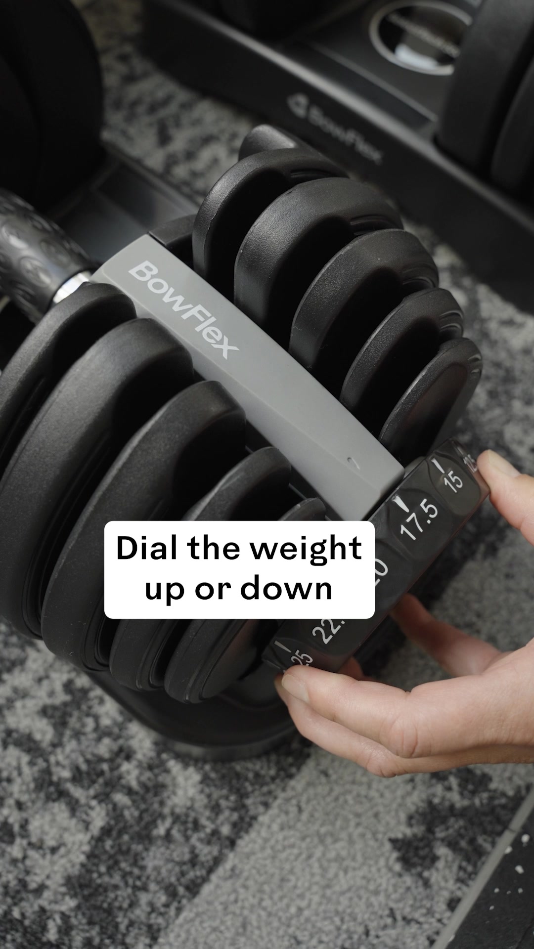

Your own page
You just read somebody else's funnel. What does yours score?
The score above came from the real landing page behind this ad, graded on 8 CRO factors. Run your own page through the same rubric, free, and see what each factor found and where you give up the most ground.
Free, no signup, no card. The same 8 factor score every page here was graded on.
Keep exploring
Data from the public Meta Ad Library. Funnelens is not affiliated with or endorsed by Meta. See data sources.