Based Supplies
Facebook · Instagram · Audience Network · Image
The ad
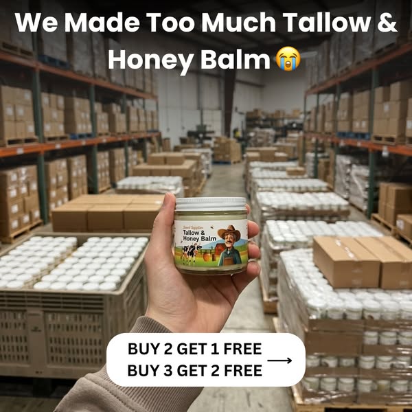
We made way too much Tallow & Honey Balm. Our warehouse is overflowing and our accountant isn't happy — so instead of letting it sit, we're doing something we've never done: Buy 2 jars, get 1 FREE. Buy 3 jars, get 2 FREE. Same grass-fed tallow. Same raw honey. Same balm that replaced every lotion, cream, and serum in your cabinet. Once the shelves are cleared, this deal is gone. Shop Now before our accountant changes his mind.
Restore Your Skin in 3 Weeks!
Learn moreThe funnel behind it

Offer: Buy 2 jars, get 1 FREE. Buy 3 jars, get 2 FREE. Limited inventory—once shelves are cleared, this deal is gone.
Funnel score
8-point CRO breakdown
How well the landing page behind the ad is built to convert, scored across 8 factors: offer, copy, speed, trust, mobile, message-match, CTA, and social proof.
This landing page has solid foundational trust and social proof but suffers from critical message-to-page misalignment and poor technical performance. The ad promises an urgent warehouse clearance sale with specific bundle discounts; the landing page delivers educational content about product benefits. The ad headline ('Restore Your Skin in 3 Weeks') doesn't match page messaging, creating cognitive dissonance. PageSpeed score of 52 is problematic—expect 20-30% higher bounce rates. The CTA mismatch ('Learn more' vs 'Check Availability') further dilutes conversion intent. Strengths include excellent social proof (1,897 reviews, credible logos, real testimonials) and clear product positioning. To improve: (1) Create a dedicated discount/offer landing page matching ad copy, (2) Optimize page speed (target 75+), (3) Align CTAs across ad and page, (4) Move social proof higher, (5) Add urgency messaging matching the ad's scarcity angle, (6) Include visible pricing/discount details above fold.
What this funnel does right. Steal these.
- Trust signals: Strong trust signals: Logos from National Library of Medicine, Healthline, Mayo Clinic, Medical News Today, Women's Health, ScienceDirect. Real customer testimonials with photos. Glass jar packaging (eco-friendly). Transparent ingredient sourcing (grass-fed tallow, organic honey). However, no money-back guarantee or return policy visible on page.
- Offer clarity: Bundle discount offer is crystal clear (Buy 2 get 1 FREE, Buy 3 get 2 FREE). Urgency messaging ('once shelves are cleared') reinforces scarcity. However, landing page doesn't prominently feature the exact discount offer from the ad—requires scrolling to find pricing details.
- Mobile experience: Layout appears responsive and readable on mobile. Text is legible, images scale well, CTAs are tappable. However, dense text blocks could be better chunked for mobile scanning. No obvious mobile-specific optimizations (e.g., sticky CTA bar).
- Social proof: Strong social proof present: 4.8★ rating with 1,897 reviews, customer testimonials with photos, and quotes from real users (Amanda, Samantha, Marissa, etc.). However, testimonials are small and appear only at bottom of page—should be higher for faster impact.
Where it's weak
- Page speed4/10
PageSpeed score of 52 is below acceptable threshold (target: 75+). Slow load time will increase bounce rate, especially on mobile. Multiple high-res images and lack of optimization are likely culprits. This significantly impacts conversion potential.
- Call to action5/10
Ad CTA is 'Learn more' (soft), but landing page primary CTA is 'Check Availability' (green button, appears twice). Mismatch between ad CTA and page CTA. Button placement is good but could be more prominent above fold. No urgency-driven CTA text matching the 'limited inventory' ad message.
- Message match5/10
Significant disconnect: Ad emphasizes warehouse overstock/urgency/bundle deals; landing page focuses on product benefits and ingredients. Ad headline promises '3 weeks' results; page doesn't mention timeline. Ad CTA 'Learn more' doesn't match page CTA 'Check Availability.' Audience expects discount offer, lands on educational content.
Full breakdown
Ad CTA is 'Learn more' (soft), but landing page primary CTA is 'Check Availability' (green button, appears twice). Mismatch between ad CTA and page CTA. Button placement is good but could be more prominent above fold. No urgency-driven CTA text matching the 'limited inventory' ad message.
PageSpeed score of 52 is below acceptable threshold (target: 75+). Slow load time will increase bounce rate, especially on mobile. Multiple high-res images and lack of optimization are likely culprits. This significantly impacts conversion potential.
Strong trust signals: Logos from National Library of Medicine, Healthline, Mayo Clinic, Medical News Today, Women's Health, ScienceDirect. Real customer testimonials with photos. Glass jar packaging (eco-friendly). Transparent ingredient sourcing (grass-fed tallow, organic honey). However, no money-back guarantee or return policy visible on page.
Layout appears responsive and readable on mobile. Text is legible, images scale well, CTAs are tappable. However, dense text blocks could be better chunked for mobile scanning. No obvious mobile-specific optimizations (e.g., sticky CTA bar).
Ad headline 'Restore Your Skin in 3 Weeks!' is benefit-driven but vague. Landing page headline 'One Jar, Countless Benefits' is different and less compelling. Mismatch between ad promise (3-week results) and page messaging creates friction.
Strong social proof present: 4.8★ rating with 1,897 reviews, customer testimonials with photos, and quotes from real users (Amanda, Samantha, Marissa, etc.). However, testimonials are small and appear only at bottom of page—should be higher for faster impact.
Significant disconnect: Ad emphasizes warehouse overstock/urgency/bundle deals; landing page focuses on product benefits and ingredients. Ad headline promises '3 weeks' results; page doesn't mention timeline. Ad CTA 'Learn more' doesn't match page CTA 'Check Availability.' Audience expects discount offer, lands on educational content.
Bundle discount offer is crystal clear (Buy 2 get 1 FREE, Buy 3 get 2 FREE). Urgency messaging ('once shelves are cleared') reinforces scarcity. However, landing page doesn't prominently feature the exact discount offer from the ad—requires scrolling to find pricing details.
More ads from Based Supplies
View all →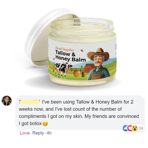 438dIMAGE
Restore Your Skin in 3 Weeks!
 437dIMAGE
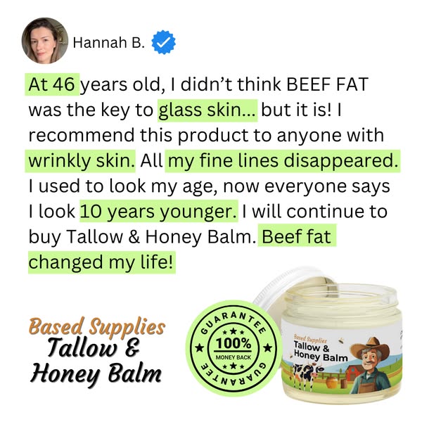
The All-in-One Skincare Solution!
 437dIMAGE
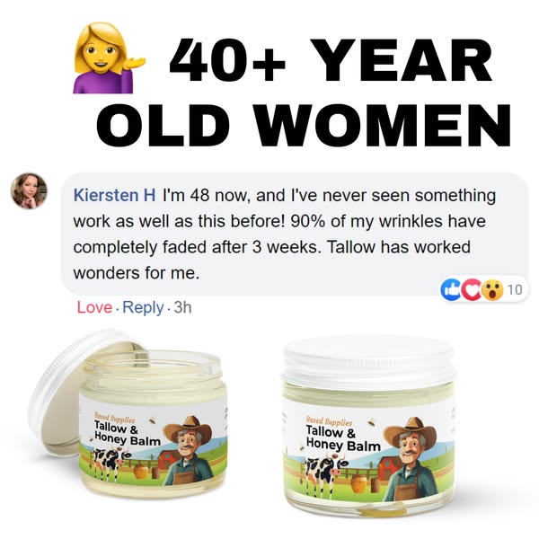
Restore Your Skin in 3 Weeks!
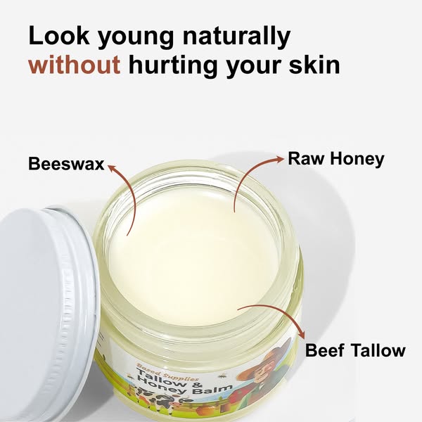 322dIMAGE
Restore Your Skin in 3 Weeks!
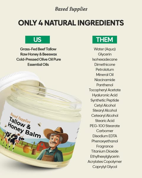 317dIMAGE
Restore Your Skin in 3 Weeks!
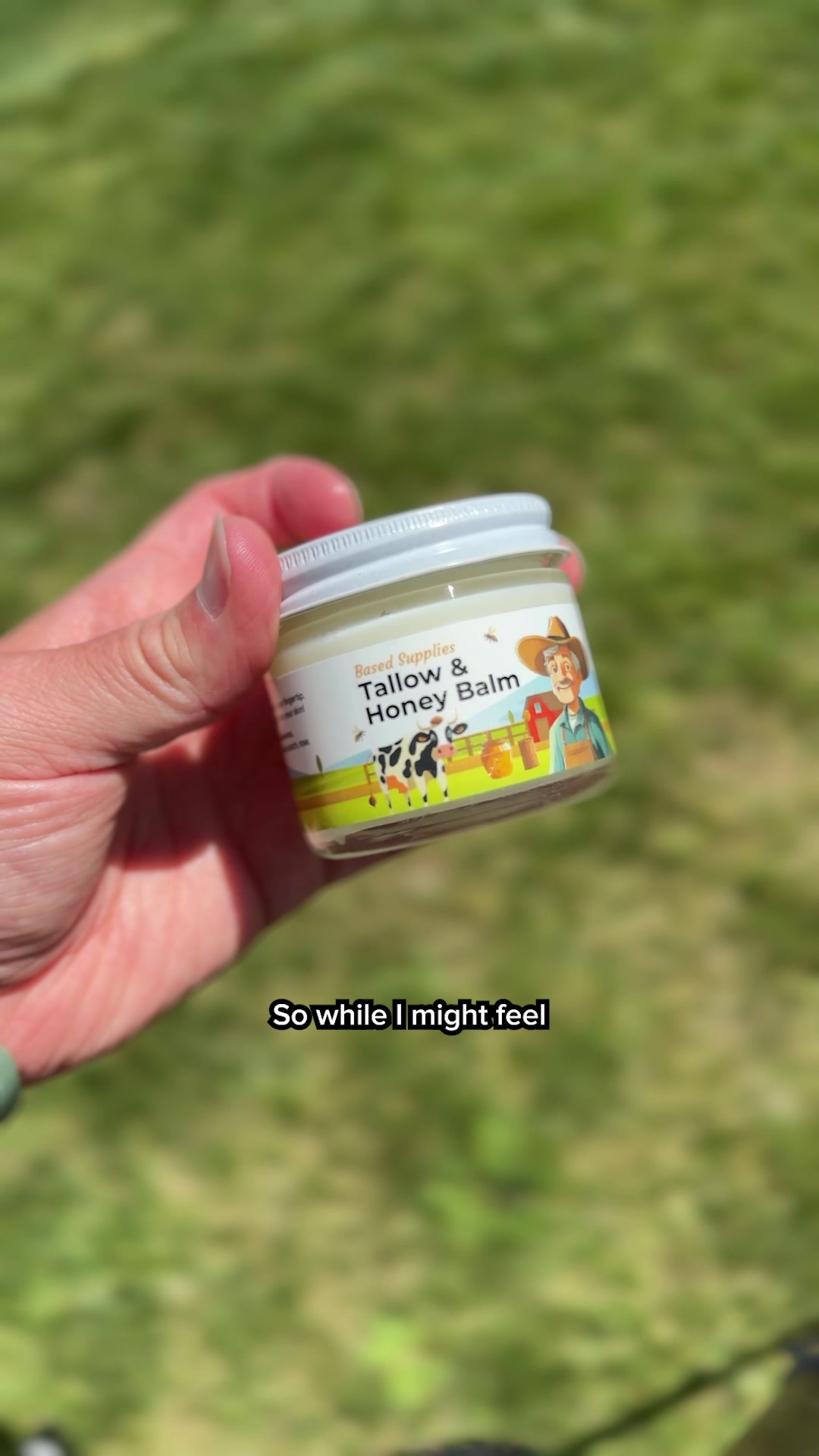 303dVIDEO
Restore Your Skin in 3 Weeks!
Your own page
You just read somebody else's funnel. What does yours score?
The score above came from the real landing page behind this ad, graded on 8 CRO factors. Run your own page through the same rubric, free, and see what each factor found and where you give up the most ground.
Free, no signup, no card. The same 8 factor score every page here was graded on.
Keep exploring
Data from the public Meta Ad Library. Funnelens is not affiliated with or endorsed by Meta. See data sources.