Alya Skin Australia
Facebook · Instagram · Audience Network · Video
The ad
Your 2-step routine for dewy skin 💗 Cleanse with our Micellar Foaming Cleanser, then layer on the Pink Marine Collagen Sleep Mask. @ugcbyabbiegrace_ keeping it simple for glowy, bouncy skin.
Dewy Skin, Simplified ✨
Shop nowThe funnel behind it
Offer: 40% OFF SITEWIDE
Funnel score
8-point CRO breakdown
How well the landing page behind the ad is built to convert, scored across 8 factors: offer, copy, speed, trust, mobile, message-match, CTA, and social proof.
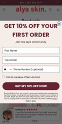
This is a product collection page that does several things well: it displays a sitewide 40% discount prominently at the top, shows 30 products with clear pricing and star ratings, and includes multiple trust signals (customer reviews visible at bottom, 5-star ratings on products). However, it struggles with message-match to the ad—the ad promotes a specific 2-step routine (Micellar Cleanser + Pink Marine Collagen Sleep Mask) but the page shows a generic product grid with no hero section highlighting this routine. The popup offer (10% off first order) conflicts with the sitewide 40% discount messaging. Mobile experience appears functional but the popup modal dominates the view. The page lacks a clear narrative connection between the ad's "dewy skin simplified" promise and the product selection shown.
What this funnel does right. Steal these.
- Trust signals7/10
- Social proof7/10
Where it's weak
- Message match2/10
- Headline3/10
- Call to action5/10
Full breakdown
Call to action
5/10Primary CTA 'GET MY 10% OFF NOW' is prominent in the popup but conflicts with sitewide offer; secondary CTAs (shopping cart icons) are small and scattered across product cards.
- Large, high-contrast button 'GET MY 10% OFF NOW' in burgundy stands out in popup
- Shopping cart icons on each product are accessible and clear
- Multiple CTAs available (popup form, product add-to-cart buttons)
- Primary CTA is buried in a popup that blocks the main product grid
- No clear 'Shop Now' button matching the ad's CTA language visible above the fold
- Cart icons are small and secondary; no prominent 'Shop the Routine' or 'Shop Now' button for the featured products
Page speed
6/10PAGESPEED_SCORE of 61 converts to approximately 6/10; page loads but has room for optimization.
- Product images load and display
- Navigation and interactive elements respond
- PAGESPEED_SCORE of 61 indicates moderate performance issues
- Popup modal may add rendering overhead
- Multiple product images on grid may slow initial load
Trust signals
7/10Page displays consistent 5-star ratings, customer testimonial, and clear brand identity (Alya Skin logo), but lacks security badges, return policy visibility, or detailed company information above the fold.
- 5-star customer review from 'Brianna J.' praising product quality and results
- Consistent 5-star ratings across all visible products
- Clear brand logo and professional design throughout
- No security badges (SSL, payment icons) visible above the fold
- Return policy and terms only visible in footer, not prominently displayed
- No 'About Us' or company credibility information visible on main page
Mobile experience
6/10Mobile layout is functional with stacked product cards and accessible navigation, but the popup modal dominates the viewport and form fields are cramped.
- Product grid adapts to mobile with single-column layout
- Navigation menu accessible via hamburger icon
- Product images and prices are readable on mobile
- Popup form takes up entire screen on mobile, blocking product browsing
- Form fields (First Name, Email, Phone) are cramped and difficult to fill on small screens
- No easy way to dismiss popup and browse products without completing form
Headline
3/10The page headline 'Products' is generic and does not connect to the ad's promise of 'Dewy Skin, Simplified' or the specific 2-step routine mentioned.
- Headline is clear and scannable
- Generic 'Products' heading has no connection to ad messaging about dewy skin routine
- No hero section or subheading reinforcing the ad's specific product pairing
- Misses opportunity to echo ad's 'simplified' positioning
Social proof
7/10Multiple 5-star ratings visible on product cards throughout the grid, and a customer review from 'Brianna J.' with 5 stars at the bottom praising product effectiveness.
- 5-star ratings displayed on every product card (e.g., Australian Native Berries Moisturiser, Pink Clay Mask)
- Customer testimonial at bottom: 'Brianna J.' with 5-star review saying products make skin 'feel super clean and fresh'
- Consistent star ratings across multiple products builds credibility
- No review count visible next to star ratings (e.g., '4.8 stars from 2,100 reviews')
- Only one customer review visible at bottom; more testimonials would strengthen proof
- No trust badges, certifications, or brand credentials shown
Message match
2/10Ad promotes a specific 2-step routine (Micellar Cleanser + Pink Marine Collagen Sleep Mask) but landing page shows generic product grid with no hero section, bundle highlight, or routine-focused messaging.
- Both products mentioned in ad (Pink Clay Mask visible as 'Australian Pink Clay Mask') are present on the page
- No hero section or featured bundle highlighting the 2-step routine from the ad
- Generic 'Products' page with 30 items shown; no focus on the specific cleanser + mask pairing
- Ad's 'dewy skin simplified' narrative completely absent from page copy
Offer clarity
6/10Two competing offers are visible: '40% OFF SITEWIDE' at top and '10% OFF YOUR FIRST ORDER' in popup, creating confusion about which discount applies.
- Sitewide discount clearly stated at top banner
- Specific product prices shown with original and sale prices
- Popup offer has clear call-to-action button
- Two conflicting discount messages (40% vs 10%) confuse which offer is primary
- Popup blocks product view and doesn't explain offer terms clearly
- No explanation of how discounts stack or which applies to which products
More ads from Alya Skin Australia
View all →Build Your Bundle. Get Up to 30% Off.
Build Your Bundle. Get Up to 30% Off.
Glowy Skin While You Sleep? Dreamy.
Build Your Bundle & Save up to 30% 💕
Meet Swipe Bright
Build Your Bundle. Get Up to 30% Off.
Your own page
You just read somebody else's funnel. What does yours score?
The score above came from the real landing page behind this ad, graded on 8 CRO factors. Run your own page through the same rubric, free, and see what each factor found and where you give up the most ground.
Free, no signup, no card. The same 8 factor score every page here was graded on.
Keep exploring
Data from the public Meta Ad Library. Funnelens is not affiliated with or endorsed by Meta. See data sources.