Funnelens

Cirkul

Facebook · Instagram · Whatsapp · Video

Active
Days running
20 days
Funnel score
54/100
Page speed
30/100

The ad

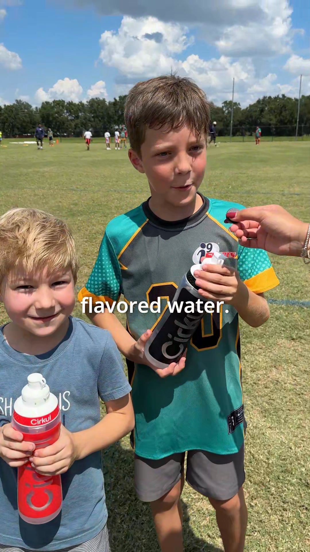
Cirkul ad creative

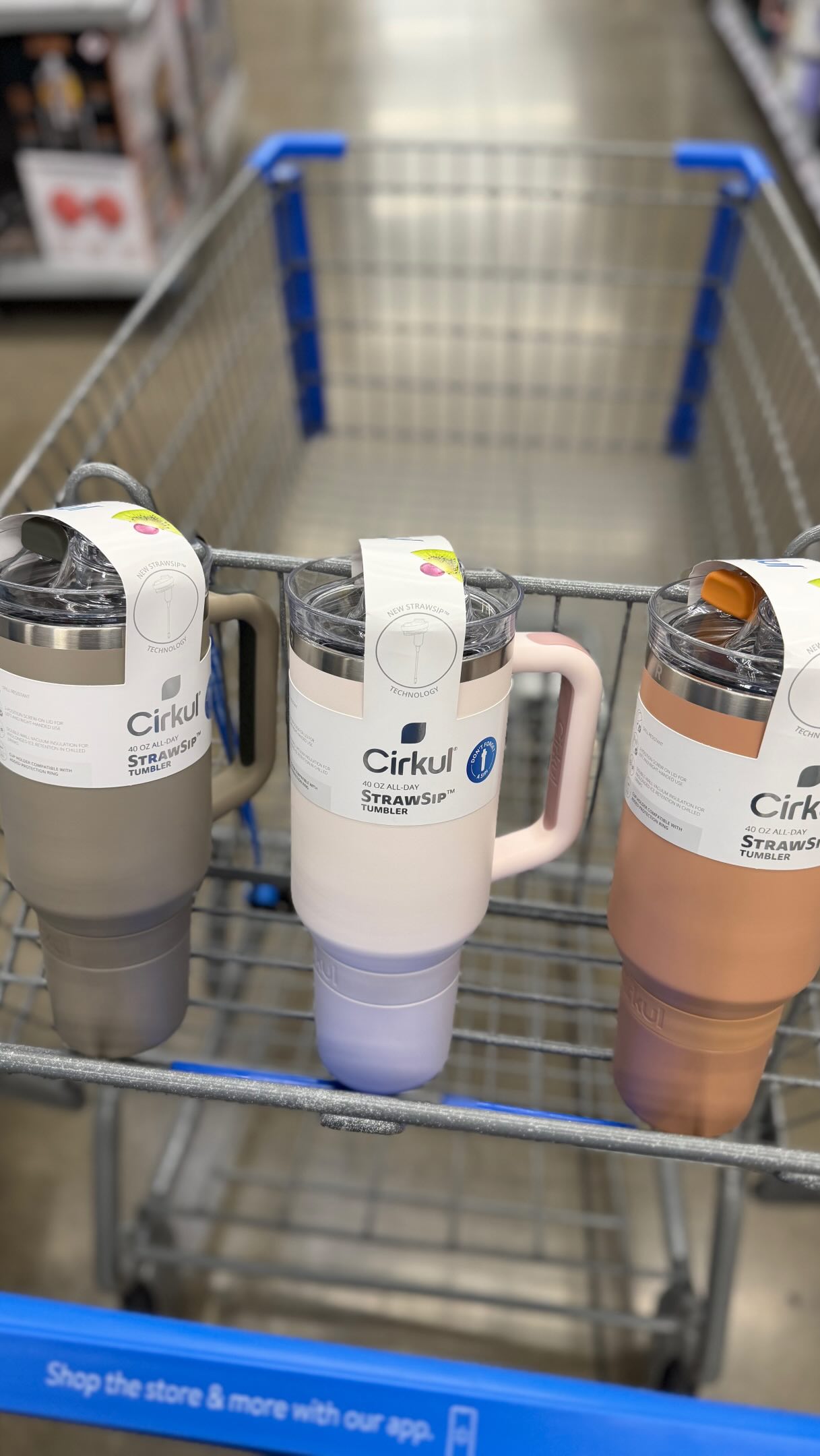
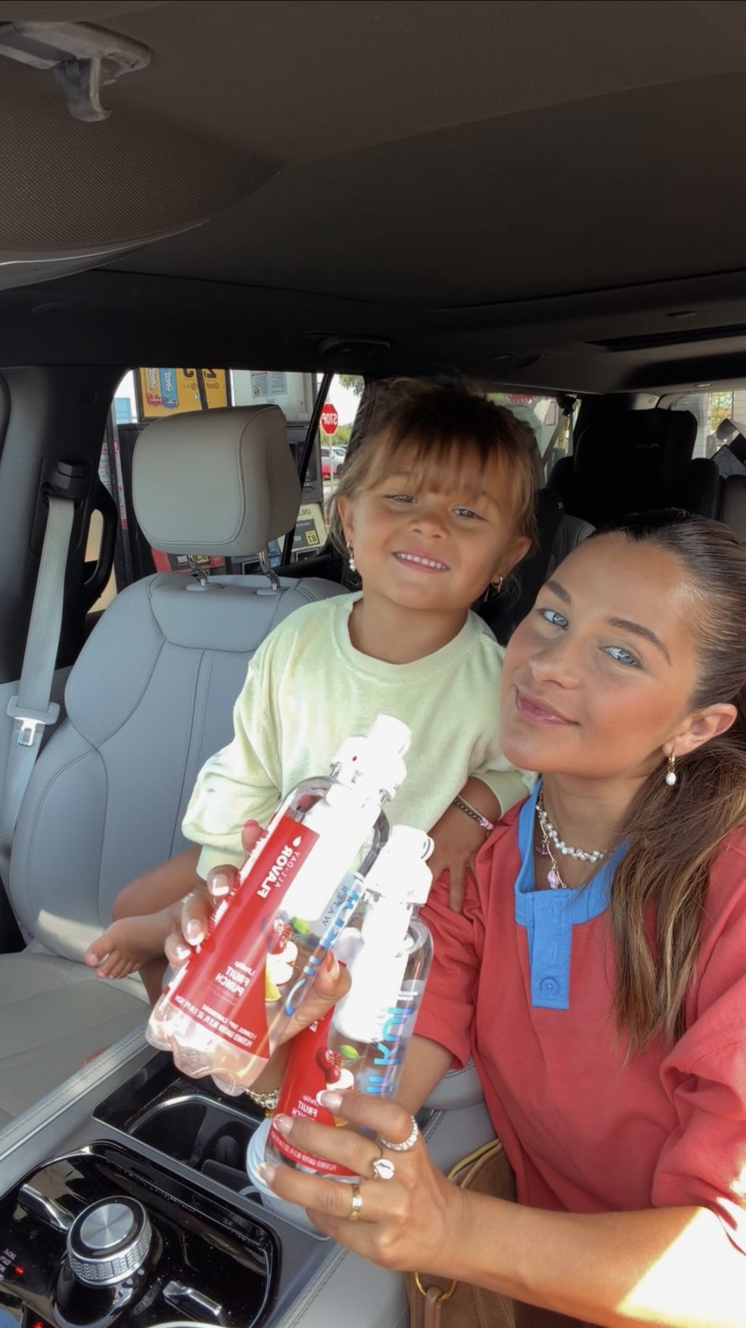
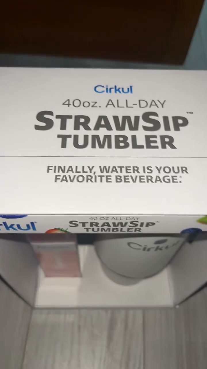
💧 The must-have hydration find at Walmart right now is Cirkul and I am so obsessed with this thing! The Cirkul All-Day StrawSip Tumbler is a 40oz double-wall insulated tumbler with a comfort-grip handle and the most genius flavor system I have ever seen! Here’s how it works: fill it with water, fasten your Sip flavor cartridge, dial your flavor intensity, snap the cap back, and drink! 😍 Zero calories, no sugar, no artificial colors - just bold personalized flavor with every single sip! Choose from 150+ flavors including LifeSip with B vitamins, GoSip with caffeine, and FitSip with electrolytes for an extra boost! 🥳 You can find it in the tumbler aisle at Walmart for just $30! @drinkcirkul @walmart #CirkulPartner #walmartfinds #walmart

Shop now
Angle: Product discovery/lifestyle obsession - positioning Cirkul as a must-have hydration innovation with personalization appealHook: Enthusiasm-driven personal endorsement with emoji emphasisFormat: Video testimonial/product demo

The funnel behind it

Cirkul landing page

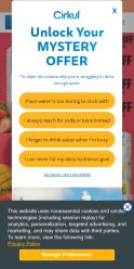
Offer: Unlock Your Mystery Offer - Multiple tiered CTAs with unspecified discount/benefit

54/ 100

Funnel score

8-point CRO breakdown

How well the landing page behind the ad is built to convert, scored across 8 factors: offer, copy, speed, trust, mobile, message-match, CTA, and social proof.

This landing page suffers from a fundamental mismatch between ad promise and page delivery. The ad sells a specific, feature-rich product (Cirkul tumbler with 150+ flavors, $30 at Walmart) with clear benefits, but the page pivots to a vague mystery offer that creates friction rather than conversion. Critical issues include: (1) Abysmal PageSpeed score of 30 will cause significant abandonment, (2) Complete absence of social proof despite ad's enthusiastic tone, (3) Mystery offer format lacks transparency and may trigger skepticism, (4) No product information, pricing, or Walmart connection on landing page, (5) Generic design doesn't leverage the specific product differentiation from the ad. The page appears designed for lead capture rather than direct product sales, creating a disconnect with the ad's retail-focused messaging.

What this funnel does right. Steal these.

  • Mobile experience: Layout appears mobile-optimized with stacked CTAs and readable text. Yellow buttons are thumb-friendly. Good vertical scrolling experience, though mystery offer format may not be ideal for mobile conversion.
  • Call to action: Multiple yellow CTAs are prominent and action-oriented ('Shop now', 'Get offer'), but the mystery element creates friction. Clear button hierarchy, though repetition may dilute effectiveness.
  • Offer clarity: Mystery offer is prominently displayed with multiple CTAs, but the actual value/discount is vague. 'Unlock Your Mystery Offer' creates curiosity but lacks specificity on what discount or benefit awaits.

Where it's weak

  • Page speed: PageSpeed score of 30 is critically poor. Slow load times significantly harm user experience, increase bounce rates, and negatively impact conversion rates across all devices.
  • Social proof: No visible social proof elements on the page. Missing customer testimonials, reviews, ratings, or user-generated content that would validate the product enthusiasm expressed in the ad.
  • Message match: Poor alignment between ad and landing page. Ad focuses on Cirkul product features, flavors, and $30 price point at Walmart. Page pivots to generic mystery offer with no product details, creating disconnect and potential confusion.
  • Trust signals: Branding is present (Cirkul logo visible), but mystery offer format feels manipulative. No security badges, privacy policy links, or trust indicators visible. Generic landing page design reduces credibility compared to ad's specific product claims.

Full breakdown

Call to action7/10

Multiple yellow CTAs are prominent and action-oriented ('Shop now', 'Get offer'), but the mystery element creates friction. Clear button hierarchy, though repetition may dilute effectiveness.

Page speed3/10

PageSpeed score of 30 is critically poor. Slow load times significantly harm user experience, increase bounce rates, and negatively impact conversion rates across all devices.

Trust signals5/10

Branding is present (Cirkul logo visible), but mystery offer format feels manipulative. No security badges, privacy policy links, or trust indicators visible. Generic landing page design reduces credibility compared to ad's specific product claims.

Mobile experience8/10

Layout appears mobile-optimized with stacked CTAs and readable text. Yellow buttons are thumb-friendly. Good vertical scrolling experience, though mystery offer format may not be ideal for mobile conversion.

Headline6/10

Headline 'Unlock Your MYSTERY OFFER' is attention-grabbing but generic. Doesn't communicate the core product benefit (hydration, flavor customization, Cirkul tumbler) that the ad emphasizes.

Social proof3/10

No visible social proof elements on the page. Missing customer testimonials, reviews, ratings, or user-generated content that would validate the product enthusiasm expressed in the ad.

Message match4/10

Poor alignment between ad and landing page. Ad focuses on Cirkul product features, flavors, and $30 price point at Walmart. Page pivots to generic mystery offer with no product details, creating disconnect and potential confusion.

Offer clarity7/10

Mystery offer is prominently displayed with multiple CTAs, but the actual value/discount is vague. 'Unlock Your Mystery Offer' creates curiosity but lacks specificity on what discount or benefit awaits.

More ads from Cirkul

View all →

Keep exploring

Data from the public Meta Ad Library. Funnelens is not affiliated with or endorsed by Meta. See data sources.