Cirkul
Facebook · Instagram · Messenger · Video
The ad

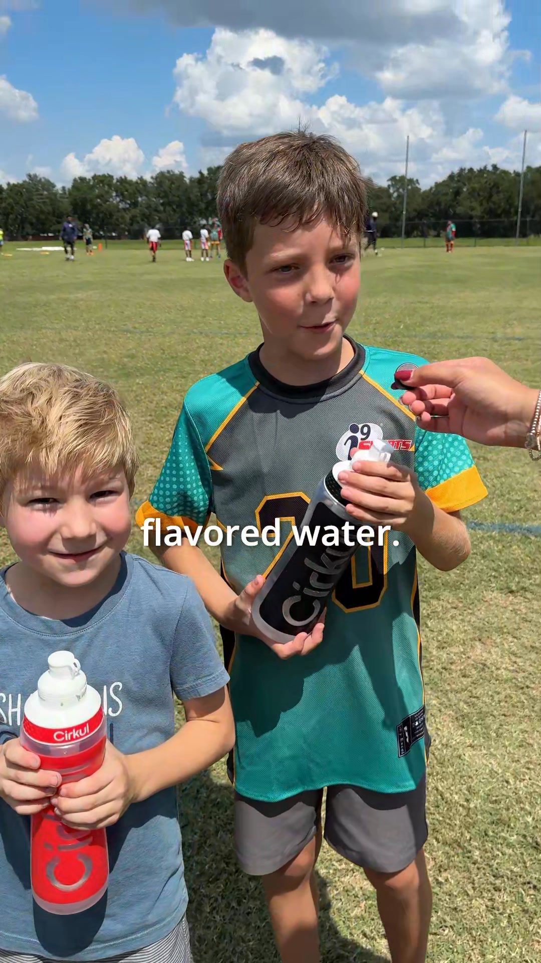
Kids drink more water when they pick the taste. With Cirkul they twist the dial for more or less flavor and swap cartridges in seconds. No powder mess. Zero sugar option.
Shop nowThe funnel behind it
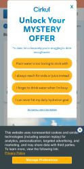
Offer: Mystery offer with multiple unclear options presented as yellow buttons
Funnel score
8-point CRO breakdown
How well the landing page behind the ad is built to convert, scored across 8 factors: offer, copy, speed, trust, mobile, message-match, CTA, and social proof.
This landing page suffers from fundamental CRO issues. The mystery offer approach creates friction rather than excitement, with no clear value communication. The 4 identical yellow buttons confuse users about next steps. Critical disconnect exists between the ad's product-focused messaging (flavor customization, kids, zero sugar) and the page's discount-focused mystery offer. The PageSpeed score of 28 is catastrophic for conversions. Missing social proof, trust signals, and clear offer details compound the problems. The page prioritizes mystery over clarity, which typically depresses conversion rates.
Where it's weak
- Page speed: PageSpeed score of 28 is critically poor. Slow load times significantly harm conversion rates and user experience, especially on mobile devices.
- Social proof: No visible testimonials, reviews, ratings, user counts, or social proof elements. Missing critical trust-building components for a mystery offer landing page.
- Trust signals: Mystery offer format reduces trust - users don't know what they're getting. No security badges, guarantees, brand credibility markers, or clear company information visible. Vague messaging increases skepticism.
- Message match: Significant disconnect between ad (focus on kids, flavor customization, zero sugar) and landing page (generic mystery offer with no product details). Ad emphasizes product benefits; page emphasizes discount mystery.
- Offer clarity: Mystery offer is intentionally vague ('Unlock Your MYSTERY OFFER'). Multiple yellow buttons with unclear differentiation make it hard to understand what each option provides. No clear value proposition stated.
- Call to action: Multiple CTAs (4 yellow buttons) create confusion and decision paralysis. Primary CTA text is unclear - buttons don't specify what action leads to what outcome. No urgency or scarcity messaging.
- Headline: Headline 'Unlock Your MYSTERY OFFER' is generic and doesn't communicate product benefits. Lacks specificity about what makes Cirkul unique compared to ad messaging about flavor customization.
Full breakdown
Multiple CTAs (4 yellow buttons) create confusion and decision paralysis. Primary CTA text is unclear - buttons don't specify what action leads to what outcome. No urgency or scarcity messaging.
PageSpeed score of 28 is critically poor. Slow load times significantly harm conversion rates and user experience, especially on mobile devices.
Mystery offer format reduces trust - users don't know what they're getting. No security badges, guarantees, brand credibility markers, or clear company information visible. Vague messaging increases skepticism.
Layout appears mobile-responsive with stacked buttons. However, multiple similar CTAs on mobile create usability issues. Text is readable but button hierarchy is unclear.
Headline 'Unlock Your MYSTERY OFFER' is generic and doesn't communicate product benefits. Lacks specificity about what makes Cirkul unique compared to ad messaging about flavor customization.
No visible testimonials, reviews, ratings, user counts, or social proof elements. Missing critical trust-building components for a mystery offer landing page.
Significant disconnect between ad (focus on kids, flavor customization, zero sugar) and landing page (generic mystery offer with no product details). Ad emphasizes product benefits; page emphasizes discount mystery.
Mystery offer is intentionally vague ('Unlock Your MYSTERY OFFER'). Multiple yellow buttons with unclear differentiation make it hard to understand what each option provides. No clear value proposition stated.
More ads from Cirkul
View all →
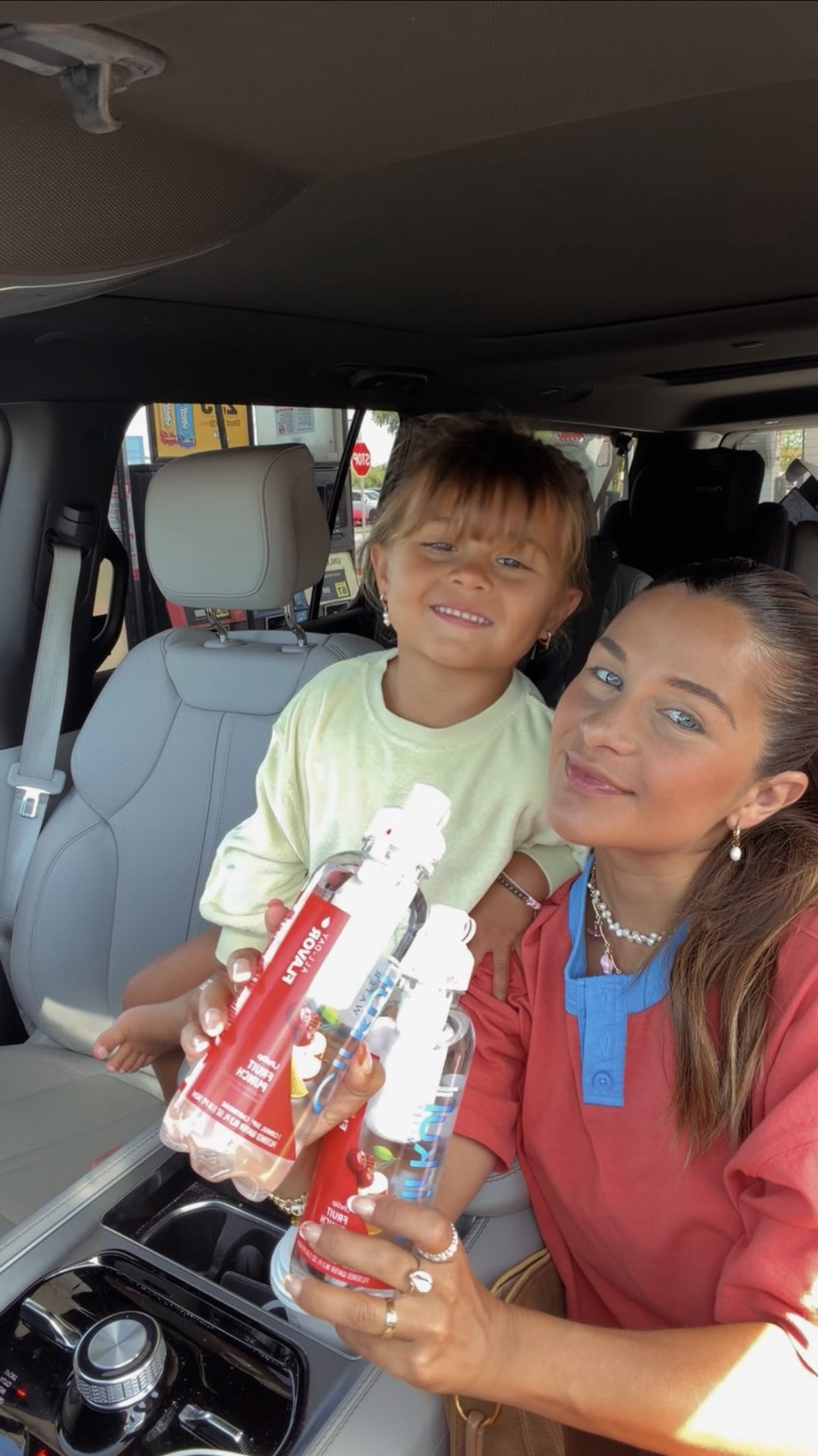
62dVIDEOwe love a roadtrip!! which of course means snacks, beautiful chaos & making sure everyone stays hydrated🤭 we’ve been loving these new ready-to-drink @drinkcirkul Water bottles because they make it SO easy. just grab your favorite flavor and go🧚🏼♀️you can GET UP TO SIX DRINKS from the same bottle (depending on the flavor dial setting), plus you can adjust the flavor which the kids think is the coolest thing ever.l it’s become part of our routine anytime we’re on the move! To get Cirkul Water head to your local @walmart 💙#CirkulPartner
96% of People Say they are Drinking More Water With Cirkul! Fight Dehydration with 150+ Flavors.
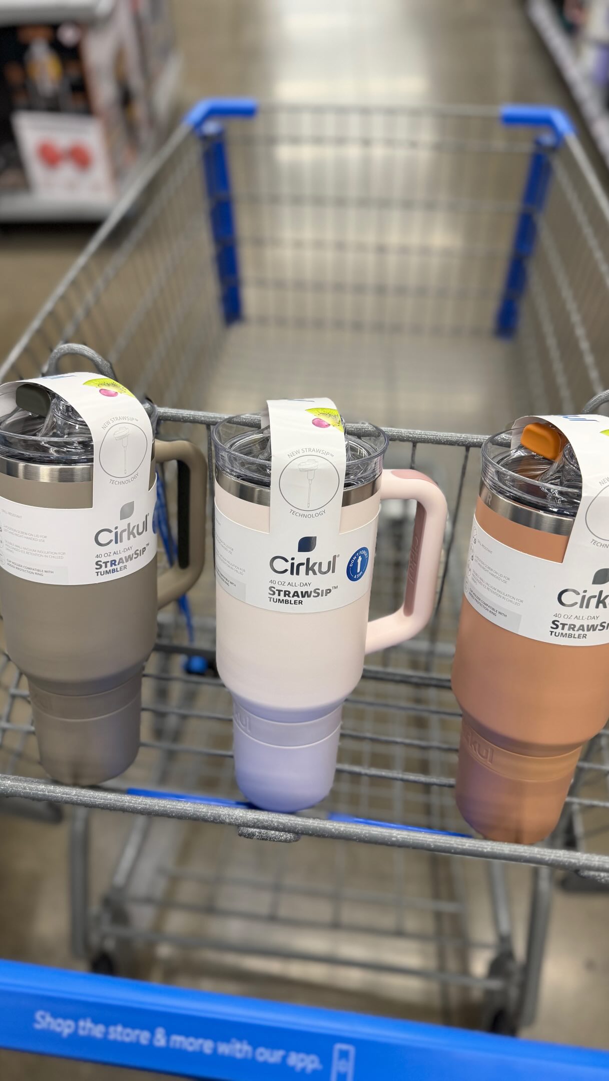
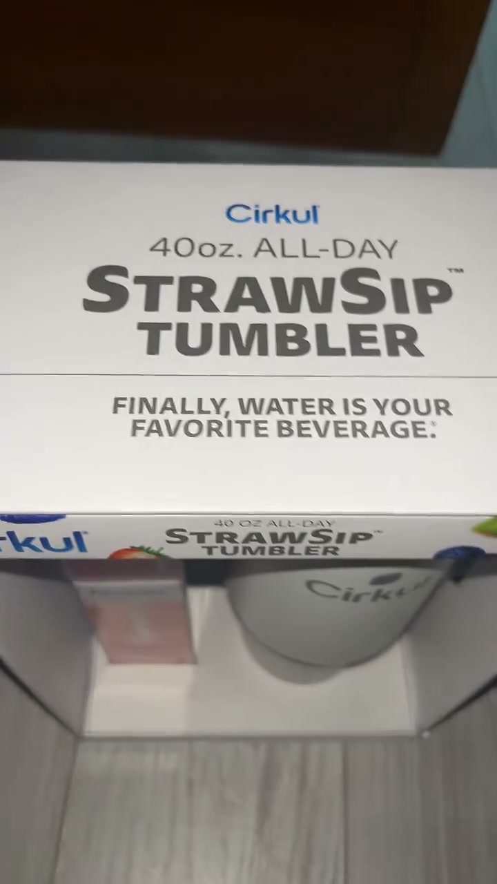
20dVIDEO💧 The must-have hydration find at Walmart right now is Cirkul and I am so obsessed with this thing! The Cirkul All-Day StrawSip Tumbler is a 40oz double-wall insulated tumbler with a comfort-grip handle and the most genius flavor system I have ever seen! Here’s how it works: fill it with water, fasten your Sip flavor cartridge, dial your flavor intensity, snap the cap back, and drink! 😍 Zero calories, no sugar, no artificial colors - just bold personalized flavor with every single sip! Choose from 150+ flavors including LifeSip with B vitamins, GoSip with caffeine, and FitSip with electrolytes for an extra boost! 🥳 You can find it in the tumbler aisle at Walmart for just $30! @drinkcirkul @walmart #CirkulPartner #walmartfinds #walmart
5dVIDEOSave Up to 20% + Extra 30% Off
Keep exploring
Data from the public Meta Ad Library. Funnelens is not affiliated with or endorsed by Meta. See data sources.