Funnelens

Frøya Organics

Facebook · Instagram · Audience Network · Image

Active
Days running
211 days
Funnel score
60/100
Page speed
40/100

The ad

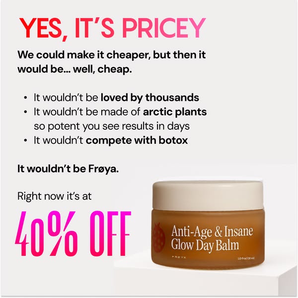
Frøya Organics ad creative

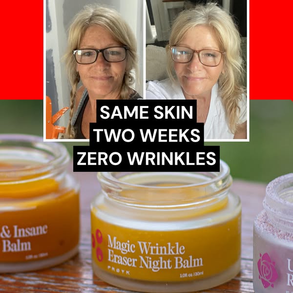
💛 Embrace your natural beauty and feel confident in your skin. Unlock the power of Arctic balms, made with just plants and beeswax: 🌼 Arnica: Stimulates collagen production to smooth wrinkles 🍊 Sea Buckthorn: Powerful antioxidant that enhances skin elasticity 🍯 Beeswax: Locks in moisture and repairs the skin barrier for lasting hydration With the goodness of 100% natural ingredients and never any ❌ Toxic chemicals ❌ Hormone disruptors ❌ Fillers It’s unlike any natural product you’ve ever tried. These Arctic balms really work. If you don’t see visible results in 60 days, you’ll get your money back.

Side effect: Younger skin

Shop now
Angle: Natural skincare efficacy with scientific ingredient benefits and risk-free guaranteeHook: Benefit-driven headline with playful tone ('Side effect: Younger skin')Format: Image ad with benefit-focused primary text and ingredient breakdown

The funnel behind it

Frøya Organics landing page

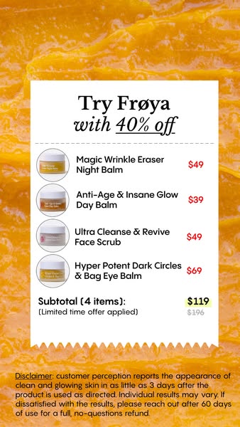
Offer: 46% OFF - Pick your biggest concerns & save extra

60/ 100

Funnel score

8-point CRO breakdown

How well the landing page behind the ad is built to convert, scored across 8 factors: offer, copy, speed, trust, mobile, message-match, CTA, and social proof.

This landing page uses a discount-driven entry point (46% off) with a personalization mechanism (concern selection) to segment users. The design is mobile-friendly with clear visual hierarchy and prominent CTAs. However, the page suffers from critical weaknesses: (1) Poor PageSpeed score (40) will hurt conversion rates, (2) Complete absence of social proof (reviews, testimonials, ratings) for a skincare product, (3) Disconnect between ad messaging (natural ingredients, collagen, elasticity benefits) and landing page focus (discount + concern selection), (4) Limited trust signals beyond the money-back guarantee. The page appears to be an entry funnel rather than a complete sales page, which may explain the missing product details and social proof. The visible sections show competent UX design but lack the persuasive elements needed for high conversion on a premium skincare product.

What this funnel does right. Steal these.

  • Mobile experience: Layout appears mobile-optimized with full-width buttons, readable typography, and vertical stacking. Touch-friendly button sizes. Good mobile UX visible in the captured sections.
  • Offer clarity: 46% discount offer is prominently displayed with clear call-to-action buttons. Discount percentage is explicit and easy to understand. Personalization angle (pick your concerns) adds clarity.
  • Call to action: Multiple orange buttons with clear CTAs ("Shop now" equivalent through category selection). Buttons are visually prominent and action-oriented. However, the primary CTA requires selection first rather than direct purchase.
  • Headline: "WANT 46% OFF?" is clear and benefit-driven. However, the page headline doesn't directly echo the ad headline "Side effect: Younger skin" - there's a disconnect in messaging hierarchy.

Where it's weak

  • Social proof: No visible social proof elements on the captured sections. No testimonials, reviews, ratings, user counts, or trust badges are shown. This is a significant weakness for a skincare product claiming results.
  • Page speed: PageSpeed score of 40 is poor. This significantly impacts user experience, especially on mobile devices. Slow load times typically reduce conversion rates.
  • Trust signals: Brand logo present (FRØYA). Ad mentions 60-day money-back guarantee which builds trust. However, no visible third-party certifications, ingredient sourcing details, or customer testimonials in captured sections. Limited trust signals overall.

Full breakdown

Call to action7/10

Multiple orange buttons with clear CTAs ("Shop now" equivalent through category selection). Buttons are visually prominent and action-oriented. However, the primary CTA requires selection first rather than direct purchase.

Page speed4/10

PageSpeed score of 40 is poor. This significantly impacts user experience, especially on mobile devices. Slow load times typically reduce conversion rates.

Trust signals5/10

Brand logo present (FRØYA). Ad mentions 60-day money-back guarantee which builds trust. However, no visible third-party certifications, ingredient sourcing details, or customer testimonials in captured sections. Limited trust signals overall.

Mobile experience8/10

Layout appears mobile-optimized with full-width buttons, readable typography, and vertical stacking. Touch-friendly button sizes. Good mobile UX visible in the captured sections.

Headline7/10

"WANT 46% OFF?" is clear and benefit-driven. However, the page headline doesn't directly echo the ad headline "Side effect: Younger skin" - there's a disconnect in messaging hierarchy.

Social proof3/10

No visible social proof elements on the captured sections. No testimonials, reviews, ratings, user counts, or trust badges are shown. This is a significant weakness for a skincare product claiming results.

Message match6/10

Ad emphasizes natural ingredients, collagen stimulation, and 60-day guarantee. Landing page focuses on discount and concern-based selection. The core product benefits from the ad are not prominently featured in the visible sections.

Offer clarity8/10

46% discount offer is prominently displayed with clear call-to-action buttons. Discount percentage is explicit and easy to understand. Personalization angle (pick your concerns) adds clarity.

More ads from Frøya Organics

View all →

Keep exploring

Data from the public Meta Ad Library. Funnelens is not affiliated with or endorsed by Meta. See data sources.