Funnelens

Frøya Organics

Facebook · Instagram · Audience Network · Video

Active
Days running
130 days
Funnel score
60/100
Page speed
48/100

The ad

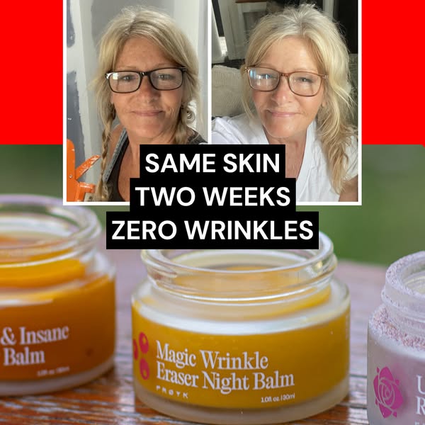
Frøya Organics ad creative

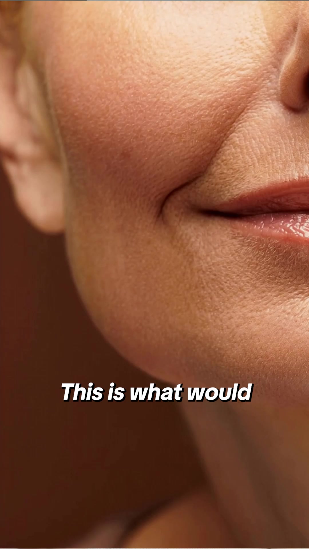
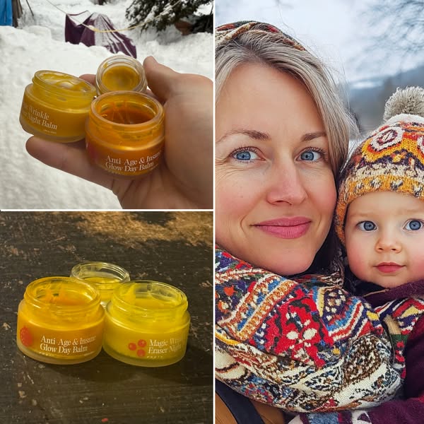
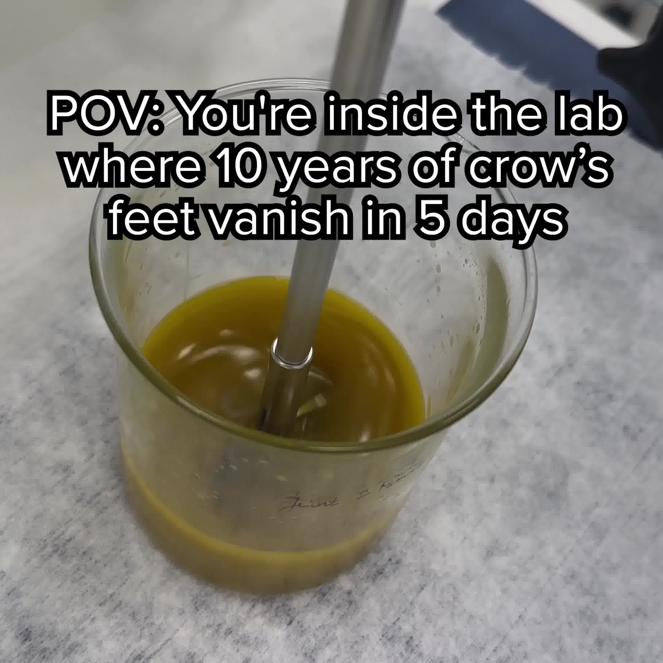
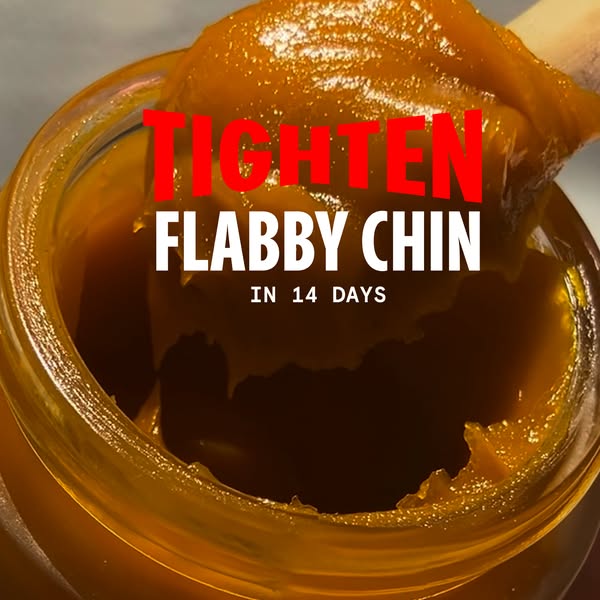
💛 The Anti-Aging Ingredient You’ve Never Heard Of … ❌ Retinol = skin thinning ❌ Hyaluronic acid = dehydration ❌ Store-bought creams = oil waste toxins 🟡 But Arctic plants? Criminally overlooked. Arnica locks in hydration, boosts collagen, and improves elasticity. Sea buckthorn activates stem cells and rejuvenates the skin barrier. Calendula soothes the skin, eliminates redness, and fades dark circles. Made with just Arctic botanicals + organic beeswax. If you don’t see visible results, you’ll get your money back. That’s our 60-day promise.

Side effect: Younger skin

Shop now
Angle: Natural alternative superiority - positioning Arctic botanicals as overlooked anti-aging solution superior to mainstream ingredientsHook: Problem-agitation - debunking common skincare myths with negative calloutsFormat: Video testimonial or before/after demonstration

The funnel behind it

Frøya Organics landing page

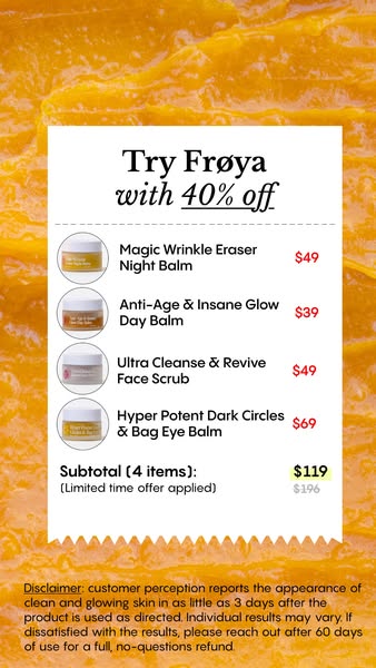
Offer: 46% OFF - Pick your biggest concerns & save extra

60/ 100

Funnel score

8-point CRO breakdown

How well the landing page behind the ad is built to convert, scored across 8 factors: offer, copy, speed, trust, mobile, message-match, CTA, and social proof.

This landing page captures a discount-driven entry point with personalized concern selection, but suffers from critical gaps in social proof and trust signals. The page speed (48) is problematic and will hurt conversions. While the offer is clear and the mobile layout is solid, the page doesn't leverage the compelling ingredient story from the ad. The absence of testimonials, reviews, or trust badges for a skincare product is a major missed opportunity. The concern-based button selection is clever for segmentation but doesn't lead to an obvious purchase CTA in the visible sections. The page appears to be an intermediate step rather than a complete conversion funnel.

What this funnel does right. Steal these.

  • Mobile experience: Layout appears mobile-optimized with full-width buttons, readable typography, and vertical stacking. The Froiya logo and buttons are appropriately sized for mobile interaction.
  • Offer clarity: 46% off discount is prominently displayed with clear call-to-action buttons. The personalization angle (pick your biggest concerns) adds clarity to what discount applies to.
  • Call to action: Multiple orange buttons with clear CTAs ("FINE LINES, WRINKLES, DARK CIRCLES" etc.) are prominent and action-oriented. However, the primary CTA text doesn't explicitly say "Shop now" or similar on visible buttons—they're concern-based selectors rather than purchase CTAs.
  • Headline: "WANT 46% OFF?" is direct and benefit-driven. However, it's transactional rather than emotional. The ad headline "Side effect: Younger skin" is more compelling but doesn't appear on the landing page itself.

Where it's weak

  • Social proof: No visible social proof elements detected on the captured sections. No testimonials, reviews, ratings, user counts, or trust badges are shown. This is a significant weakness for a skincare product claiming results.
  • Page speed: PageSpeed score of 48 indicates poor performance. This is below acceptable standards and will negatively impact conversion rates, especially on mobile devices where most traffic likely originates.
  • Trust signals: The ad mentions a 60-day money-back guarantee, which is trust-building. However, the landing page shows no visible trust signals, security badges, certifications, or company credentials. The brand name (Froiya) is present but no additional trust markers are evident in captured sections.

Full breakdown

Call to action7/10

Multiple orange buttons with clear CTAs ("FINE LINES, WRINKLES, DARK CIRCLES" etc.) are prominent and action-oriented. However, the primary CTA text doesn't explicitly say "Shop now" or similar on visible buttons—they're concern-based selectors rather than purchase CTAs.

Page speed4/10

PageSpeed score of 48 indicates poor performance. This is below acceptable standards and will negatively impact conversion rates, especially on mobile devices where most traffic likely originates.

Trust signals5/10

The ad mentions a 60-day money-back guarantee, which is trust-building. However, the landing page shows no visible trust signals, security badges, certifications, or company credentials. The brand name (Froiya) is present but no additional trust markers are evident in captured sections.

Mobile experience8/10

Layout appears mobile-optimized with full-width buttons, readable typography, and vertical stacking. The Froiya logo and buttons are appropriately sized for mobile interaction.

Headline7/10

"WANT 46% OFF?" is direct and benefit-driven. However, it's transactional rather than emotional. The ad headline "Side effect: Younger skin" is more compelling but doesn't appear on the landing page itself.

Social proof3/10

No visible social proof elements detected on the captured sections. No testimonials, reviews, ratings, user counts, or trust badges are shown. This is a significant weakness for a skincare product claiming results.

Message match6/10

Ad emphasizes Arctic botanicals (Arnica, Sea buckthorn, Calendula) and anti-aging benefits. Landing page focuses on discount personalization rather than ingredient education. The core message (Arctic plants as anti-aging solution) is present but secondary to the discount offer.

Offer clarity8/10

46% off discount is prominently displayed with clear call-to-action buttons. The personalization angle (pick your biggest concerns) adds clarity to what discount applies to.

More ads from Frøya Organics

View all →

Keep exploring

Data from the public Meta Ad Library. Funnelens is not affiliated with or endorsed by Meta. See data sources.