Frøya Organics
Facebook · Instagram · Audience Network · Image
The ad

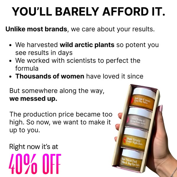
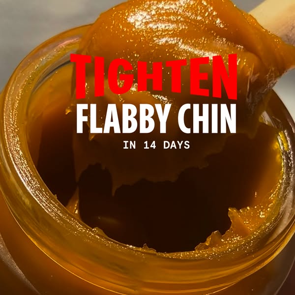
💛 Embrace your natural beauty and feel confident in your skin. Unlock the power of Arctic balms, made with just plants and beeswax: 🌼 Arnica: Stimulates collagen production to smooth wrinkles 🍊 Sea Buckthorn: Powerful antioxidant that enhances skin elasticity 🍯 Beeswax: Locks in moisture and repairs the skin barrier for lasting hydration With the goodness of 100% natural ingredients and never any ❌ Toxic chemicals ❌ Hormone disruptors ❌ Fillers It’s unlike any natural product you’ve ever tried. These Arctic balms really work. If you don’t see visible results in 60 days, you’ll get your money back.
Side effect: Younger skin
Shop nowThe funnel behind it

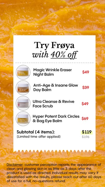
Offer: 46% discount - pick your biggest concerns & save extra
Funnel score
8-point CRO breakdown
How well the landing page behind the ad is built to convert, scored across 8 factors: offer, copy, speed, trust, mobile, message-match, CTA, and social proof.
This landing page captures a discount-driven offer (46% off) with a personalized concern-selection mechanism. The page is mobile-friendly with clear CTAs, but suffers from critical weaknesses: (1) Poor PageSpeed score (34) will cause abandonment, (2) Complete absence of social proof/reviews despite being a skincare product, (3) Disconnect between ad messaging (natural ingredients, guarantee, younger skin) and landing page focus (discount + concern selection), (4) Missing key trust signals like the 60-day guarantee mentioned in the ad. The page appears to be a discount-first funnel rather than a benefit-first conversion page. The personalization angle is good UX, but the lack of social proof and slow speed are major conversion killers.
What this funnel does right. Steal these.
- Call to action: Multiple prominent orange CTA buttons with clear action text ("FINE LINES, WRINKLES...", "DRY, ITCHY...", etc.). Buttons are visually distinct and easy to tap on mobile. Secondary CTA "I want to pay full price" provides alternative path.
- Mobile experience: Layout appears mobile-optimized with full-width buttons, readable text hierarchy, and appropriate spacing. Buttons are large enough for touch interaction. No obvious mobile usability issues in visible sections.
- Offer clarity: 46% discount offer is prominently displayed with clear call-to-action buttons. Discount percentage is explicit and easy to understand. Personalization angle (pick your concerns) adds clarity.
- Headline: "WANT 46% OFF?" is clear and benefit-driven. However, the page headline doesn't directly echo the ad headline "Side effect: Younger skin" - there's a disconnect in messaging hierarchy.
Where it's weak
- Page speed: PageSpeed score of 34 is poor. This significantly impacts user experience, bounce rates, and conversion. Slow loading will hurt mobile users especially.
- Social proof: No visible social proof elements on the captured sections. No testimonials, reviews, ratings, user counts, or trust badges are shown. This is a significant weakness for a skincare product claiming results.
- Trust signals: Froya Organics branding is present. Ad mentions 60-day money-back guarantee (strong trust signal) but this is not visible on the landing page sections shown. No visible certifications, third-party validation, or detailed ingredient sourcing information. Missing trust-building elements.
Full breakdown
Multiple prominent orange CTA buttons with clear action text ("FINE LINES, WRINKLES...", "DRY, ITCHY...", etc.). Buttons are visually distinct and easy to tap on mobile. Secondary CTA "I want to pay full price" provides alternative path.
PageSpeed score of 34 is poor. This significantly impacts user experience, bounce rates, and conversion. Slow loading will hurt mobile users especially.
Froya Organics branding is present. Ad mentions 60-day money-back guarantee (strong trust signal) but this is not visible on the landing page sections shown. No visible certifications, third-party validation, or detailed ingredient sourcing information. Missing trust-building elements.
Layout appears mobile-optimized with full-width buttons, readable text hierarchy, and appropriate spacing. Buttons are large enough for touch interaction. No obvious mobile usability issues in visible sections.
"WANT 46% OFF?" is clear and benefit-driven. However, the page headline doesn't directly echo the ad headline "Side effect: Younger skin" - there's a disconnect in messaging hierarchy.
No visible social proof elements on the captured sections. No testimonials, reviews, ratings, user counts, or trust badges are shown. This is a significant weakness for a skincare product claiming results.
Ad emphasizes natural ingredients, 60-day guarantee, and specific benefits (collagen, elasticity). Landing page focuses on discount offer and concern-based selection. The guarantee mentioned in ad is not visible on captured page sections. Moderate alignment but missing key ad claims.
46% discount offer is prominently displayed with clear call-to-action buttons. Discount percentage is explicit and easy to understand. Personalization angle (pick your concerns) adds clarity.
More ads from Frøya Organics
View all →

546dVIDEOUltra-Potent Natural Skincare
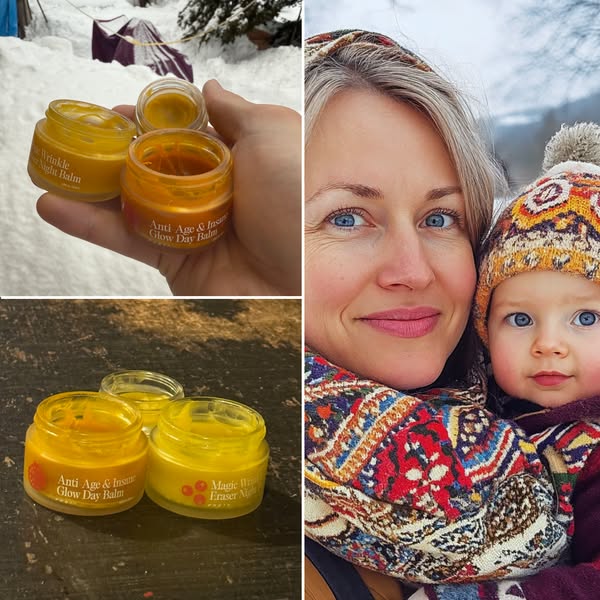
531dIMAGESide-effect: my skin is glowing
454dVIDEOYounger SKIN or Money Back
412dIMAGEMy Husband Was Shocked
340dVIDEOYour skincare is making you age faster 🤯
340dIMAGE“My skin cells are waking up!”
Keep exploring
Data from the public Meta Ad Library. Funnelens is not affiliated with or endorsed by Meta. See data sources.